SWOT Analysis (Strengths, Weaknesses, Opportunities & Threats) is crucial to every business or organization. It is more than just an intelligent evaluation of the company's performance in the global market. SWOT Analysis is an indispensable exercise before making any key business decision, whether it is overhauling the brand strategy or rolling out new products. Needless to say, it is a pat on the back for the strengths gained, a humble reminder of your weaknesses that need to be worked upon, a push to explore the opportunities for growth and meet the threats from current competitors.
How you present SWOT Analysis through PowerPoint in front of the decision makers is quite crucial too. Presenting the list as a row of dots points out your weakness as a presenter and can even pose threat to your career progression. If the SWOT Analysis slide in your PowerPoint presentation is, on the other hand, a sleek and professional one, it is a proof of your strength in presentation skills and an opportunity to make an impact on the audience.
It’s therefore imperative that before you do a SWOT Analysis of your organization, you do a personal SWOT Analysis! Put simply, dressing up your slides neatly is as important as dressing up yourself for the next business presentation.
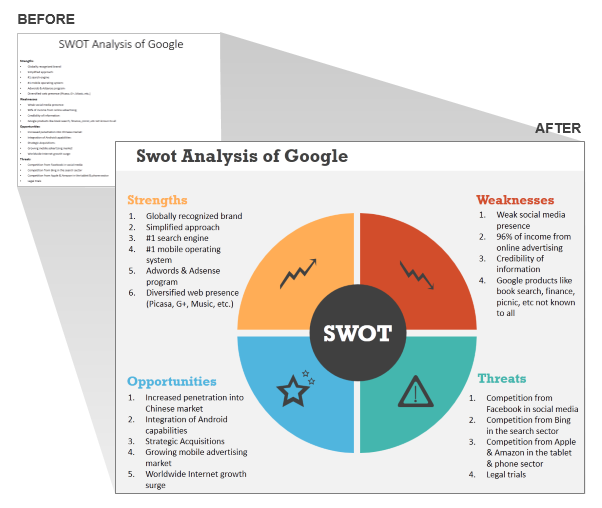
Let us show you the difference between a shabbily dressed SWOT Analysis slide and a beautifully dressed one:
While the after slide beats the bulleted slide hands down, it’s also far better than the usual SWOT Analysis matrix with 4 rectangular boxes (that has been done to death). You are most welcome to download the above SWOT Analysis template but through this article, we’ll also show you how you can create this awesome design on your own. So, if you are interested in strengthening your PowerPoint skills, read further:
8 Steps to Create a Creative SWOT Analysis Template in PowerPoint
Step 1: Insert a Pie Chart
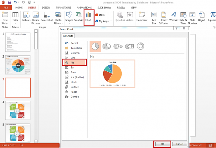
In the slide above, we have presented the SWOT as four pieces of a pie. Using the amazing software that PowerPoint is, we are going to split it into 4 equal halves. In the end, we’ll have an editable shape or shapes allowing us to change their colors and even contract or enlarge a piece for effect. But first we need to insert a basic pie chart into the slide. Follow these steps:
- Click the Insert tab on the PowerPoint Ribbon
- Click Charts (see the screenshot below)
- Select the Pie option
- Click OK
Step 2: Edit Data
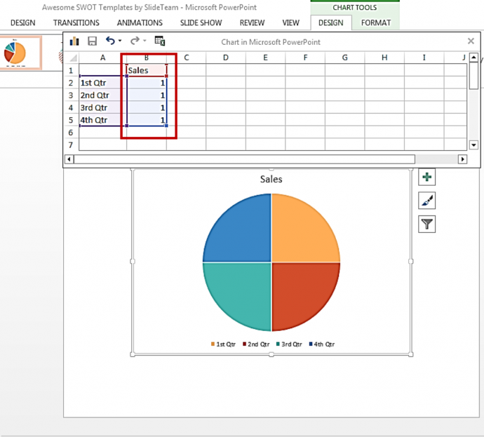
By default in Microsoft PowerPoint 2013, the Excel data sheets opens up as soon as the pie chart is inserted. If it doesn’t open on your screen, simply right click on the diagram and click Edit Data. We now need to equally divide the pie chart. For that, we need to manually alter the values in that Excel sheet. In the Sales column, put the value under all quarters as 1 (see the screenshot below). This will divide the pie equally.
You may now close the Excel sheet. Before proceeding to step 3, select the Sales text box above the circle and the quarters box below and press Delete. You’ll now be left with the pie alone. Now to step 3.
Step 3: Let’s Split the Pie!
It’s far easier to split a pie in PowerPoint than in real life. All you have to do is:
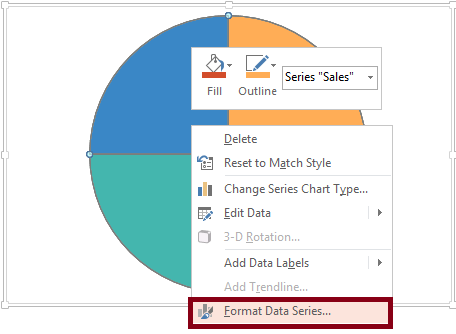
- Right click on the shape
- Click Format Data Series
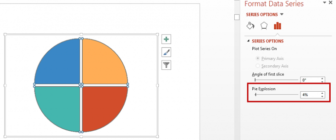
- A window will open on the right side of the slide
- Set the Pie Explosion value at 4%
Step 4: Save it as an enhanced picture
Since right now we have a chart linked to an excel sheet, we cannot experiment much with it. Each pie will stay enclosed within the chart area. We’ll therefore need to convert it into an object that can be moved around. In this step, you just have to do these 3 things:
- Select the pie chart and press Ctrl+X
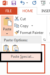
- Click the Paste drop down in the top left corner under the Home tab and click Paste Special
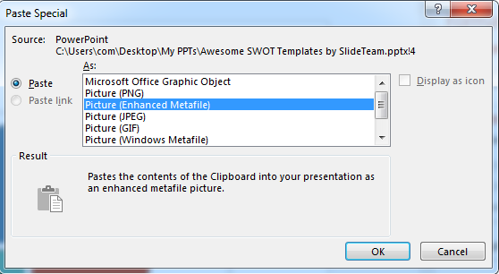
- Select the Picture (Enhanced Metafile) option in the window and click OK.
Step 5: Ungroup the picture
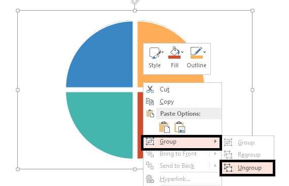
The image saved is a grouped one. To ungroup the image, right click on it, click the Group menu and select Ungroup, or simply use the shortcut- Ctrl+Shift+G.
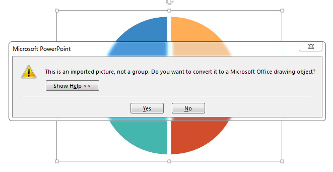
You get the following informational message: This is an imported picture, not a group. Do you want to convert it to a Microsoft Office drawing object? Click Yes.
Step 6: Delete the duplicate shape
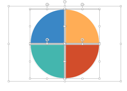
There is a duplicate shape behind the ungrouped object. If you move any of the pies, you’ll notice the duplicate shape beneath it. It’s better to delete this shape since it’s using up extra space. To delete the duplicate shape, follow these steps:
- Ungroup the shape once again (follow the same steps for ungrouping as above)
- You’ll notice all the four pies and the border selected (see the screenshot below)
- Deselect the four pies so that only the border remains selected
- Press Delete
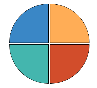
This will delete the duplicate shape leaving all the four pies with their respective outlines.
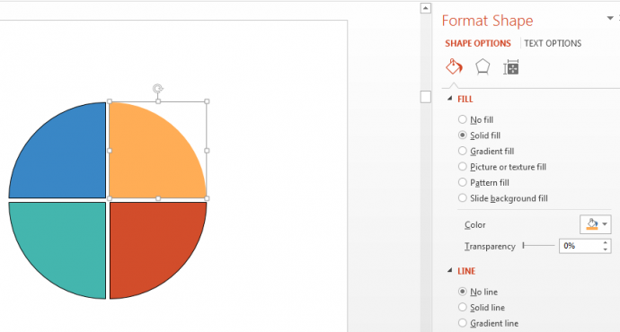
Step 7: Remove the Outlines
To make the shape look more professional and flat, we can delete the outlines. Simply select a pie, right click and click Format Shape. Under the Line menu, select the radio button No line. Do the same for each pie.
Step 8: Insert Icons and Text Boxes
Icons bring a touch of sophistication to presentation slides. Being a visual representation of your content, they enhance its value and say a lot without using up much space. Use editable vector icons so you can alter their color and sizes as per your requirements. Browse our collection of PowerPoint Icons that cover almost all presentation topics under the sun.
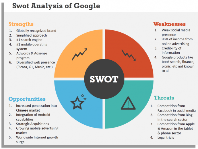
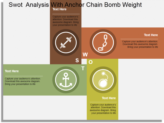
For the S i.e. Strength in SWOT Analysis, you can choose a muscular arm, dumbbell or an ascending bar diagram as an icon. Weakness icon can be a descending bar diagram or a broken link in the chain. An anchor or a star depicts opportunity while a bomb or a warning sign is indicative of threat. Insert the chosen icon in their respective pie.
Last but not the least, place your content adjacent to these four pieces of a pie. Make sure they are properly aligned; you can use the Align command in PowerPoint to do this (Select the text boxes, click the Format tab and locate the Align command). You can choose a light gray background in the slide if white looks boring to you.
You have now designed a dynamic SWOT Analysis slide that grabs the audience's’ attention (here’s the link to make this SWOT template yours if you don’t have the time to create one yourself):
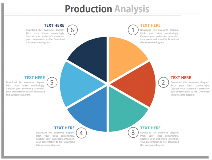
P.S. Using this tutorial, you can split the pie chart into as many areas as you require for your presentation. All you need to do is edit the data (step 2) and add as many fields as you need. For instance, in the slide below we have split the circle into 6 equal parts by following the same steps.
More Awesome SWOT Designs made by our team
There are a hundred ways to show your SWOT Analysis. We won’t show you them all here, just a few to spoil you for choice. Check out these SWOT ppt templates designed by our Presentation Design Services team:
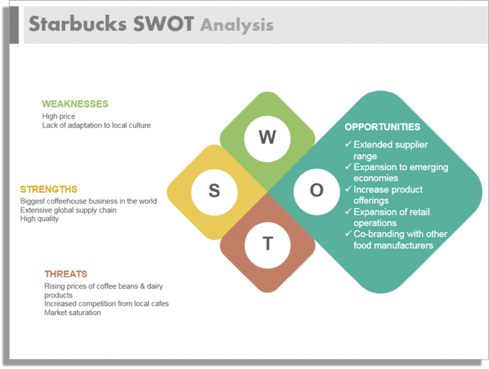
Diamond Shaped SWOT Analysis Template
The template below is another awesome creative design to present your company SWOT. Since it is a fully editable template, you can use your brand colors, add your company logo and alter the sizes of the four diamonds for each slide. For instance, in the Starbucks SWOT Analysis slide below, the Opportunities shape has been highlighted. If you are devoting one slide to each of the four parts of a SWOT, then this ppt template is for you.
Download this SWOT Analysis template and present in style.
Rectangular Shaped SWOT Analysis
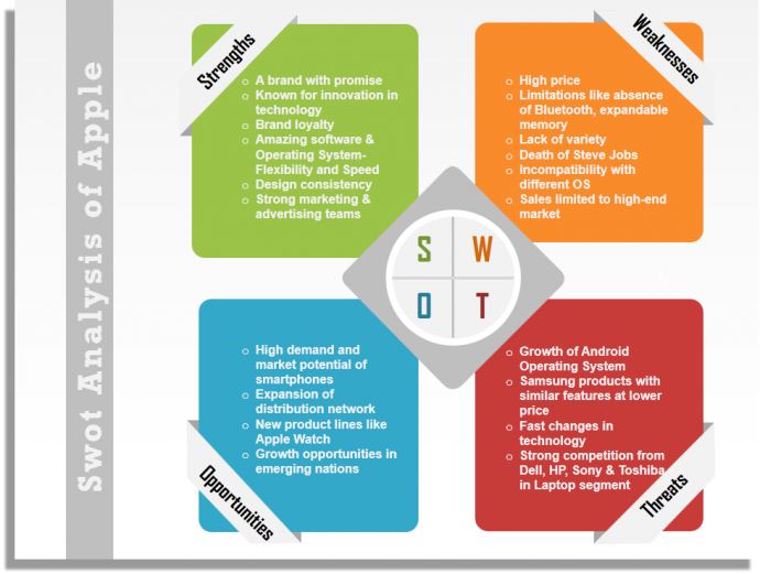
A common SWOT Template is the grid having four rectangular quadrants. To lend this shape a little more color and excitement, we can take the rounded rectangle shapes and a diamond in the centre. The SWOT Analysis of Apple slide below is not just neat and professional, it’s easy to the eye and lends itself for a quick reading.
Grab this SWOT PowerPoint Template to use it for your next presentation.
Circular SWOT Analysis Diagram
This is perhaps the simplest template to make of all- all you need is four equal circles representing each letter of the SWOT. Yet it is also the cleanest and most sophisticated template of all. With plenty of white space at your disposal, you can insert a lot of text without making it look too text-heavy. Check out the SWOT Analysis of McDonalds presented through this template below:
Click here to download this flat SWOT Analysis template.
Hexagon SWOT Analysis Template
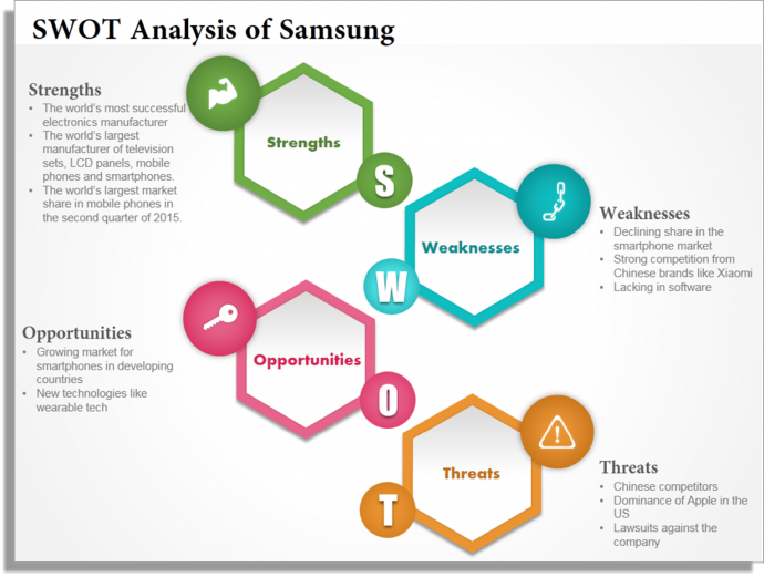
Hexagon is another shape that adds dynamism to a presentation slide. Check out this Samsung SWOT Analysis slide created using such a template:
Get access to this professional SWOT slide from here.
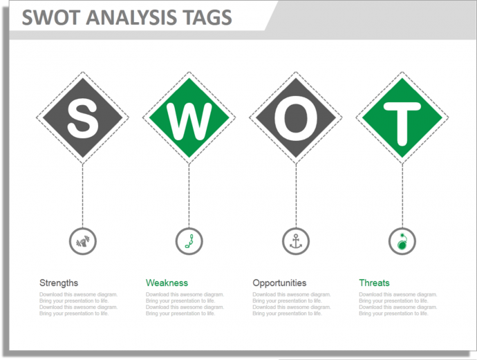
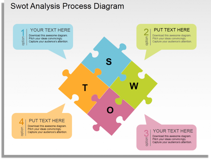
There are many other ways to design an attention-grabbing SWOT slide: boxes, tags, gears, puzzles, etc.
Hope these designs have given you enough inspiration to sizzle up your sales deck or marketing pitch. Let the next presentation be an opportunity to show your strengths, not weaknesses.
Share this knowledge with your friends and colleagues who you’ll think will benefit from this article. P.S. Here's a handy pre-populated tweet to help you share this post with your followers!



 Customer Reviews




![How to Create a Fantastic PowerPoint Agenda Slide Template in 5 Steps [Presentation Hackathon 4]](https://www.slideteam.net/wp/wp-content/uploads/2015/11/How-to-Polish-Your-Agenda-Slide-in-5-Easy-Steps-335x146.png)




Thanks