

 Customer Reviews
“Know your numbers’ is a fundamental concept of business”- Bill Gates
“Numbers are the highest degree of knowledge. It is knowledge itself”- Plato
“There is safety in numbers”- Ancient proverb
Numbers, numbers and more numbers. Why are they so important in business world? One reason- They give us insight. No wise business decision can be taken without taking into account the key profit generating segments, the rise and fall of customers or web traffic, and other KPIs (key performance indicators) and metrics driving their business.
So the next time when your boss (be it the marketing manager, sales manager, or CEO) asks you to make a presentation on key business metrics, keep in mind that the numbers you tell and how you tell them can make or break the business.
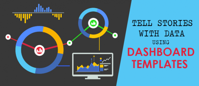
You don’t want to be that presenter who turns up with slides full of botched up, haphazard numbers. ‘Numbers speak for themselves’ does not apply to PowerPoint presentations. Here, numbers speak for themselves when they are accompanied with the right design. We think you got the point- Dashboards is what you need to be using in your presentations in order to tell stories with numbers.
There is a good chance you are already using it. You are on the right track. If not, your reputation as a sales or marketing rep is at stake. You are not helping anybody by dumping numbers on your audience. You need to offer insight and that is only possible with data visualization and metric tools a.k.a. dashboard. What constitutes a good dashboard, nay, a great dashboard? For that, let us be clear what a dashboard is:
What is a Dashboard
One of the most popular definitions of dashboard is that by Stephen Few (Information Dashboard Design, 2006):
“A dashboard is a visual display of the most important information needed to achieve one or more objectives; consolidated and arranged on a single screen so the information can be monitored at a glance.”
In other words, dashboard is a visual representation of your business performance. The most important KPIs (Key Performance Indicators) are measured and visualized to be easily understood by all. Here is a Marketing Dashboard that gives the marketing team an instant overview of the website performance in terms of marketing metrics like website visitors, sessions per browser and so on.

Data visualization tools like maps, charts, bar graphs and pie charts turn numbers into interesting stories that can be understood by all.
Check out more industry-specific dashboards to get inspiration for creating your own perfect dashboard:
11 Business Dashboards That Best Depict Key Metrics
Finance Dashboard
Finance is one field where dashboards are the most needed. How will the CFO or board members know last year’s fiscal performance at-a-glance without a graphic report? As a presenter, you can’t put mind-boggling numbers on the blank slide and expect the decision makers to understand it all. Use a dashboard to visualize key metrics such as net profit, net loss, operating expense, and turn numbers into an engaging story.
Check out the dashboard below- the line graph showing the profitability over last 10 years immediately points out that last performance was good but still not the highest as compared to 2009-2010. Decision makers can then analyse the changes introduced last year and what more can be done to increase profits further.

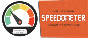
Want the speedometer design for your dashboard? Then download the speedometer template that we have used or browse for more speedometer PPT designs.
Line graphs are an essential element of dashboards to compare performance over years and observe trends. Download these editable, Excel-linked Line Graph templates by clicking the link below:
Browse Ready-to-Use Line Graphs
DevOps Dashboard
Developers are the key men responsible for bringing out an efficient and error-free website or application. A Developer Operations (DevOps) dashboard lets the devops team instantly track key performance metrics such as uptime, downtime, load time, top release errors, etc. Thanks to a neat, professional dashboard, all the members of the team are quickly able to identify the bottlenecks and resolve the bugs before making the app or website live.

The DevOps Dashboard also allows you to visually track the performance of the team, set the targets and work together to meet them.
In the above dashboard template, Pointers with Pie-Chart Template was used to depict Availability & Outages, a Bar Graph diagram for Performance Average Response Time, Financial Graph for Open Number of Issues, and Timers Templates for average release duration and mean time to recovery.
If the above DevOps Dashboard template is not the most suitable design for your data, you can create a customized dashboard from scratch: all the data visualization tools are available for you on SlideTeam- Bar Charts, Tables, Line Graphs, etc. and all editable to meet your needs. Combine these elements to create the perfect dashboard template and motivate the DevOps team.
Healthcare Dashboard
Many healthcare professional would remember early in their careers compiling reports upon reports on patient care and using hunches to analyze those and make future strategies! Now, almost all hospitals and healthcare service providers rely on real-time dashboards to arrive at a conclusion and introduce measures for improved patient satisfaction, increased accountability, quick emergency response time, and so on.
Here is a dashboard from a health app that analyses daily health parameters like average sleep time, daily calories intake and so on. It is so much easier for the health conscious users of this app to regulate their calorie intake and move closer towards realizing their fitness goals:

The above healthcare dashboard design uses a colorful bar graph to depict average sleep hours, Line graph for daily calories intake and nutrition and Percentage circle chart for activity.
Social Media Dashboard
Social media marketing executives need to track the performance of their marketing campaigns across different social media channels like Facebook, Twitter, LinkedIn, and so on. The performance analytics allow them to make quick changes in the campaign and allocate more budget to the channel that is bringing the maximum traffic.
Although social media executives have access to automation tools that have in-built dashboards, they need to often transport the same to PowerPoint presentations using attractive designs like the one below:

Doughnut Chart clearly shows the social media impression by demographic, Doughnut Percentage Chart for Comparison beautifully depicts social media insights and Column Chart Graph shows website visits.
HR Management Dashboard
The manpower is an organization’s most valuable asset. Is the HR department doing a good job in recruiting good talent and retaining it? What are the possible reasons for high attrition rate and what can the HR do to reduce it? HR Management dashboard instantly gives you a complete picture of the organization’s manpower. Executives are able to make quick decisions and introduce new HR policies thanks to the transparent data that lies in front of them. Let the HR Manager and key decision makers know which positions are open, how many and gauge the satisfaction levels of the workforce.
Besides, all the members of the HR department need to be on the same page to work as a team. Let a dashboard help you reach this goal in your next meeting.

Grab the above templates to create your own HR Dashboard:
- Data-driven Line Chart for Total Employees
- Volume Controls for key metrics- Employee Turnover and Speed to Hire
- Excel-linked Doughnut-Chart for Open Positions by Divisions
- Data-driven business chart for Employee Churn
Environment/ Energy Consumption Dashboard
Are you meeting your energy conservation goals? Which are the most polluted zones in the country or state? Has there been any drop in the pollution levels post the new traffic regulations? Climate dashboards are easily the most interesting dashboards to read. Which have been the hottest, coldest, wettest places and how much temperature fluctuations have been recorded over last 5 years or any other metric can be easily deduced via these dashboards.
And what about energy consumption dashboards? It is so easy to monitor the real time consumption of energy across buildings and see the impact of our eco-friendly measures with a colorful, data-driven dashboard.

Supply Chain Dashboard
The production and distribution of your merchandise at the right time, in right quantities and at the right locations is a guarantee to business success. Every business aims for a flexible and quick supply chain. That requires constant analysis of key performance indicators (KPIs) like inventory, delivery time, warehouse operations, shipping carriers, etc. Supply Chain dashboard is the perfect data visualization tool to keep track of your supply chain operations, identify the bottlenecks and smoothen out the process to deliver better services to customers.
The below supply chain dashboard gives warning signals as to late deliveries by countries and low performing carriers. This allows the executives to take quick measures and deliver faster orders. Use maps, graphs, dials, thermometers to visually depict all data, which otherwise would be hard to digest.

Construction Dashboard
Timely completion of construction projects and as per the business goals requires constant, real-time monitoring of the status of such projects. When you are delivering a presentation to industrial bodies, company executives, project managers, government bodies, builders and so on, you need to give them all the information that can be digested at-a-glance. Charts and graphs will instantly show them the rate of labour turnover, rate of injuries, orders received over a period of time, etc. They can assess their productivity and take quick decisions to ensure timely completion of all construction projects.
Check out the construction management dashboard below- the effective use of doughnut charts and speedometer dials will put an end to the idea that dashboard is only about charts and graphs. Yes, charts and graphs play a very important role but in the end, it is your creativity that will make the dashboard as well as your presentation more interesting.

Call Center Dashboard
Call Centers have to offer the highest level of customer satisfaction. This requires managers to be aware about all call center metrics like average time in queue, call abandonment rate, longest waiting time, average handle time and so on. You also need to gauge the volume of calls so that if it is increasing at a high rate, you can allocate more representatives to this task. If the response rate is dropping and calls abandoned are increasing, you need to quickly address this issue before it snowballs into a major problem.
A highly efficient call center requires that managers and agents know all metrics and understand them so they can adapt themselves according to the situation and deliver better results.

Use the following templates to put together an easily understandable call center dashboard:
- Column Line Chart for volume of calls and call answer/20 seconds
- Quad Chart for time spent on dropped calls vs time spent on calls
- Dashboard Meter for average connected call duration, call response rates, and average dropped call rates
- Pie Graph for customer responses
Education Dashboard
Schools, colleges and universities are now becoming more transparent and accountable. The performance of each institution in the district via a vis others is closely scrutinized and efforts are being made to make changes to improve educational outcomes.
School leaders too are changing their leadership style- no more are decisions made hastily and on hunches. With real-time data on the projector screen that shows each performance metric like demographic data, enrollment rate, graduation rate, performance of students with special needs, etc. board members are able to make informed decisions and bring out new education policies. Higher education dashboards have today become a must as each country wishes to have the maximum graduates in the world.
Education dashboard templates help you put the latest performance outcomes and budget and expenditure details across the table. Being editable, you just need to punch in the numbers and get readymade charts and bar graphs for your next presentation:

Sales Dashboard
All eyes are on the sales figures. It is understandable that the sales team is always on its toes to convert leads into customers. They need to stay up-to-date with the latest opportunities in the market, the regions that are bringing in the maximum deals and the nature of the leads generated. A Sales Opportunity Dashboard is therefore keenly followed by the sales managers and reps.
What about the sales performance this quarter? Did the sales reps meet their goals? Who has been the best performer? What more initiatives can be taken to drive more sales? All these questions are covered in your Sales Product Performance dashboard and is a necessary exercise to reward the top performers and train the under performers.
Use a sales dashboard to visually show key sales metrics like the close-won opportunities, this month’s forecast, sales by region, total deals closed, and revenue generated. Use the visual data to drive forward the sales team and grab more deals in the fastest time.

These were just some business dashboard examples from our collection of editable dashboard templates. A good thing is that all industries are now becoming data-driven and using hard-hitting numbers made available by technology to make new strategies. The decisions are therefore not random and a shot in the dark. Outcomes are more predictable and careers are performance-driven.
If you have to present reports in your presentation, it’s high time you start leveraging dashboards to make your numbers jump out. And with our editable, ready-made dashboards templates, you don’t have to do all the hard work in creating charts, graphs and gauges. Just type in your numbers in the editable, data-driven templates, create the perfect business dashboard, report trends, tell story through numbers, and help the company make the best decisions!
Having problem in making your dashboard? Do you need a customized dashboard specific to your needs and in the shortest time? Get in touch with our Design Services Team who will take your data and deliver you a ready-to-present dashboard in no time!