Api integration icon for software development

Rating:
84%
Api integration icon for software development
Slide 1 of 2

or

Favourites Favourites

Try Before you Buy Download Free Sample Product

Audience Impress Your
Audience
Editable 100%
Editable
Time Save Hours
of Time
The Biggest Sale is ending soon in
0
0
:
0
0
:
0
0
Rating:
84%
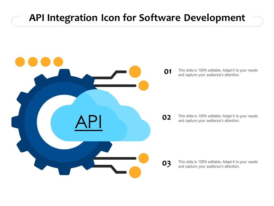
Presenting this set of slides with name API Integration Icon For Software Development. This is a three stage process. The stages in this process are API Integration Icon For Software Development. This is a completely editable PowerPoint presentation and is available for immediate download. Download now and impress your audience.

FAQs for Api integration icon

API integration icons are visual symbols that represent data connections, system workflows, cloud services, database links, and communication protocols between different software applications. These icons enhance presentations by simplifying complex technical concepts, enabling audiences to quickly grasp integration architectures, and streamlining the communication of data flow processes, ultimately delivering clearer stakeholder understanding and more effective technical discussions.

API integration icons streamline technical presentation development by providing standardized visual representations of complex connectivity concepts, reducing design time, and ensuring consistent communication across development teams. These visual elements enable presenters to quickly illustrate data flows, system architectures, and integration processes, while helping audiences understand technical relationships more intuitively, ultimately delivering clearer stakeholder communication.

API integration icon design best practices include using consistent visual metaphors like connecting nodes or data flows, maintaining scalable vector formats, employing intuitive color coding systems, and ensuring readability at multiple sizes. These approaches streamline user comprehension by creating recognizable patterns, reducing cognitive load, and enabling faster workflow navigation, with many development teams finding that standardized iconography across their integration platforms ultimately delivers improved user adoption and reduced support requests.

API integration icons can be customized through color modifications, size adjustments, style variations, font pairings, and background treatments to align with specific brand guidelines. These design elements enable organizations to maintain visual consistency across presentations while clearly communicating technical concepts, with many companies finding that customized iconography enhances brand recognition and professional credibility in client-facing materials.

API integration icons emphasize connectivity and data flow between systems through visual elements like arrows, linking lines, and interconnected shapes, while standard application icons represent individual software tools or functions. These specialized icons help audiences understand complex system relationships, data exchanges, and workflow processes more effectively, ultimately delivering clearer technical presentations and enhanced stakeholder comprehension.

API integration icons simplify complex technical workflows by translating abstract data exchanges, system connections, and integration processes into universally recognizable visual symbols. These icons enable business stakeholders, project managers, and executives to quickly grasp technical architectures, data flows, and system dependencies, ultimately bridging communication gaps between technical teams and decision-makers while accelerating project approvals.

Industries like financial services, healthcare, e-commerce, SaaS companies, and telecommunications benefit significantly from API integration icons in presentations, as these sectors rely heavily on interconnected systems and data flows. These visual elements help stakeholders in banks, hospitals, retail platforms, and tech companies clearly communicate complex integration strategies, streamline technical discussions, and demonstrate competitive advantages through seamless connectivity solutions.

API integration icons can illustrate data flow and system architecture by representing connection points, data pathways, service endpoints, authentication layers, and processing nodes within diagrams. These visual elements streamline complex technical concepts by mapping information exchanges between systems, databases, and applications, with many organizations finding that well-designed API diagrams enhance stakeholder understanding and accelerate development workflows.

**INPUT**: What tools or software are recommended for creating high-quality API integration icons for presentations? **OUTPUT**: Recommended tools include Adobe Illustrator, Sketch, Figma, Canva Pro, and specialized icon libraries like Flaticon or Icons8. These platforms streamline icon creation by offering vector-based editing, API-specific templates, and scalable formats, with many presentation designers finding that combining professional design software with curated icon libraries delivers consistent visual branding and enhanced audience comprehension. **Word count: 56 words**

Effective color and design in API integration icons significantly enhances audience engagement by improving visual clarity, reducing cognitive load, and creating intuitive user experiences. Through strategic color coding and consistent design patterns, organizations streamline complex technical processes, enable faster decision-making, and ultimately deliver more accessible interfaces, with many development teams finding that well-designed icons increase user adoption and reduce training time.

Common mistakes include using overly technical icons that confuse non-technical audiences, inconsistent visual styling across different API representations, overcrowding slides with too many integration points, and failing to clearly label data flow directions. These design pitfalls can undermine presentation clarity and audience comprehension, with many organizations finding that simplified, consistently styled icons with clear directional indicators ultimately deliver better stakeholder understanding and more effective technical communications.

Consistency in API integration icon style and size is crucial for maintaining professional credibility and ensuring clear communication throughout presentations. Uniform visual elements reduce cognitive load, enhance audience comprehension, and create seamless information flow, with many organizations finding that standardized iconography across technical presentations delivers stronger stakeholder engagement and more effective knowledge transfer.

Presenters can explain API integration icons by using simple visual analogies like electrical plugs connecting devices, starting with familiar examples from daily apps, and creating step-by-step flow diagrams that show data movement. These approaches work particularly well in healthcare and retail sectors, where audiences can relate API connections to patient records or inventory systems, ultimately making complex technical concepts accessible and actionable.

**INPUT**: How do trends in graphic design influence the creation of API integration icons in today's presentations? **OUTPUT**: Current graphic design trends significantly influence API integration icons through minimalist aesthetics, flat design principles, consistent color palettes, and intuitive visual metaphors. These design approaches enhance presentation clarity by creating universally recognizable symbols, streamlining complex technical concepts, and ensuring visual consistency across platforms, with many organizations finding that modern iconography ultimately improves audience comprehension and professional credibility.

**INPUT**: What resources are available for finding or purchasing high-quality API integration icons suited for business presentations? **OUTPUT**: Professional icon resources include SlideTeam's curated collections, Flaticon's business libraries, IconFinder's enterprise sets, Noun Project's scalable designs, and custom design platforms like 99designs. These platforms streamline presentation development by offering consistent visual styles, multiple formats, and licensing clarity, with many organizations finding that professional icon sets enhance audience comprehension and deliver more polished, credible business communications. **Word count: 58 words**

Ratings and Reviews

84% of 100
Review Form
Write a review
Most Relevant Reviews
  1. 80%

    by Daron Guzman

    Qualitative and comprehensive slides.
  2. 100%

    by Dave Shaw

    Illustrative design with editable content. Exceptional value for money. Highly pleased with the product.
  3. 80%

    by Michael Allen

    Graphics are very appealing to eyes.
  4. 80%

    by William Martinez

    Very unique, user-friendly presentation interface.
  5. 80%

    by Devon Ferguson

    Wonderful templates design to use in business meetings.

5 Item(s)

per page: