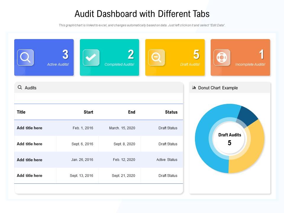
Audit dashboard snapshot with different tabs

Rating:
80%
Audit dashboard snapshot with different tabs
Slide 1 of 2

or

Favourites Favourites

Try Before you Buy Download Free Sample Product

Audience Impress Your
Audience
Editable 100%
Editable
Time Save Hours
of Time
The Biggest Sale is ending soon in
0
0
:
0
0
:
0
0
Rating:
80%
Presenting this set of slides with name Audit Dashboard Snapshot With Different Tabs. The topics discussed in these slide is Audit Dashboard With Different Tabs. This is a completely editable PowerPoint presentation and is available for immediate download. Download now and impress your audience.

FAQs for Audit dashboard snapshot

Real-time status updates are huge - you want instant visibility on where each audit stands. Risk ratings and progress tracking come next. Executive summaries work way better than those massive reports nobody opens anyway. Honestly, I'd go heavy on visual stuff like charts and color coding since execs love dashboards they can scan quickly. Customizable filters let different people see what they care about without the noise. Automated alerts for urgent issues are clutch too. Oh, and include historical trends - spotting patterns over time can save you tons of headaches down the road.

Dude, visuals are a game changer for audit stuff. You'll spot patterns and weird outliers in seconds instead of staring at endless spreadsheets for hours. Heat maps are perfect for showing risk levels, and trend lines make changes over time super obvious. Executives eat this up because they get the whole story without drowning in numbers. Honestly, I've seen people's eyes glaze over during presentations until you throw up a good chart. Dashboards work great for real-time updates too. Just figure out your main points first, then pick whatever visual actually makes sense for each finding.

Track completion rates and how fast recommendations get closed - leadership's obsessed with that second one. Also monitor findings by severity and cycle time from start to final report. Honestly, stakeholder satisfaction scores are clutch if you're collecting them. High-risk area identification is another good one. But here's the thing - executives need to understand it during their 30-second dashboard glance. I'd stick with maybe 5-6 metrics tops. Any more and you'll lose them. Keep it dead simple.

Just ask each group what metrics they actually care about first - saves you tons of headaches later. Executives want the big picture stuff like KPIs and risk overviews. Audit managers need all the nitty-gritty details about findings and where things stand with fixes. Department heads? They only want to see their own mess, not everyone else's. Most platforms have role-based controls so you can set up custom widgets and different access levels. Then play around with date ranges and filters. Honestly, the visualization types matter way less than I thought they would when I started doing this stuff.

So instead of finding out about problems weeks later, real-time data lets you catch stuff as it's actually happening. Your dashboard becomes way more useful - like an active monitoring system vs just looking at old reports. You'll spot compliance issues or control failures right away when you can actually fix them. Honestly, it's a total game changer for staying on top of regulations (which is such a pain otherwise). Your risk assessments stay fresh too since the data keeps flowing. Oh and definitely set up alerts for key indicators - that way it's working even when you're not staring at it.

Don't trust your data automatically - that's like rule number one. Build automated checks that catch weird stuff, missing values, or outliers before they mess up your dashboard. I've literally watched companies make terrible decisions because their dashboards looked great but ran on complete junk data. Pull from verified sources only, and get specific people responsible for data quality (not just "whoever has time"). Document where everything comes from so you can trace problems back. Oh, and set up regular reconciliation - boring but necessary. Map out where your errors usually happen first, then work backwards from there.

Honestly, the worst thing you can do is cram everything onto one screen - total information overload. Users just freeze up when they can't figure out where to look first. Skip the jargony metrics too. Not everyone speaks audit-ese, you know? Also, definitely nail down those user permissions early or people will see stuff they shouldn't. Oh and mobile responsiveness is huge since auditors are basically nomads. My advice? Start with your must-have KPIs only. Label everything super clearly and actually test it with real users before launch. You can always add bells and whistles later based on what they tell you.

Hey! So most dashboards connect through APIs or direct database links to your current audit system. You can export/import data or set up real-time sync if both platforms play nice together. Honestly, the pre-built connectors for tools like ACL or TeamMate are lifesavers - way less painful than custom integrations. Just make sure your data fields map properly so you don't lose audit trail stuff. Oh, and definitely test it on one audit cycle first before going all-in. Trust me on that one.

Bar charts and tables are your best friends for audit dashboards - auditors eat that stuff up. Heat maps are perfect when you need to show risk patterns over time or across departments. Honestly, I'm probably too into waterfall charts, but they're amazing for tracking how findings evolve quarter to quarter. Pie charts? Sure, but only if you've got 4-5 categories max. Any more than that and they look like a hot mess. The key is making sure anyone can look at your dashboard and instantly get what's happening without squinting at tiny labels or playing guessing games.

Honestly, audit dashboards are game-changers for compliance stuff. Real-time visibility means you can see everything in one spot instead of digging through endless spreadsheets - which is honestly the worst part of compliance work. Set up alerts for deadlines so nothing sneaks up on you. Patterns start jumping out when all your data's in one place, plus you can generate reports without wanting to pull your hair out. Control effectiveness becomes way easier to track too. I'd start with your biggest compliance headaches first and build from there. Much better than the old way of doing things.

Start with the basics - status tracking so you know what's open, in progress, or done. Assignment features are key too, plus due dates with alerts because people forget everything. Priority levels matter since some audit findings are way more critical than others (learned that one the hard way). You'll need good filtering by department, auditor, risk level - whatever makes sense for your team. Comments help track what's actually happening with each item. Automated reminders are a lifesaver for deadline management. Don't overthink the reporting stuff initially - get people using it first, then add fancy dashboards later.

So permissions are basically about controlling who sees what on your dashboard. Map out the access levels first - execs want the big picture stuff, auditors need all the nitty-gritty details they can drill into. Regular employees? Just their department's data, because nobody wants Bob from accounting stumbling across audit findings from HR. The real pain comes when you're trying to build all these permission layers without creating a maintenance headache later. Trust me, spending time upfront figuring out who needs what will save you so much trouble down the road.

So there's some cool stuff happening with audit dashboards right now. AI and machine learning are handling anomaly detection automatically - no more digging through spreadsheets for hours. Real-time data integration is everywhere now, which honestly makes those old monthly reports seem kind of ridiculous. Cloud platforms let teams actually collaborate instead of emailing files back and forth (thank god). The visualization tools have gotten way better too. You can spot issues instantly instead of squinting at endless charts. Worth checking out how this could speed up your processes - some of it's pretty game-changing.

Honestly, just talk to the people actually using your dashboard every day - auditors, managers, whoever. Coffee chats work better than formal surveys sometimes. After big updates, shoot them a quick message asking what's broken or annoying. Most users are pretty upfront about what they need if you actually listen. I usually track the complaints that keep coming up, then fix whatever saves people the most time first. Oh, and test changes with like 2-3 people before you roll it out to everyone. Saves you from those "why did you break everything" emails later.

Set up monthly reviews minimum - weekly if you're dealing with tons of audits. Automate your data feeds because updating stuff manually gets annoying real quick. Track what actually matters to people, not just whatever's easiest to pull. Clean out old widgets nobody checks anymore (dashboard clutter is surprisingly frustrating). Critical alerts are clutch so nothing falls through the cracks. Oh, and definitely ask users what they think - they'll straight up tell you what sucks and needs tweaking.

Ratings and Reviews

80% of 100
Review Form
Write a review
Most Relevant Reviews
  1. 80%

    by Duncan Berry

    Out of the box and creative design.
  2. 80%

    by Devin Daniels

    Best way of representation of the topic.

2 Item(s)

per page: