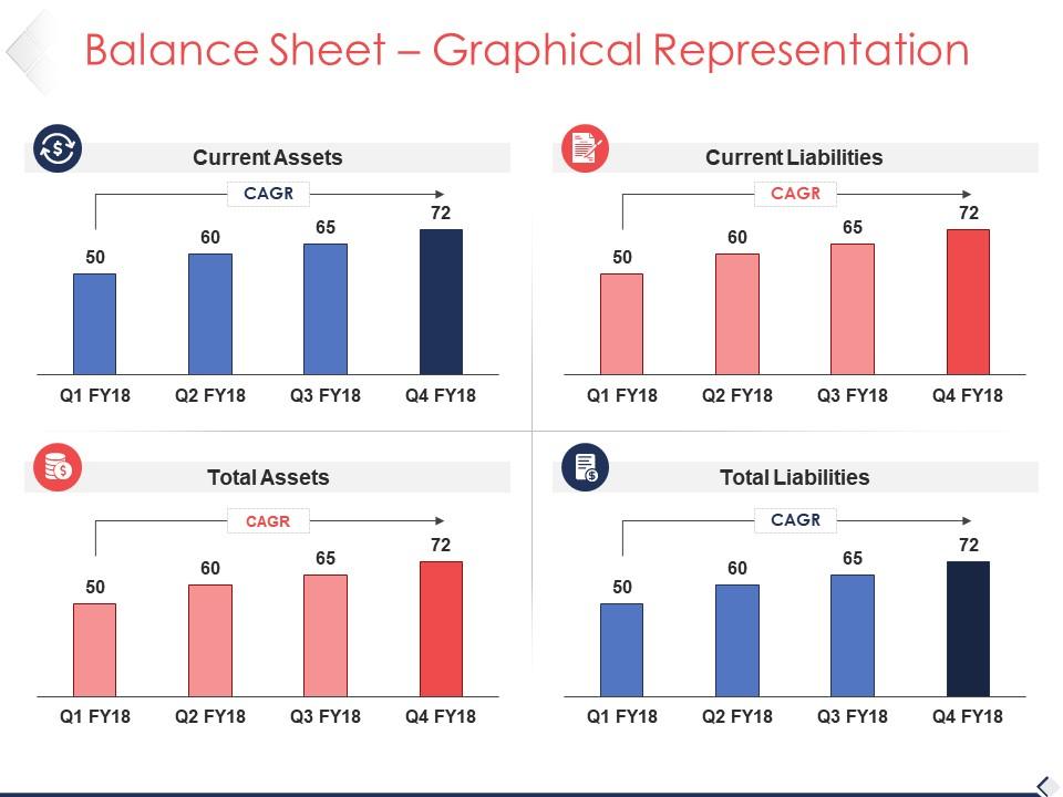
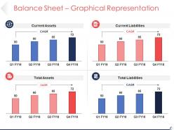
Balance sheet graphical representation sample of ppt
Try Before you Buy Download Free Sample Product
Audience
Editable
of Time
Identify acts of injustice with our Balance Sheet Graphical Representation Sample Of Ppt. Initiate action to correct for errors.
People who downloaded this PowerPoint presentation also viewed the following :
Balance sheet graphical representation sample of ppt with all 5 slides:
Our Balance Sheet Graphical Representation Sample Of Ppt will brook no nonsense. Like you they are straight and direct.
FAQs for Balance sheet graphical representation
Honestly, just focus on the big three: assets, liabilities, and equity. Break down your assets into current stuff (cash, inventory) versus long-term things like equipment. Same deal with liabilities - separate what you owe now from long-term debt. Make sure your equity section clearly shows retained earnings and what shareholders put in. Oh, and definitely use colors or something to make each section pop visually. People need to see that assets = liabilities + equity at a glance - otherwise what's the point? I'd probably make the layout super clean so anyone can spot issues quickly.
Honestly, turning those balance sheet numbers into charts is a game changer. You'll spot stuff like declining cash or growing debt way faster than staring at spreadsheet rows forever. Bar charts work great for key ratios - start there. I love creating dashboards that show liquidity trends and asset breakdowns over time. Comparing quarters side-by-side makes your strengths and weak spots obvious immediately. Industry benchmarks are clutch too for context. It's wild how patterns just jump out visually that you'd totally miss otherwise.
Waterfall charts are your best bet for balance sheets - they actually show how assets flow into liabilities and equity, which makes the whole accounting equation click visually. Horizontal bar charts work well too, especially if you're comparing different periods. Whatever you do, avoid pie charts. I know they look nice but they're awful for this since you're not really showing parts of a whole. Oh, and if you're trying to highlight specific line items, horizontal bars might actually be better than waterfalls. Start simple though - a basic waterfall chart and most people will get the balance relationship right away.
Honestly, color coding makes balance sheets way easier to read. Green for positive, red for negative - pretty standard stuff. I'm obsessed with blue-to-orange combos lately since they're opposite on the color wheel and look sick together. Dark shades work best for your main line items, then go lighter for the sub-accounts underneath. People can spot weird trends super fast this way instead of staring at endless rows of numbers. Oh, and don't go crazy with colors - maybe 3 or 4 max? I made that rainbow mistake once and it looked like a kid's coloring book exploded.
Dude, interactive balance sheets are a total game changer. Your audience can actually dig into the numbers they care about instead of sitting there glazed over while you flip through slides. Let them toggle between quarters, drill down into specific items, whatever. Honestly, executives love being able to poke around the data themselves rather than just watching you present. Oh and definitely add hover details and clickable stuff - keeps people way more engaged. It's like the difference between watching TV and playing a video game, you know?
Line charts work great for this stuff - just plot your main balance sheet items over like 3-5 years. I'd do assets, liabilities, and equity as separate lines so you can actually see what's happening. Cash, debt, and retained earnings are usually where the action is, honestly. Those tell you way more than getting lost in the weeds with every single line item. You can throw in some ratios too - debt-to-equity over time is pretty revealing. Keep it clean though. If you're squinting to figure out the trends, you've probably overcomplicated it. Start with what matters most to your situation.
Honestly, the biggest mistake is shoving every tiny detail into one chart - it turns into a hot mess nobody can read. Group your smaller stuff together and focus on what actually matters. Oh, and never use pie charts for assets vs liabilities because they don't have to match (hello, that's literally what equity is for). Make sure your time periods line up consistently. I'd also double-check that your scaling works across different chart types. Test it on someone fresh though - like seriously, get someone who wasn't knee-deep in the data to look at it and see if they get the point.
Oh nice question! So I'd start with color coding - like making accounts with bad liquidity ratios show up in red. Super visual that way. Then add your debt-to-equity calculations right next to the relevant sections instead of calculating separately. Dashboard layouts are honestly a game changer because the ratios update automatically when you tweak numbers. No more doing math by hand every time (thank god). Trend lines work great too - just put them alongside your balance sheet stuff to catch patterns. I'd probably start with like 3-4 basic ones - current ratio, ROE, maybe one more. You can always get fancy later once you've got the basics down.
Honestly, just start with Excel or Google Sheets - they're way more powerful than people give them credit for. Most accounting teams can get by fine with basic charts and tables there. Tableau and Power BI are where it's at if you want those fancy interactive dashboards that actually look impressive. I've even seen people make decent stuff in Canva, though that's more for when you're presenting to clients or whatever. Oh, and check if QuickBooks (or whatever accounting software you're using) has built-in charts first - might save you some time. Start simple, then upgrade if you need bells and whistles.
Investors want the big picture stuff - clean dashboards with debt-to-equity ratios, ROA, maybe some trend lines. Pretty straightforward. Your internal team though? They need way more granular data. Drill-downs, department breakdowns, all that operational stuff that helps them actually do their jobs. I've seen this mess up so many times - you show investors a data dump and they zone out, or you give your team surface-level metrics and they can't make real decisions. Honestly just ask each group what questions they're trying to answer first. Saves everyone a headache.
Honestly, just use the exact account names from your books - no weird abbreviations that'll make zero sense in six months. Put labels right on the chart elements so people aren't squinting at some tiny legend across the page (seriously, why do people do that?). Make sure the time period and currency are obvious at the top. For anything complex, throw in quick explanations like "Current Assets = cash, inventory, receivables." I usually go with blues for assets, reds for liabilities - keeps things intuitive. Oh, and definitely have someone else look at it first. You know the data too well to spot what's confusing.
Okay so here's the thing - most balance sheets are boring AF, but you can totally fix that. Show the story behind your numbers! Like, "this is where we bought all that new equipment" or "here's when we finally paid off that massive loan." Waterfall charts work great for showing how things changed between periods. Color coding helps too - makes your wins pop out visually. Think of it like before/after photos but for your finances. People actually care when you frame it as milestones instead of just random data points sitting there.
Honestly, adding icons to your balance sheet is a game changer - especially for people who aren't finance nerds. Think building icons for real estate, little gear symbols for equipment, dollar signs for cash. Way less scary than just endless rows of numbers, you know? People actually retain the info better when there's something visual to grab onto. Color coding works great too - like red for problem areas or green for strong performance. I'd start simple though. Maybe just 3 or 4 icons for your biggest categories and see how it goes.
Oh totally! Colors are huge - red screams "bad news" here but means good luck in China. Layout matters too since some cultures read right-to-left, so they'll scan your charts differently. I bombed a Tokyo presentation once because of this stuff, honestly. Different regions are used to different chart styles too. You'll want to check with local people first if possible. When you're unsure though? Just go boring - neutral colors and basic formats everyone gets. Sounds obvious but it's easy to mess up.
Honestly, start with the big three - current ratio, debt-to-equity, and return on equity. Those give you the health check that actually matters to people. Working capital and cash position should be front and center too because that's what makes everyone panic at 2am lol. Keep it to maybe 5-7 metrics max though, otherwise people's eyes just glaze over. Show trends instead of just static numbers - month-over-month or year-over-year changes tell the real story. You can always add more specialized stuff later if people keep bugging you about specific things.
-
Great product with effective design. Helped a lot in our corporate presentations. Easy to edit and stunning visuals.
-
Nice and innovative design.