


 Customer Reviews
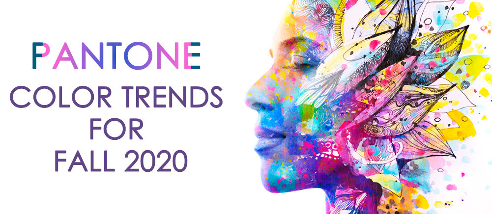
"When 80% of human experience is filtered through the eyes, we understand that the choice of color is critical” Pantone Institute Of Color
Most of the design trends are inspired by the Pantone Color of the Year, and its selection provides a springboard of new ideas, elements, themes, brands, and projects.
Have you ever heard of Minion Yellow or Tiffany Blue? These colors are customized and standardized by the Pantone Color Institute after working in close proximity with the associated brands. This ensured no matter which part of the world you wander off to, the emotions associated with these brands remain true and the ties strengthen with every encounter.
From Living Coral to Mimosa to Marsala (yes, these are legit color names), the Pantone Color Institute decides which color will dominate our lives every year, popularly known as Pantone Colour of the Year. These colors aren’t just trendsetters, but also tone-setters, mood setters, and creativity boosters selected every year, let alone every season. Whether it is summer, winter, fall, or any other season, Pantone springs an entire list of colors right up a designer’s alley with unique numeric codes and effervescent names.
But who are these Pantone guys anyway, and why do they have the authority to bring ‘color’ into our lives and design?
If you are a seasoned designer, then you must have heard of Pantone. If not, just trust us, they are pretty big, somewhat pioneers of the fashion and design industry.
Think of them as Color-Linguists, people that speak the language of color, study them, communicate with colors, translate codes, and bring about the hidden messages inside colors. Isn't it fascinating? The LANGUAGE Of COLORS!
So, yes, frankly speaking, they have the authority and are generously qualified to predict the next color trends.
Last season we went gaga over pretty pastel hues and shades. But this time, we have switched gears to more intense, daring, and whimsical colors to brighten up your fall 2020.
“The color palette for fall 2020 highlights our desire for versatile, timeless color—reflecting a less-is-more mindset,” explains Leatrice Eiseman, executive director of the Pantone Color Institute, “colors whose timelessness and versatility convey a level of functionality and at the same time lend themselves to unique color statements that stand out.”
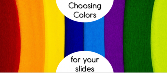
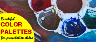
From deep rich burgundy shades to asphalt gray hues and brighter than the day yellows, we share some of the best fall color trends to spice up your presentation designs. Afterall for a presentation design expert, his presentation is his runaway fashion and canvas to add colors and aesthetics in!
P.S Keep your designs in Vogue, with these stunning color trends all Pantone approved and predicted to pop this Fall season!
#1.Pantone 19-4052 Classic Blue (Pantone Color of the Year 2020)
")
2020 is blue!
As we head towards a new era of intense challenges and adversities, especially due to pandemic hitting our livelihoods, Pantone Color Institute announced Classic Blue as its musketeer; an old boy classic that is both comforting and relatable.
The indigo blue hues remind us of the vintage and the constants, the falling night sky at dusk, impeccably tailored and well-fitted suit to honor the deserving, serene ocean waters and a ripe bowl of blueberries, the perfect breakfast to begin your day with.
Pantone’s selection of this old boy classic is more decadent when you dive deep into the history of the Color of the Year franchise, which started in 1999 with ‘Cerulean’ as its pioneer. Cerulean, a serene shade that expressed our excitement towards the beginning of a new millennium and calming enough to spare the horrors and anxieties of Y2K. Its impact permeated the cultural zeitgeist, just as Miranda Priestly’s monologue (a character played by Meryl Streep) did in “The Devil Wears Prada”, where she explains how ‘Cerulean’ the fashion world is!
Seeing this, it is of no surprise that as our lives have turned a full circle in 2020, Pantone revisits the classic blue color family ahead of a year that will bring about many fears, changes, and hopes as we usher into a newer phase of life!
The classic blue color mirrors intelligence, maturity, and trustworthiness, which explains why this blue color is a cult favorite of presentation design experts. It is tranquilizing and relaxing- things that we all crave heading into a new decade!
Let us explore how this old boy classic can be incorporated into your design to remove the “feeling blue” expression from your presentations:
As a Background
Design 1

Design 2

As a Color Outlay

Bonus “Blue” Presentation to download

Download Core Values PowerPoint Presentation
#2. Pantone 16-1328 Sandstone

While Fall is the air and the days are getting shorter and cooler, Pantone has chosen Earthy Sandstone as its second color. Tied to the warmth of nature with rustic outdoors as its inspiration, Sandstone is a perfect touch of Pantone’s “less is more” approach. The color evokes the true feeling of the fall season which is not quite neutral but has a timeless and earthy tone imbued with a feeling of warmth and comfort just like the sands of Wadi Rum. Despite being overly subdued in color outlay, it is very uplifting and comforting. Its softness is very soothing to the eyes, thus making it a perfect color for a statement-making presentation design!
Most of the designers refrain from using such dull colors, but they are some timeless pieces that can add a rustic feel to your presentations. When used in the right combinations, this color can add a dash of authenticity and a spark of creativity to your presentation design.
Let us show you how you can imbibe this color in your presentation design.
Design 1

Design 2-

Design 3

Design 4

#3. Pantone 19-1337 Fired Brick

Red, a Satan personified evil color, known for its fiery and untamed nature!
Shades like red never fail to add opulent drama to any element- a trend that Pantone has set its eye on from times immemorial and doesn't believe to dissipate any time sooner. Belonging to the same gamut of shades, from sultry to cherry reds, is Fired Brick shade with deep undertones of red and a hint of neutral to create a balance. It is strong, sturdy and an epitome of sophistication, that adds gravitas to any design. It also conjures a luxurious aesthetic, rooted in a decadent indulgence, something that Pantone takes pride in. Although this color is not for the faint-hearted, true statement is something that this shade has written all over it!
Brands that wish to showcase their bold and fierce attitude can adopt this shade, to imprint their message on the audience’s minds. Its boldness lays the ground for a solid foundation, that exudes confidence and fearlessness, a deadly combination to make a mark!
Design 1

Design 2

Design 3

#4. Pantone 16-1350 Amberglow

Orange is the new black!
Orange is the least understood and most maligned of all the colors in the color spectrum. Long-standing attitudes are the least responsive to change, that is why people perceive this flamboyant and vivacious sibling of red too over-the-top, offensive, and blatant. For a more subdued soul, orange is definitely a vibrant and overwhelming color to use. However, Pantone graciously accepts Amberglow, tangerine tinted orange shade, the trend of the season. Bright upbeat orange shade is predicted to pop this fall season, heartily embraced by young-at-heart, our youth, and trendies. This color reminds us of musky scents, pungent spices of the East, deserts, and Arabian nights linked to warmth and an element of earth. The falling autumn leaves, mouth-watering pumpkin lattes, and Halloween trick or treat are something this color instantly reminds us of, the memories engraved on our souls from childhood.
Pantone describes this color as “ A radiant autumnal orange, Amberglow promotes self-confidence and creative self-expression”
When it comes to using Amberglow in our designs, it is a color for the maximalists, who like experimenting and playing with bolder brighter colors, definitely not something that a faint-hearted could pull-off. Here is an inspiring example, to help you use this color graciously without overwhelming your audience:
Design 1

Design 2

#5. Pantone 13-0648 Green Sheen

There is nothing mellow about this Yellow!
As Pantone describes, “the color Green Sheen is optimistically rebellious with its bold acidic yellow-green shade that will always stand out”. Is it definitely one of the brightest colors in the Pantone Fall Color palette of 2020. This tarty lemony color with a greenish subtone will delight you with its ray of sunshine and juiciness in these cold autumn days when everything is turning orangish and pale. As yellow sunshine permeates our atmosphere’s layer, this color will add cheerfulness and vivaciousness to your design.
Again a bold and out-there-color that is something a maximalist would love. Wondering how yellow will suit your design style? To be frank, yellow is a widely used presentation color as it stimulates mental activity, especially due to its contrasting hues with bolder colors like blacks and blues. So, yellow is a color cherished by seasoned designers, examples of which are shown below:

Download Food Restaraunt Brochure
#6. Pantone 16-3916 Sleet

“Highlighting our desire for longevity, Sleet is a timeless gray that is dependable, solid, and everlasting.” - Pantone Color Institute
Sleet being a perfect neutral shade is easily adaptable and is coherent with almost all of the colors of the spectrum. This Fall color is an exceptionally versatile and flattering shade that screams sophistication. Traditionally this color was reprimanded for being flat and dreary ( nimbostratus clouds, I’m looking at you), But, off lately its status has been elevated to being a more sophisticated color when paired with the right combination to create a contrast. Hence securing a position in Pantone Fall Colors 2020 List!
This timeless gray color can be used to add a bit of personality and confidence to a presentation rather than using traditional blues, greens, and whatnot. Because of its neutral undertone, it can fit any presentation, especially a corporate one that needs to be refined to wow your audience.

#7. Pantone 14-1220 Peach Nougat

With Living Coral being a rage in 2019 and Millennial Pink still going strong, pinky nudey shades continue to be the trend of the season and are becoming insanely popular due to the famous # Instafeed. This color palette will surely suit our palate due to its warm and feminine traits that evoke the feeling of sensitivity, benevolence, and tenderness. Also, apart from being feminine, this color is very reserved in a way that it appears to be mature rather than childish. In fact, it is very nurturing and inviting, making it a chic choice rather than a dowdy one! That color adds a dash of warmth of summer months to care for you during the harsh winter season that is fast approaching!
Here is our recommendation to keep your designs pretty in peach…….

Download Customer Persona Template
#8. Pantone 16-1511 Rose Tan

Much like Peach Nougat, Rose Tan is a sophisticated take on “Millennial pink”. Retaining its youthful glow and aesthetics, the blush tinted dusty color is more ‘elegance’ than ‘Instagram’, lending itself to cool-toned designs. Like its warm counterpart (Peach Nougat), this is a mature shade that imparts a sense of composure with its neutral undertones, reinterpreting the season’s trendiest color.
When it comes to presentation designs this color is playful and leisurely, making the design instantly approachable and enjoyable. When accompanied by the right color options this color Rose Tan makes your presentation grow in stature.

#9. Pantone 19-2428 Magenta Purple

“ A hypnotic purple shade, Magenta Purple intrigues and mesmerizes” Pantone
Magenta purple, a warm deep purple shade that exudes royalty, and glamour along with holding its intrigue with a dash of danger. This hypnotic jewel color is definitely a style statement of all the Pantone colors for this fall 2020. It is indeed an intriguing and mesmerizing shade that symbolizes magnificence. It could be seen as one of the bold colors trending this season that signifies creativity and wisdom.
Although It is a very alluring shade, don’t go overboard with it. Using it sparingly, in the places that need to be focused upon, will do the trick.

#10. Pantone 18-5338 Ultramarine Green

Nature at its finest!
Like every other season and year, this fall season has a greenery touch to it, linked with nature and its colors. Ultramarine is a gorgeous blue-leaning green shade that exudes poise and self-assurance- two much-needed traits during this pandemic. Because of its richness, this color reminds us of the calmness of ocean depths, imbued with hues of blues and greens. This color feels almost regal perfectly suiting our ‘fall’ palate.
As far as presentation design is concerned, it is a symbol of health, vitality, and serenity, making it a cult-favorite color of presentation designers. Reaffirming to the environment and its valuable assets is something that the green color truly depicts. Therefore, when in doubt pick green!

Download America Map Showing Coronavirus Disease 2019
#11. Pantone 19-0622 Military Olive

Semi neutral shade, that doesn’t cease to disappoint. This is a strong mossy green color as its core, which takes no prisoners to flaunt and add a bit of weight to the design. Pantone describes this warm green-hued color as “strong and stalwart,” a shade that implies fearlessness and discipline. It adds an edgy feel to the design with its elevated approach to seaweed-eques tones and hues, making it a very confident shade.
Though it may appear a very striking color at first, it can surely be utilized to add a bit of edgy feel to your presentation designs. We believe most of the designers will hesitate to use such bold and refreshing color, but when we have experimented with other bolder colors, why should Military Olive be left out sad and weeping... Right?
Here is a good example, take a look at:

Permission Granted!
That is pretty much the message Pantone wants to convey through its list of colors for Fall 2020. Experiment with bolder, brighter, mystical hues to accord different feelings to your presentation design. The idea of trying different colors and blending them with traditionally recognized tones is perfect in the time of seasonless that is all-inclusive.


![19 Colors from Pantone 2000-2018 Color of the Year [Design Inspiration]](https://www.slideteam.net/wp/wp-content/uploads/2018/06/Color-of-the-Year-by-Pantone-from-2000-to-2018-335x146.png)


