Every year, the Pantone Color Institute, a global authority on colors, chooses “Color of the Year” to celebrate the power of colors and mark a new beginning for the world of design. To do this, its professionals comb the world for the latest trends, cultural breakthroughs, technological innovations, and understand the socio-economic climate. Started in 2000, we now have 19 colors of the year from 2000-2018 (2019 updated) giving us rich, new color combinations that we probably never used in our designs.
PowerPoint Presentations are mostly, sorry to say, bleak and stripped of color’s life-infusing force. Presenters are wary of trying something new for fear of being labelled “unprofessional.” It’s approaching 2020 but presenters are still damn conservative!
Are you ready to break out of your mould and give your presentations, like yourself, a new lease of life? Pantone’s Color of the Year, is a great starting point.
We have compiled all the 19 Colors of the Year, along with their RGB color combination, to give you a ready list for reference. Also shared are slide examples showing the use of each color. Let’s color our PowerPoint canvas right away:
UPDATE:
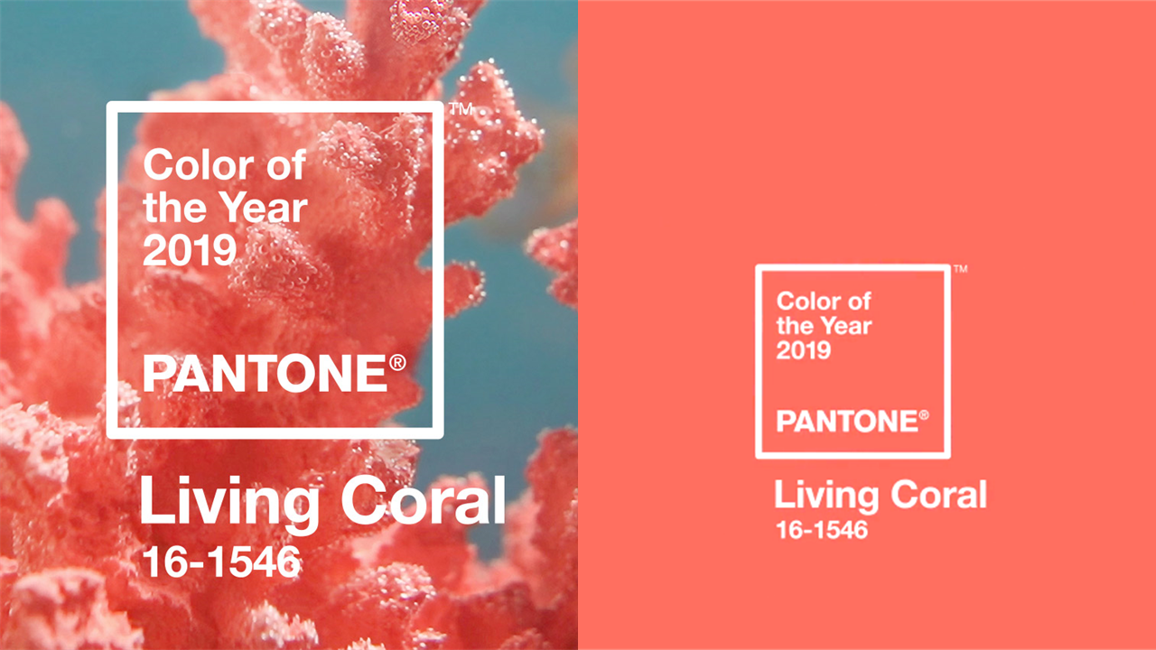
Pantone Color of the Year 2019- Living Coral
To infuse liveliness into the world of design, Pantone has chosen Living Coral, a warm and vibrant color that instantly evokes warmth and togetherness. Reminding us of the ocean's coral reefs and the marine life inhabiting it, Pantone sends out a message to preserve nature and its invaluable gifts. From the point of design, coral is a mesmerizing color made by the combination of pink and orange. This feminine color, as Pantone puts it, “embraces us with warmth and nourishment to provide comfort and buoyancy in our continually shifting environment.”
Color values:
RGB- Red- 255, 111, 96
Presenters, we believe, will be hesitant to try out this color fearing it might be too bright and non-serious for their presentations. However, as more and more presenters seem to target millenials and seek to establish a rapport with them through their talks, this color will help them establish that connection and win their trust. As Pantone also rightly puts, with the explosion of digital technology and social media, users seek enriching experiences and colors are the easiest way to offer that. Presentations on branding and social media seeking to target Generation Y (born between the early 1980s to 1994) and Generation Z (born between 1995 to 2012) should definitely apply this color.

Pantone Color of the Year 2018- Ultra- Violet
This year belongs to the intriguing and enigmatic Ultra Violet. Pantone chose this color to inspire visionary thinking and motivate individuals to pursue goals beyond their reach. The violet shade of night sky is symbolic of limitless reach, undiscovered mysteries and ambitious efforts. It is also a highly individualistic color as Ultra Violet symbolizes non-conformity to traditional rules.
Color values:
RGB - 95 75 139
For organizations, Ultra Violet is a great color choice to make their mark in the world of design. Bold, courageous and impossible to ignore, this color will infuse your design and presentations with a distinctive look and appeal. Startups this year can stop thinking about which color to choose for their brand and pick ultra violet for making a bold start and to reaffirm they are new wine in a new bottle.
Pantone Color of the Year 2017- Greenery
Pantone awarded nature’s invigorating and omnipresent green color as 2017 color of the year. The institute picked the yellow-green shade to invoke the freshness and new beginning of the spring season. The color green is the symbol of hope, balance, growth, and renewal. Its healing touch relaxes the human eye and alleviates anxiety. It is also associated with money and finances making it the right choice for presentations to do with banking and finances.
Color values:
RGB - 136 176 75
Despite such empowering qualities, green is quite often given the go-by in presentation business. It’s fresh appeal at the same time invokes a lack of experience which makes it less appealing in the eyes of professionals. If green becomes too light, it invokes sickness. So the tint and shade of green has to be chosen carefully. Pantone has shown a nice shade that can definitely be employed in Corporate Social Responsibility reports and presentations. Organizations often commit to environment conservation. Picking this color can reaffirm their commitment to environmental causes.
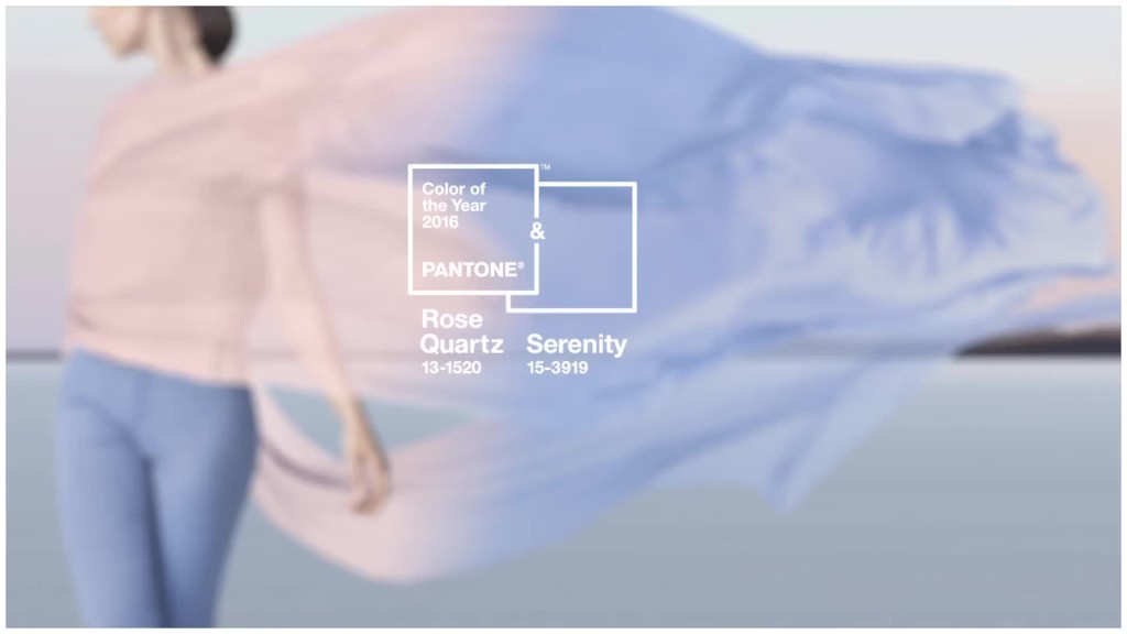
Pantone Color of the Year 2016- Rose Quartz & Serenity
Departing from its tradition, Pantone chose blending of two shades - Rose Quartz and Serenity - as Color of the Year 2016. Traditionally, the shade of Rose Quartz is associated with femininity and the blue shade of Serenity associated with men. But as Pantone quoted, the blend of the two shades was taken to reinforce gender equality and give further expression to the gender blur experienced across all fields.
Since the two shades are on the opposite ends of spectrum with red tone being a warm color and blue a cool color, the harmonious blend of the two creates a balance and sense of order.
Color values (Rose Quartz):
RGB - 247 202 201
Color values (Serenity):
RGB - 145 168 208
The color of 2016 is a bit difficult to apply in corporate presentations since the goal is to push audiences to action while the above shade achieves the opposite effect. The color combination calms the senses and reassures the modern day consumers. Despite this drawback, the color can be used in HR presentations and workforce related slides that touch upon gender equality. Architecture presentations can also leverage this peaceful color palette to provide a sense of well being to viewers.
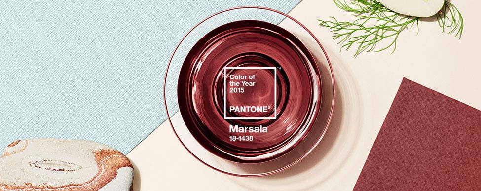
Pantone Color of the Year 2015- Marsala
Sophisticated and seductive, tasteful and earthy, flattering and grounded, Pantone chose the robust wine red Marsala as the 2015 color of the year. Used on its own or as an accent to other colors, Marsala makes a strong statement.
Red, being a rich warm color, instantly adds energy to the design, attracts audience attention and stimulates them to act upon the message. The shade of wine red is popularly called the color of love. Blood red symbolises life and power. Pantone gives people the option to choose the matte finish giving an earthy, textured look or add sheen to it for a glamorous look.
Color values:
RGB - 150 79 76
Leatrice Eiseman, Executive Director of Pantone Color Institute rightly points out that the color "is universally appealing and translates easily to fashion, beauty, industrial design, home furnishings and interiors." Add to this list presentations too. Brands wishing to look youthful, energetic, confident, polished and yet grounded can use Marsala as an accent color to breathe life into their presentations. It is a color difficult to forget and slides that use this will imprint themselves on audience’s mind.
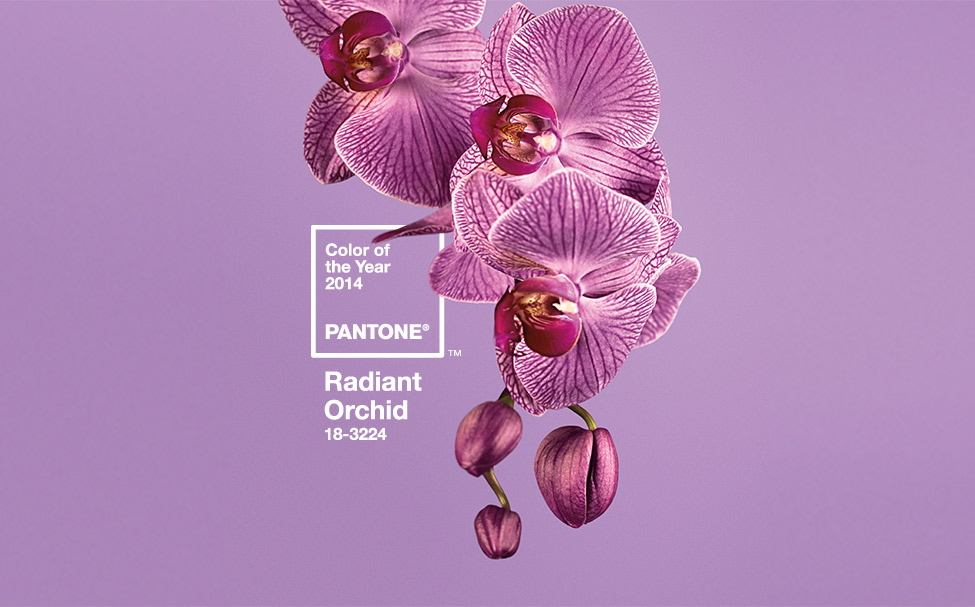
Pantone Color of the Year 2014- Radiant Orchid
Charming and dazzling, Radiant Orchid was the proud Color of the Year 2014. A harmonious blend of fuschia, purple and pink, Radiant Orchid beautifully captures the drawing power of warm colors and the tranquility of cool colors.
Radiant Orchid is attention-grabbing to say the least. It is the color of creativity and thus encourages innovation and originality.
The way it is combined with other colors will determine the mood and impression it sets on the viewer. Combined with neutral gray and beige, Radiant Orchid will throw spotlight on the object it graces.
Color values:
RGB - 173 94 153
If you wish to use a color that other presenters have not used before but still look awesome, this is the color to go for! The invigorating orchid will freshen up your slide like nothing else.
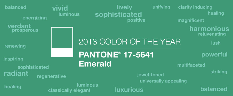
Pantone Color of the Year 2013- Emerald
Green makes it twice in the list. This time it is Emerald that gets picked as the Color of the Year for 2013. You already know green is the color of renewal and growth and Emerald invokes that abundantly with its lush greenery. Associated with precious gemstones, Emerald also invokes sophistication and luxury.
Color values:
RGB - 0 148 115
Emerald can be used as a dominating color in PowerPoint presentations and other designs without any second thought.
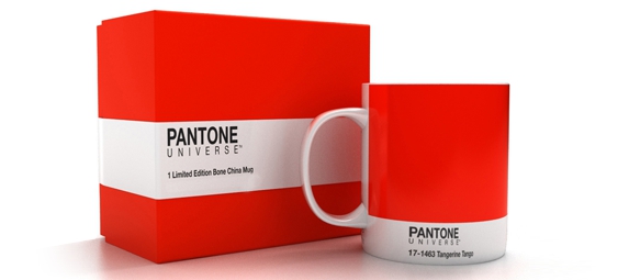
Pantone Color of the Year 2012- Tangerine Tango
Another warm energetic color takes the spot as Color of the Year. This time it is Tangerine Tango, a dazzling reddish orange, that captures the eye instantly. The red tone lends energy while the warm yellow infuses freshness and joy. The color is overpowering and therefore great for designs that aim to target the youth.
Color values:
RGB - 221 65 36
Use of orange in presentations? Nah. Well, that's the first thought that comes to mind. Unless you are creating a deck on apparel. But on second thoughts and experimentation, it can work wonders for your slides, without making you or your presentation look amateurish. Use the color sparingly on your slides for emphasis and your slides will look as great as the one below:
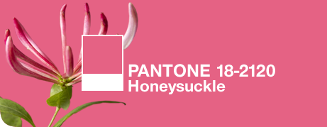
Pantone Color of the Year 2011- Honeysuckle
Red, probably the most powerful color in the color spectrum, is bound to dominate over other colors. Marsala, Chilli Pepper, Tangerine Tango and now Pantone Color of the Year 2011 Honeysuckle - all borrow its dominant hue from mother color red. This time it is reddish pink that takes the spotlight.
Based on flower of the same name which attracts hummingbirds to its nectar, this color gently attracts readers towards itself. The innocent pink gives a feminine touch to the overall look and feel of the design. Pantone calls it the “color of all seasons” yet “a brave new color.” Pink is the softer, sweeter side of color red and lends a gentle and calm look to the designs it graces.
Color values:
RGB - 217 79 112
Although the color itself is alluring and engaging, Honeysuckle does not appear to be a color meant for presentations. It appears more suited for fashion industry. Indeed it is. But once you ponder on the symbolism of the color and experiment the same with slides, it is far from disappointing. Here’s a slide example to prove it:
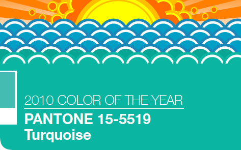
Pantone Color of the Year 2010- Turquoise
There is no way the cool, enigmatic Turquoise could remain out of the list of top colors. Pantone gave this honor to it as the Color of the Year 2010. Cool blue and enlivening green combine to bring out this powerful hue. Reminding you instantly of the tropical waters, it refreshens and enlivens both men and women. It also brings to mind the precious gemstones and wedding accessories making it a happy color.
"Through years of color word-association studies, we also find that Turquoise represents an escape to many – taking them to a tropical paradise that is pleasant and inviting, even if only a fantasy,” explains Leatrice Eiseman, executive director of the Pantone Color Institute.
The hue has many positive emotions associated with it such as serenity, sophistication, emotional balance, good luck, wholeness, open communication, and clarity of thought.
Color values:
RGB - 69 181 170
With these many positive associations, turquoise is a befitting color for any business presentation. It also gels with many hues in the color spectrum. You can use it with neutral colors to create a strong contrast or even pair it with darker colors as you can see in the slide below:
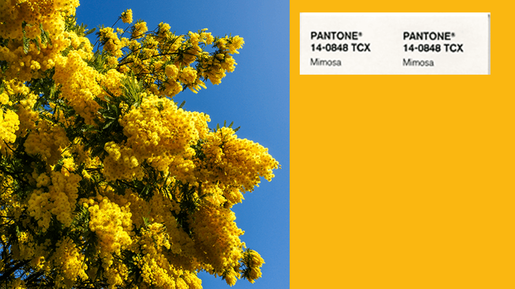
Pantone Color of the Year 2009- Mimosa
There can’t be a happier and brighter color than yellow. To underscore the need for optimism in dark times, Pantone chose the color of the abundant flowers of the Mimosa tree to bring hope, joy, and freshness in the world of design.
Color values:
RGB - 240 192 90
Yellow in PowerPoint presentations? Sounds so unprofessional, right? But yellow being the color of mind and intellect should definitely find a place in our intellectual presentations. The yellow bulb represents knowledge, new learning, logic and creativity. Employ this color to present facts. Use it with a strong contrasting color like gray to create a professional look.
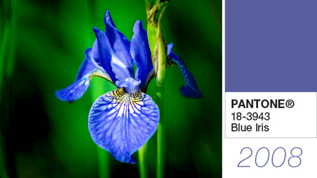
Pantone Color of the Year 2008- Blue Iris
Combining the calm stability of blue and the extravagance and magic of purple, Blue Iris was chosen as the Pantone Color of the Year 2008. The shade of purple in this color lends to it royalty, wisdom, mystery and magic. Purple is also associated with spirituality and mystical qualities thus adding excitement and an ambitious feel to the hue.
Color values:
RGB - 90 91 159
If blue is your favorite color choice for presentations and marketing collateral, then you can safely move to this color to create a bolder look and stronger impression:
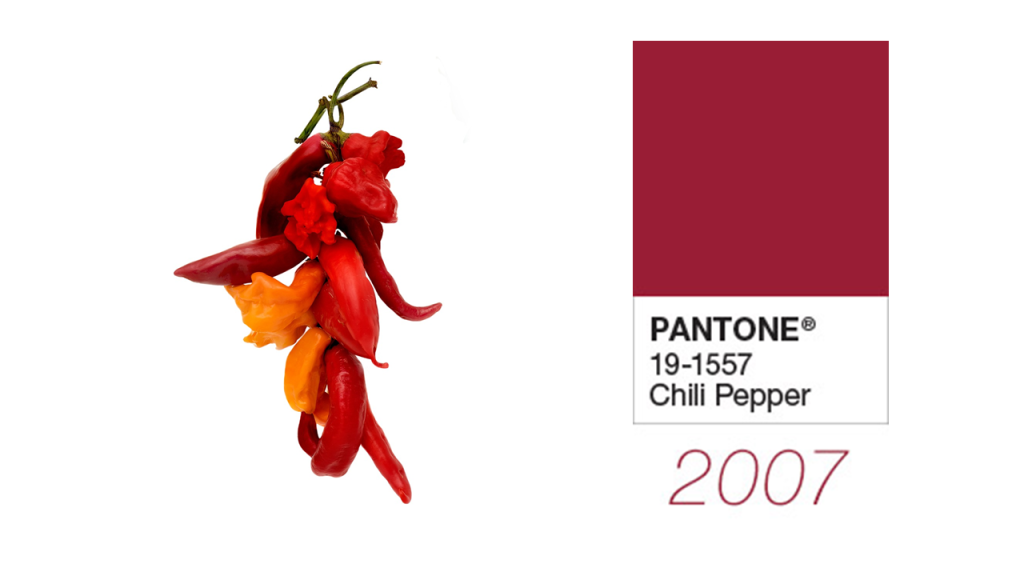
Pantone Color of the Year 2007- Chilli Pepper
Red is an attention-grabbing color, there’s no doubt about that. Pantone chooses Chilli Pepper’s deep spicy red as the Color of the Year 2007. The seductiveness and confidence of this color appealed to the team who thought that in a time when personality is everything, this color is hard to ignore. It is confident, bold, sexy and stimulates senses like no other color.
Color values:
RGB - 155 27 48
Personally, red might be one of your favorite colors as it symbolises love, energy, determination, and enthusiasm. Professionally, we shy away from using it because we assume it might “look desperate” or “too flashy”. However, as brands celebrate individuality and boldness, Chilli Pepper can be the perfect color choice to create that impression:
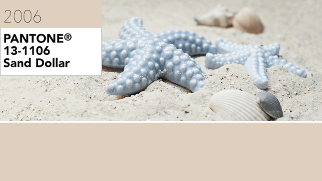
Pantone Color of the Year 2006- Sand Dollar
Pantone chose the down-to-earth Sand Dollar in 2006. The color is tan, a pale tone of brown, which makes the viewer feel relaxed, humble and secure. Brown is the color of stability and security and lends its seriousness to this soft tone also.
Sand dollar brings to mind the images of soft beach sand instantly soothing the nerves. It also lends a sophistication or elegance to the design. Add turquoise, shades of blue and green and a coastal look is complete.
Color values:
RGB - 222 205 190
Sand dollar can easily be used in corporate presentations, research projects, or any presentation which has serious undertones.
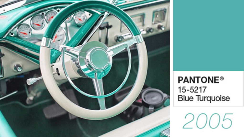
Pantone Color of the Year 2005- Blue Turquoise
Turquoise is lucky to be chosen twice by Pantone, this time with more of blue. Naturally, the instant association of ocean creates a rich, surreal look and feel to the design. It is calming and reassuring but visually grabbing at the same time.
Color values:
RGB - 83 176 174
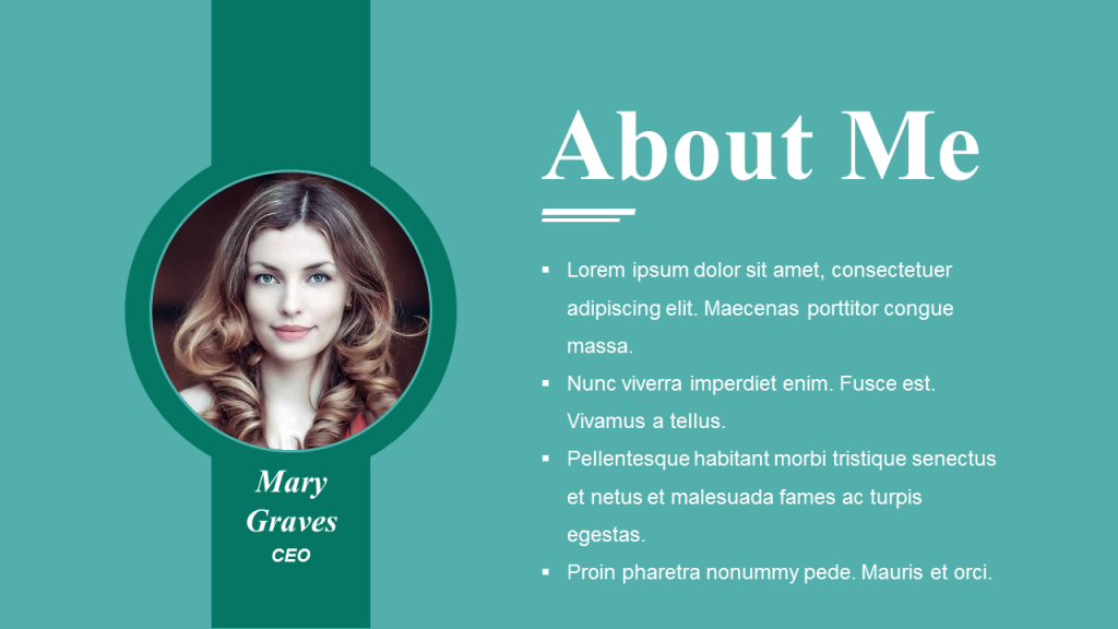
Combine it with soft colors like cream or beige to create a rich contrast and luxurious look. Turquoise is a modern color and lends an elegant look to your design. Try it without any second thought.
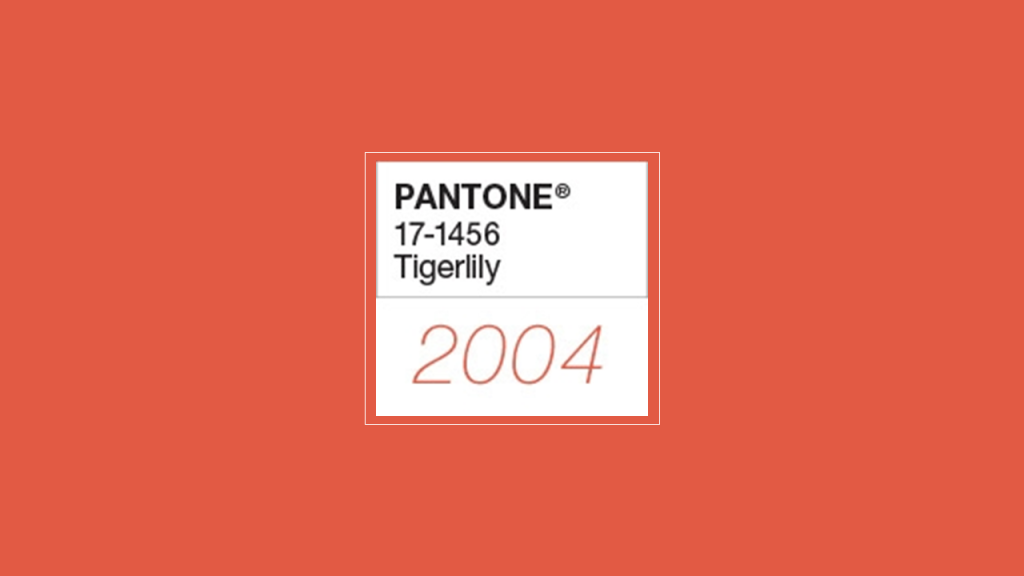
Pantone Color of the Year 2004- Tigerlily
With Tangerine Tango, Chilli Pepper, and now Tigerlily as the Color of the Year 2004, it seems Pantone is in love with red and oranges. Can’t blame them as these warm colors attract the human eye the fastest. Tigerlily is bright orange with a bit of red and yellow. It is bold, passionate, and rejuvenating.
Color values:
RGB - 226 88 62
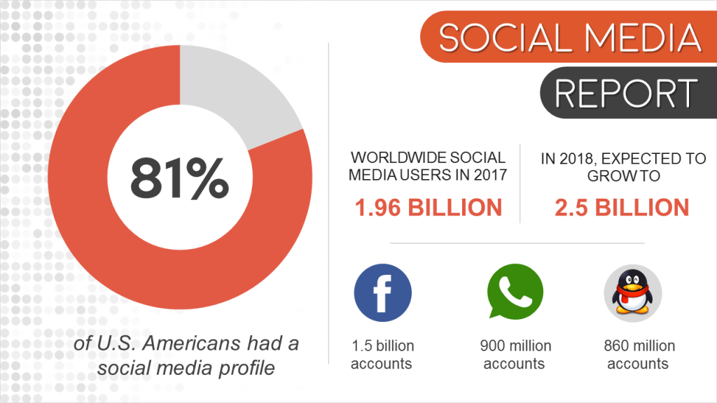
Again the mental barrier crops up - “Orange in presentation?” You don’t have to imagine the entire slide canvas painted in this color. Use it sparingly as an accent color and you will have an infographic look for your slide which will be visually appealing and yes, professional too like this slide on social media below:
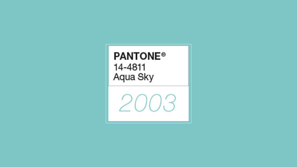
Pantone Color of the Year 2003- Aqua Sky
The calming, cool Aqua Sky took the spot in 2003. The blue-green combination lends a serene look.
Color values:
RGB - 123 196 196
Use this color in your health and wellbeing presentations to reassure and rejuvenate the viewers. While choosing nature images or that of tourist spots, you’ll find plenty of breathtaking shots rich in this color.
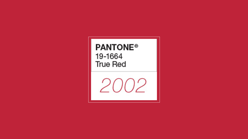
Pantone Color of the Year 2002- True Red
Red is an emotionally powerful color. It is the color of love, passion, power, desire, energy, and action. Physiologically, red raises blood pressure, heartbeat and respiration rate. Pantone chooses True Red as Pantone Color of the Year 2002 to bring vibrancy in the field of design.
Color values:
RGB - 191 25 50
Add excitement to your slides with this color. Highlight the area of interest in true red while using neutral, soft colors for less important points. Draw readers’ eye first to the most important message of your slide.
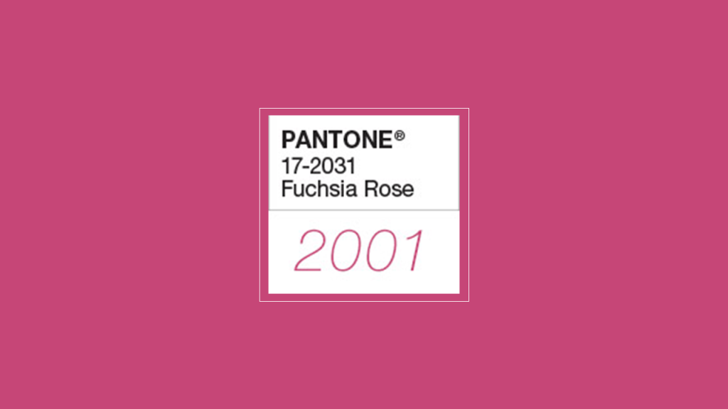
Pantone Color of the Year 2001- Fuchsia Rose
Fuchsia Rose, dark pink, is the color of appreciation and gratitude. A feminine color, it is warm and endearing. A feel-good color, it can be a beautiful accent color.
Color values:
RGB - 199 67 117
If you want to create an infographic design, fuchsia rose will be a great choice. Your design will look modern and stand out in a sea of designs.
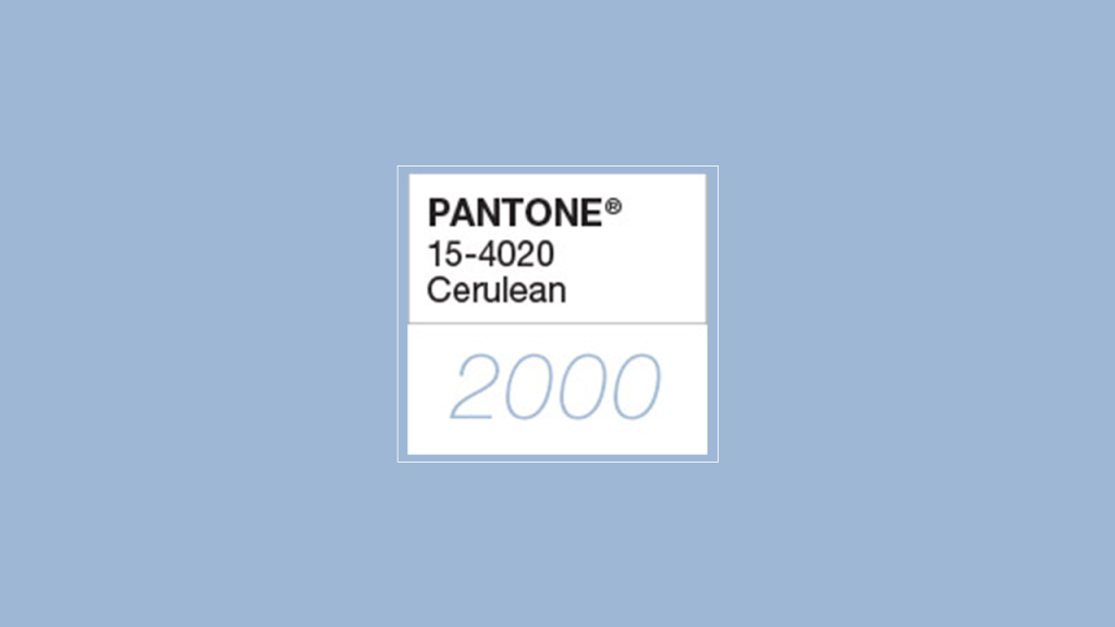
Pantone Color of the Year 2000- Cerculean
The year 2000 was the start of a new millennium. The honor to represent this new millennium was given to Cerculean, the color of crystal clear sky. "Sky blue is imprinted in our psyches as a retiring, quiescent color. Surrounding yourself with Cerulean blue could bring on a certain peace because it reminds you of time spent outdoors, on a beach, near the water - associations with restful, peaceful, relaxing times," says Leatrice Eiseman, executive director of the Pantone Color Institute.
Color values:
RGB - 155 183 212
Blue has always been the favorite color of presenters. So you are probably using it already. If not, you can try out this shade to show your inner balance and wisdom.
With so much color inspiration in front of you, there shouldn’t be any excuse left to create dull, lifeless slides. Which color will you be trying for your next presentation? Share your thoughts in the comments below.


![19 Colors from Pantone 2000-2018 Color of the Year [Design Inspiration]](https://www.slideteam.net/wp/wp-content/uploads/2018/06/Color-of-the-Year-by-Pantone-from-2000-to-2018-1001x436.png)

 Customer Reviews

