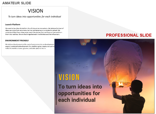
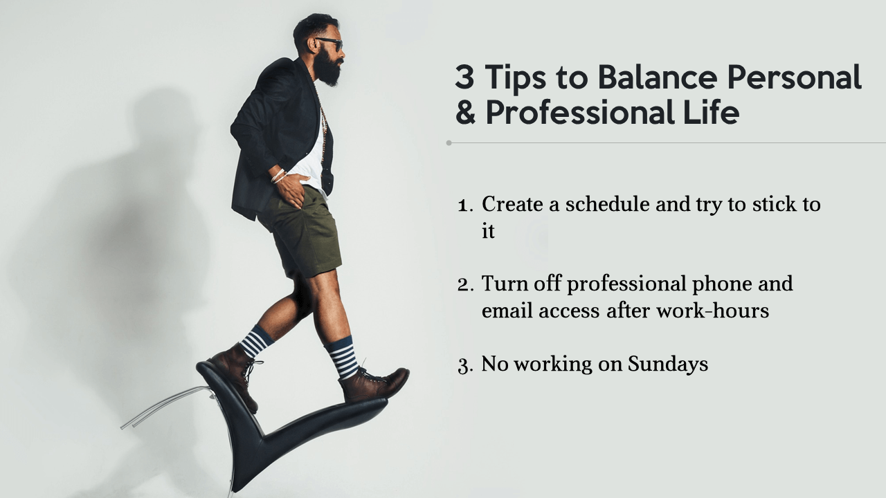
This post is not about turning bad slides into good but about turning good slides into great ones. The post limits itself to mastering the art of choosing the perfect image and using it in your slides. Why just images? Small moves, presenter. Small moves.
It is no secret from you that professional presentation design agencies turn boring-to-death slides into amazing, professional ones using the most basic, non-technical trick -
Adding Images!
Our presentation design agency too resorts to this simplest yet unbeatable design hack.
“That is all what design agencies do? I could do that on my own.”
Of course, that is not all what professionals do. Images alone do not turn any cluttered slide into amazing. There is the selection of right fonts, spacing and alignment, creating a right personality for the deck, creating graphics, turning numbers into stories, and more. You can do all these on your own if you have the time and expertise.
But coming back to images, they do work wonders for a slide. We are going to refrain from using the picture-is-worth-a-thousand-words cliche although that is true. Images make it easy for our overworked brain to process information. We are visual learners after all. They make it easy for us to recall information as research has proved that images are remembered more than text.
An image tells a story as each captures an emotion or behavior that everybody can relate to. They provide visual relief to the eye scanning and reading lots of gray text be it in a newspaper, magazine or a process slide.
Choosing images is an art. Not every image is the perfect image for your slide. We have already covered the Dos and Don’ts of using images previously.
11 Dos And Don'ts Of Using Images In Presentations
We want to go a step further this time and help you become better at choosing images for your slides. You might find plenty of good images on any photo website. But why settle for good when you can have a GREAT image!
Here are some tips for getting that great image for your next PowerPoint presentation:
Criteria for Choosing the Best Images for Presentations
#1- Pick Images With Lots of Empty Space
Chances are you will find plenty of good images on the required subject. Some might be so good you would want to put them as your laptop’s wallpaper. But think twice before choosing the same for your presentation. Ask yourself...
- Is the image busy? Does it have lots of elements competing for attention?
- Do you have to add text over the image?
- Will adding text make the slide look even more crowded?
P.S. Adding text over images can be a challenging task. Text readability can be a big issue. We showed the ways to avoid the same in one of our posts. Head over to the article shared below if you are facing the same challenge currently:
11 Ways to Make Text Over Images Readable
What we had not shared last time was to choose an image where you have plenty of white space to add text easily without losing the beauty of your image. Searching for such an image will probably take up more of your time but it’s worth it. See the difference between a busy image slide and its cleaner alternative:
The busy slide is good. Image is refreshing. Text is readable too. So there is nothing wrong with it. The audience will take 5-6 seconds to process it. We can make it a 2-second task by choosing a cleaner image. Here’s why the cleaner slide is more powerful than the busy one:
- It is a perfectly composed slide. Image and Text balance each other out.
- Text becomes a visual element in itself demanding as much attention as the image used.
- It is easier to process; takes split seconds to understand the message you wish to convey.
- It is also easier on the eye. Busy slides naturally cause fast eyeball movement!
Here is another before-after comparison to support this argument:
White Space Does Not Always Mean White!
White space is the empty space on your slide, whether it is white or any other background color. It is also called as negative space. This negative space is very important in any design composition. It adds contrast to the design and allows the most important element in your composition get all the attention it deserves.
Do You Know About the Rule of Thirds?
The Rule of Thirds is a design composition technique aimed at getting clean, elegant compositions. It involves splitting the area into 9 equal halves using two straight horizontal and vertical lines. The points where the lines intersect are called “power points” and artists try to position their object of interest on those points. This is especially useful as it leaves the remaining two-thirds of the slide area for keeping white space and accommodating text.
Choosing such images will help you give a professional designer’s touch to your designs. See the difference when you choose a good image but does not follow this rule versus another good image but following the rule of thirds:
#2- Pick Images with High Contrast
Contrast is a key design principle that plays a huge role in visual communication. If you want to draw attention to a particular object in your composition, lead the audience eye first towards that object, show hierarchy and structure, or entice them to take an action, contrast helps you do that.
Simply, contrast is the difference between two or more visual elements in a design. You can create this difference by size, color, shape, scale, layout, or other way. Any image will naturally have some contrast between the object and background color, between size and color of the objects in the image. Only a completely white screen would have no contrast.
Some images, however, are richer in contrast as compared to others. Choosing such images will give your design a superior, polished look. You will come out as a professional who has a good taste in design and has mastered the art of visual communication. Look at the beautiful contrast in the image below:
The contrast between the sobre gray and energetic red helps you instantly capture the audience attention and create impact. Here is another example of an image that is so attractive to the eye:
#3- Images Should Look Inside the Slide
Unless that is your objective, the actor in the image should not be looking outside the slide. Humans are naturally drawn to follow the eye movement and there’s no point in leading the audience attention outside your presentation.
So, should you reject an image that is clean, based on the rule of thirds and has lots of white space but does not follow this rule? No. That’s what hacks are for. Suppose you have an image like the one below:
You can fix it in 2 ways:
- Put the actor on the left or right depending on its original position so that it is looking inwards. If the slide has a solid background color, you can fill the slide background with the same color so that the image appears to cover the complete slide area. This is how the above slide will look if you use this hack:
2. Don’t move the image. Simply select it, go to the Format tab on the PowerPoint ribbon. Locate the Rotate menu and select the Flip Horizontal option. You can see the result in the slide below:
#4- Pick Images High on Emotion, Action
Don’t just choose a pretty image. Choose one that instantly evokes an emotion in the audience. Try finding images that capture the raw emotions. Audiences are bored of staged stockphotos. Pretty models with fake smiles do not add power to your content although it might achieve the opposite effect (tune out the audience).
Let your images amuse, shock, or provoke them to think and feel a certain way. Turn your crappy designs into awesome with just a image:
Finding such images is not difficult. You have to know the right search words to type in to get amazing results. For example, if your presentation is trying to stop managers from making some mistakes, you need to instill that urgency via your message. You can type in words such as “shout”, “blunder” and “anger” to get a range of emotional expressions that are depicting that urgency.
If your presentation is on a positive change, you can search for happy, amusing images to set the mood for your audience. Here’s an example of an image which might look exaggerated but conveys the subject topic perfectly:
#5- Pick Metaphorical Images
For every concept, you can either have a literal image or a metaphorical one. Metaphors involve analogies and help explain mundane topics in creative, engaging ways. They spark imagination. That is why, they are more powerful than literal images.
The analogies you use, however, have to be easily understood. Being too out of the box and not understood by anybody will have the opposite effect - audience will feel confused and unimpressed.
You can represent team building with a literal image of your team members or a metaphorical image of a sports team huddled up on a pitch. Business strategy, for instance, can be represented metaphorically through the game of chess as shown below:
#6- Choose Images Showing Faces of People
Whether it is the face of a human or an animal, we love checking out others! It is but natural for our eye to get attracted to faces. It helps us connect with them. We cannot feel that connection if we see their arm or back.
That applies to images too. We want to know stories of people like us. Choose real people; not the photo of a pretty model with a headset or a muscular businessman!
#7- Avoid Cliches
Audience is tired of seeing the pretty model with a headset, handshakes, fake meeting room setups. The minute they see one of those, they mentally label the presenter and his presentation as average and cliche like the image they just saw.
Photo websites are full of amazing images too. Spend a few minutes extra to get a better image that you have not already seen in umpteen presentations. For example, are you bored of seeing hands on top of one another for team unity slides like the one below? If yes, your audience will be too.
A hand holding a business card or a man writing something on whiteboard inspires nobody. A little creative effort will create a world of difference and help you tell stories through your images. And as you know, stories captivate like nothing else!
Want to see more creative analogies? Check out our blog post on stockphoto cliches and their creative alternatives:
18 Awful Stock Photo Cliches And Their Awesome Alternatives
Hopefully, these tips will help you choose better images for your next PowerPoint presentation. Also keep in mind the best practices while using those images:
- Use high resolution images
- Avoid cliparts
- Use legal images. If you want free images, use websites like Pixabay, Unsplash and Pexels.
- Make the images bleed i.e. cover the complete slide area
Master the art of visual communication and see your presentations become a visually engaging and rewarding experience for you and your audience. Tell us your thoughts in the comments below.
P.S. We broke one of our rules in the slide examples presented here. Can you spot which slide that is and which rule is broken?



 Customer Reviews

