


 Customer Reviews
Whether we are a beginner or professional, we need to brush up our presentation skills now and then. Considering presentation design trends keep changing.
Now obviously, there are a few alerts that you always have to keep in mind while creating the presentation.
Otherwise,
This happens.

Picture Credit: Glasbergen
Of course, we don’t want you to ever face such circumstances. So we bring these truly weirdly funny sarcastic presentation comics that will give you gales of laughter with wisdom.
Here we go:
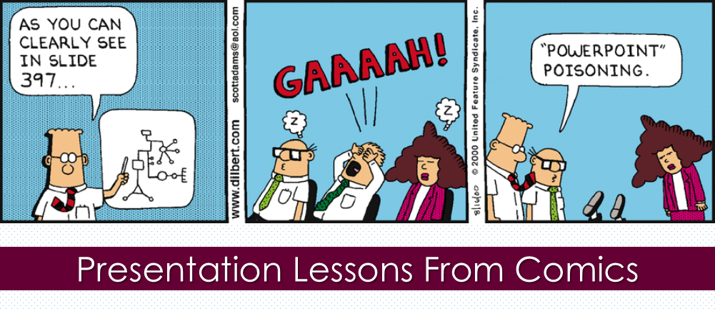
- Less is More

Picture Credit: Dilbert.com
Very few of us can handle too much. Be it drama, food, or whatever. Presentations are no different. Keep your number of slides and text minimal. Don’t make your audience sit through a deck of 150 slides when the message can be put across in just a few slides.
- Don’t Create an Eye Chart

Picture Credit: Marketoonist.com
Content is king but that does not mean you will just put everything in a slide without any visuals or illustrations and bore your audience to death. Don’t make your slide look like an eye chart to the audience.
Choose an amazing visual. Add a little content to it.

Or
![]()
Choose whichever option and you will be fine. You can add shapes, diagrams, colors or more to create a visually appealing slide.
- Bullets are a Silent Killer, Don’t Use Them

Picture Credit: Dilbert.com
Replace boring old bullet points with visual elements like images, icons, customized shapes and more. You can experiment here a little.
Bullet points can be replaced with icons.
![]()
Or with an image.

Not just these, you can have tons of options to choose from when it comes to replacing the bullet points. Transform bullet points with infographic designs. Go through this blog to explore more amazing options for you.
- Say What? Don’t Use Jargon

Picture Credit: Dilbert.com
Let me just put it this way. Repudiation of practicing hackneyed terms.
I think the message went well.
Use simple language.
- Slides are Free, Use Them

Picture Credit: Dilbert.com
Have too much to show? It is okay. Divide content into headings and subheadings. Then divide those into your slides. Don’t throw everything into one slide. It is better to divide the content before starting to create a PowerPoint deck.
Tip: Make the first slide an outline of your presentation. So you and your audience know the sequence.
- Oh my Eyes! Font Size Matters

Picture Credit: Dilbert.com
So if you put everything on one slide, you will barely see. But if you put just the headings, then of course you will have bigger font size to cover up that slide. Just like Dilbert has done.

Well obviously, there is no hard and fast rule of what font size should be used. But it is advisable to use font size up to 24 points and not less than 18 points.
- Simplify the Simplified!

Picture Credit: Dilbert.com
We don’t need to get into the details here. Let’s just say put your best efforts to simplify the content. Don’t waste your time in putting something so complicated in the slide that people won’t even care to look at. It will be a waste of your efforts and their time.
- Style Matters, Not at the Cost of Substance

Picture Credit: Dilbert.com
When it comes to the clients and customers, they will only say the slide is amazing when they will actually see something amazing. Don’t sound verbose, say something that is of value to the audience. Also don’t wrap up your presentation into clouds, stars, dollars and weird symbols and signs. Say yes to more professional business diagrams, charts, tables, metaphorical images and more.
You have tons of options to give your presentation a professional look. Use business diagrams like arrows, circular arrows, parallel arrows, roadmaps, timelines, funnels, puzzles, flow process, pyramids and the list is never ending.

If you want to give a creative touch to your slide, go for images.

However, if you can’t find the perfect image for your presentation, we suggest you go through this blog to make it easy peasy for you.
- Don’t be a PowerPoint Zombie

Picture Credit: Taloali.us
Prepare well before the big day. Rehearse as many times as you can. Record your speech, practice with friends and family, have a dry run at the venue. Do everything that prepares you for the presentation.
This is it. These presentation lessons were not just a laughter dose but also showed the reality when it comes to boring and dull presentations. Well it surely gave me some insights to improve my presentation skills. Hope it helped you too.


