

 Customer Reviews
We've all been in a mathematics class before. And we've all used a Cartesian graph to plot data points back when we were learning the nuances of algebra.
The simple data visualization technique helped us assess two variables and draw patterns from them. Not to mention, understanding this binary system helped us with our grades too!
But what if we need to include a third variable into the mix?
How do we assess and visualize three variables onto a graph?
The answer to that question lies in a nifty visualization tool called the bubble chart.
So in this guide, we will explore the concept of bubble charts in a comprehensive fashion. Follow along and learn how you can make a bubble chart and incorporate it into your evaluations and statistical analyses. There are also handy bubble chart templates up for grabs by the end. Let’s get started.
What is a bubble chart?
Also known as bubble plot, bubble matrix, or bubble graph, a bubble chart is an advanced scatterplot that is used to display three dimensions of data on a Cartesian graph. Unlike a scatterplot that considers two variables for visualizing data sets with distinct dots, a bubble chart considers a third variable as well and denotes it with bubbles or circles of various sizes. The size of each bubble is determined by the third variable. Labels and colors can be used to distinguish the plotted variables.
The following popular Ted Talk by Swedish physician Hans Rosling puts a lot in perspective about bubble chart and how it is formed.
Based on the preference of the user, a bubble chart can be represented in various formats. These include a 3-D bubble chart (where circles or bubbles are replaced by spheres), a map bubble chart (used in cartograms), a comparative bubble chart (with data triplet sets of two entities), and so on and so forth.
How to make a bubble chart?
For someone uninitiated, it matters more that you learn the applications of a bubble chart first than make one for your use case. We will address these applications in the next section.
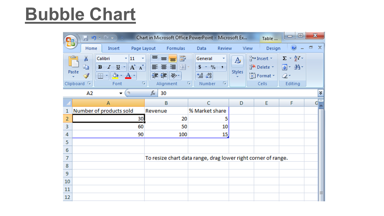
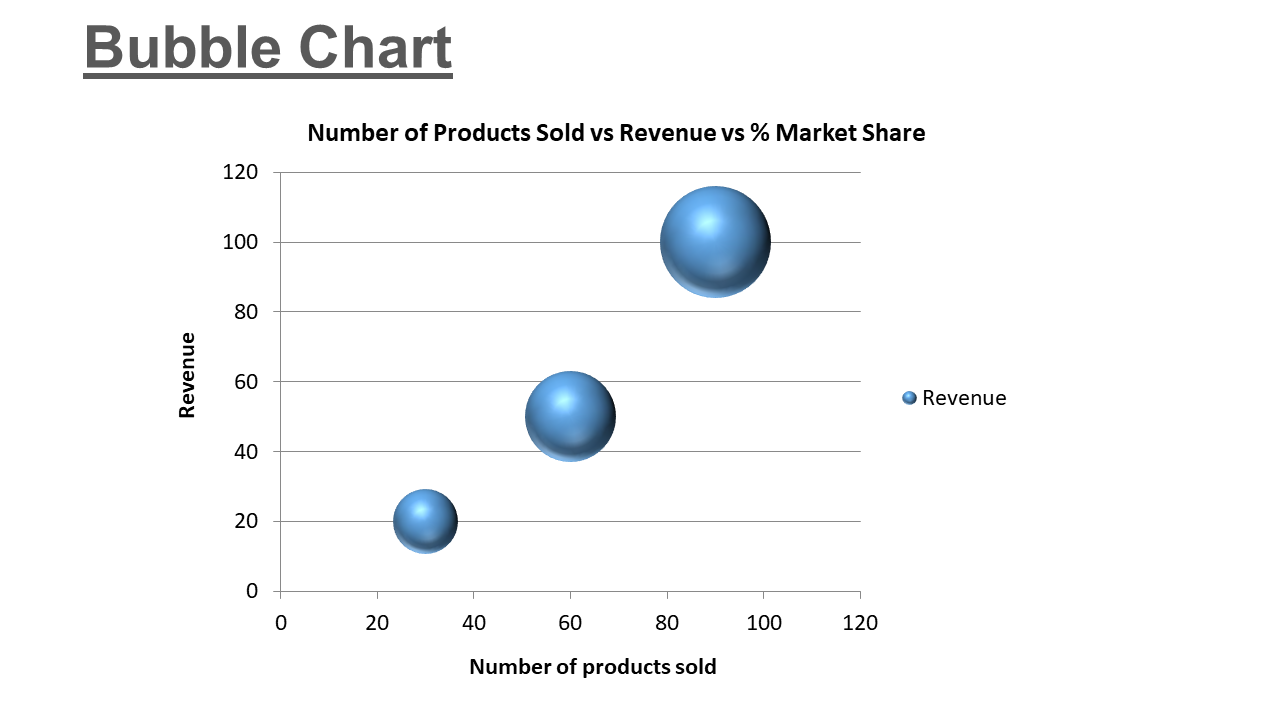
In this section, we will show you how you can easily visualize and create a bubble chart in PowerPoint in four easy steps. For further clarity, we are taking the example of a product use case where we have three variables — revenue, number of products sold, and percentage market share of the product as per the sales.
So follow along these steps and prepare a handy bubble chart in PowerPoint for your problem statement.
Step 1: Define your variables
Gather the data that you want to visualize with your bubble chart. The ideal data set will contain triplets of values like (v1, v2, and v3). In our example, let’s assign v1 to revenue, v2 to number of products sold, and v3 to the percentage market share. Now gather and arrange these triplets into a tabulated format. You can choose to either write the values down or tabulate them in Excel.
Step 2: Define the axes
Choose which value you want to visualize on each axis of your Cartesian graph. Label the axis as per the value and segment it suitably. For our example, we are keeping revenue on the Y-axis and number of products sold on the X-axis. We will add these labels to the graph to be added to our PowerPoint slide.
Step 3: Add the graph
With your values and labels determined, it’s time to use the nifty features of PowerPoint to let your numbers tell a story. In the main menu, go to “Insert”, then “Chart”, then “Bubble”.
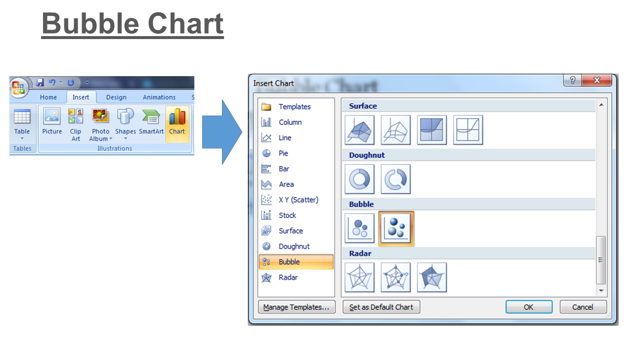
You can choose “Circle” or “Sphere” for the shape of the bubbles. We are picking the latter for better visual effect.
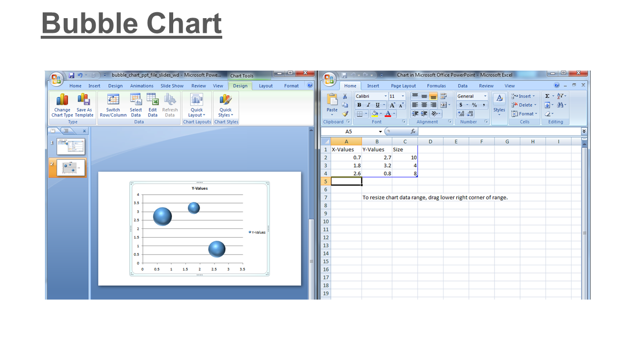
Step 4: Plot values and present
Your bubble graph will show up with the Excel sheet linked to it. Fill in the variables and the labels determined earlier into the respective cells and close the Excel window.
Your simple yet effective bubble chart is ready to impress.
Applications of bubble chart
On the surface, a bubble chart seems just that – a CHART. But if one understands the concept of how it is created, it is easier to figure out the mind-boggling applications this data visualization tool serves. Now that you have learnt how you can create one for your business scenarios, we give you a rundown of the most prominent applications of a bubble plot below:
→ Pattern study: With a bubble chart, it becomes easier to evaluate a third dimension of business data. Compared to a triple bar graph, a bubble chart makes it simpler to visualize patterns and correlations. This makes bubble charts a key driver in market trend analysis and geographical trend analysis.
→ Search engine marketing: There’s a very distinct use of bubble charts in the digital marketing industry, especially in the SEM vertical. Digital marketers can compute and visualize the effect of high cost per click rate on ad position and the number of conversions for their business. The ideal plotting includes number of clicks on the X-axis, cost per click on the Y-axis, and number of conversions being the size of the bubbles. A similar application involves finding the impact of promotional campaigns.
→ Keyword density: Another significant use of the bubble chart is again for digital marketers wherein bubble size can determine the popularity of the keyword being researched. A prominent example of this use case is Google reports on the most searched keyword or hashtag. The biggest circle makes it easy to spot the keyword with the highest search volume.
→ Product differentiation: A bubble plot helps juxtapose product KPIs in the most concise and lucid manner. So you can have as many bubbles as the products and determine associated metrics instantly by simple observation.
Advantages of bubble chart
Inherently, bubble charts are the best visualization tool for three-dimensional data. They make trend identification super convenient. Additionally, bubble plots make for an appealing layout on a PowerPoint slide when compared to a cluttered bar graph or a haphazard line graph. This makes them an ideal choice for projecting and comparing financial data.
Another advantage of using a bubble chart is that when it is connected to form a line graph, it conveys the same information without distortion. Legends can be used as the key to reading a bubble chart more conveniently. Furthermore, colors can be used to add a fourth dimension to the data for visualization.
Disadvantages of bubble chart
Just like other tools for data representation, bubble charts do have their limitations. First off, you cannot depict zero or negative values with bubbles.
Secondly, it is next to impossible for uninitiated human visual perception to ascertain values based on the area of the bubble. This means the reader has to be sound enough to read the visual data on a bubble plot as intended rather than perceiving it objectively solely on the basis of the circle size.
Thirdly, complex data, when plotted onto a bubble graph, can be difficult to interpret. This is because multiple bubbles can overlap, distorting the visual perception of the value being displayed.
Some bubble chart templates you can use right away
By this point, you have already weighed the pros and cons of a bubble chart and are probably dabbling with PowerPoint to draw yourself one.
But when time is of the essence and attractive design is of the utmost importance, the default templates in PowerPoint may take up a lot of effort to perfect according to your unique requirements. Not to mention, these features are pretty much limited and are a hassle when it comes to customization.
And don’t even begin to think about graph placement, alignment, and other nitty-gritty stuff. That will bog… you… down.
So what can be a feasible way out?
How about using this catalog of 10 unique PPT designs custom-made for your use cases! All you have to do is put in your content, edit the data in the Excel sheet linked to these templates, and present your findings with a stunning bubble chart.
So scroll below and download the templates that fit your scenario the best.
Template 1
Here’s a simple 3-D bubble chart template for showcasing valuable data. You can download this PPT template to enlighten your audience about product differentiation using comparative analysis. The graph comes linked with an Excel sheet, so just edit the numbers and present your data with confidence.

Template 2
Intrigue your boardroom with this unique 3-D bubble chart slide. The template displays a handy model to present data for multiple products. You can alter the labels according to your business needs and captivate your audience with a personalized slide. Just select this template and edit as desired.

Template 3
You won’t find this unique design in the default PowerPoint library. A special feature of this bubble chart slide is that it lets you portray comparative data for the sales and numbers associated with two products instead of just one. Feel free to choose this PPT template to start productive conversations.

Template 4
Summarize the statistical and financial data about three products in this bubble chart template. This no-clutter no-flab design helps you give a clear snapshot of the financial performance of your product offerings. Small and medium businesses can utilize this template to keep track of sales data and draw innovative conclusions from it.

Template 5
Take your analytical storytelling to the next level by incorporating this handy PPT template. With circular and color-coded data points for each of the four products displayed on the slide, this template is the perfect model to accommodate and assess essential information. This flexible template is ready for use by each and every team in your organization. So pick it now!

Template 6
This concise template lets you visualize profit vs cost vs probability for success for seven products. So companies with multiple products in their portfolio can use this bubble matrix preset to compare various parameters of performance. You can also examine profit figures with this design and share your findings with your colleagues in PPT and PDF formats.

Template 7
Compatibility is no issue for this modern bubble chart template design. You can use this scatter bubble chart preset to present profit margins for a product in a particular financial year. Besides, you can share this PPT with your team via Google Slides and let them share their feedback on it. Deploy this PPT design and jack up those sales figures.

Template 8
Here’s a straightforward bubble chart design to keep it short and sweet. The template displays price and sales in a lucid format. You can either use this as a standalone slide for analysis or incorporate it in your existing presentation. You can also reproduce this slide into print formats and attach it with your reports to augment informed decision-making.

Template 9
Turn boring numbers into engaging storyboards with this decision-making matrix design containing a distinct bubble chart. One can showcase the importance of various project management activities with this color-coded graph. You can also use this matrix to decide on the priority of various project activities and delegate tasks accordingly.

Template 10
Take graphical evaluation to the next level with this handy bubble chart PPT template. The expressive design is completely editable, providing you effective visualization capabilities. Besides, this template is ideal for product differentiation and comparison in your monthly review meetings. So download this template and start personalizing it to fit your message.

Conclusion
The utility of bubble charts cannot be overstated. Give these charts the right ingredients and they can make your data mesmerizing. They are the best medium to cater to the growing need for accessible tools of analysis. When you wish to unlock analytical prowess for any of your projects, a bubble chart is the first thing you turn to. And if you use our PowerPoint templates for creative visualization, your numbers will always pack a punch.
So what are you waiting for? Get started with SlideTeam’s bubble chart templates and master data like never before. Try them. Twist them. Turn them. Play with them. Just don’t bore them.
And don’t forget to share your thoughts in the comment section below. We would love to hear from you.
P.S. For more handy tips on data visualization, check out our comprehensive guide and templates featured here.