


 Customer Reviews
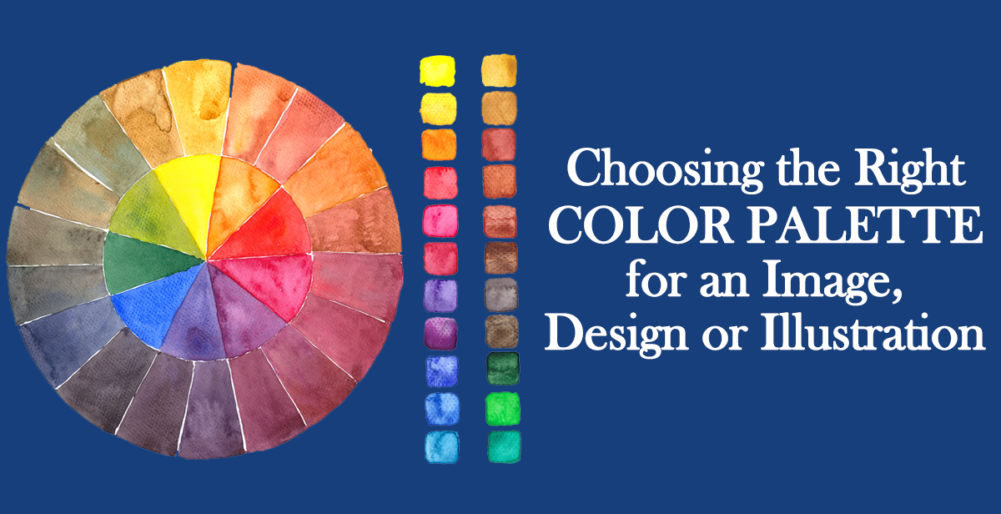
Choosing the right color palette for your Illustrations, Designs or Graphic Art
Color is a crucial design element. It can be used to draw attention to something, evoke an emotion and communicate through an image. Colors are like the notes in music, if used well you will have a melodious, soul-stirring symphony, if not, it could be disastrous. Have you ever struggled with finding the perfect color scheme for an illustration or a flyer? Have you found some combinations that work and are afraid of stepping out of those tested palettes into unknown waters (colors)? Then you would certainly appreciate the content here. Hope your color ‘band’ plays well.
1. The Building Blocks
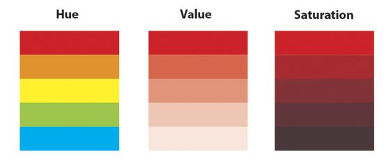
Let us familiarize ourselves first with the terminology. The three key words used to define the shade of a particular color are: Hue, Value and Saturation
- Hue is just another fancy name for color.
- Saturation refers to the intensity of the color and if it is subtle or vibrant. A de-saturated color looks more grey.
- Value is the brightness or darkness of a color, and you can get different values of the same hue by adding black or white to it.
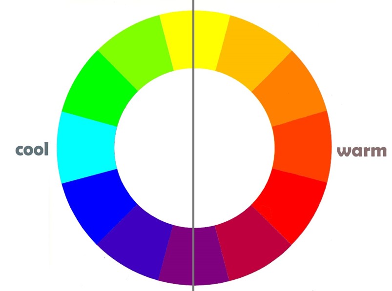
2. The Color Wheel

The Color Wheel
The colors on the right hand side are warm colors, meaning they create a warm feeling and the colors on the left side are cool colors.
The language and personalities of colors
Red is a strong color, which can convey meanings from love and passion to anger, fire and danger. Red is known to increase blood pressure and respiration rates. Yellow evokes feelings of happiness, optimism, and summer. In color psychology, orange represents creativity, adventure, enthusiasm, success, and balance. The color orange adds a bit of fun to any picture, website, or marketing material it’s on. Pink could mean love or innocence or could just be used for anything feminine. Blue can generate a sense of calmness, professionalism and even sadness. Different shades could suggest different emotions.
Nothing explains this better than the characters from Disney Movie Inside-Out. The character Joy is yellow, Anger is red, Sadness is blue, Disgust is green and Fear is purple.

Disney Movie Inside Out
3. Tried and tested formulae
Harmony is when there is a balance and consistency in a design, such that the colors please the eye. Certain color combinations mostly always work, and it is helpful to have some understanding of why it is so. Have you visited websites where you returned from the home page without looking at the content? The reason could have been the use of a color palette that did not seem harmonious to your eyes and was clashing or confusing, or the color of the text over the images was such that it wasn't readable or legible.
There are some accepted theories and formulae on how to pick colors such that there is harmony in the composition. And these formulae are:
Color Combination#1: Monochromatic
In a monochromatic color scheme, the artist can play with value and saturation while keeping the hue the same. There are many examples of famous artists using a one color palette.

Landscape by Mark Tansey
A monochromatic color scheme can also be used when the artist wants to convey one mood of the design. It could be used for backgrounds, or when the designer doesn’t want the colors to take away the attention from the main content. Monochromatic color scheme is best used for a harmonious and visually cohesive look.

This illustration, by the artist Au Aranas, portrays a very busy indoor life. The use of a one color palette emphasis the theme and mood. Since the design is very busy, it helps by not distracting the eyes with too many details while missing the underlying mood.

Here, the focus is naturally Buddha, and Purple, being the color of spirituality, imagination and healing supports the Buddha image well.
Color Combination #2: Analogous
Colors adjacent to each other on the color wheel create a nice and soft harmony that could be used if you want to have a more diverse palette than just a single color, but not too much contrast. The colors give a sense of blending in with each other. Analogous harmonies can be soothing. One can still play with the value and saturation to achieve desirable contrast. If you want to draw the eye's attention to something special in your design, it is a good idea to have everything else in either monochromatic or analogous harmony and then the subject stands out.

Analogous Color Scheme

Claude Monet: Water Lilies and Japanese Bridge

Concept Art, Disney Movie Moana
Color Combination #3: Complementary
Opposite colors on the color wheel render the most sharp contrast and have very strong energy and vibrancy. Hence it needs caution when being used. It is used when the designer wants something to stand out or draw the attention of the viewer’s eyes. To make it easy on the eyes, either you can play with the proportion of the colors, and/ or with the saturation levels to make one or both colors look less strong. Nature presents us with the most amazing complimentary schemes. Be it the Kingfisher's blue and orange or the red and green of Poppies.

Complementary Color Scheme: Red and Green

Complementary Color Harmony: Blue and Orange

Complementary Color Scheme
The complementary color scheme has been tested by the masters to work. It worked then and it works now.

Vincent Van Gogh, Starry Night
The following poster of the movie Brave shows how the use of complementary color on the character brings the eye's attention to it.

Disney Movie Brave
Color Combination #4: Split Complementary
This color harmony is a variation of complimentary which gives more colors to work with and the contrast is not as sharp.Instead of using the two exactly opposite colors, this cousin of complementary uses one base color and two colors that are both adjacent to the color directly opposite to the base color on the color wheel. The colors are mostly never used in the same proportion. For example, instead of making a palette with blue and orange, the palette will have blue and the two neighboring colors of orange on the wheel which are red and yellow.
The following Target design by Allan Peters is an example of Split Complementary Color Harmony:


Color Combination #5: Triadic
Triadic color palette is made up of three colors that are equidistant from each other on the color wheel, like …..
Usually, one of them will be a dominant color, and either both the other colors are accent colors, or one of them is a secondary color, and the third one is used as an accent color. The mood of the illustration will depend on the dominant color. A 60-30-10 proportion can be used for the strength of the dominant, secondary and base color. Now we understand what makes Superman stand out.

Triadic Color Scheme
![]()
Another example of Triadic Color Harmony is this Powerpoint Template of fall background:

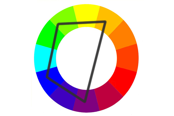
Color Combination #6: Tetradic
Tetradic color scheme has four colors that make a rectangle on the color wheel. It gives a designer a wide choice of colors. It is mostly for a happy, colorful design or illustration and mood. The colors purple, green, blue and yellow form a rectangle on the color wheel. Notice how blue and yellow have been used very conservatively.

4. Tools
- The Color Calculator of Sessions College allows the designers to create a color scheme on the color wheel using one of the harmonies (monochromatic, analogous etc) and making adjustments as they go.
- Canva presents a great color palette tool where you can pick colors, choose harmonies, play with saturation levels and values and then use those combinations in your designs. You can also generate palettes from images using Canva.
- Coolors.co is another very good resource for designers that offers many ways of choosing, arranging and exporting images and palettes.
- Adobe Color offers the ability to pick up a color palette using any color harmony and also lets you extract the theme from any image that you upload. Whenever you come across palettes that catch our attention, you can take a picture and upload here to save the color scheme for future.
- MillionShade.com has ready to use palettes
5. Collecting References
- The most common and easy way to collect reference is from websites like Pinterest.comhttp://Pinterest.com
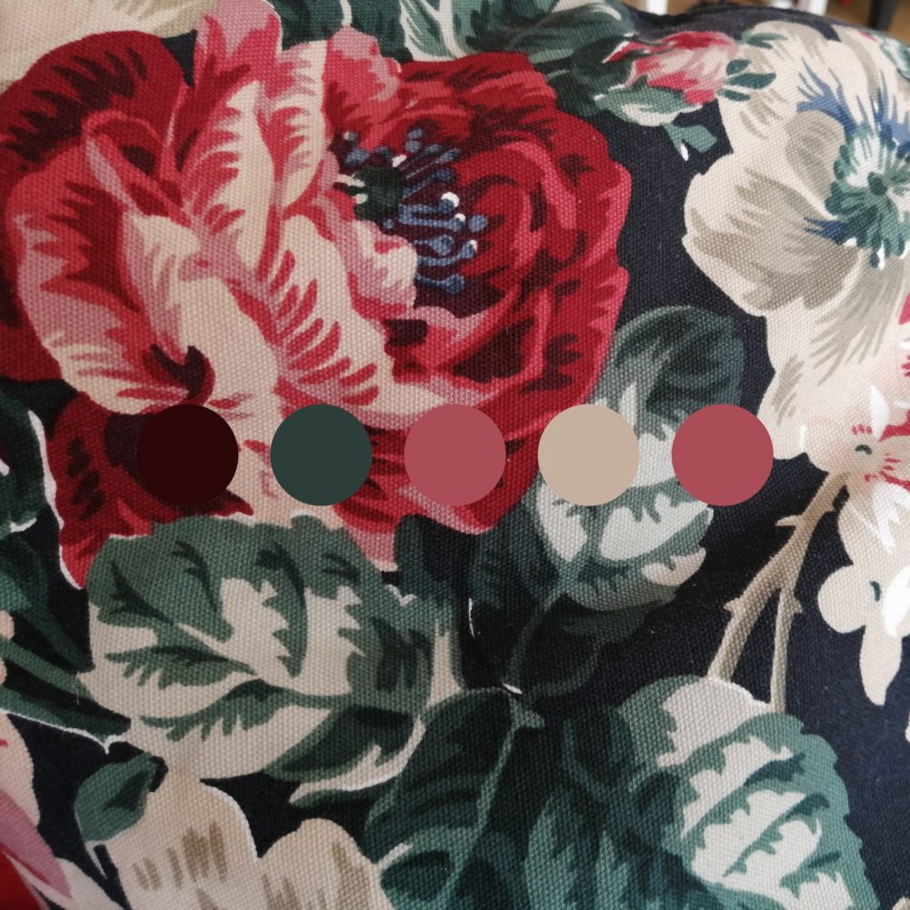
- You can take pictures wherever you go and find something interesting. It could be a cushion cover from your living room like the following:
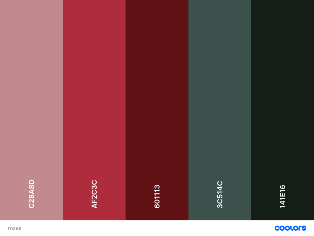
- Nature is the best preacher, or should we say designer and illustrator. Take pictures of whatever catches your eye and then use the tools mentioned above to generate the palette.The following is an example of a picture I took:
![]()
6. How do you settle on a the palette
- The first step would be to decide the mood of the design or illustration. Think about the message you want the illustration or design to convey. Depending on that, finalize on one or two dominant colors.
- Next choose the harmony accordingly. The tools listed above can help you pick up colors.
- Try to use a limited color palette. While choosing a color palette, one must remember that less is more. And somewhere between 3-5 core colors is mostly sufficient.
- Then you can play with the saturation levels and the percentages in which these colors might be used.
Hope this post helps you push your design horizons beyond measure.


