


 Customer Reviews
So you have a brilliant idea for a startup? Great. You might be the next Mark Zuckerberg, Bill Gates or Elon Musk. Why not? A small but brilliant idea can shake the world.
But every entrepreneur knows that idea alone is not enough. You need money, lots of it, to set the wheels in motion. Raising money is not that daunting task today as it used to be once. Venture capitalists and angel investors are looking for the next big idea. Millions of dollars are out in the market eager to land in the lap of the next big startup that’ll multiply that amount into billions for the investors. The only difficulty is convincing the investors that you are The Next Big Startup. How do you convince them?
With your Pitch Deck of course.
Pitch Deck is a promising presentation comprising 10-12 slides describing your vision, your core team, the all-important business model, and market figures. “Communications is at the heart of e-commerce and community,” says Meg Whitman, President and CEO of Hewlett-Packard. Pitch Deck is the HOOK with which you will draw in the investors to BELIEVE in your story.

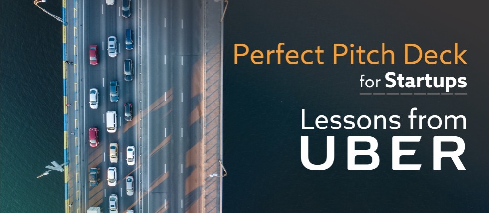
If you are at this stage looking for some inspiration for creating a knockout pitch deck, you have come to the right place. Rather than bombarding you with one pitch deck after another, we are showcasing just 1 pitch deck here, that of UBER. They have an awesome pitch while we will be proving the design inspiration by visually enhancing their slides.
Uber Pitch Deck Redesign by SlideTeam Design Services:
Uber is a classic example of runaway success stories. A simple idea coupled with a smart business model revolutionized the transport industry. Started in 2008 as UberCab in San Francisco, Uber today is estimated to be worth $70 billion operating in 600 cities worldwide. On the ninth anniversary of Uber, its co-founder Garrett Camp shared UberCab’s first pitch deck that has powerful pitches in each of its 25 slides.
The slides themselves, however, are quite average even by the standards of that time. The powerful punches and their intriguing vision is subdued by bullet point slides.
The bullet points style might have worked in 2008 but it won’t now. The pitch deck has to be visually arresting and interest investors who are reviewing multiple pitch decks on daily basis. A great design does not mean that content can take a backseat. Content will always remain the king; design is only the crown on its head.
Let’s review 8 key slides from Uber’s pitch deck, get ideas from their outstanding pitch and give it a makeover for design inspiration:
#1- Cover Slide
The cover slide of any deck serves the same purpose as the cover slide of a magazine. It should make people curious to know more. Even more importantly, it is your visual elevator pitch. It has to describe who you are in such a way that the investors can’t help but want to know more about you.
Uber did a great job here by using just 4 words on its cover slide via its catchy tagline which reads “Next Generation Car Service”. The design is simple but effective- the slide shows a black car along with iPhone and Blackberry clearly implying that booking taxi will now be a phone click away. Our designers, however, felt the black and white treatment did not convey the “next generation” feel. Time for little design improvements!

Our design services team had the luxury to take advantage of Uber’s brand colors and highlight the same in the cover slide for reinforcing their brand identity. The brand’s color scheme might not have been decided 10 years back, so we can excuse Uber for not doing the same. Our designers picked the cool turquoise and dark green from Uber’s palette and made the cover slide visually captivating for the audience.
Key Takeaways (Content):
- Logo or Brand name should be prominently visible
- Have a kickass tagline- short but powerful that describes what you do and your mission
- Less is more. Use as little words as possible to describe who you are
Key Takeaways (Design):
- Use brand colors if you have decided your color palette. If not, use colors that evoke the right feeling (profesional blue, energetic red, warm yellow, etc.)
- Use an image to draw attention (majority of people are visual learners and visuals are remembered more than text)
- Prominently position your logo for brand authority.
#2- Problem/Current Situation
One of the reasons Uber was such a huge success was because it addressed a widely felt problem and created a solution no one had thought of before. Commuting was not an easy task. Time wasted waiting for taxis, hailing taxis with your hand and the stress of not reaching destination in time for want of taxi were some of the problems experienced by riders one and all.
Uber clearly articulates these problems in its short, simple to understand phrases. The taxi of that day “yellow taxi” is also shown in their slide to make the audience quickly remember their experiences in that car. Our designers decided to visually enhance the slide. The yellow taxi needed to be right out there, not buried beneath rows of text.

To mirror the real life, a graphic of the street road was also added. A textured background was used as the slide background with New York city skyline also visible to create the right look and feel. Text was neatly arranged in columns to disrupt the done-to-death bullet point style. Icons were added to make the slide look more contemporary, easy to understand and visually appealing.
Redesigned Version 2
Uber’s problem slide offers many possibilities when it comes to design. While the above slide literally showed the cabs in 2008- the yellow Ford Crown Victoria, designers felt the pain point could be exploited with use of the right image. So hailing taxis with hand was represented visually to show the actual challenge every rider faced in 2008 before Uber was launched.

Key Takeaways (Content):
- Personalise the problem. Share the everyday experience of the consumers
- “For the most effective pitch, focus 80% on the problem, 20% on the solution”- Dave McClure
Key Takeaways (Design):
- Show the problem with images rather than just tell with words
- Use icons to reinforce the message
- Maintain consistency in use of colors, fonts and icons
#3- Solution Slide
Now is the time to show how you are going to magically solve the problem. Needless to say, the solution has to be convincing, not existing before, and convenient. Uber scored a perfect 10 on these points. Getting a ride was now possible with touch of a button. Ride sharing was a totally new concept. In Uber’s case, Uber was the solution to the problem. So the solution slide also acted as the “about us” slide for the startup.
In clear words, it introduced the UberCab concept, its market and what made it special. Professionals in American cities would be the target market and the service would be introduced initially in San Francisco and New York City alone. Uber’s competitive advantages- fast, efficient, convenient, professional drivers are clearly mentioned. Uber also compares itself to NetJets and positions itself as the “NetJets of Car Services” thus effectively positioning itself as “your taxi” just like NetJet was “your own jet”.
Just 1 mistake. A rather big one. The Bullet Points.

Entrepreneurs and authors Evan Baehr and Evan Loomis in their book Get Backed: Craft your story, build the perfect pitch deck, and launch the venture of your dreams strongly caution the budding entrepreneurs, “If you learn nothing from this book, remember this: never use bullet points for your solution slide.”
That’s also the first thing our designers did: remove the bullet points. Solution slide deserves visual representation too. The challenge with images is accommodating the content. As you can see above in the redesigned version, our designers solved that problem by taking a cutout of Uber’s black taxi with New York city skyline in the background.Text was complemented with icons for the next generation look.
Key Takeaways (Content):
- Be innovative in your solution. “You should learn from your competitor but never copy. Copy and you die”- Jack Ma, Executive Chairman of Alibaba Group
- Ensure that the solution kills the pain point (for instance, digital hail removes the need to hail by hand, automate dispatch reduces wait time)
- While describing your service, try using analogies and comparisons (Uber is the NetJets of car services)
Key Takeaways (Design):
- Use images. Solution slides and self introduction slides should be visually engaging
- Arrange the bullet points in columns or a different layout to avoid “death by bullet points”
#4- Key Differentiators
What makes your startup so special? How is your startup going to disrupt the industry? Uber again has convincing points to impress investors. It does not beat around the bush and highlights its USPs with crisp headlines and short phrases. It takes mere seconds to read their key strengths like technological innovation, luxury cars, and fast service. Headings are in bold while description is greyed out to make reading easy on the eye.
The one-click hailing promised by Uber is quite enticing but seems buried in the original slide. SlideTeam Design Services uses that as a bait line to catch the investors attention to that point again.

The designers used the Rule of Thirds principle to create a balanced slide by placing the image and text on power points.
Also notice how the Uber’s logo has been leveraged at the footer of the slide enclosing the page number. Such subtle additions give your presentation a unique branded look.
Key Takeaways (Content):
- Highlight your strengths without humiliating the competitors
Key Takeaways (Design):
- Highlight the most powerful USP of yours by giving it a different design treatment in terms of font type, font size and color
- Use the Rule of Thirds principle to balance text and image and create a well composed slide
#5- Use Cases
How will your new product, service or idea be used in the real world? Use Case scenarios add credibility and punch to your pitch and give valid reason for your existence. More the number of use case scenarios, more the customer segments you can involve. Uber casts a wide net here in this slide and covers the use case for professionals, students, householders, parents, elderly, etc.

Maintaining consistency in design across the deck, the designers used the eroded textured background and added road track in the footer to add a visual element. The use cases were split into a grid that allows easy reading of the content. Colorful line icons and ample white space creates a professional look.
Key Takeaways (Content):
Ensure that all use case scenarios are covered. A use case insignificant to you might prove to be quite profitable in future
Key Takeaways (Design):
Avoid the bullet point list. It’s lazy and outdated. If there are many points to be covered, use different slide layouts to split the content into digestible chunks. The article below shows 15 slide design layouts that can be used when you have lots of text, including the grid layout we used in our redesign:
15 ways to transform bullet-ridden slides into amazing
#6- User Benefits
While the use case scenarios describe your offerings, this slide, as the heading clearly implies, outlines the advantages consumers get by using your services. A good way to do that is to reiterate the problem and the solution you offer to reinforce your pitch and that is what Uber does.
Our designers split the “negative points of other cabs” and “the competitive superiority of Uber” and gave a different design treatment to both. The negative points deserved a poor treatment while Uber’s competitive edge needed to played up on the slide. In redesigned version, Uber’s “faster and cheaper” claim is given the attention it deserves.

A motion blur effect was given to the background image to make Uber appear racing ahead of all other market players. The “next generation car service” claim made on pitch decks’ cover slide is further backed up here on this redesigned slide.
Key Takeaways:
- Use Picture Effects to enhance the message. PowerPoint offers plenty of formatting options when it comes to pictures. To try more advanced effects, you can definitely get the design expert in your team to achieve the same with Photoshop or Illustrator
- Use the power of Typography to pack a punch with your content. Look at the angle given to text using rotation feature and the glow and blur effect added to it to recreate the motion blur effect. Get started with typography today by trying out the ideas shared in the article below:
11 Typography Tweaks And Text Effects To Spice Up Your Presentation Content
#7- Market Opportunity
Investors want research-backed data on market size and market potential to see how lucrative the business is. Market Analysis will give you tons of data but you need to share the most important details over here- like market size for your business, market trends, market share you plan to achieve and the geographical area you’ll target. Uber shares the details through a table but most importantly, sums up the entire market findings report in two short, straightforward points.
Our design team made 2 version of Uber’s market slide- one you see below where we added a bit of color to bring life to the bland PowerPoint table:

If you end up with messy tables, follow these quick steps to polish up tables in PowerPoint.
Redesigned Version 2
Data visualization helps bring life to numbers. To show how numbers can be creatively represented, our designers added a column chart over the US map in the redesigned slide. Numbers are put randomly here for representation purposes. The idea is to get creative with data and not just dump numbers on slide.

Key Takeaways (Content):
Bigger the market, the better. Put impressive figures right on top so that they are seen first.
Key Takeaways (Design):
Depending on the type of data, use data visualization tools like charts, graphs, thermometers, speedometers, etc. Use maps to segment markets geographically. Check out 16 data visualization tools you can leverage to add magic to numbers.
#8- Marketing Ideas
A unique product or service also deserves out-of-the-box marketing ideas. Uber’s team had interesting catchlines like “one-click cab” , “NetJets of Limos” and “Cabs 2.0”. Our design team visually enhanced this by placing Uber cab right in the centre and arranging all marketing ideas around it in a semi-circular layout so that the spotlight is right on Uber.

These were eight slides we picked from Uber’s pitch deck. You can view the complete pitch deck Uber co-founder Garrett Camp shared. Hopefully, their power-packed pitches coupled with our designs will help you create a stellar pitch deck for your startup. If you need help with the pitch deck outline, then we have got that covered too.
Pitch Deck Outline + Pitch Deck Templates for Startups
The most popular pitch deck outline that has been tried and tested with success is that given by Dave McClure, the founder of 500 Startups. An ultimate pitch deck should definitely have these 10 slides:
- Elevator Pitch
- The Problem
- The Solution
- Market Size
- Business Model
- Proprietary Tech
- Competition
- Marketing Plan
- Team
- Money
To make the process of creating and designing a professional pitch deck for you, we have created complete professional pitch deck presentations that you can simply download, add your content and present to investors. Won’t that make everyone’s deck look same? No, it won’t. Because your brand colors and researched content will give the unique look and feel to your presentation.
Download Investor Pitch Deck for a Startup
If you want our professional designers to create a knockout pitch deck for you that will capture investors’ imagination, then get in touch with our Presentation Design Services team.


Amazing blog.