

 Customer Reviews
When it comes to graphs and charts, the general statistical expression only works well for up to three or four variables. Any further addition of variables makes the visual more complicated to read and difficult to understand.
So what to do when our data set surpasses this threshold? What handy visual tool will ensure that the problem of plenty gets addressed with a design that is easy to comprehend?
The answer to that is radar chart.
So if you are just getting started with data visualization or anticipating chunky data sets to come your way, this superfast guide is for you. Read on and find out the ins and outs of radar chart and get your hands on actionable PowerPoint templates to apply your learnings.
Here we go!
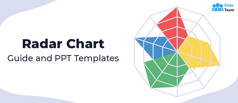
What is a radar chart?
A variant of a parallel coordinates plot, a radar chart is a 2-D graph that is used to plot multivariate data sets on axes with the same origin. When the plotted coordinates are joined, the resultant figure resembles a spider web, which is why it is also called spider chart or web chart. Owing to its varying applications through the years, it has also earned aliases like star chart, star plot, radar graph, cobweb chart, and polar chart.
An additional score axis is usually drawn vertically to signify values that increase outwards on other axes. Structurally, the position or angle of the axes in a radar chart is inconsequential and only used for indicative purposes. The real value comes from the patterns that are obtained by tracing the plotted variables and applying problem-solving approaches to these patterns. That means, the shape of the web will help you find correlations and tradeoffs — concentric shapes mean direct proportions, while irregular patterns highlight differences.
Additionally, a radar chart is best suited for comparing disparate groups, enabling better decision-making, and optimizing algorithms. Businesses can utilize radar charts for quality improvement initiatives besides calibrating their strengths and weaknesses. The only limitation that one may face while utilizing radar charts is that with more than 10 spokes, the graph becomes difficult to interpret.
How to create a radar chart?
By this point, you already want your pile of variables to just fit into a radar chart. It’s great if you have already etched a sketch too.
But how to visualize it digitally?
The answer is simple — PowerPoint.
To clarify, we will take the example of a toy company. We will represent the monthly sales of two types of toys — slinky and frisbee. To create a radar chart for this scenario, follow these three simple steps:
Step 1: Jot down the dates and values you want to represent on the axes corresponding to the dates. In PowerPoint, go to Insert > Chart > Radar.

Step 2: Now you can choose a simple radar chart, a radar chart with markers, or a filled radar. Since we are trying to show more visual contrast, we will select Filled Radar. Hit OK.

Step 3: Your radar chart with a linked Excel sheet will pop up. Adjust the values and labels.

Your actionable radar chart is ready to be presented.

PowerPoint templates to visualize radar graph
Given how a radar chart serves a multitude of applications, it is only practical to use it in a data set dominated by qualitative variables. Product manufacturers and statisticians can derive a lot of value out of radar plots.
If you are thinking to spice up your presentations and performance reports with catchy visuals, here’s a quick catalog of eight handy radar chart templates from SlideTeam. Crafted by experts to fit any critical business scenario, these PPT templates will save you a lot of time and effort in conceptualizing useful information out of raw data.
And the best part, these templates are fully editable. So all you have to do is just download these templates and edit their Excel files to create a stunning yet informative slide. Scroll below and take your pick.
Template 1
Here’s a simple yet effective radar chart PPT template to get you started. The design showcases color-coded web or “radar sweeps” to make product differentiation quick and hassle-free. So download this template and work to make analytical decisions with confidence.

Template 2
Here’s a radar plot design that works for any project you have. You can assimilate historical and current data sets into this editable layout to showcase the numbers that matter. So select this template and detect interesting patterns from raw data.

Template 3
Here’s a spider chart template that depicts values for monthly evaluation. You can utilize the color-coded design of this PPT slide to visualize the sales performance of three products. Feel free to click the link below and start personalizing the template according to your requirements.

Template 4
This spider chart sample works for number crunchers and managers alike. The stunning slide draws the viewers’ attention instantly. Therefore, this design will come in handy for any business meeting conducted for a strategic overview of a product line. Click below and get started.

Template 5
This is a highly practical layout that you can adapt for comparative analysis and quality control. Each colored line can correspond to a distinct entity, making the graph more readable and lucid. Incorporate this PPT slide to explain the impact of outliers and churn out effective strategies for growth.

Template 6
Here’s a modern radar chart design that will help you maximize the productivity of business meetings. You can utilize this slide to gauge the strengths and weaknesses of each product. So get your hands on this intuitive template and jack up your performance metrics instantly.

Template 7
Now here’s a template that you will not find in the default PowerPoint library. This unconventional spider chart design comes with an eye-catching color scheme. Just like the toy company example mentioned before, you can also utilize this to assess problem statements on a monthly basis. Click below and get to work.

Template 8
We saved the best for last. This star plot design is the ultimate tool for skill and resource gap analysis. The layout includes a color-coordinated table to clarify the link between various concepts like data analysis, programming, system design, and more. Take this template and maximize the impact of your next presentation.

So there you have it! Get started with radar charts and tell captivating stories with your data. Download the featured templates and crank it up a notch. Also, don’t forget to share your experience in the comment section below.
P.S: For more tips on how to get the most out of your graphs and charts, check out our all-inclusive guide and templates here.