Analyzing sales data and profit margins is non-negotiable for any business striving for success and growth. It provides insights into the performance of different products, market segments, and customer trends. However, interpreting and presenting this data effectively can be challenging. That's where sales comparison templates come to the rescue.
This blog will explore the top 10 sales comparison templates that can help you analyze your company's profit margins quickly and precisely. These PPT Sets offer a range of visualizations, charts, and graphs designed explicitly for sales analysis, empowering you to make data-driven decisions and identify areas for improvement. Let's dive into the world of sales comparison templates and unlock the power of insightful data analysis!
Client Sales Comparison PPT Bundles
Revolutionizing the way sales professionals deliver impactful presentations, this PPT Set bring a wave of innovation to the table. With their cutting-edge designs and interactive features, these bundles redefine the art of storytelling. Seamlessly blending aesthetics with functionality, they empower presenters to captivate their audience through visually stunning visuals, sales comparison charts, and engaging infographics.
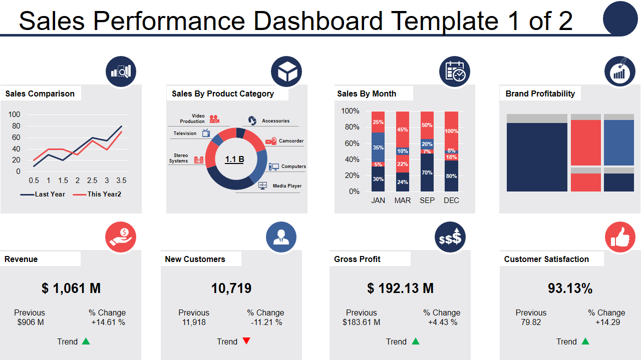
Sales Performance Dashboard PPT Design
Embarking on a voyage of data-driven decision-making, the sales performance dashboard for sales comparison by product category emerges as an innovative tool that propels sales teams toward unprecedented success. This dashboard transcends the traditional boundaries of static reports and ushers in a new era of dynamic visualizations. With real-time updates and interactive features, it paints a vivid picture of sales performance, enabling teams to identify trends, uncover opportunities, and make informed strategic choices. Harnessing the power of cutting-edge analytics, this dashboard dives deep into the intricacies of each product category, unveiling invaluable insights and correlations that were once hidden in a sea of numbers.
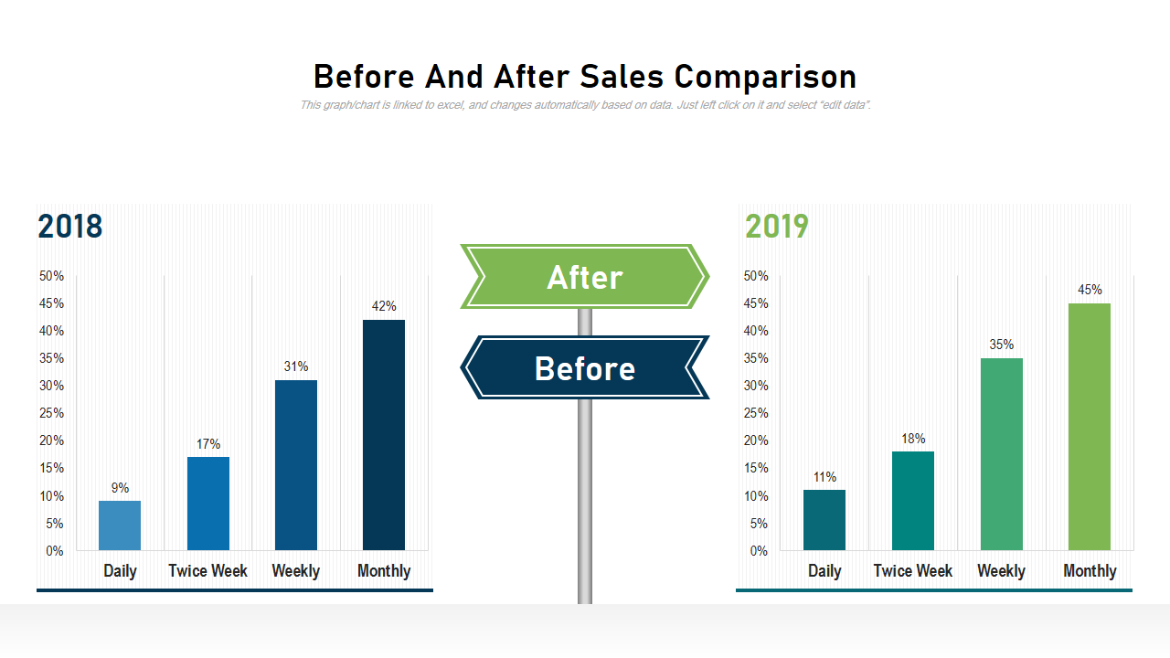
Before and After Sales Comparison PPT Framework
Stepping into the realm of transformative possibilities, the before and after sales comparison unveils a captivating narrative of progress and triumph. With a single glance, this innovative comparison transports viewers through time, revealing the remarkable transformation that has taken place. With sales comparison templates, you can also explore cost comparison templates. Captivating visuals and striking charts bring the numbers to life, highlighting the leaps and bounds that have been made in revenue, market share, gross profit and customer satisfaction.
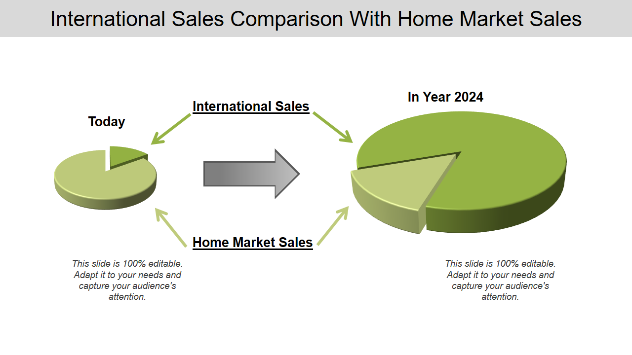
International Sales Comparison with Home Market Sales PPT Set
Unveiling a theoretical perspective on global success, the international sales comparison with home market sales illuminates a tapestry of innovation and expansion. Like a bridge connecting distant shores, this dynamic analysis paints a captivating portrait of growth and opportunity. Each slide becomes a portal to a world of possibilities, showcasing the power of market penetration, cultural adaptability, and strategic alliances.
Yearly Product Sales Comparison
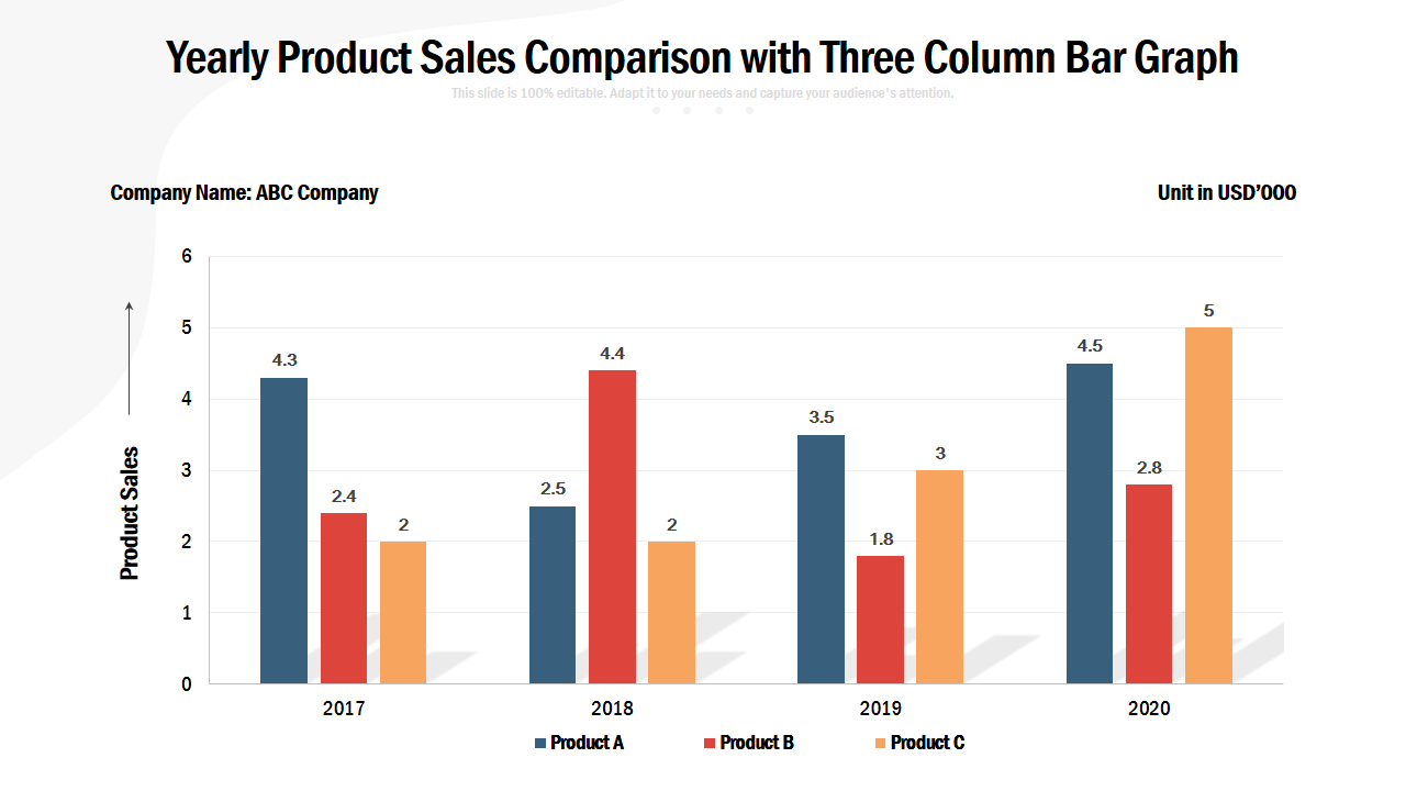
In the symphony of data visualization, the yearly product sales comparison with three column bar graph takes center stage as a beacon of innovation. Esach column becomes a testament to the ebb and flow of sales performance, painting a vivid picture of the journey taken throughout the year. Like a conductor orchestrating harmony, this graph allows viewers to discern patterns, spot trends, and unlock invaluable insights. It unveils the rise and fall of different products, and their individual stories are interwoven into a grand tapestry of success and adaptation. The three-column structure offers a comparative lens, enabling sales teams to identify top performers, strategic gaps, and untapped potential.
One-Pager Client Sales Comparison Sheet
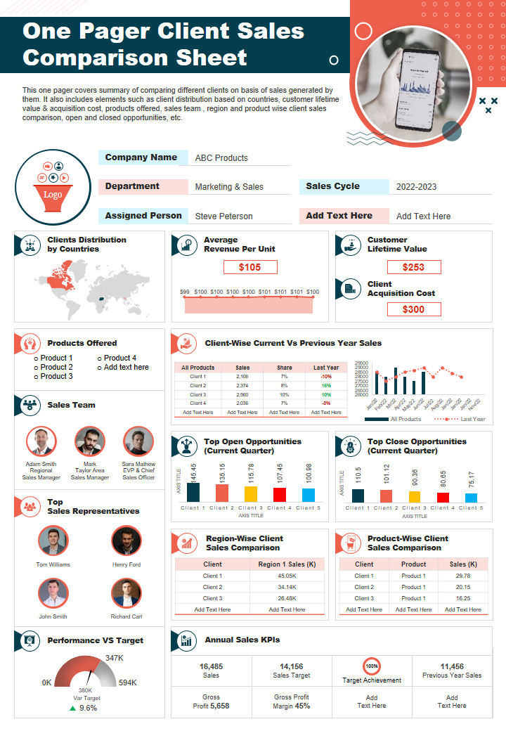
In the realm of concise and impactful communication, the one-pager client sales comparison sheet presentation report infographic emerges as a versatile masterpiece, seamlessly blending creativity and information. Like an artistic canvas, it combines diverse elements into a harmonious whole, captivating the audience with its visual allure and insightful content. In a world where time is of the essence, the one-pager client sales comparison sheet presentation report infographic stands as a testament to effective communication, providing a gateway to understanding, inspiration, and informed decision-making.
One-Pager Client Sales Comparison Sheet
Combining the essence of multiple mediums, this comprehensive document offers a condensed yet impactful representation of client sales comparisons. It serves as a one-stop solution, encompassing a range of formats, including infographics, charts, and concise text, meticulously crafted to convey critical insights.
Products Annual Sales Comparison PPT Set
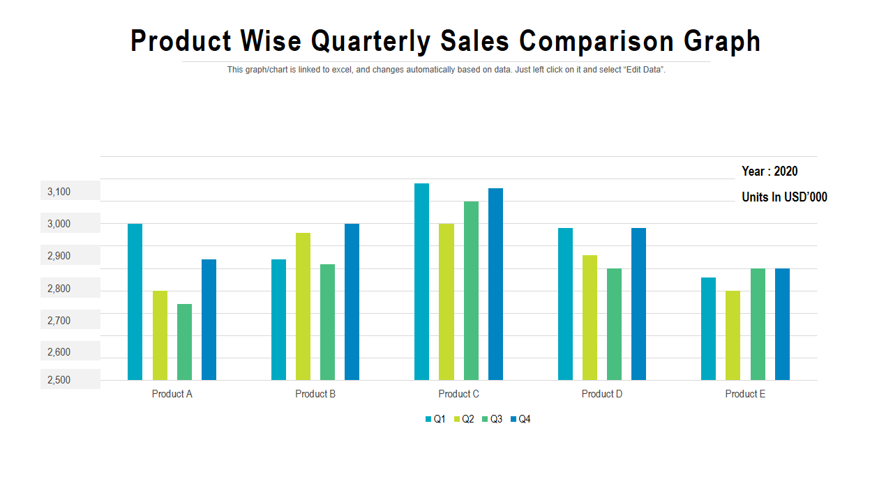
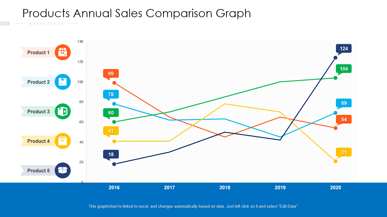
Like an artist's canvas, this dynamic PPT Design weaves a mesmerizing tapestry of sales performance, guiding viewers through a visual journey of growth, trends, and untapped potential. Each line, curve, and intersection represents a story waiting to be unraveled, revealing the triumphs and challenges that have shaped the product landscape over time. Along with annual sales, quaterly sales report empowers decision-makers to discern patterns, identify high-performing products, and uncover strategic opportunities that may have gone unnoticed.
Year Over Year, Different Products Sales Comparison
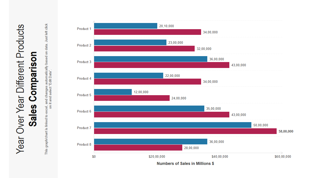
Embarking on a captivating journey through the ever-evolving landscape of sales, the year-over-year different products sales comparison unveils a narrative of growth, adaptation, and endless possibilities. Like a kaleidoscope of progress, this dynamic analysis transcends traditional boundaries, painting a vivid portrait of the shifting tides within the product realm. With every passing year, it becomes a time capsule, capturing the essence of sales trends, market demands, and consumer preferences.
Year Over Year Sales Comparison PPT Framework
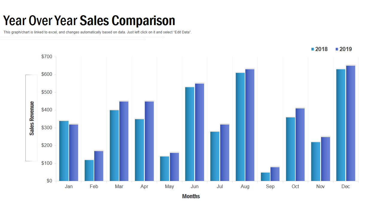
The year-over-year sales comparison encapsulates the essence of progress and evolution within a business landscape. Like a compass guiding decision-making, this insightful analysis paints a comprehensive picture of sales performance over time. It connects the past and present, revealing the ebbs and flows of revenue, customer trends, number of new customers and market dynamics. This comparison is a testament to growth, resilience, and strategic adaptation each year.
The Comparative Edge
In today's competitive business landscape, analyzing sales data and profit margins is crucial for driving growth and staying ahead. The top 10 sales comparison templates discussed in this blog have revolutionized the way businesses analyze their company's profit margins. Whether looking for visually appealing charts, interactive dashboards, or comprehensive reports, these templates provide the tools to make informed decisions and optimize your sales strategies. SlideTeam also offers sales projection templates for you that help you show the sales projection of your organization more effectively. By harnessing the power of these templates, you can gain a deeper understanding of your company's sales performance, identify areas for improvement, and uncover growth opportunities. Embrace the power of data analysis and leverage these sales comparison templates to propel your business toward success and achieve sustainable profitability.
Frequently Asked Questions
What is a sales comparison report?
A sales comparison report is a comprehensive document that analyzes and presents sales data to provide insights into a company's performance. The report highlights key trends, identifies top-performing products or segments, and assesses the effectiveness of sales strategies. By examining historical data and benchmarking against targets or competitors, the sales comparison report helps decision-makers make informed decisions, refine marketing strategies, and identify areas for improvement. It is a valuable tool for evaluating sales performance, identifying growth opportunities, and optimizing business strategies to drive profitability and achieve sustainable success.
What is the sales comparison and cost approach?
Sales comparison and cost approach are two widely used methods in real estate valuation. Sales comparison involves comparing the subject property to similar properties recently sold in the same or similar location. The goal is to determine the market value based on the prices at which comparable properties have transacted. On the other hand, the cost approach determines the value by estimating the cost of replacing the property, considering the land value and construction costs. It is advantageous when there is limited sales data or for unique properties.
What is an example of a comparable sale?
An example of a comparable sale is when a house with similar features, such as size, location, condition, and amenities, is sold in the same neighborhood. This sale is considered comparable because it provides relevant data for estimating the value of a similar property in the market.
What is the sales comparison grid?
The sales comparison grid, also known as the sales grid or the comparative market analysis grid, is a tabular representation of key factors used to compare and evaluate properties in a real estate market. It typically consists of rows and columns, each representing a different property and each representing specific features such as property size, number of bedrooms, location, amenities, condition, and recent sales prices. By analyzing the sales comparison grid data, individuals can make informed decisions regarding pricing, negotiation, and investment opportunities.


![[Updated 2023] Top 10 Sales Comparison Templates To Analyze Your Company's Profit Margins](https://www.slideteam.net/wp/wp-content/uploads/2021/04/Size-1013x441-2.jpg)

 Customer Reviews



![[Updated 2023] Top 10 Sales and Operations Planning Templates to Cope With Market Volatility](https://www.slideteam.net/wp/wp-content/uploads/2021/04/02_1013x4414-493x215.png)

