

 Customer Reviews
A dashboard has always fascinated the humankind, be it of a ship, an aeroplane or even the more mundane cars. There is something unique and fascinating at having information displayed in an attractive, vibrant format.
In today’s business world, however, the dashboard has turned into an amazing tool for taking important business decisions.
From the simplest of tools used to track, analyse and display data, dashboards are toys for the mind that the big boys like to fiddle with. With technology no barrier, and to an extent even information easy to cull out, dashboards are here to stay.
Depending on the purpose, dashboards are classified into operational dashboards; strategic dashboards; analytical dashboards and informational dashboards. Remember, the key to the categorization is quality of data and the purpose with which it has been designed.
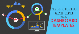
If you need data dashboards that tell you the story of your own business within that one-page, there is no better resource than SlideTeam. We offer data dashboards templates that just need you to key in your own data, and voila, you have your customized dashboard.
Besides being convenient, we are also design and data friendly with your convenience guiding all the templates. Each of the templates is 100% customizable and editable.
Let us have a tour of dashboard templates.
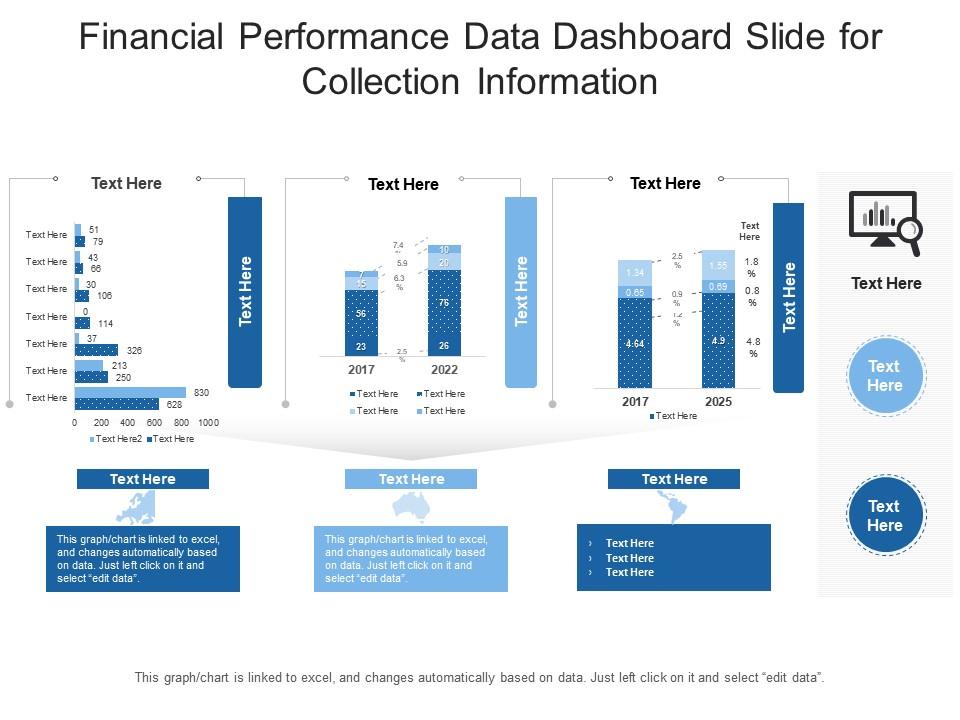
Template 1: Financial Performance Data Dashboard Snapshot Slide PPT Template
This PPT Template is best used for representing your financial performance on the three parameters of sales growth, profit and assets acquired over a specified period. There is room to give qualitative information/data also beneath each of the graphics of the presentation template. For now, these have been left blank for your convenience. Use this presentation to also ensure that your visual dashboard has both vertical and horizontal components. Download now!
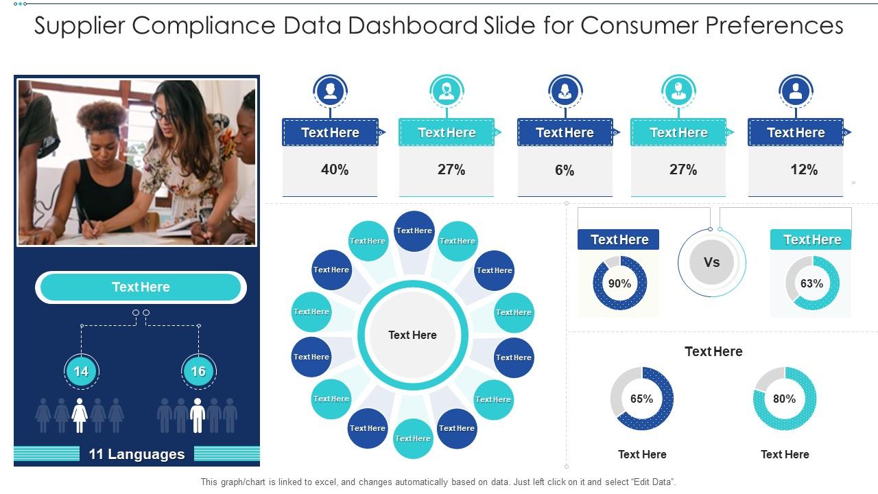
Template 2: Supplier Compliance Data Dashboard Slide for Consumer Preferences
Ultimately, it is the consumer who is the king in any business. You can cover at least nine kinds of data on consumer preferences using this PPT Template. Be it the time they most prefer to shop or the kind of color they prefer. This presentation template also offers the advantage of gender segregation of your targeted customer base. Basically, you can slice and dice your customer from all angles with the use of this presentation template. Know your customer like the back of this hand and transmit the same to your audience and make that customer interaction just a bit better with this template. This customized approach can create magic. Try it with a download of this presentation template now!
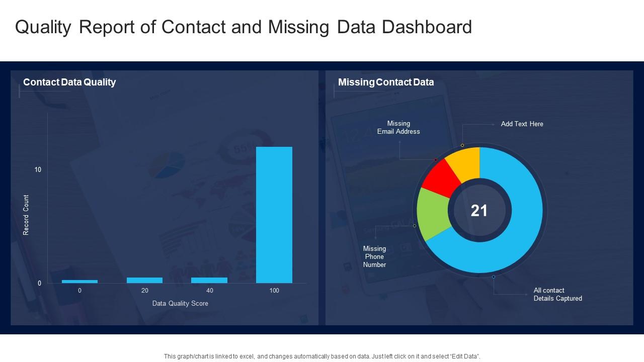
Template 3: Quality Report of Contact & Missing Data Dashboard
At the ground level, it is essential that the last touchpoint of the customer with the sales channel captures customer data with precision. This, however, is easier said than done with the touchpoint owner frequently seen not to collect this data. For owners of the business, this is a huge headache, as you never get to know the customer well. Data so gathered is also prone to error, being wrong etc. Use this PPT Template to make sure your missing contact details are visible, and thus this missing data can be used to ensure better data collection, if nothing else. This is a well-structured data quality report, which helps you sort out the last sales channel. Download now to improve your connect with the customer.
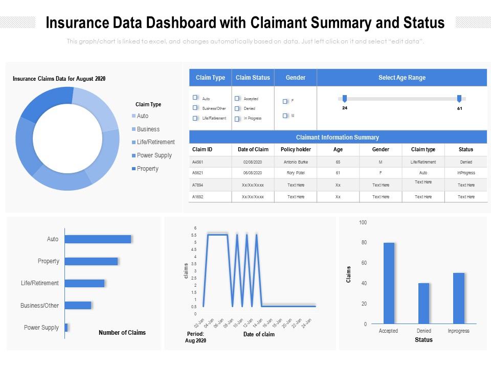
Template 4: Insurance Data Dashboard Snapshot with Claimant Summary and Status
This content-ready PPT Template, in the form of a dashboard, solves the problem of a major sector of our financial universe with its focus on insurance. If you are heading an insurance major, this dashboard is just the solution you need for your data analysis pain-point. Sort the total number of claims by type such as power supply, business, auto, health etc. See how claims fluctuate with weather or time, and get status updates as well in the lower half of this presentation template. A claimant information summary is most useful for owners wanting to introduce new insurance products. Download now!
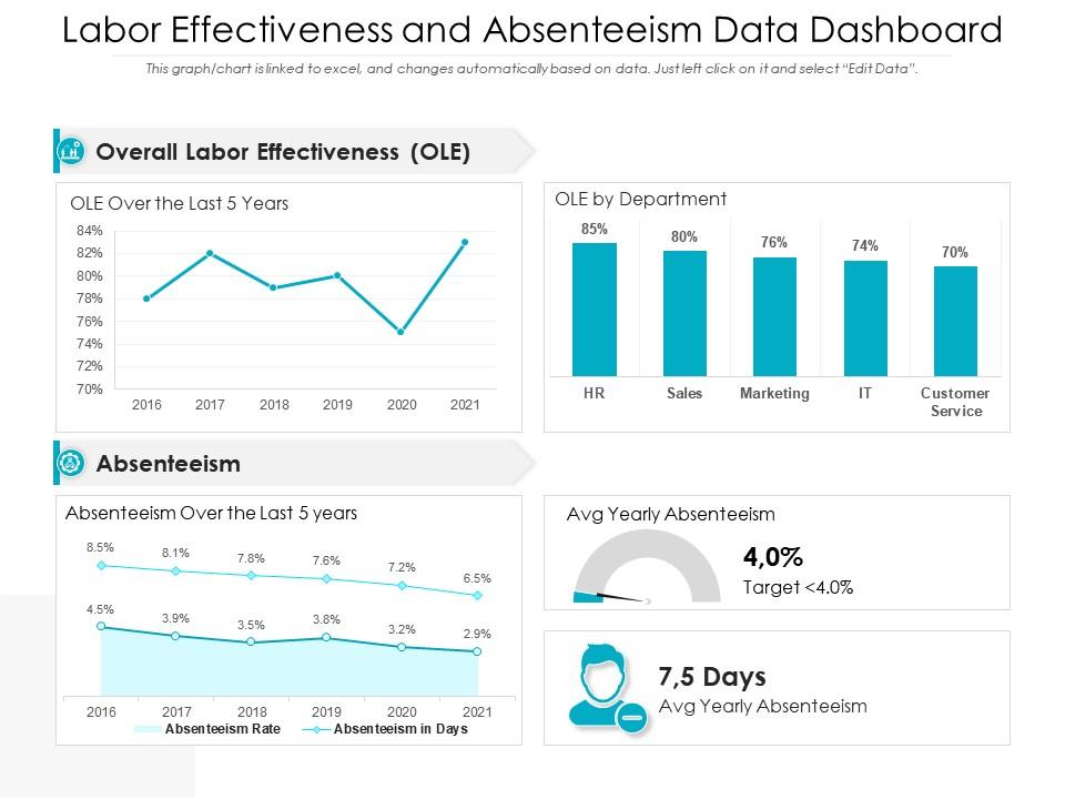
Template 5: Labor Effectiveness and Absenteeism Data Dashboard Snapshot
Display on-screen information about the effectiveness of labor and their absenteeism data through this wonderful, self-explanatory PPT Template. Overall labour effectiveness (OLE) is an important indicator that this informational and operational dashboard captures. The department-wise numbers on this could reveal institutional deficiencies, if any. Absenteeism is also captured. Get better forecasting power and real-time analytics through this simple idea of a dashboard that helps you measure the performance of your labour contractor or the hiring practices that your business or the industry follows. Data transparency and accessibility is a key principle that this dashboard provides, The ability it gives in terms of responding with agility to an imminent labour crisis is just invaluable. Download now!
***
Handsome dashboards
The beauty of a dashboard lies in its ability to convey 1,000 words of a business analyst in just that one graphic or image. It saves time, money and effort of businesses. Even more useful are business intelligence dashboards, enables executives to understand data and insights for themselves, even if they are not data experts or statisticians. Find the best-in-class business dashboards here.
P.S. : Dashboards can also function as department-wise sentinels, if you run a huge business. Get our specialized dashboards on employee separation dashboards here.
FAQs on Data Dashboards
What are some examples of data dashboards?
Data dashboards are considered innovations as these provide room for innovative decision-making. Some examples of data dashboards are information that gives you an idea of the attrition rate in your company, for instance. Technically, if course, it is of many types under the four broad categories of operational, analytical, strategical and information. Other examples of its are management KPI dashboard; IT project management dashboard; employee separation dashboards and so on.
What should be on a data dashboard?
A data dashboard ought to have certain kinds of information with clear, decisive and tangible link to decisions. To this end, a good data dashboard includes information in terms of the Key Performance Indicators (KPIs), other metrics that are relevant to be business. The aim is to make sure you capture all relevant data on a single, visually attractive dashboard. A dashboard is liked and is in vogie only because it takes experts to design and give the figures that make senses. The format is important as well; hence, good design and aesthetics is also a key input that goes into data dashboards.
What kind of analytics is data dashboard?
Dashboards are, for the major part, quantitative, interactive tools for decision making in business. It analysis real-time information as the data can be keyed in daily. Most charts on the dashboard are excel-linked and your data can be represented visually with just a single click. What is also important is that even as the dashboard is such a powerful tool, it be used with caution for major, big-ticket decision. Reality and dashboards are always aligned, but there is no harm for business owners in checking the ground reality for quality as well. Remember, decision analytics is a growing field and dashboards are a must for that.
How to create a data dashboard?
As is the norm, before businesses embark on a data dashboard design and framework, it will pay bigtime to consider your target audience. Most times, this will be top management or heads of major department is large companies. Then, it is critical to check the data; after this, be sure that you filter information correctly and have the knowledge of relevant statistical tools to really give the data some shape. For instance, the knowledge of concepts like standard deviation, correlation helps in dashboard creation from scratch. Once all these issues are sorted out, you can move on to actual creation of a dashboard. Remember, linking a dashboard to excel is the smartest thing you can do in this context. If data is dated, a dashboard becomes useless.