

 Customer Reviews
If a single picture is worth a thousand words, visual data is at least worth a million, perhaps even more than that.
Humans are visual creatures. A piece of visual information is processed approx 60, 000 times faster by them than any form of text. Yes, you heard it right, 60, 000 times faster and that too in a matter of seconds! The wonders of the human brain are definitely unknown and unexplored and so is the buzzword- “BIG DATA”.
Big Data is indeed a Buzzword but it is one that is frankly under-hyped- Ginni Rometty
In this modern age, folks are often swamped with quintals of data thrown at them every day. Enter the unexplored phenomenon of data visualization popularly known as the “big data”-the ability to condense, interpret and share the particular data to make an impact. It is a promise made to mankind to transform every part of their lives ranging from health crisis to the effects of color on mood.
Hence David McCandless quoted Data is the new oil? No, data is the new soil.
But what exactly does data visualization do?
At its core, data visualization helps to visually represent data and statistics in a way that it is more understandable at-a-glance. You could write an entire article on the evolution of Facebook from being a social network of universities to becoming the powerhouse of global social networking or you could visually represent it just as Lee Byron from the Facebook data team did. This data showed “The Road to 200 million users” on Facebook.
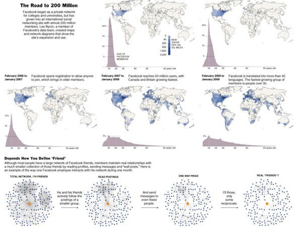
As you can see, rather than a written article, Lee Byron illustrated the road to 200 million users on Facebook with a visual representation. This is data visualization in a nutshell!
Unfortunately, a majority of people think that slapping a few charts together means creating a good data visualization design. However, this should not be the case.
There are a few simple things and tweaks you can do to massively enhance the overall look and feel of your data and also the way the human brain interprets it. These small tweaks here and there can make a world of a difference to your otherwise boring data and even save your credibility.
So, if you are ready to make these tweaks, here are a few tips and tricks to help you present your data beautifully and give it the much needed WOW factor!
1. Narrate a tale
Storytelling is nothing but data with a soul- Dr. Brene Brown
An effective data visualization not only presents data in an impressive manner but also narrates a powerful story worth telling. Data is just a collection of numbers and stats slapped together until turned into a narrative providing insights into what happened, why it is important and how you can use it to turn it into something practical. Showing dashboards and reports can be quite overwhelming for the viewer and so here is an example that tells the story of the evolution of amazon. By distilling information and presenting it in the form of a comprehensible visual format, this roadmap dramatically highlights the milestones and achievements of Amazon throughout the years, that should not go unnoticed.

Download this Roadmap PPT Design Templates
If a scale is your best buddy to convey a tale then this example might interest you- The scale showing the sales volume of a company:

Download this Measure Strength With Meter Image Graphics For PowerPoint
2. Spice it up with various combinations of data
Variety is the spice of life! So, why settle for a single chart when you can spice it up with a mixture of them, right? This is especially true when you are looking for ways to present your data in an attention-grabbing way.
So, don’t be afraid to combine various charts and graphs to add that wow factor to your data. The result will be a beautiful data enriched with the visualization factor that is very engaging and intriguing to the audience.
This dashboard image, for example, shows the digital analytics of a company:

Download this Dashboard PPT Diagram
With a combination of various charts and graphs like pie charts, line charts, and bar graphs, this dashboard helps in showing as well as interpreting the online stats of a company very easily. At a single glance, the authoritative person can understand their online marketing efforts, whether they are yielding results or not. Also, the interesting color scheme of pinks, blues and purples, which has been tweaked a bit gives it a very modern approach without being too busy and difficult to understand.
3. Iconize to Emphasize
Icons are a perfect medium for attracting the eye while scanning through a page, image or any other important document. They grab the immediate attention of the viewer. If there are specific data points that you want the reader to ponder upon and understand, place an icon beside it to make it much more noticeable and attention-grabbing. You can also pair the icons with headers to convey the message of the beginning of a new section to avoid any confusion.
The following pie charts with icons inside makes it much more easy to understand that Facebook is the most popular and accessible online platform among others.
Have a look at it:

4. Overlay data onto beautiful images
A super cool way to visualize your data is to find the images that perfectly match the topic of your stats and overlay your data onto them to create something interesting and out-of-the-box! This will immediately get hold of the audience, cue them into what you are trying to convey, help them memorize it- and of course, make it look great and absolutely stunning!
Look at this example. The theme of the slide is Chocolate Ice-Cream lovers, so the data is presented over the various sizes of ice-cream sticks in the background.
Isn’t it lip-smacking?
The image is very cleverly used as it is talking about the ice cream lovers according to age group. Which age group favors chocolate ice-cream over others is clearly shown in the image which ticks all the right boxes for us!
Of course, creating such slides can take a bit of an extra effort. You have to browse through hundreds of images to find the perfect one, lay your data onto it and take care of the other factors that go into creating that perfect data interpretation. Apart from being relevant, it has to be high quality, having just the right space to put your data, with enough white space and not too busy so that it does not distract the viewer from the important information to be conveyed.
I know it is quite a big list of demands! But the end result though is totally worth it! If you manage to pull it off, just like we did, you can create an awesome and engaging design with a visual cue sitting right in the background.

5. Pick popping colors
The easiest way to grab the attention of the viewers is to use popping colors in your design. So, make that pop with a dark backdrop!
Use light colors on a dark background to make them stand out. Consider the mood you want to convey and pick popping colors on its basis to reflect the overall mood, just like we have done in this world map showing the Global Peace Index.

Download this World Map Of The Continents Different Colors
The color scheme used is very bright - perfect to grab the attention of the viewer.
If you are still not quite in for the idea of using popping colors to emphasize your point, well here is another example:

Download this Scatter Bubble Chart Presentation Ideas
Rather than going for the traditional and old fashioned pie charts, we have used a bubble chart with a striking color scheme to present sports data. This bubble chart shows the number of championships won by teams of various sports in South Carolina. Presenting data of the players of various sports and their wins in the form of a table can be quite overwhelming. So, we have created a bubble chart to help you interpret the data very easily and conveniently.
Check out this example of heatmap as well to get more ideas on using popping colors to make your slide more attractive:

Download this Heatmap Visualization
6. Show how parts sum up to make a whole
Usually, it is quite difficult to break a topic into parts and present it in a way that they look like a whole. But worry not, conventional pie charts can be used for this purpose.
With little designing skills and a lot of creativity you can create something like the balanced diet food plate that we have created. Using a pie chart as a base we have created something that diet-conscious people and dieticians will absolutely love! Showing the portion of fats, carbs, meat, dairy, and proteins on a food plate unlike the conventional charts and graphs, it is a sigh of relief for anybody looking to present their data visually!

Download this Balance Diet Food PowerPoint Templates
If your love for the conventional pie charts has still not ended, we have another gem to convince you.
A pie chart in the form of a table showing ratios of various shareholders. Isn’t it amazing? And the interesting color scheme makes it all the more better and convincing!

Download this Pie Chart PowerPoint Slides
7. Focus on one and only one amazing statistic at a time
If you are designing a presentation and wish to display your data, cramming in too many percentages and visuals is definitely not an option. It will make the slide look too busy and won’t even help the viewer understand the main element. So, make one statistic and one number the focus of your slide just as we have done in this slide showing digital transformation:

Download this Bulb showing Innovation PPT
The finance sector has evolved the most among other sectors which is quite evident in this slide. By increasing the size of the last bulb and giving it an altogether different color, the main sector is highlighted very clearly in the slide, helping the viewer interpret the data easily.
8. Accord fly-out graphics effect
Another popular trick to help you present your data in an enticing way is by adding fly-out graphics. You can really make your main statistics pop by changing the color of other non-important elements like a dull, neutral color or simply giving it an outline similar to what we have done in this slide.
Tip- Any bland and dull color from the color palette is a really good choice.

Download this Pie Chart PPT Slide
The minimalist design with a highlighted yellow portion in this slide gives it a very aesthetic appeal along with showing the highest percentage of women entrepreneurs. There is also no data shown inside the chart itself, but instead, it is shown outside with white font. The minimalist color scheme really complements this slide.
9. Avoid halts by skipping defaults
Sure PowerPoint default charts are very easy to insert, but they are also boring as hell! And you are definitely better than that. So, “think out of the box”. We know that the phrase “outside the box” is an overexaggerated and overused buzzword but it surely deserves its due in presenting data visually!
Before you go running for searching and inserting the standard bar chart, pie charts and others, conduct a little brainstorming session to think about some potential ideas to make your data look UNIQUE.
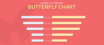
Take a look at our example. Notice how instead of the default bar chart we have created a butterfly chart with an abstract image of a butterfly in the background. Male and female ratio can be shown with a standard bar graph as well, but see how presenting it in the form of a butterfly chart makes it look a lot cooler than what it is!
So, “GO ALL OUT OR GO HOME”!

Download this Butterfly Chart PPT Design
To learn how to create a butterfly chart go through this blog- How to Create a Butterfly Chart (Tornado Chart) in PowerPoint
Take a look at another example of NO defaults:

Download this Percentage Chart For People Growth Powerpoint Slides
Is it a bar graph? No, I don’t think so! But it still shows the various types of child employment such as paid, unpaid, self and not defined, with unpaid labor being the most common among them.
Have a look at this example too:

Download this Data Visualization In Human Form
You can see in this slide, rather than using bar charts and other default charts, we have shown data in the form of a colored silhouette making it much more appealing to the eye. This is a very fun way to show your data.
So experiment with unique styles, colors, and images to keep your data interesting!
10. Choose an effective data visualization chart
One of the keys to skillfully visualize your data is matching your data-set with the most suitable chart set. You want your data to be simple, easy to understand and digestible in which choosing the right chart set plays a very important role. That’s because selecting the wrong form of visual aid can cause confusion or lead to mistaken data interpretation that you do not want.
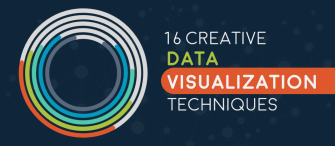
To understand the “chart psyche” and provide the right canvas for analysis go through our blog on Data Sucks, Says Who? 16 Creative Data Visualization Techniques to Showcase Your Numbers.
Going the extra mile and embracing these data visualization rules is what separates the veterans from the rookies. Hopefully, after going through these 10 rules you will love data visualization, as much as we do!
Would you follow these rules to a T? Maybe add your own ideas? Perhaps discover a new rule? Just let me know your thoughts in the comment section below.