


 Customer Reviews
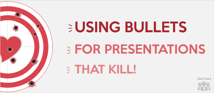
Bullet points are boring. Bullets points are dreadful. Bullet points are unending and long. Bullet points suck.
Bullet points are pretty much one of the most hated things in PowerPoint presentations. That’s unfair. Just like it’s wrong to criticize PowerPoint software for horrendous presentations, it’s equally unfair to blame bullet points for an ugly slide. Bullet points look ugly, nope, slides look ugly when presenters do the following:
- Put TOO MANY bullet points on one slide (some as many as 18 to 20)
- Put ONLY bullet points on a BLANK slide (making it look like a Word document)
- Use long winding sentences in each bullet point rather than just keywords
Now, I could have written the above three points in a paragraph form too. But knowing you would have skimmed through the para, I slowed down your speed and forced you to pay more attention to those three points. Bullet points are absolutely essential when you want to:
- Highlight the key takeaways of an event
- Summarise the main points of a lengthy piece of information
- Show the order or steps of a process
- Club several points under one slide (1 message per slide doesn’t work in your case)
You’re probably still not convinced. You might be having flashbacks of nightmarish presentations partly or totally caused by bullet points. So, let me show you how you can use bullet points in your presentation without killing people, using some before and after examples:
Four Simple Ways to Make Bullet Points Look Spectacular
1. Use a relevant visual in the background
Obvious though it might sound, for some strange reason presenters continue to shun the power of visuals. Here’s a slide that is still being made by millions of presenters (audience will vouch for that):

With slides like these, let the snoring begin! The presenter minimized casualties by going for a good contrast but it still won’t save the day. It takes only a few seconds to fix this slide: just pick an appropriate visual and let it set the context for your bullet points. Like this:

The visual in the above slide not just adds professional as well as cool value to your business but also makes audiences excited to know your approach. You can use simple appear animation for each bullet point so that your audience does not race to the last point while you are still on first.
The above example employed an image that had plenty of free space to place your bullet points. If you find a good image with less space available to type your text, you can always take a square or rectangular box, place your bullet points inside it, and increase the transparency level of the box so that the words are readable while the image is not totally blocked off too.
Here’s a slide from tourism presentation that does not deserve any justification whatsoever for being so boring.

There’s no dearth of free images on the web for tourism industry. So we picked up one and put all the content in a rectangular box adding little transparency to it.

Won’t this slide lead to more viewer engagement than the first?
If you are wondering, “That’s all ok. But I am making a presentation on Kant’s philosophy and I can’t find any suitable image to go with it”, then this is where you need to employ the second technique.
2. Use a Textured Background
Whether it’s an earthy look you wish to give to your presentation, a philosophical one, or a postmodern one, textured backgrounds can completely transform your slides. The brightening and dulling of shades adds mysterious value to the slide, sets the context and raises curiosity of the viewer. A black and white or green and white textured background signifying the blackboard can be safely used for any educational presentation.
PowerPoint has many default textured backgrounds which you can try for your slides. Simply right click on the blank slide, click Format Background, select the Picture or texture fill radio button, and choose the desired texture from the options available.

You can also create your own textured backgrounds. Let’s try a slide makeover again. Here’s a slide using just one tone of color (again very commonly seen slides):

And this is how the slide looks with one of the PowerPoint textures filling the background:

3. Use an Interesting Theme
Noticed a range of themes and templates on your screen when you open PowerPoint? In a hurry, we usually tend to click the first option which is the 'Blank Presentation'. If you look down below, PowerPoint 2013 gives you an array of exciting themes designed using beautiful textures and shapes.

Let’s take the same ‘population structure’ slide and pick one theme let’s say Ion theme, use a sobre yet attractive font (Century Gothic in this case), add a little drama to the points by putting them under rectangular boxes, give the text boxes a dotted outline and that’s it...you get a far superior slide than you started with:

A stunning theme does half your work of capturing audience attention. Don’t lose out on that by burying the entire backgrounds under piles and piles of text. You can also use our awesome collection of free PowerPoint templates, themes and backgrounds to create eye-catchy slides!
4. Use Icons in place of Bullet Points
What do you see when you launch iTunes? The music note symbol (icon), right. Icons are graphical representation of an idea, concept or action. Audiences take seconds in identifying the idea or object you are referring to. Words become redundant when icons are present. They also add color to your otherwise grey slide and adds value to your message. What more do you need?
Let’s take a slide full of points and subpoints and spice it up with icons instead. Here’s the before:

And here’s the after designed using one icon each for the main bullet points and dividing it into three neat sections (Download free icons for your PPT slides):

Learn more ways to use icons to transform mind-numbing slides into sexy ones.
So, after reading this article do you still think PowerPoint bullets kill people? On the contrary, you can now use bullets to create KILLER presentations!
If you still feel stuck up with a horrible slide and need help of a Professional PowerPoint Design Agency, we are a click away!
Takeaway: Content and Design needs to be balanced out. You don’t need to forsake bullet points just to have a pretty slide. But you can’t simply copy, paste all your content on to slides; it’s better to go with Microsoft Word then. PowerPoint is a visual supplement to your textual content; let it stay that way.
There must be more ways to create magic without sacrificing bullet points. We’re dying to know! Share with us in the comments below.


Senta pereira