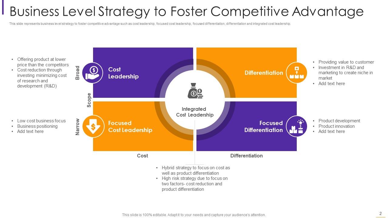
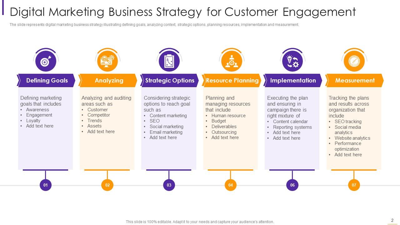
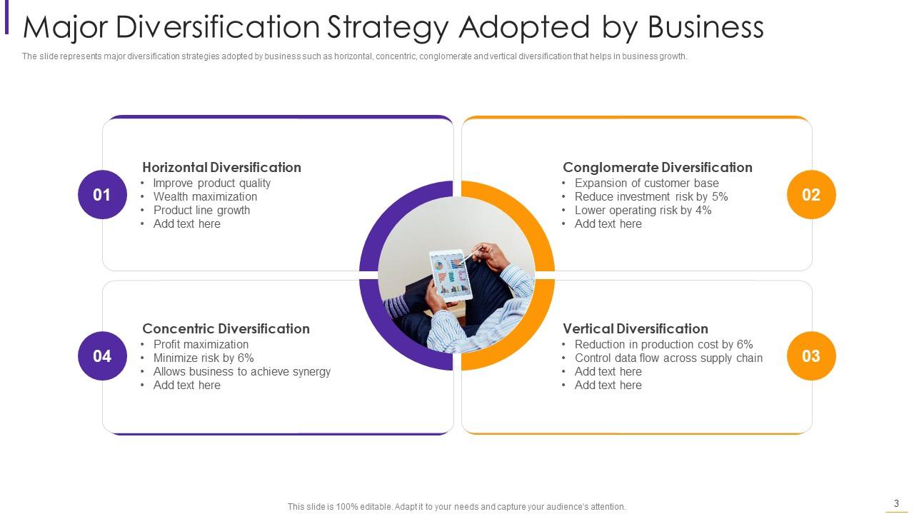
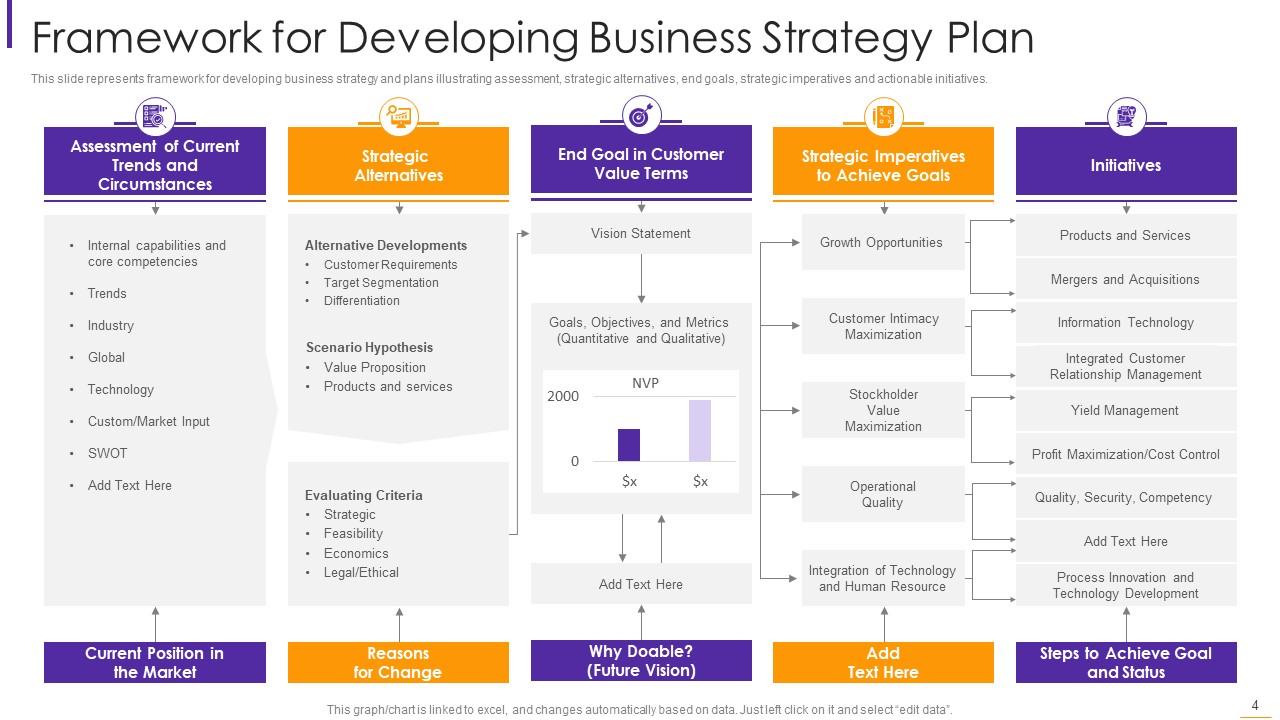
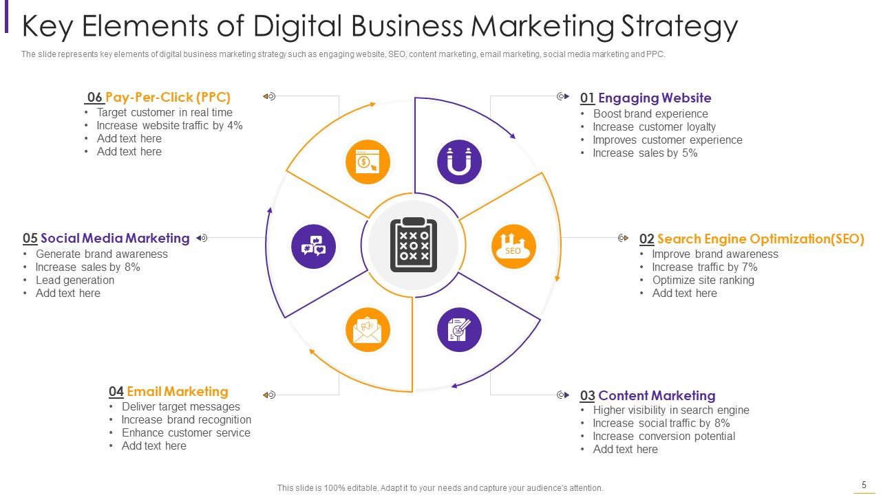
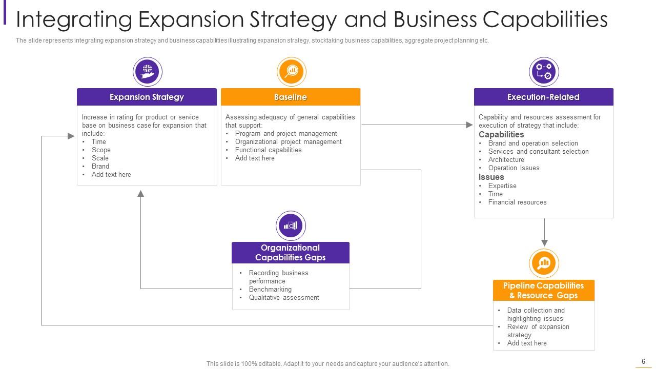
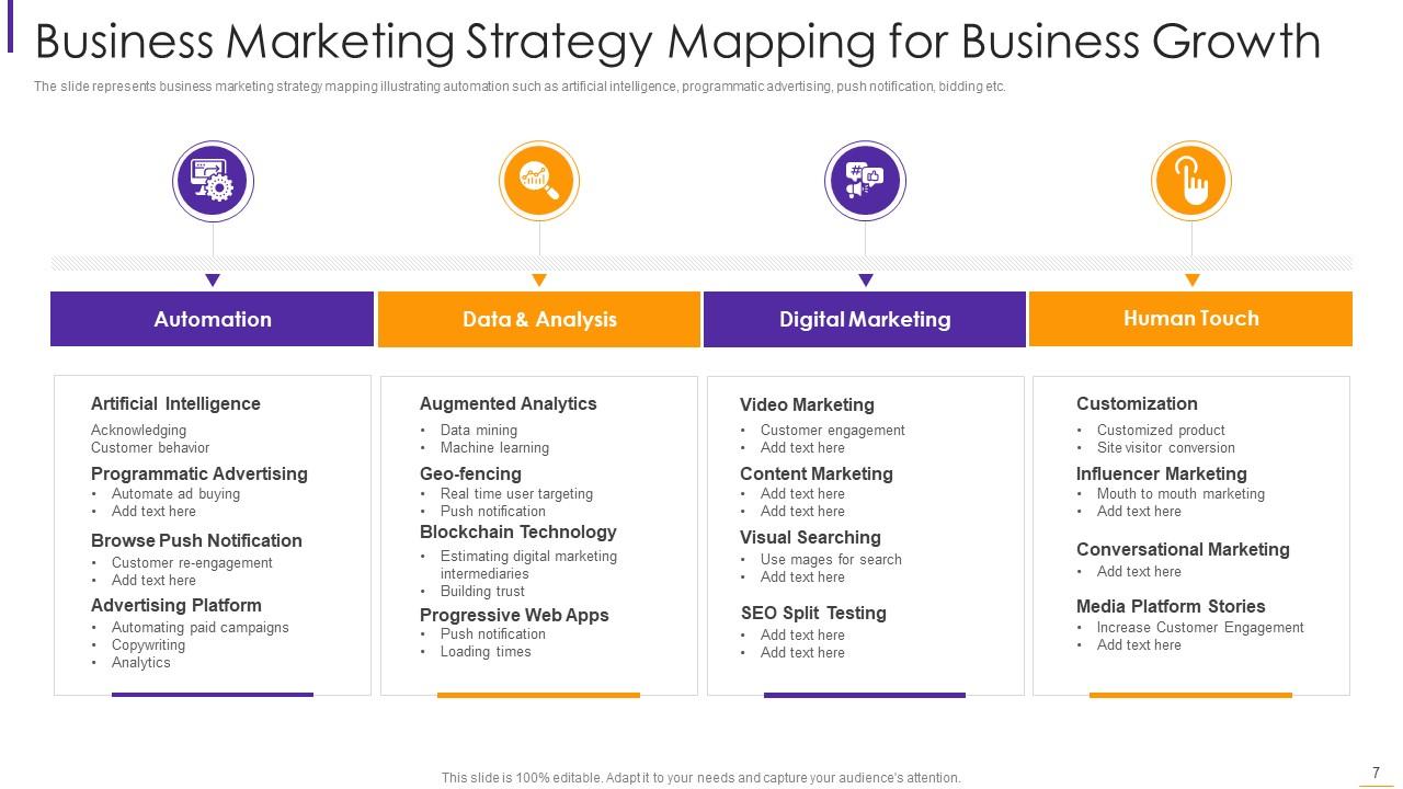
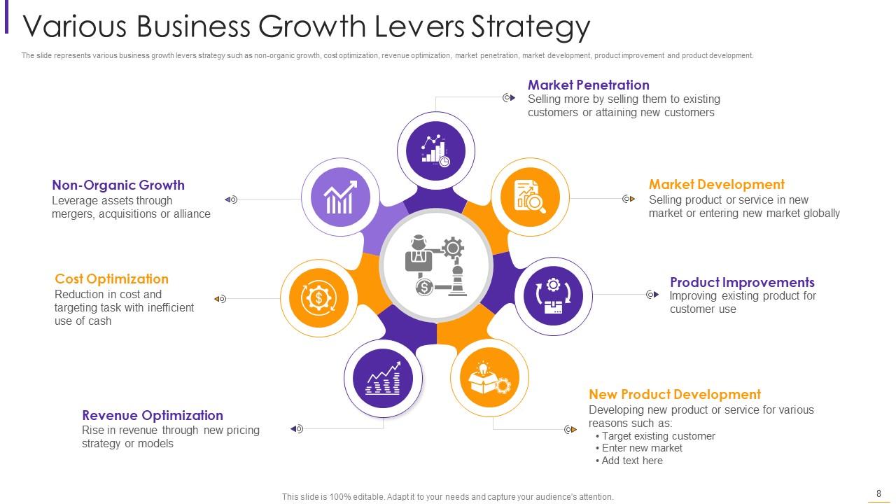
Business strategy powerpoint ppt template bundles
Try Before you Buy Download Free Sample Product
Audience
Editable
of Time
Our Business Strategy Powerpoint Ppt Template Bundles are topically designed to provide an attractive backdrop to any subject. Use them to look like a presentation pro.
People who downloaded this PowerPoint presentation also viewed the following :
Business strategy powerpoint ppt template bundles with all 19 slides:
Use our Business Strategy Powerpoint Ppt Template Bundles to effectively help you save your valuable time. They are readymade to fit into any presentation structure.
FAQs for Business strategy powerpoint
Look for templates with clean slides that break complex stuff into bite-sized pieces - executive summary, SWOT analysis, strategic goals, timelines. Visual elements are huge here. Flowcharts, matrices, infographics - anything to avoid text walls because honestly those kill presentations. You'll need market analysis and financial projection slides too. Oh, and competitive positioning is pretty crucial. Keep formatting consistent with lots of white space so people can actually follow what you're saying. Templates with built-in frameworks work best - you just dump your data in and you're basically done.
Honestly, good templates make a huge difference. People judge your ideas based on how polished everything looks - kinda shallow but true. Clean slides help your audience actually focus on what you're saying instead of getting distracted by messy layouts. You'll want something that matches your company's vibe and then just stick with it across all slides. Makes the whole thing flow better. I mean, you wouldn't show up to a big meeting in wrinkled clothes, right? Same logic applies here. Trust me, consistent formatting keeps people engaged way longer than random fonts and colors everywhere.
Look for bundles with matching fonts and colors across slides - consistency is everything. Make sure they actually have the frameworks you use, like SWOT charts or timeline templates. So many look gorgeous but are completely useless in real meetings. Check that the graphs are editable, not just pretty pictures you can't change. Multiple slide layouts help too, plus good icon collections. I'd preview a few slides first though - you want something that actually matches your company's style, not just whatever looks trendy. Trust me, I've bought template packs that sat unused because they didn't fit our vibe at all.
Yeah, your industry totally matters for template choice. Tech ones are all about innovation metrics and user funnels. Manufacturing focuses on supply chain stuff and cost cutting - way more practical. Healthcare? Everything's about compliance because regulations are insane there. Financial templates lean heavy into risk matrices. The thing is, each industry has its own visual language too. Colors that work, KPIs that actually matter to your audience. I'd honestly just pick something that already matches your field's vibe. Saves you from spending forever tweaking things that should've been right from the start.
Dude, get the template bundle - it'll save you so much time. Pre-made slides for SWOT analysis, competitive stuff, roadmaps, all that. Super clutch when you're panicking before a big meeting (been there). Your presentations will look way more professional and consistent too. Oh, and you can match your company colors easily. I always keep like 3-4 customized slides ready to go. Honestly one of the better investments I've made for work stuff.
Honestly, PowerPoint's data viz features are a game changer for making spreadsheets actually readable. Instead of bombarding people with raw numbers, you can throw together charts and graphs that show trends instantly. I swear, nothing kills a meeting faster than someone reading off Excel cells for ten minutes straight. Bar charts work great for comparisons, and trend lines are perfect for showing progress over time. Your audience will actually retain the information instead of zoning out. Trust me, even basic visuals make you look way more put-together than just dumping data on slides.
Stop using the same slide layout over and over - that's what kills presentations. Mix it up with data viz slides, storytelling bits, maybe throw in a poll or two. Template bundles are honestly clutch here since you get tons of variety. Don't just use their default colors though, make it actually match your brand. I'm big on keeping slides super visual with barely any text. Each slide needs a clear takeaway too. Oh, and pick templates that naturally guide you through a story instead of just... I dunno, bullet point dumps that put everyone to sleep.

Honestly, don't underestimate how much colors and fonts matter for keeping people hooked. Blues make you seem trustworthy, greens suggest growth - that psychology stuff actually works. Your font choice screams either "we're cutting-edge" or "we've been around forever." Good color schemes help guide people through your logic instead of confusing them. Consistent typography makes you look like you have your shit together rather than scrambling at the last minute. Though let's be real, we've all been there with the late-night formatting panic. Just match your company's brand colors and pick fonts readable from the cheap seats.
Templates are honestly a lifesaver because they already have different sections built for different audiences. Executive summary for the bosses, detailed numbers for investors, timelines for your actual team doing the work. Just pick what you need based on who's sitting there. No more staring at blank slides wondering where to even start (ugh, the worst). The flow's already mapped out, so you just swap in your content instead of building the whole thing from scratch. Get a good template bundle and delete whatever doesn't fit. Way easier than reinventing the wheel every time.
First thing - change the colors and fonts to match your brand. Makes everything look way more professional. Most templates have like 20 slides when you probably need 8, so cut the fluff. Rearrange everything so it tells YOUR story instead of following their generic flow. Replace all that fake data with your real numbers and case studies. That's honestly where most people mess up - they just fill in the blanks instead of actually reshaping the whole thing. The goal is making it feel authentic to what you're doing, not like you downloaded something and slapped your logo on it. What makes your strategy different? Lead with that.
Dude, stop dumping raw data on people - wrap it in a story instead. Your brain actually remembers narratives way better than random bullet points, which honestly makes total sense when you think about it. Structure your deck like: problem → journey → solution. Give it a proper beginning, middle, end. Charts are fine but they need context to stick. People stay way more engaged when they can follow along with "here's our mess, here's how we fix it, here's where we end up." Trust me, your next presentation will hit different when you frame it like that.
Don't stuff every slide with text just because there's room - honestly, PowerPoint seems designed to make people do this. Pick something that actually matches your company's vibe and how formal your audience is. Those super fancy templates with all the bells and whistles? They'll just pull focus from what you're trying to say. I always mess with the colors and fonts so it doesn't look like I grabbed the first Google result. Oh, and definitely check how it looks projected - some fonts are impossible to read from the back row. Go for function first, then worry about making it pretty.
Honestly, most people just slap visuals everywhere and call it good - don't do that. Put your charts and videos right where people need to make decisions, not as random decoration. I'd use subtle animations to reveal data bit by bit so your audience can actually process it. Short audio clips work great too, like quick testimonials or whatever. The key is making sure every single thing moves your story forward. Oh, and those cheesy slide transitions? Skip them. You want people focused on your message, not distracted by spinning graphics that add zero value to what you're saying.
So there's this massive move toward super clean, minimalist stuff right now - bold fonts with data viz that actually makes sense. Thank god, because those old cluttered slides were painful. Interactive elements are pretty much expected now, and modular layouts mean you don't have to rebuild everything from zero each time. Dark mode templates are huge too. Oh, and there's finally attention being paid to accessibility - better contrast, readable fonts, all that. When you're updating your collection, grab ones with solid data visualization built in. The flexibility is worth it.
Check which slides got people asking questions or nodding along - that's your gold right there. When audience members looked confused or zoned out during certain parts, ditch whatever template style caused that mess. I've watched so many beautiful strategy decks completely bomb because nobody could actually follow them! Comments about readability and flow are huge. Build your template collection around the design elements that worked, not whatever's trending on design blogs right now. You want slides that actually communicate, not just pretty ones that leave everyone scratching their heads.
-
Great designs, Easily Editable.
-
Awesomely designed templates, Easy to understand.