13017091 style essentials 2 financials 8 piece powerpoint presentation diagram infographic slide
Pareto chart picture PowerPoint template is the perfect tool to illustrate the efficiency of the organization. When a manager performs a Pareto analysis, he or she would have to make a list of the issues in the organization. After analyzing he can arrange these problems as well as the causes as per the most severe to the least. With the help of Pareto chart visual representation template, a user can illustrate all the problems and later, start the planning. The team leader can ask his team to focus on the issues that he ranks as the highest or first on the list. You can use this Pareto efficiency chart introduction slide when you are thinking about problem resolution. Apart from the problems, a presenter can also focus on the problem causes. By doing so, he will be able to resolve them in a better way. With the help of graphical Pareto chart introduction PowerPoint template can help a user to discuss how they can improve the efficiency of an organization. As the company can function better when the employees establish the root causes of the problem and to explain such strategies the Pareto distribution graphical chart template is a boon for the presenter. A user can discuss the count of defects and the count can get changed by changing the values of an Excel sheet. Deliberate on how to handle climate change with our Pareto Chart Ppt Pictures Example Introduction. Be able to elaborate on green growth.
- Google Slides is a new FREE Presentation software from Google.
- All our content is 100% compatible with Google Slides.
- Just download our designs, and upload them to Google Slides and they will work automatically.
- Amaze your audience with SlideTeam and Google Slides.
-
Want Changes to This PPT Slide? Check out our Presentation Design Services
- WideScreen Aspect ratio is becoming a very popular format. When you download this product, the downloaded ZIP will contain this product in both standard and widescreen format.
-

- Some older products that we have may only be in standard format, but they can easily be converted to widescreen.
- To do this, please open the SlideTeam product in Powerpoint, and go to
- Design ( On the top bar) -> Page Setup -> and select "On-screen Show (16:9)” in the drop down for "Slides Sized for".
- The slide or theme will change to widescreen, and all graphics will adjust automatically. You can similarly convert our content to any other desired screen aspect ratio.
Compatible With Google Slides

Get This In WideScreen
You must be logged in to download this presentation.
PowerPoint presentation slides
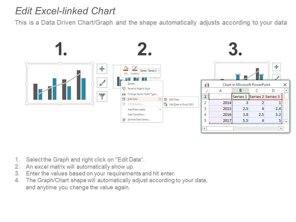
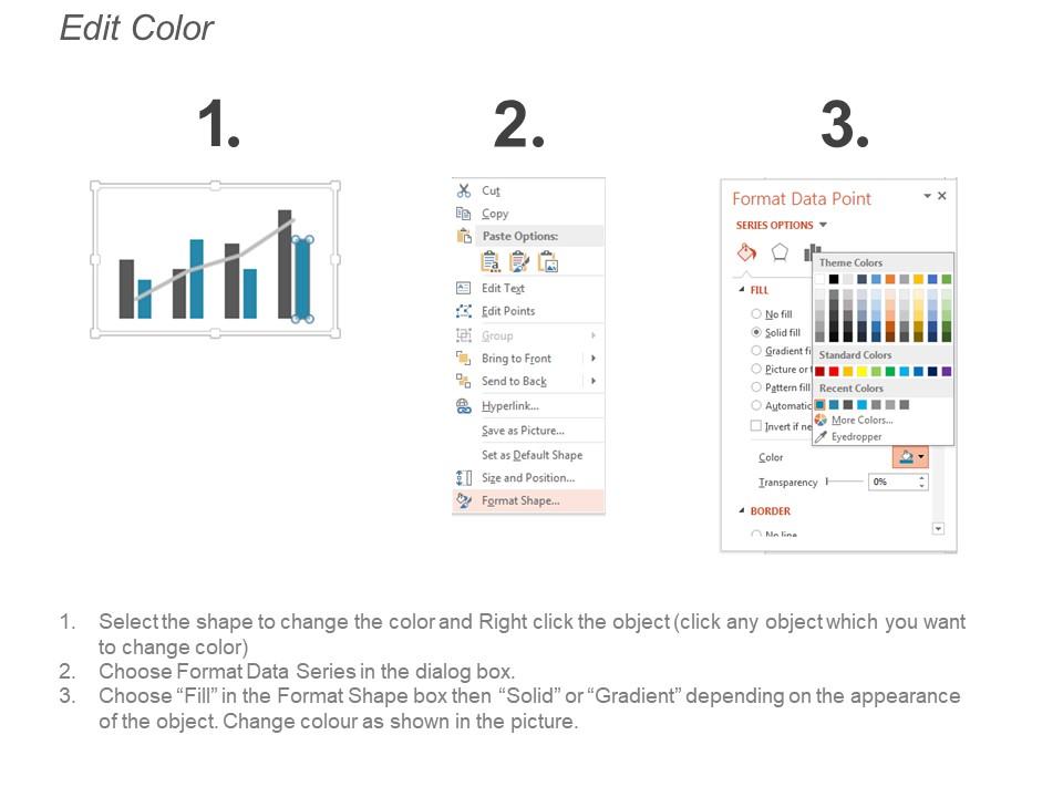
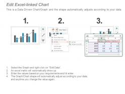
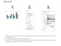
Presenting Pareto chart PPT pictures example introduction PPT slide. The Pareto chart picture PowerPoint slide designed professionally by the team of SlideTeam and it is useful for illustrating the count of defects. The Pareto chart introduction template is the data driven template and can edit the count as the Pareto style slide gets linked with the Excel sheet. The graphical Pareto chart picture PPT slide is customizable in PowerPoint and compatible with Google Slide. A presenter can make changes in the visual Pareto chart picture template such as font size, font type, color and dimensions of the charts.
Content of this Powerpoint Presentation
Description:
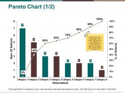
The image presents a Pareto Chart, which is a type of graph that represents the frequency of defects in different categories, alongside a cumulative percentage line that helps to identify the most significant contributing factors to a problem. The chart is composed of several text elements:
1. The Title "Pareto Chart (1/2)" indicates this is the first part of a two-slide presentation or analysis.
2. The vertical axis labeled "Num Of Defects" measures the number of defects in each category.
3. The horizontal axis titled "Observations" represents eight different categories of defects.
4. Bars of varying heights represent the number of defects in each category, with Category 1 having the highest count at seven defects, and Category 8 the lowest at one defect.
5. A line graph overlaid on the bar chart represents the cumulative percentage of defects. This line starts at 0% and climbs to 100%, showing the cumulative impact of each defect category.
6. Data labels on the line graph display the cumulative percentage at each increment.
7. The note on the chart reads: "This is one of the most commonly used in ensuring quality standards in the products, Pareto chart would help in indicating the percentage of defects occurring observations. This would help in estimating whether over a time period the defects are reducing or not."
8. The caption at the bottom informs that the graph/chart is linked to Excel and can be updated automatically based on data. Instructions to edit the data are provided.
Use Cases:
The Pareto Chart can be applied in various industries for quality control, process improvement, and strategic decision-making purposes.
1. Manufacturing:
Use: Identifying and prioritizing defect reduction efforts
Presenter: Quality Assurance Manager
Audience: Production Team
2. Healthcare:
Use: Analyzing the frequency of medical errors by category
Presenter: Healthcare Quality Specialist
Audience: Hospital Management
3. Customer Service:
Use: Pinpointing the most common types of customer complaints
Presenter: Customer Service Manager
Audience: Customer Support Representatives
4. Retail:
Use: Assessing the most frequent sources of product returns or complaints
Presenter: Operations Manager
Audience: Store Managers and Staff
5. Information Technology:
Use: Evaluating the most frequent types of software bugs or issues
Presenter: IT Project Manager
Audience: Software Developers and Testers
6. Finance:
Use: Determining the most common causes of transactional errors
Presenter: Compliance Officer
Audience: Finance Department Staff
7. Logistics & Supply Chain:
Use: Identifying the most prevalent types of shipping or inventory discrepancies
Presenter: Supply Chain Analyst
Audience: Warehouse and Logistics Personnel
13017091 style essentials 2 financials 8 piece powerpoint presentation diagram infographic slide with all 5 slides:
Get to find out what best applies to you with our Pareto Chart Ppt Pictures Example Introduction. Be able to function with freedom.
-
Very unique, user-friendly presentation interface.
-
Nice and innovative design.


