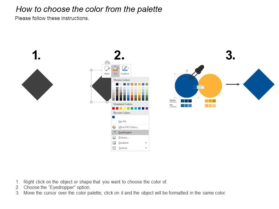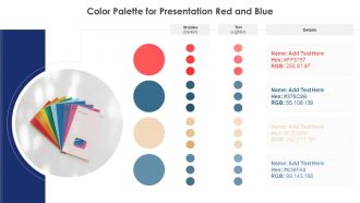
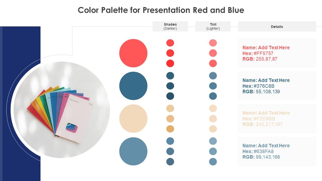
Color palette for presentation red and grey
Try Before you Buy Download Free Sample Product
Audience
Editable
of Time
Our Color Palette For Presentation Red And Grey will get your business to bloom. They act like an excellent fertilizer.
People who downloaded this PowerPoint presentation also viewed the following :
Color palette for presentation red and grey with all 2 slides:
Folks believe they will gain by following your advice due to our Color Palette For Presentation Red And Grey. They will always heed your inputs.
FAQs for Color palette for presentation
Oh totally! Colors mess with people's heads more than you'd think. Blue builds trust - that's why literally every boring corporate deck uses it. Red screams "pay attention!" but can feel aggressive. Green = growth and balance, yellow energizes (though it'll hurt your eyes if you overdo it). Purple feels fancy or creative. Here's the thing - warm colors like red and orange get people hyped up, while cool ones like blue and green seem more professional. Just match whatever vibe you're going for with your audience's expectations. Works every time.
Start with one base color, then grab the color wheel. Neighbors on the wheel (analogous colors) give you that calm, pulled-together look. Opposites create way more drama and contrast. The 60-30-10 thing is clutch when you're totally stuck - dominant color takes up 60%, secondary gets 30%, accent color just 10%. Warm colors pump energy while cool ones chill everything out, so think about the vibe first. Oh and definitely test your palette under different lights before you commit! I learned that one the hard way.
Honestly, Adobe Color is probably your best move here - you can pull colors straight from images plus they have pre-made palettes that don't look terrible. Coolors.co is clutch too, just spam the spacebar until something looks decent. If you're already on Canva (and let's be real, everyone is), their palette generator works fine. There's also Colormind which is more design-focused if that's your thing. My usual approach? Start with whatever company colors you have, then use Adobe Color to find stuff that actually goes together. Way easier than trying to wing it.
Look, if people can't read your text against the background, they'll just leave. It's that simple. You want at least a 4.5:1 contrast ratio - WCAG says so and they know their stuff. Strong contrast makes everything way more scannable too. I learned this the hard way when I made white text on light gray once... yikes. Poor contrast honestly pisses people off faster than almost anything else. Here's my go-to test: back away from your screen or squint at it. Can you still read everything? If yes, you're golden.
Dude, colors are way trickier than people think! Red screams prosperity in China but feels super aggressive here in the West. White means purity to us but represents mourning in some cultures - totally backwards, right? You really need to dig into who your audience actually is before picking anything. I learned this the hard way on a project once. Test your palette with real people from those demographics first. What feels trustworthy to one group might signal danger or bad luck to another. It's honestly kind of fascinating how differently we all see the same colors.
Honestly, less is more with presentation colors. I'd go with 2-3 main colors tops, maybe throw in one accent color if you really need it. Your main color should take up like 60% of the slides, secondary around 30%. That accent color? Use it super sparingly - just for highlighting important stuff or key numbers. Don't underestimate white space either. You don't have to color everything! Just make sure there's good contrast so people can actually read your text, especially since everyone's looking at different screens these days. Oh, and definitely test it out on a couple slides first before you go crazy with the whole deck.
Think of your color palette as the mood ring of your presentation. Warm colors like reds and oranges scream urgency - perfect for that "we need to act NOW" vibe. Blues and greens? Way more chill and trustworthy. Here's what drives me nuts though - people pick colors that totally fight their message! You'll want consistency too. Start dark and dramatic when presenting the problem, then gradually brighten things up as you reveal solutions. Honestly, I always map out my color story before touching any slides. Makes everything flow so much better.
Honestly, monochromatic schemes are great for that clean, put-together vibe. Your audience won't get distracted by wild color combos. But here's the thing - they can look super boring if you're not careful. I've definitely sat through some presentations that felt way too sterile, like a doctor's office or something. The trick is using different shades of your main color to create some visual interest. Maybe 3-4 variations? That way you keep everything cohesive but don't put people to sleep. When it works, it makes you look like you really know what you're doing.
Color trends usually flip every 2-3 years - cultural shifts, new tech, platform updates all play a part. I always check Dribbble and Behance for what's coming next. Pantone does those yearly reports too, though honestly? Just watch what big brands are doing since they throw crazy money at trend research. Instagram's probably your best bet for catching stuff early. Don't overhaul everything at once though, that's exhausting. Try swapping one accent color in your next deck and see if it feels right. Pinterest's decent for this too, forgot to mention that earlier.
Honestly, bright colors can be awesome for grabbing attention, but I've sat through way too many presentations with neon slides that literally made my eyes water. For corporate stuff or longer presentations, you're better off with muted colors - they look more professional and won't distract people from actually listening to you. That said, if you're sharing exciting news or want to pump up the room, brighter colors totally work. Oh, and definitely test your colors on different screens first because what looks good on your laptop might look terrible projected on the wall. Trust me on that one.
For stats stuff, go bold - blues, oranges, greens that really pop. Even colorblind people need to read your charts easily. But narratives? Totally different game. Muted, harmonious colors work way better since they create mood without being distracting. I mean, bright red would be weird for a gentle brand story, you know? Short version: ask yourself what you actually need first. Quick data comparison? High contrast. Want people to feel something? Go softer. Match your palette's vibe to what you're trying to do. Honestly, this one thing will save you so much second-guessing later.
Honestly, stick with blues and greens for educational stuff - they're calming and won't distract from your content. Navy text on white is your friend here. Marketing presentations? Go nuts with bold oranges, reds, whatever grabs attention. I once used this awful neon green for a training session and people couldn't focus on anything else lol. Educational slides need simple palettes, maybe 2-3 colors tops so people actually learn something. Marketing can handle more drama since you're trying to get them hyped up. Oh, and definitely check how your slides look from the back of the room first!
Yeah, definitely think about accessibility when picking colors! Around 8% of guys and 0.5% of women can't see certain colors properly. Don't just use red and green to show good vs bad data - that's useless for colorblind people. Pair your colors with icons or labels instead. Oh, and make sure there's enough contrast between text and backgrounds. There are free online contrast checkers (I always forget to use them until it's too late lol). Trust me, it's worth doing this upfront so everyone can actually see what you're presenting.
Honestly, just look at Apple keynotes - they're insanely good at this. Tons of white space, maybe one accent color that matches whatever product they're showing. Jobs was like obsessed with keeping things clean, and it totally works. TED talks do something similar with that red against neutral backgrounds. Oh, and Netflix always uses their red-black-white thing, which is smart branding. Here's what I've learned: pick 2-3 colors max and don't change them. The colors shouldn't fight with what you're actually saying - they're just there to support your content, not steal the show.
Print a few slides in black and white first—if you can't tell elements apart, your colors are too similar. Also check how they look on different screens since projectors will totally butcher your carefully chosen palette (learned this the hard way). I always make a test slide with headers, body text, highlights, all that stuff to see how everything plays together. Have someone look at it for like 5 seconds and ask what jumps out first. Short sentences work better than long ones for this test. If they don't notice what you wanted to emphasize, tweak your colors before you build the whole deck.
-
The Designed Graphic are very professional and classic.
-
Really like the color and design of the presentation.