Customer Feedback Summary Table Edu Ppt
Try Before you Buy Download Free Sample Product
Audience
Editable
of Time
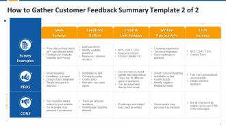
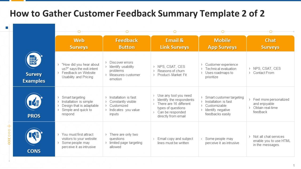
This slide covers methods of collecting customers feedback such as website and web app surveys, feedback widget or button, email embedded and link surveys, mobile app surveys, and chat surveys.
People who downloaded this PowerPoint presentation also viewed the following :
Customer Feedback Summary Table Edu Ppt with all 17 slides:
Use our Customer Feedback Summary Table Edu Ppt to effectively help you save your valuable time. They are readymade to fit into any presentation structure.
FAQs for Customer Feedback Summary
People are obsessed with those pre-built layouts - nobody wants to build slides from scratch anymore. The one-click color changes are huge too. Auto-formatting text when you paste stuff in? Sounds basic but apparently it's a game changer. Charts that update themselves from your data sources get tons of love. Honestly didn't expect collaboration features to be such a big deal, but people rave about multiple editors not screwing things up. Focus on templates with solid layout options and smooth data connections. That's where the money is.
People really like the template designs! Clean layouts and easy navigation get mentioned constantly. Visual appeal scores well too. Mobile customization is where things get messy though - that's the biggest complaint by far. (Why is mobile always such a headache?) Currently sitting at 4.2/5 satisfaction, which isn't bad. The feedback's mostly positive otherwise. I'd definitely tackle that mobile stuff first since it keeps coming up, but honestly the overall trend looks pretty good.
Ugh, honestly the font thing drives people nuts - they can't get their brand fonts to work right. Color matching is a nightmare too. People waste hours trying to get their exact brand colors only to discover we don't support those combinations. Super annoying. Then there's the layout stuff - they want to drag text boxes around or make images bigger but hit our preset limits. Can't tell you how many times someone's lost their work because they couldn't figure out the save function. Maybe a simple FAQ would help?
Customers keep saying our templates are way better value than the competition. They get more customization options plus cleaner designs for the same price. Most people mention how ours look "professional out of the box" while other companies' stuff needs tons of tweaking. Competitor X does have more variety - I'll give them that. But honestly? People see us as the premium choice that's actually worth it. When you're talking to prospects, definitely push the customization features hard. That's what really separates us from everyone else.
So the template feedback is all over the place. People dig our basic stuff - business letters, proposals, meeting agendas work great. But we keep hearing about wanting industry-specific ones, especially for healthcare and legal (nonprofit too, I think?). The creative crowd wants less boring corporate vibes. Everything feels too generic right now, which honestly makes sense. Oh, and this showed up in like 15% of recent surveys, so you should probably loop in the product team. They hate hearing about stuff secondhand.
So basically, your customers are pretty fed up with how samey everything looks right now. They want way more customization - easier color/font swaps, different layouts, industry-specific stuff. Mobile previews are huge too since everyone checks templates on their phone first. The minimalist trend is real - people are over those busy designs you have now. Honestly, I'd tackle the customization tools first since like 70% mentioned it. Those color palette options? Total quick win that everyone's asking for. Oh, and the layout variations thing came up a ton too, so that's probably next on your list.
Oh totally, there's def some clear patterns coming through. Dark mode and minimalist stuff shows up in like 70% of our feedback - no joke. Customizable dashboards are huge too, plus everyone wants better mobile templates. The weird thing? Vintage/retro vibes are super popular with younger users, which I honestly didn't see coming at all. Those monthly feedback reports break it down by user type if you wanna dig deeper. I'd probably tackle the minimalist and dark mode requests first since they're pretty straightforward wins.
Yo, so customers really love these templates - we're getting solid 4.2-4.5 star ratings. The time savings are huge for people, which makes sense because nobody wants to mess with design stuff for hours. Color schemes and layouts get mentioned a lot in reviews. People keep saying they can actually focus on their content instead of fighting with formatting (honestly my favorite part of the feedback). The whole "polished and professional" thing comes up constantly in testimonials. You should definitely bring this up with prospects - it's probably our best selling point right now. Those ratings don't lie!
So I've noticed some pretty clear patterns when I dig into template feedback by demographics. Age is huge - younger users go for clean, minimal stuff while older folks want traditional layouts they can actually navigate. Industry matters a ton too. Creative types obviously love the flashy templates, but anyone in finance or legal? They're sticking with boring conservative options (which honestly makes sense when you think about it). Company size plays in too - startups pick trendy designs but big corporations need formal, brand-safe stuff. Break down your feedback this way and you'll spot trends fast. Then just focus on whatever your biggest user groups actually want.
So people rate our instruction clarity around 4.2/5, which isn't bad. The step-by-step guides work well - especially those visual walkthroughs we rolled out recently. But yeah, we're definitely using too much jargon in technical sections (oops). Users keep asking for more examples on complex stuff too. Video tutorials are doing okay, though some people still want written docs - go figure. Honestly, if you're doing templates, just ditch the fancy language and throw in practical examples. That's what'll actually move the needle on satisfaction scores.
Ugh, same issues every time - shipping delays, crappy product quality, and people getting confused about their bills. Returns and order tracking questions are constantly flooding in too, which honestly isn't surprising since your website makes those processes confusing as hell. Pricing stuff comes up tons, especially when customers can't figure out if there's a sale happening. You'll save your support team so much headache if you just fix the FAQs for shipping and returns first. Those two alone are probably eating up like 60% of their day right now.
Honestly, customer feedback is everything for our template roadmap. We literally grab the most complained-about stuff from reviews and support tickets, then that becomes what we build next. Mobile responsiveness requests? Boom, dev team priority. Template complaints about clunky design? Same deal. The product team sits down monthly to go through all this feedback - it's actually pretty interesting how patterns emerge. What really helps though is when customers get super specific about their needs. Vague feedback doesn't help anyone, but detailed complaints? That's what our designers live for. So yeah, definitely push people to spell out exactly what's bugging them.
So the accessibility feedback's been all over the place. People like the alt text and better color contrast you added. But they're still bugging you about screen reader stuff and want more font size choices. One person said your templates feel "designed for everyone but no one in particular" - brutal but probably true? The cognitive load thing is huge though - too much visual mess makes it impossible for people with ADHD or similar to actually use them. I'd tackle the screen reader problems first since that hits the most users. Oh, and maybe simplify those layouts while you're at it.
So the feedback is pretty clear - people want to see your templates actually being used, not just the empty versions. Video tutorials are huge right now. Before/after examples too. Honestly, the user-generated content idea is genius - let customers show off their finished projects. Makes way more sense than whatever you're doing now. Short version: they can't picture themselves using it successfully. Your marketing should focus on the amazing end results, not the boring starting template. Show them what's possible, you know?
So our customer feedback has been pretty solid lately - people love how our templates look and they're super easy to use. We've become the go-to brand for professional stuff, which is cool. The main gripe? Limited customization options. Everyone wants more flexibility with the templates because some feel too rigid. That feedback caught me off guard honestly - didn't realize how much people cared about tweaking things. But yeah, customers still see us as way more reliable than our competitors. You should definitely peek at those latest feedback reports when you get a chance.
-
You can rely on SlideTeam whenever you run out of designs for your presentation. Thank you so much SlideTeam!
-
SlideTeam is the way to go when you are in a time crunch. Their templates have saved me many times in the past three months.