Customer satisfaction survey feedback summary report

Customer satisfaction survey feedback summary report
Slide 1 of 2
Favourites Favourites

Try Before you Buy Download Free Sample Product

Audience Impress Your
Audience
Editable 100%
Editable
Time Save Hours
of Time
The Biggest Sale is ending soon in
0
0
:
0
0
:
0
0
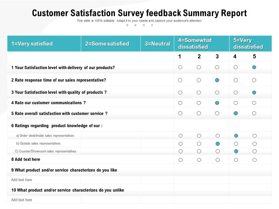
Presenting this set of slides with name Customer Satisfaction Survey Feedback Summary Report. The topics discussed in these slides are Customer Satisfaction Survey Feedback Summary Report. This is a completely editable PowerPoint presentation and is available for immediate download. Download now and impress your audience.

FAQs for Customer satisfaction survey

Honestly, three things will make or break you here. First - keep it clean and readable. Cluttered slides are presentation death, trust me. Second, actually solve their problem instead of just making things look pretty. I've watched beautiful decks completely bomb because the messaging was off. Brand consistency is huge too, especially with corporate stuff where they'll get roasted if colors are wrong. But really, just ask them upfront what success looks like. Half the time they don't even know what they want until you ask directly.

Honestly, good visuals just make everything click better for customers. They'll actually get what you're pitching instead of glazing over during yet another slide crammed with bullet points. Clean charts and relevant graphics show you respect their time too - builds way more trust than walls of text. Here's the thing though: people remember pictures way better than paragraphs anyway, so your key points will stick around after the meeting ends. My advice? Cut your text in half and swap it for simple visuals that actually tell your story. Trust me, less reading equals happier clients.

Ask about their brand stuff upfront - colors, fonts, the whole deal. Clients absolutely love when you customize templates instead of just handing over generic ones. It shows you actually listened, you know? Plus their content ends up looking way more professional and on-brand. Honestly, it's such an easy way to impress them. When everything matches their vibe, they feel like you totally get what they're going for. Makes them look good to their boss too, which they'll remember next time they need work done.

Honestly, user feedback is everything for our template updates. We'll get tons of reviews saying the same layout is impossible to customize, or that certain colors look terrible - that stuff goes straight to the top of our fix list. Reviews are like having a bunch of free consultants pointing out problems we totally missed. Font issues, clunky transitions, requests for templates in specific industries... it all shapes what we build next. Though we do ignore the random one-off complaints - it's those recurring patterns that really matter since they affect way more people.

Okay so first thing - don't cram everything onto one slide, people's brains just shut down. White space is your friend here. Stick to maybe 2 fonts max and use your brand colors but like, strategically? Not everywhere. Make your text big enough that someone can actually read it (seriously, why do people think microscopic fonts work?). One main point per slide, then always end with what you want them to DO next. The whole thing should be scannable - if they can't get your main message in 3 seconds, you've lost them.

Honestly, just dig into your survey data first - see what's actually working before you design anything new. Check which templates get the best engagement and fewest complaints. I always go straight for the "ease of use" scores since those matter most for template success. Visual appeal ratings are clutch too. Once you spot the patterns, steal those winning elements for your new designs. Oh, and definitely test prototypes with a small group first - saves you headaches later. Set up some way to track satisfaction scores after you launch each template so you're not flying blind.

Your customers are basically picking up design tastes from everywhere - Instagram, apps, whatever they're scrolling through daily. So you'll see them wanting minimalist stuff, chunky bold fonts, layouts that actually work on phones. Dark mode is everywhere now too (though personally I think it's a bit overdone at this point). Remote work changed everything - people expect interactive bits and video built right in. I'd check out Dribbble maybe once a week to see what's coming next. The key is staying just ahead of what they're seeing everywhere else, not chasing last month's trend.

Know your audience first - that's everything. Executives want the big picture with clean visuals and zero fluff. Technical people? Go ahead and use jargon, they'll eat up the detailed data. But regular stakeholders need way more context and simpler language. I totally bombed once presenting engineering specs to marketing people - learned that lesson fast! Cultural stuff matters too, like color choices. Short sentences work for some groups. Others prefer more explanation and background. What do they actually care about? Build around that instead of using some generic template. Trust me, it makes all the difference.

Dude, you've gotta give them options - like 3-4 different design styles so they can find their vibe. Then make it super easy to swap logos, colors, and text without breaking everything. Include some kind of quick tutorial or walkthrough because people get frustrated fast when they can't figure stuff out. Throw in bonus stuff too - extra icons, maybe some alternate layouts they weren't expecting. The whole point is making them feel like it's actually theirs, not some generic template everyone else is using. Oh, and honestly? Clear instructions are everything - saves you from annoying support emails later.

Honestly, speed makes or breaks customer happiness with templates. Clients get super impatient because they think "template = instant" - even though you're still doing custom work, right? I've noticed the trick is promising realistic timelines, then delivering a day early if you can. Makes you look like a rockstar every time. Quick turnarounds also prove you've got your stuff together, which builds trust fast. People really do hate waiting for anything that feels like it should be simple. Track how long things actually take you and ask clients about it - I bet you'll see your worst reviews mention slow delivery.

Ugh, template fails are the worst. Most people make them way too generic or jam-pack them with tiny fonts that nobody can read. Honestly, I've seen some that look like a rainbow threw up on them. The "one size fits all" approach never works because clients want their stuff to feel custom, you know? Plus templates get messy fast when there's no clear hierarchy or room to actually customize things. My advice? Keep fonts readable, use clean layouts with breathing room, and test them on real presentations first. Oh and don't go crazy with colors - less is definitely more here.

Honestly, solid support makes or breaks user satisfaction. People will get stuck - it's just inevitable with templates. But here's the thing: if you've got quick chat support and decent tutorials ready, they'll figure it out instead of just giving up. I'd focus on being ahead of the game though. Track what questions keep coming up in your support tickets and build help content around those specific issues. You want that "ugh I'm so confused" moment to turn into "oh okay, got it" as fast as possible. Clear documentation helps too, but video walkthroughs are usually what actually get people unstuck.

So here's the thing - good-looking templates actually make customers way happier. Clean layouts, consistent colors, proper spacing... that stuff matters more than you'd think. People literally judge visual appeal in 50 milliseconds (crazy, right?). Nobody's filling out some janky form that screams early internet vibes. When templates look polished, customers trust you more and see higher value. Honestly, just focusing on simplicity and keeping things consistent can bump satisfaction up 15-20%. It's not rocket science, but so many people still mess it up.

User testing is seriously a game changer - you'll spot problems before customers ever see your templates. Real users will struggle with things that seem totally obvious to you as the designer. Navigation that makes perfect sense in your head? Confusing as hell to actual people. Features get buried where nobody thinks to look. I've watched gorgeous templates completely bomb because they looked pretty but were impossible to use. Testing catches this stuff early so you can actually fix it. Way fewer angry support emails later, trust me.

Honestly, interactive stuff is where it's at - clickable menus, video placeholders, charts that actually update on their own. Your customers will eat that up. Animations and micro-interactions are huge too, gives everything this really polished vibe. Oh, and AI-suggested layouts based on what you're presenting? That's been a total game-changer for most teams I know. Custom icons and branded colors that auto-adjust are solid moves. But here's what really gets people excited - collaboration features. Comment sections, version tracking, all that. Don't go crazy though. Pick maybe two features first and see what actually clicks with your audience.

Ratings and Reviews

0% of 100
Review Form
Write a review
Most Relevant Reviews

No Reviews