Customer satisfaction survey questionnaire presentation deck
Try Before you Buy Download Free Sample Product
Audience
Editable
of Time
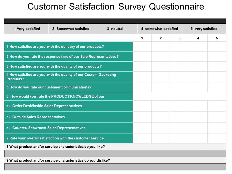
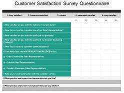
It is critical to keep the existing customers happy when you want your business to grow. In order to do so, you will need to measure as well as understand customer satisfaction and for that our team has designed the customer satisfaction survey questionnaire PowerPoint slide. The customer satisfaction PPT template design is useful to define the client’s overall level of satisfaction after using the product or service. The survey questionnaire presentation slide is suitable for a business owner to describe different questions such as did the customer gets what he was looking for? Is he satisfied? Is he asking the right questions? in that our client satisfaction survey template can help you in finding as well as selecting the customer satisfaction survey questions that solicit actionable feedback he can turn into meaningful client loyalty. This survey template consists of questions that will help a presenter quickly survey users, so he can discover bugs or confusing features, understand why clients are not checking out or upgrading, or improve his gaming experiences. You can also add the questions by your own in this customer satisfaction survey question template. Our Customer Satisfaction Survey Questionnaire Presentation Deck will make you the central figure. All the rest will just hover around.
People who downloaded this PowerPoint presentation also viewed the following :
Customer satisfaction survey questionnaire presentation deck with all 5 slides:
Our Customer Satisfaction Survey Questionnaire Presentation Deck have a wide span. Bridge the divide with your views.
FAQs for Customer satisfaction survey
Ask about the basics that keep people coming back - reliability, how fast your support team responds, whether it's actually easy to use. Value for money matters too, obviously. I'd dig into which specific features they use most because honestly, customers surprise you with what they actually care about versus what you assume. Also worth asking about their whole experience - was onboarding smooth? Did your team help when they needed it? The trick is being specific enough that you can actually do something with their answers instead of getting those useless "yeah it's fine" responses.
Honestly? I'd give them like an 8/10. Their stuff is really solid quality-wise, and - this is huge - when you call customer service, actual humans answer the phone. Wild concept, right? Only reason I'm not going higher is the pricing's kinda brutal compared to other options out there. But if you need something reliable and don't mind spending extra for decent service, I'd totally recommend them to work people. They should really think about doing volume discounts for referrals though.
Honestly, mobile optimization should be your first move - most people are answering on their phones and the experience usually sucks. Response analytics are pretty weak on most platforms too, just basic charts that don't really help. Question branching could be way better since static surveys miss tons of context. Real-time alerts would be clutch when satisfaction tanks (why is that not standard yet?). The reporting dashboards are another pain point - your team shouldn't need to decode rocket science just to read the data. I'd tackle mobile first though, that's where you'll see the biggest impact.
Honestly, I'm pretty happy with them! Save me so much time and the drag-and-drop thing actually works well. You can mess around with colors and fonts too without everything falling apart. Only annoying thing is the text boxes get weird when you try to resize - but whatever, not a huge deal. They've got good variety, usually find something that works. Oh and definitely try the business pitch ones first if you haven't yet, those are solid. Has definitely made my presentations way less of a headache.
Honestly, just stick with a clean business template. Nothing fancy - you don't want people getting distracted by flashy stuff when they should be focusing on your questions. Educational ones work fine too if you're dealing with students or academic stuff. But skip the super creative templates, even though they look pretty cool. They make your survey seem less legit somehow. Clean layout, readable fonts, maybe throw in your brand color if you have one. Keep it professional but not stuffy, you know? Trust me, your response rates will be way better that way.
Yeah the templates are pretty solid honestly. Save me like 30 minutes per deck which adds up fast. Work great for standard stuff - project updates, proposals, client pitches, you know. Design stays consistent so you don't look all over the place. Oh and the content guides actually help keep you focused instead of just rambling about whatever. Only thing I'd do is track which ones you use most and give feedback on the clunky ones. That actually helps improve them for everyone down the line.
Okay so this question is basically your customers doing free consulting for you. They're telling you exactly what's missing from your support right now. Maybe it's better docs, more training, different ways to reach you - whatever would actually make their day easier. Honestly, the responses usually show you problems you had no clue even existed. Pretty eye-opening stuff. Just make sure you actually act on the most popular requests afterward, or people will think you don't really care about their input. Use it to figure out what to build next.
Honestly, the pricing's pretty solid for what you're getting. Templates save you tons of design time, plus they throw in commercial licensing - hiring a designer would definitely cost more. You get updates and new stuff without extra fees too, which is nice. Only downside? If you're just starting out and only need one template, it might feel pricey. But for agencies or people juggling multiple projects, it's worth it. I'd actually peek at what other template sites charge first - puts things in perspective, you know?
Just stick with a basic 5-point scale - "Excellent, Good, Fair, Poor, Very Poor." Everyone knows how those work and you'll get clean data. Don't overcomplicate it because honestly, people just want to rate and get out of there. The real magic happens when you add an open text box asking "Why did you choose this rating?" That's where you find the actual problems worth fixing. Numbers show you trends, which is useful I guess, but those comments? That's your goldmine right there.
This question is pure gold for figuring out why customers actually choose you. They'll spell out your real differentiators - maybe it's your pricing, maybe your support team doesn't suck, or hell, could be something random like how smooth your signup process is. Honestly, customers see things we miss all the time. Once you get these responses, group them by theme so you can spot what different customer types care about. Then you can focus your marketing on the stuff that actually moves the needle instead of guessing what matters.
Start with site speed and mobile stuff - that's what kills most websites honestly. Your navigation might be trash too if people can't find anything. Checkout process is brutal if it's broken, you'll lose sales left and right. Heat mapping tools are pretty cool for seeing where people actually click around. User testing sessions work great too, though they're kinda awkward to watch sometimes. The survey data helps, but seeing someone actually get frustrated trying to buy something? That'll show you what's really broken. Focus on those areas first.
So the templates are actually built around what matters in your specific industry. Healthcare gets patient safety metrics instead of random "customer delight" stuff that makes no sense, right? Each one comes loaded with the compliance questions you need, plus benchmarks so you can see how you stack up. Retail focuses on omnichannel experience, B2B digs into relationships and renewals - that kind of thing. Your customers will recognize the terminology immediately. Honestly? The templates work great straight out of the box for most people. You can tweak them if you want, but just pick your industry and you're pretty much ready to go.
Hey! So I probably grab those presentation templates like 2-3 times a month. Mostly for client pitches or when I'm rushing to get internal reports done - they're honestly such a lifesaver when you're scrambling. The branded ones are great too since our manager's always on us about keeping everything consistent across the team. That quarterly business review template? I use it constantly. Oh, and if you're updating them at some point, more data viz slides would be amazing. That's literally the only area where I always end up ditching the template and making my own stuff.
Ask what they'd actually use, not just cool-sounding stuff. Pain points are gold - what's making their day harder right now? I always toss in some "dream big" questions too because people surprise you. Mobile needs, integrations, reporting that doesn't suck, automation stuff. Definitely leave an open text box at the end - that's where the real gems usually hide. Oh, and actually follow up with people about what you're building next. Most companies are terrible at closing that loop but it makes such a difference.
Honestly, go for it if you've got time! Those follow-up chats are way more useful than the original survey - you can actually explain what you meant instead of being stuck with their multiple choice answers. They're pretty chill, maybe 20-30 minutes tops. What I like is they usually circle back later to tell you what actually changed because of your feedback. Don't get that often these days. Just make sure you're not scheduling it during a crazy week or whatever.
-
Excellent Designs.
-
Amazing product with appealing content and design.