


Customer service review powerpoint presentation slides
Are you looking for pre-made customer service review PowerPoint slide deck? You might have to do lot of time killing internet digging for depicting a winning customer team review in your next presentation deck. But to aid you and to save you time we have come up with 59 slides content-ready Customer Service Review Powerpoint Presentation Slides that you can use to highlight the critical aspects of how to enhance customer service. Our PPT deck sample show also helps to give handy customer service training for ensuring better customer retention, customer satisfaction and loyalty. There are slides like the team, customer service model, customer satisfaction model, rater model, disconfirmation model. Customer services matrix, satisfaction goals, customer services management chart, customer support service chart, customer support service chart services KPI, customer service benchmarking chart, FRT, average response rate, AHT and many more. Additionally, using our sample presentation PPT you can motivate your employees to improve customer service skills for shortening of interaction time so that they can answer more service calls. Besides this, to give you an edge we have included exclusive slide templates like Csat, customer support and services metrics, performance review, customer focus performance, customer experience report, team performance comparison etc. So, what are you waiting for? Just download Customer Service Review Powerpoint Presentation Slides and let the audience follow the correct approach to this topic. Your ideas are bound to be an instant hit due to our Customer Service Review Powerpoint Presentation Slides. Folks will consider you jolly good.
Are you looking for pre-made customer service review PowerPoint slide deck? You might have to do lot of time killing intern..













-

- Google Slides is a new FREE Presentation software from Google.
- All our content is 100% compatible with Google Slides.
- Just download our designs, and upload them to Google Slides and they will work automatically.
- Amaze your audience with SlideTeam and Google Slides.
-

Want Changes to This PPT Slide? Check out our Presentation Design Services
-

- WideScreen Aspect ratio is becoming a very popular format. When you download this product, the downloaded ZIP will contain this product in both standard and widescreen format.
-

- Some older products that we have may only be in standard format, but they can easily be converted to widescreen.
- To do this, please open the SlideTeam product in Powerpoint, and go to
- Design ( On the top bar) -> Page Setup -> and select "On-screen Show (16:9)” in the drop down for "Slides Sized for".
- The slide or theme will change to widescreen, and all graphics will adjust automatically. You can similarly convert our content to any other desired screen aspect ratio.
Compatible With Google Slides

Get This In WideScreen
You must be logged in to download this presentation.


Do you want to remove this product from your favourites?
PowerPoint presentation slides
Introducing Customer Service Review PowerPoint presentation comprising a total of 59 slides. Each slide focuses on one of the aspects of customer service with content extensively researched by our business research team. Our team of PPT designers used the best of professional PowerPoint templates, images, icons and layouts. Also included are impressive, editable data visualization tools like charts, graphs and tables. When you download this presentation by clicking the Download button, you get the presentation in both standard and widescreen format. All slides are fully customizable. Change the colors, font, size, add and remove things as per your need and present before your audience.

People who downloaded this PowerPoint presentation also viewed the following :
Content of this Powerpoint Presentation
Slide 1: This slide presents Customer Service Review. State your company name and get started.
Slide 2: This is an Agenda slide. Showcase your agendas here.
Slide 3: This is About Our Company slide. State team/ company specifications etc. here.
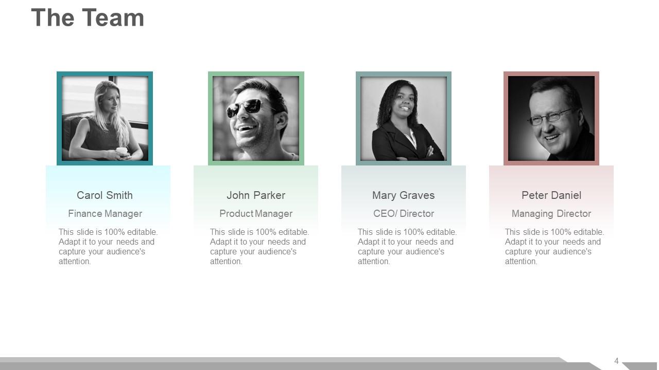
Slide 4: This is The Team slide with image boxes to fill name, designation.
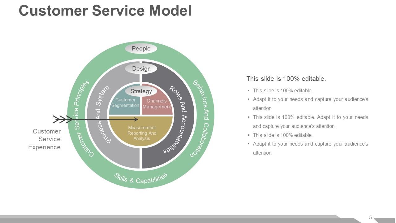
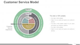
Slide 5: This slide presents Customer Service Model showing- Customer Service Principles, Behaviors And Collaboration, Skills & Capabilities, Measurement Reporting And Analysis, Channels Management, Customer Segmentation, People, Design, Strategy, Process And System, Roles And Accountabilities, Customer Service Experience.
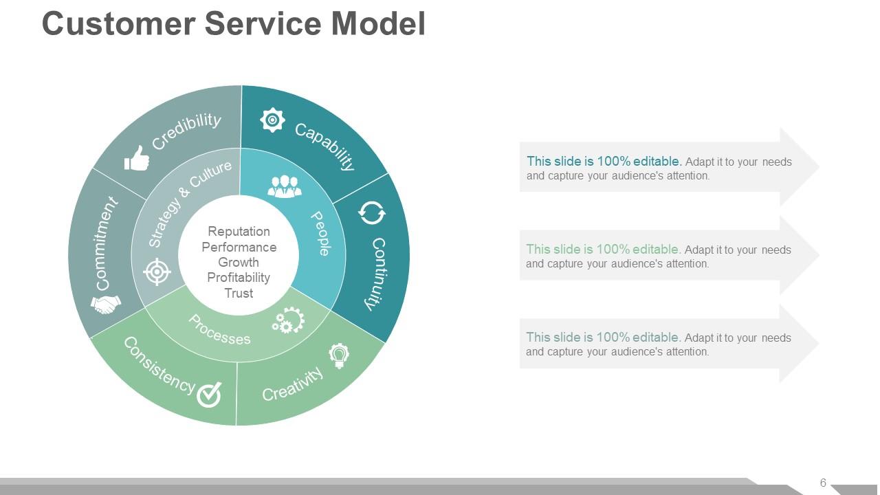
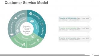
Slide 6: This slide also presents Customer Service Model showing- Reputation, Performance, Growth, Profitability, Trust, Credibility, Continuity, Creativity, Commitment, Consistency, Capability, Processes, People, Strategy & Culture.
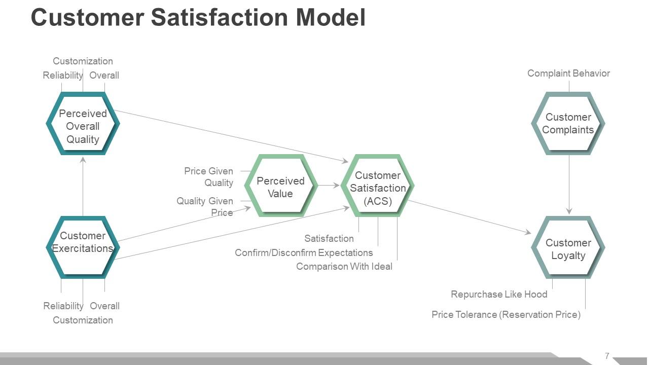
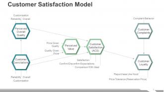
Slide 7: This slide shows Customer Satisfaction Model. Its constituents are- Customization Reliability Overall, Price Given Quality, Quality Given Price, Complaint Behavior, Repurchase Like Hood, Price Tolerance (Reservation Price), Reliability, Overall, Customization, Satisfaction, Confirm/Disconfirm Expectations, Comparison With Ideal, Customer Satisfaction (ACS), Perceived Value, Customer Complaints, Perceived Overall Quality, Customer Exercitations, Customer Loyalty.
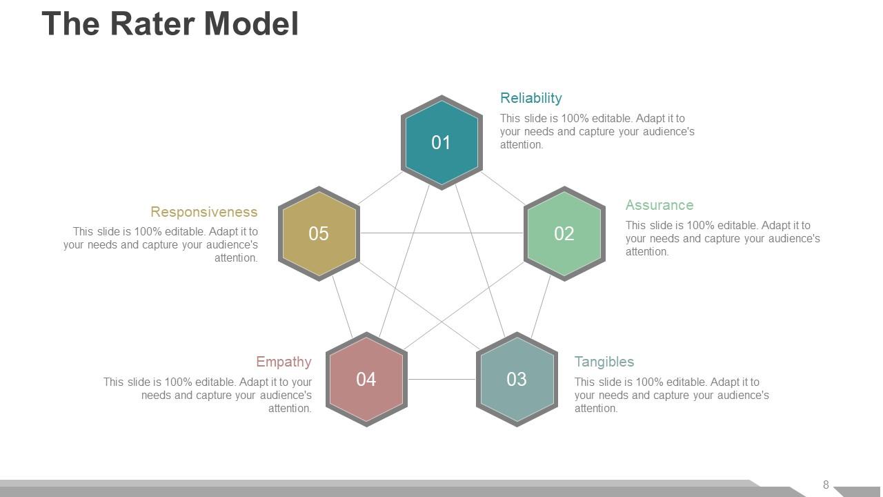
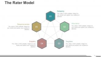
Slide 8: This slide shows The Rater Model with the following five components- Reliability, Tangibles, Empathy, Assurance, Responsiveness.
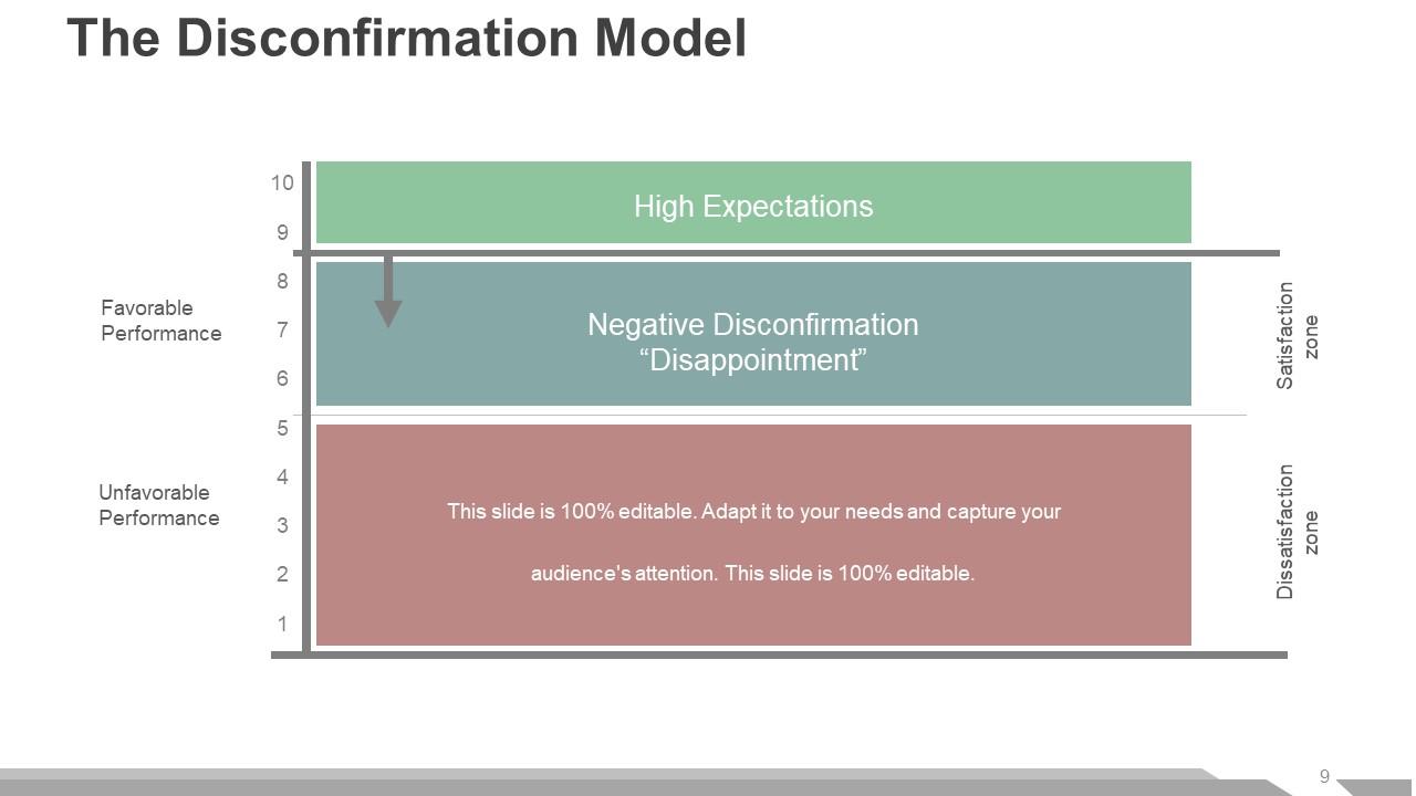
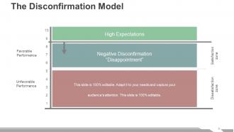
Slide 9: This slide shows The Disconfirmation Model which further shows- High Expectations, Negative Disconfirmation “Disappointment”, Dissatisfaction zone, Satisfaction zone, Favorable Performance, Unfavorable Performance.
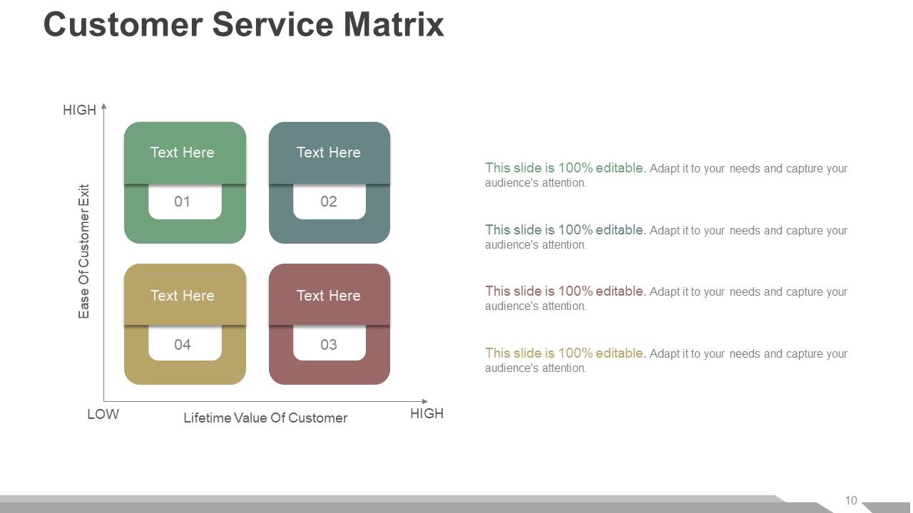
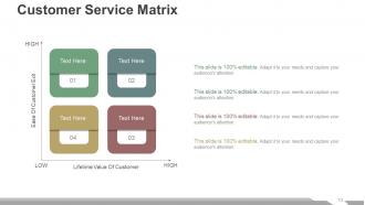
Slide 10: This slide displays Customer Service Matrix with High and Low parameters. It also shows- Ease Of Customer Exit, Lifetime Value Of Customer.
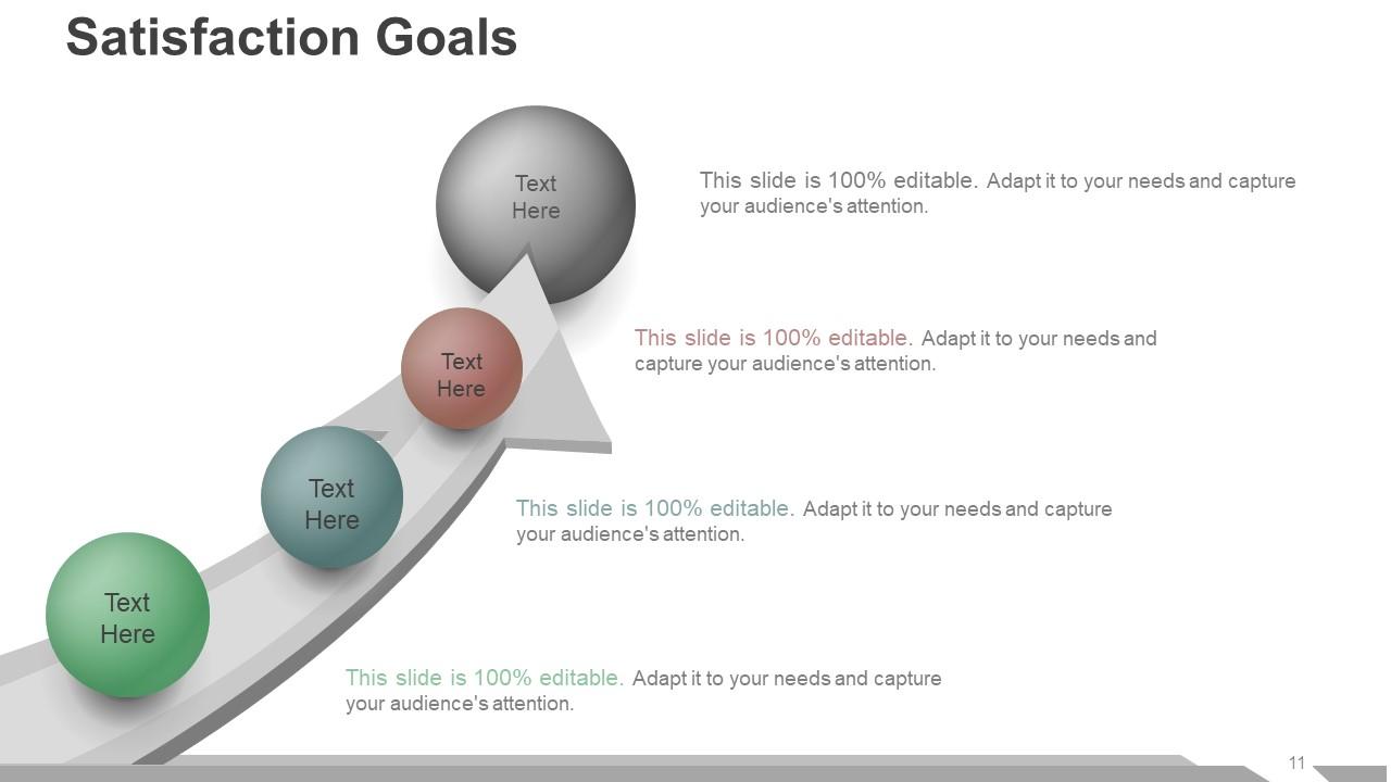
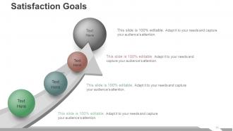
Slide 11: This slide shows Satisfaction Goals with arrow imagery and text boxes. Fill in these boxes with your satisfaction goals and use as per your requirement.
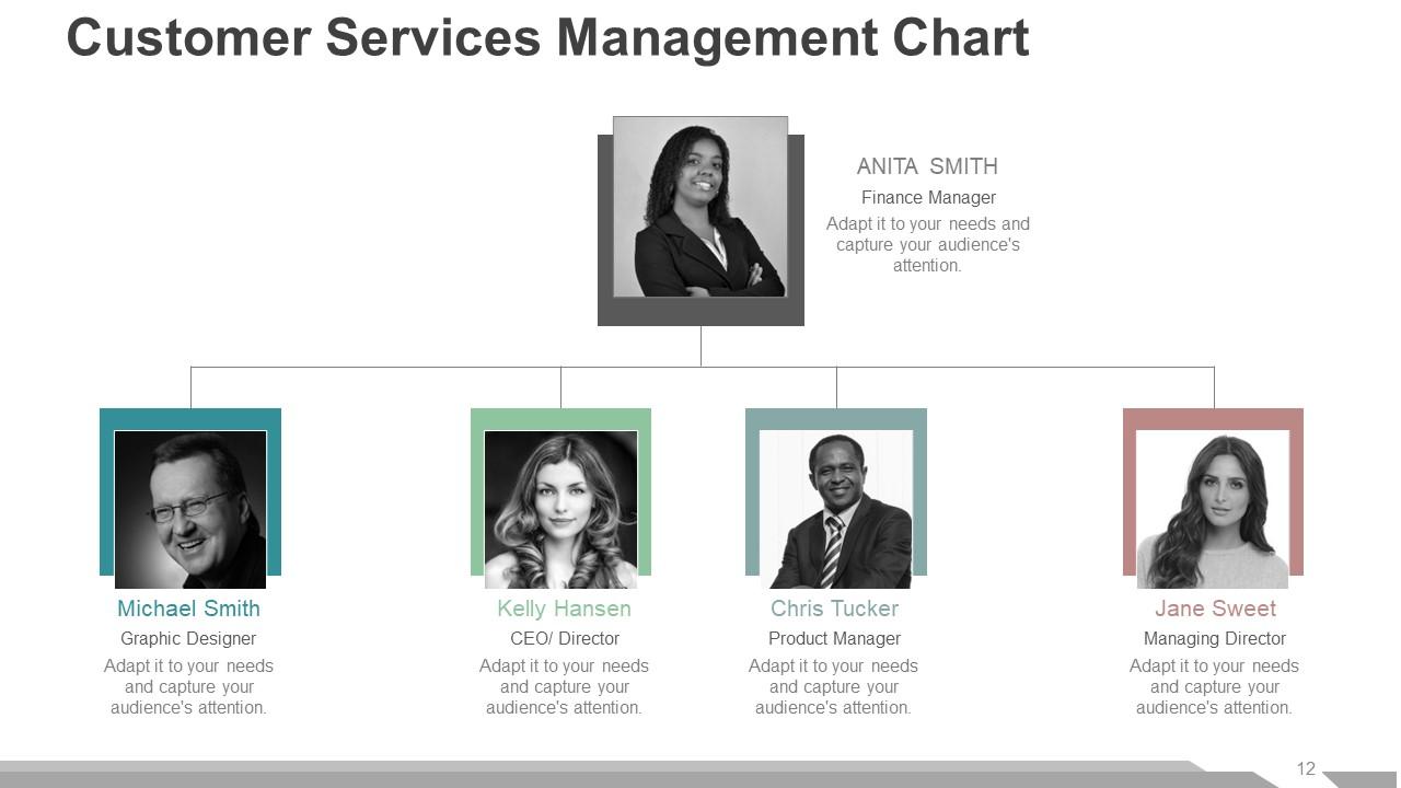
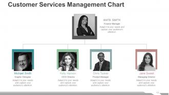
Slide 12: This slide shows Customer Services Management Chart with name and designation to fill.
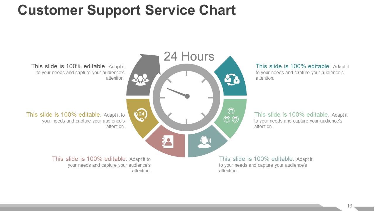
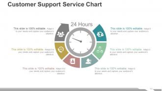
Slide 13: This slide shows Customer Support Service Chart with their respective icons.
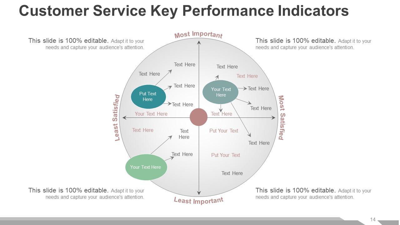
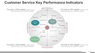
Slide 14: This slide presents Customer Service Key Performance Indicators with the following four parameters- Most Important, Most Satisfied, Least Important, Least Satisfied.
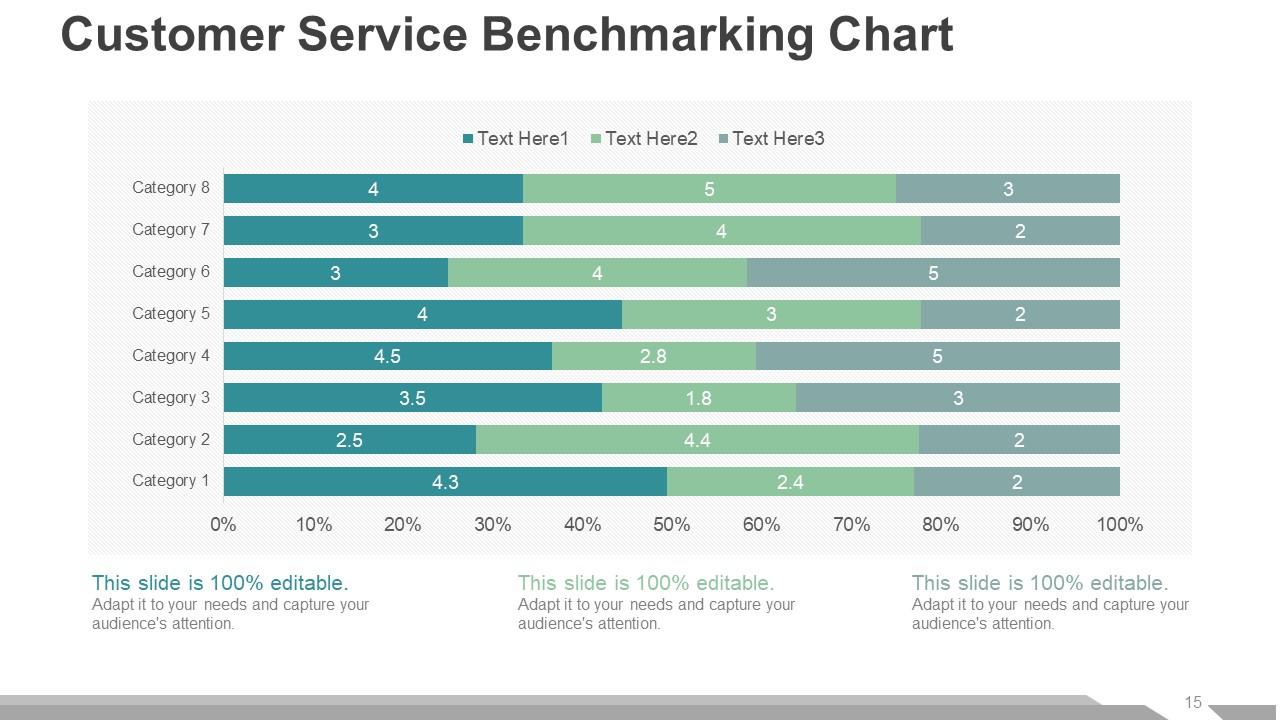
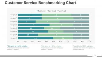
Slide 15: This slide presents Customer Service Benchmarking Chart in a graphical form.
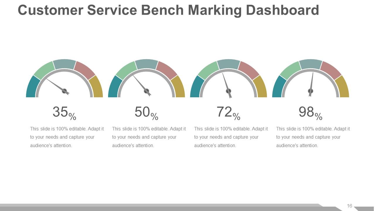
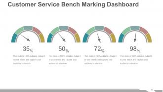
Slide 16: This slide shows Customer Service Bench Marking Dashboard. Use in to show relevant information in percentage etc.
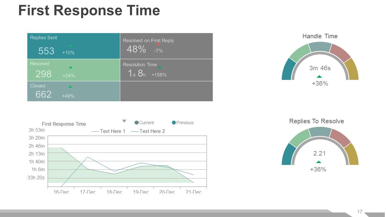
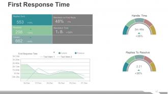
Slide 17: This slide presents First Response Time dashboard showing- Handle Time, Replies To Resolve.
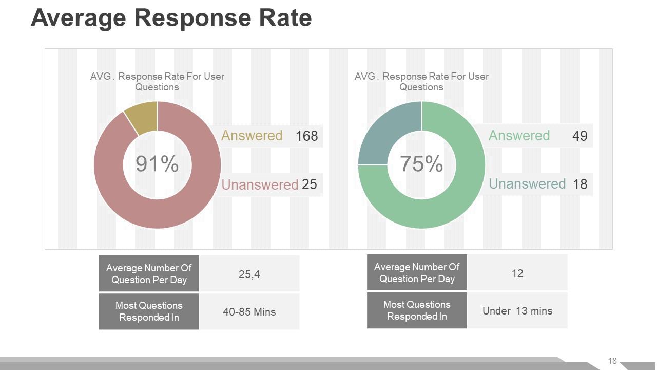
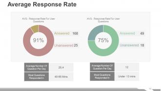
Slide 18: This slide shows Average Response Rate pie charts with the following two parameters- Answered, Unanswered.
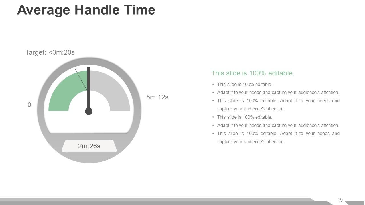
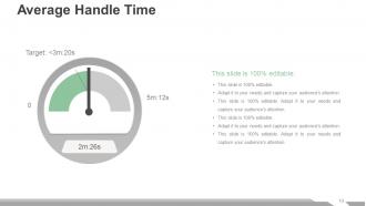
Slide 19: This slide shows Average Handle Time with metric imagery. We have provided text boxes to showcase your own Average Handle Time.
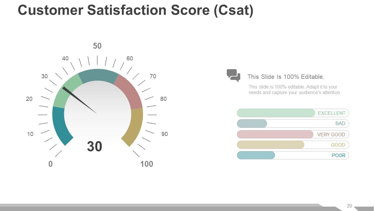
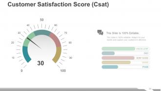
Slide 20: This slide shows Customer Satisfaction Score (Csat) with meter imagery. Use as per your company requirement.
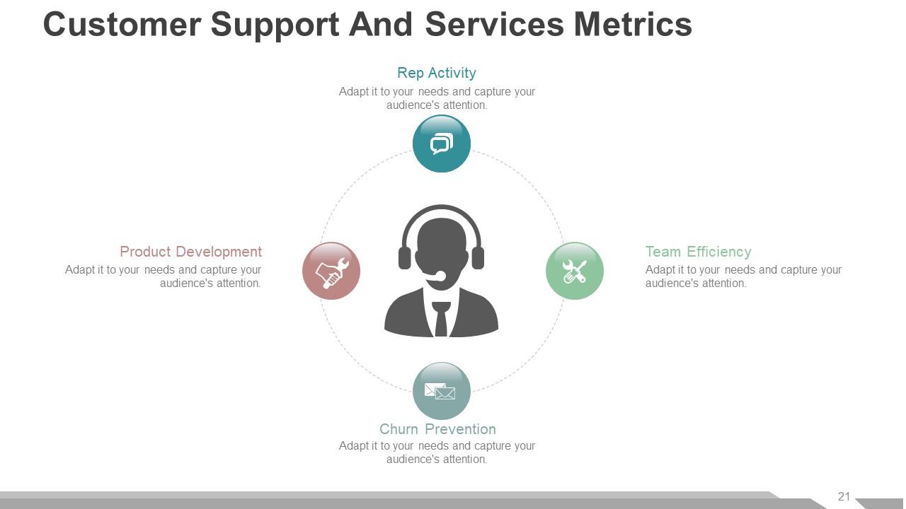
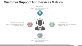
Slide 21: This slide shows Customer Support And Services Metrics consisting of- Churn Prevention, Rep Activity, Team Efficiency, Product Development.
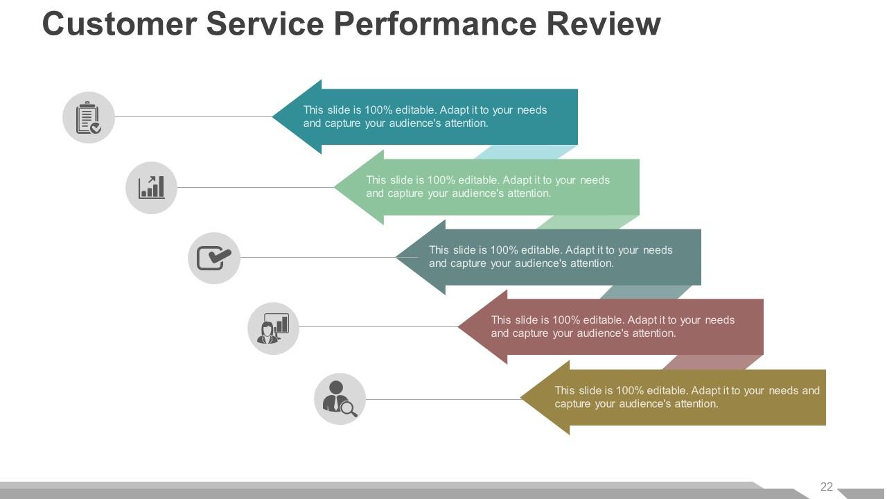
Slide 22: This slide presents Customer Service Performance Review with text boxes and icon imagery.
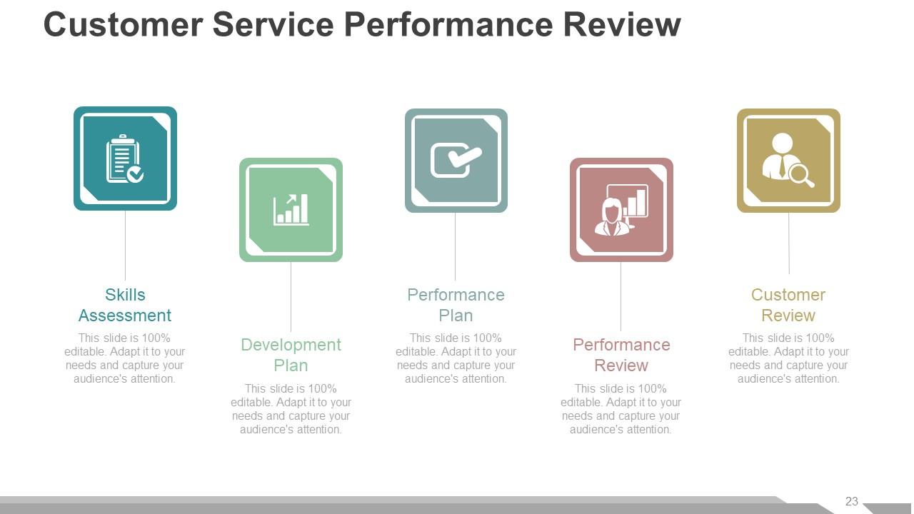
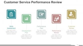
Slide 23: This is also Customer Service Performance Review slide with the following constituents- Skills Assessment, Customer Review, Development Plan, Performance Review, Performance Plan.
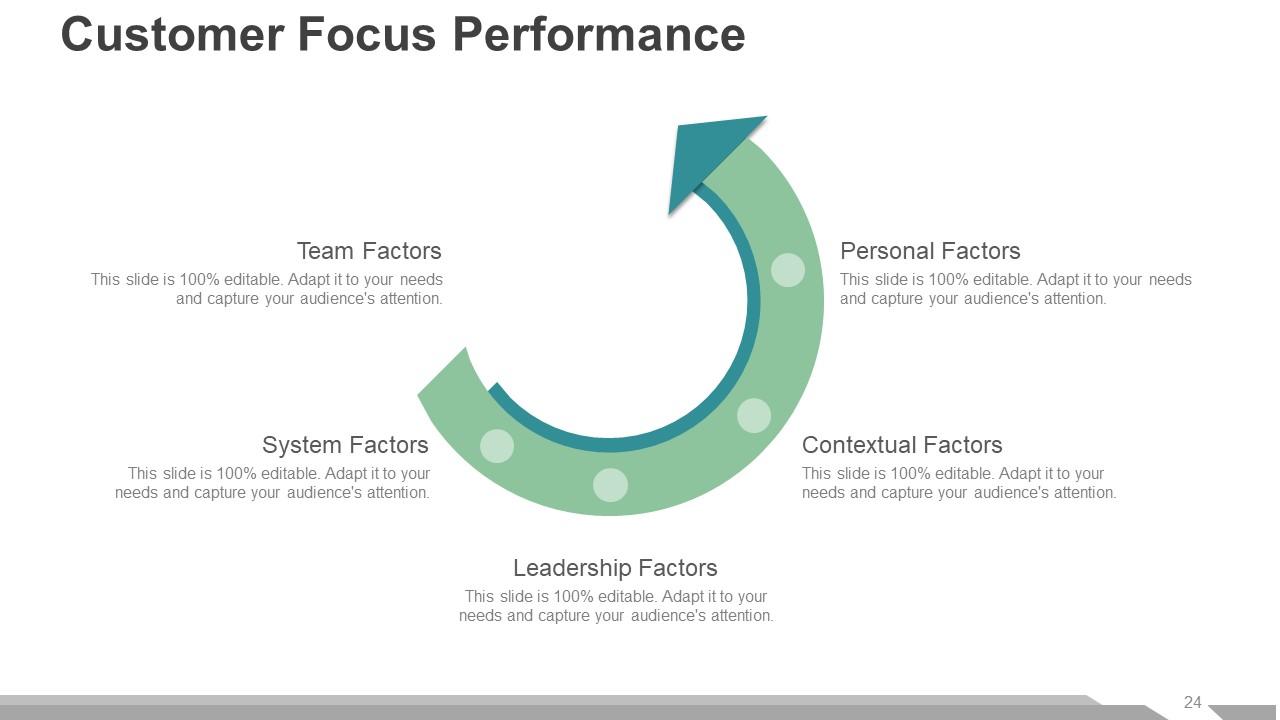
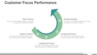
Slide 24: This slide shows Customer Focus Performance with the following factors- Leadership Factors, Contextual Factors, System Factors, Personal Factors, Team Factors.
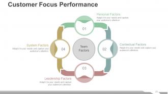
Slide 25: This too is a Customer Focus Performance slide showing Team Factors consisting of- Personal Factors, Leadership Factors, Contextual Factors, System Factors.
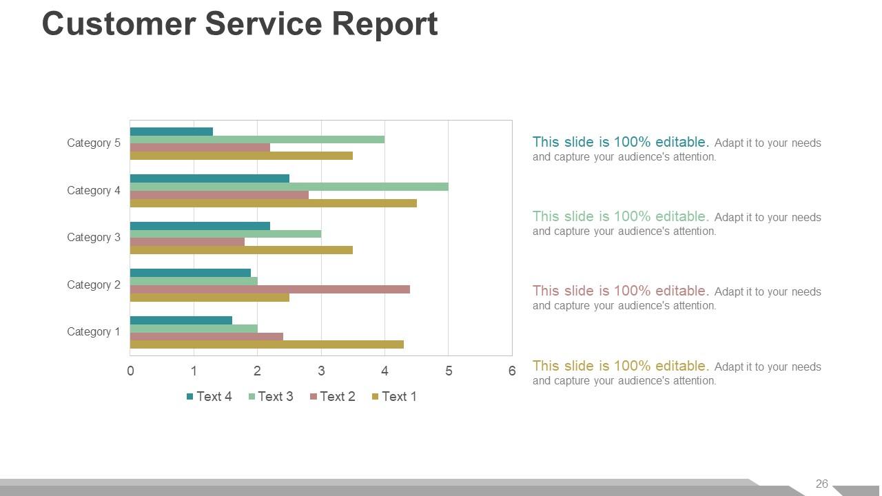
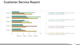
Slide 26: This slide shows Customer Service Report in a bar graph/ chart form with respect to different categories which you can add as per your need.
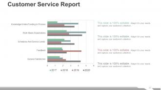
Slide 27: This slide also presents Customer Service Report showing the stats of the different attributes which you can alter as per your requirement.
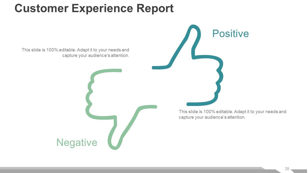
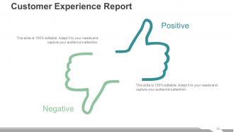
Slide 28: This slide presents Customer Experience Report with thumbs up and thumbs down imagery showing Positive and Negative aspects respectively.
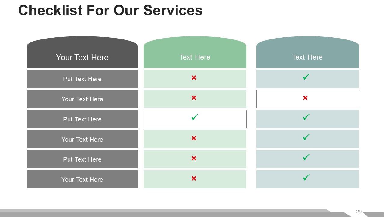
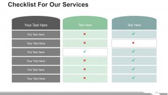
Slide 29: This slide presents a Checklist For Our Services with text boxes. You can add the required text and use it.
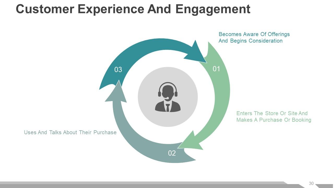
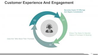
Slide 30: This slide shows Customer Experience And Engagement with the following three features- Uses And Talks About Their Purchase, Becomes Aware Of Offerings And Begins Consideration, Enters The Store Or Site And Makes A Purchase Or Booking.
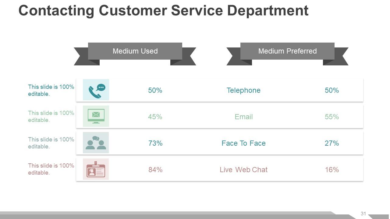
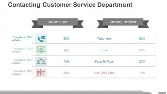
Slide 31: This is Contacting Customer Service Department with two basic parameters- Medium Used, Medium Preferred. It also mentions some of the mediums such as-Telephone, Email, Face To Face, Live Web Chat.
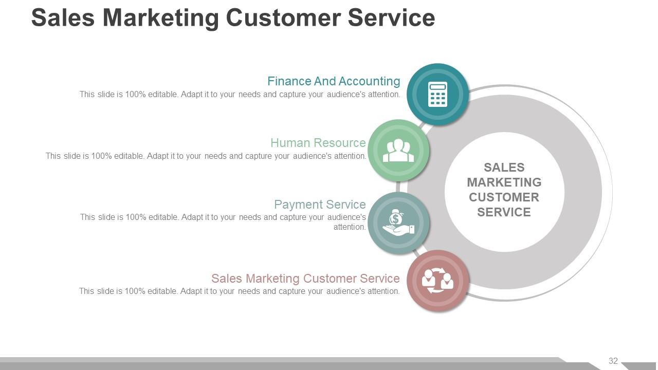
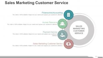
Slide 32: This slide shows Sales Marketing Customer Service consisting of- Finance And Accounting, Human Resource, Payment Service, Sales Marketing Customer Service.
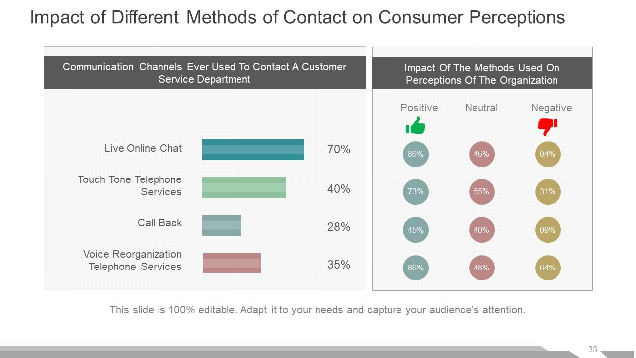
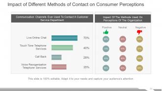
Slide 33: This slide shows the Impact of Different Methods of Contact on Consumer Perceptions.
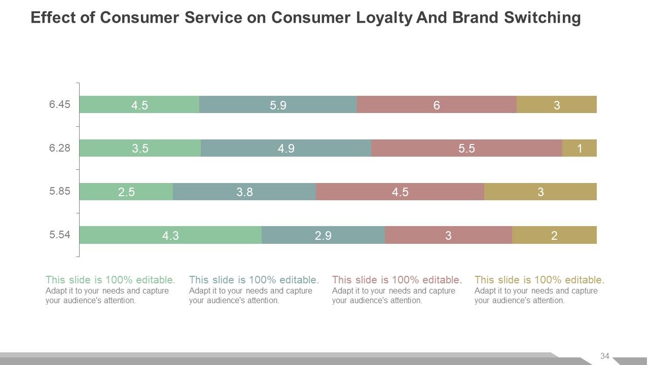
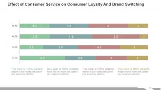
Slide 34: This slide shows Effect of Consumer Service on Consumer Loyalty And Brand Switching in a graphical form.
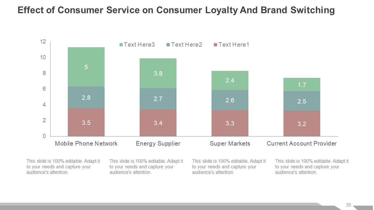
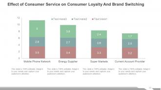
Slide 35: This slide displays a graph to show the Effect of Consumer Service on Consumer Loyalty And Brand Switching. You can show the stats of the following aspects here- Mobile Phone Network, Energy Supplier, Super Markets, Current Account Provider.
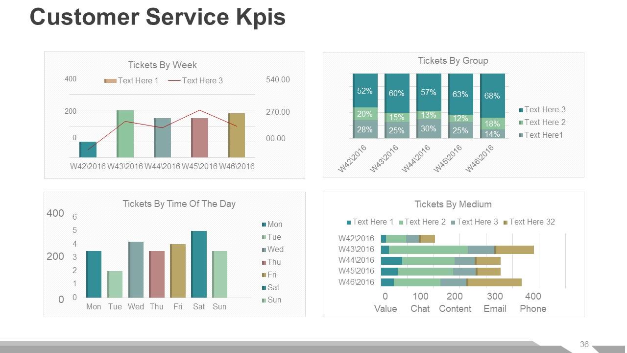
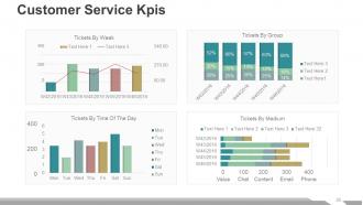
Slide 36: This slide presents Customer Service Kpis further showing- Tickets By Week, Tickets By Group, Tickets By Time Of The Day, Tickets By Medium.
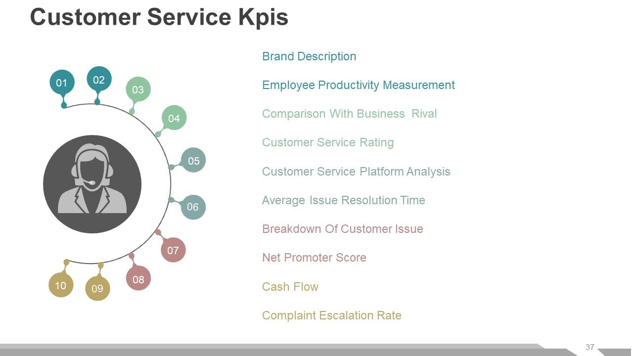
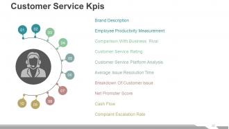
Slide 37: This slide also shows Customer Service Kpis involving- Employee Productivity Measurement, Comparison With Business Rival, Customer Service Rating, Customer Service Platform Analysis, Average Issue Resolution Time, Breakdown Of Customer Issue, Net Promoter Score, Brand Description, Complaint Escalation Rate, Cash Flow.
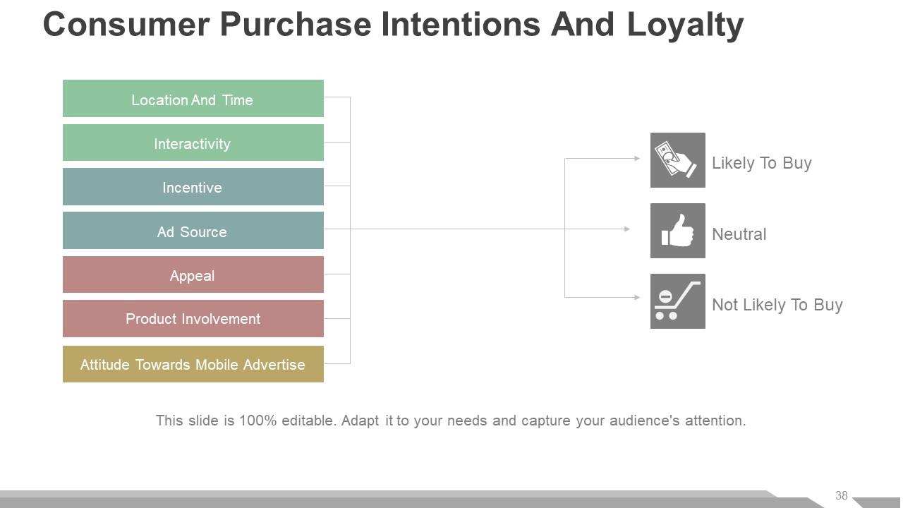
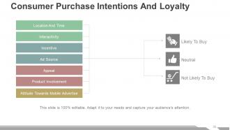
Slide 38: This slide shows Consumer Purchase Intentions And Loyalty with respect to- Location And Time, Interactivity, Incentive, Ad Source, Appeal, Product Involvement, Attitude Towards Mobile Advertise.
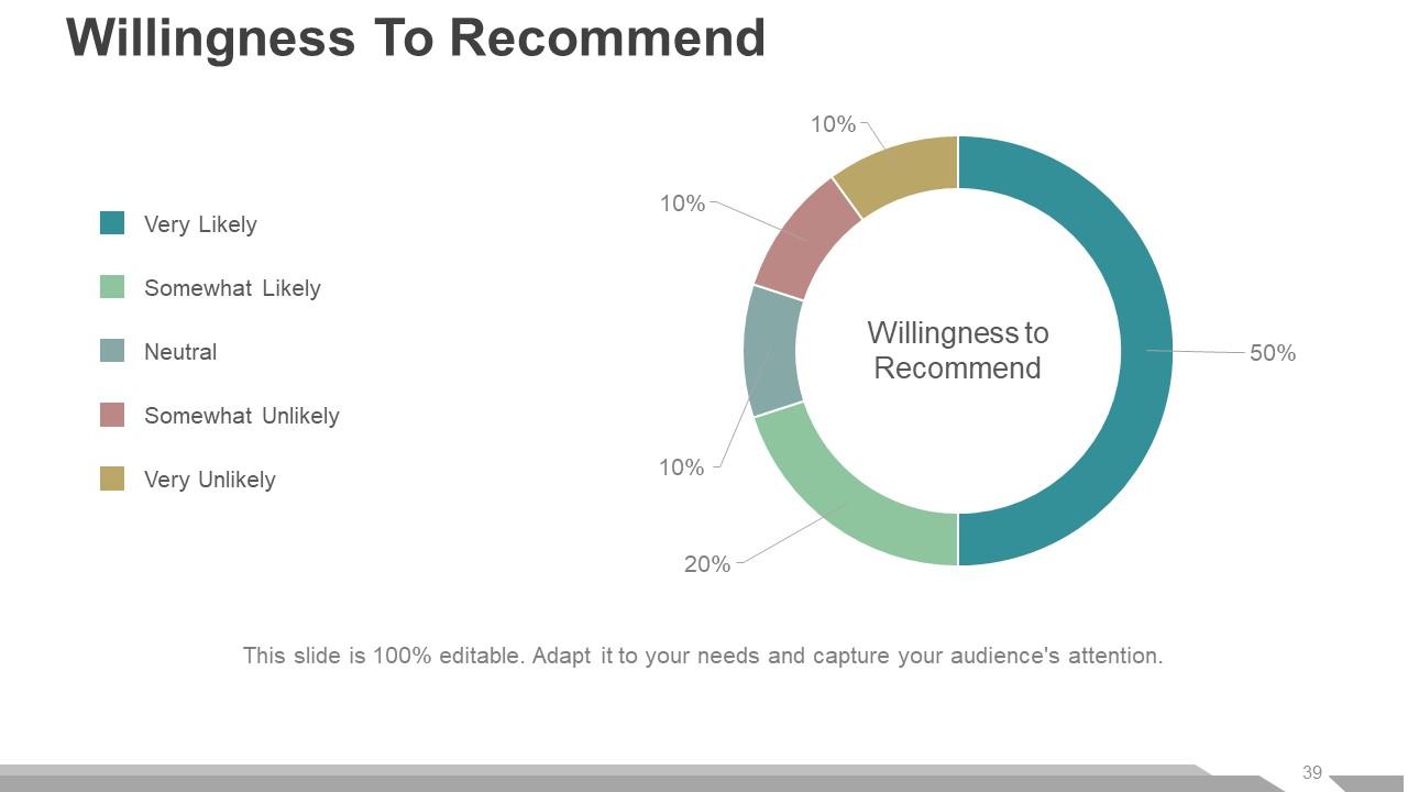
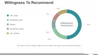
Slide 39: This slide presents Willingness To Recommend in a pie chart/ graph form with the following parameters- Very Likely, Somewhat Likely, Neutral, Somewhat Unlikely, Very Unlikely.
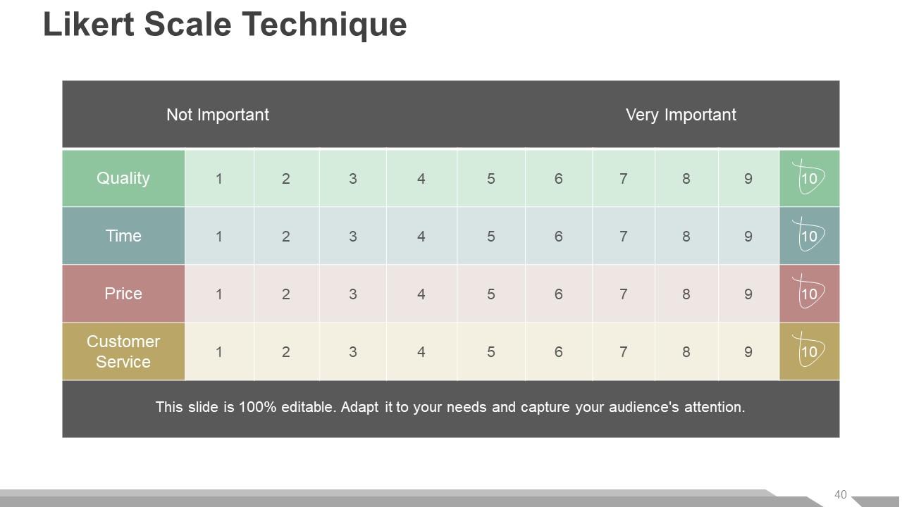
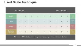
Slide 40: This slide shows Likert Scale Technique.
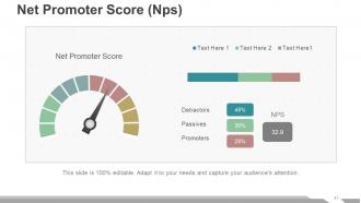
Slide 41: This slide presents Net Promoter Score (Nps) in a metric form showing- Passives, Detractors, Promoters.
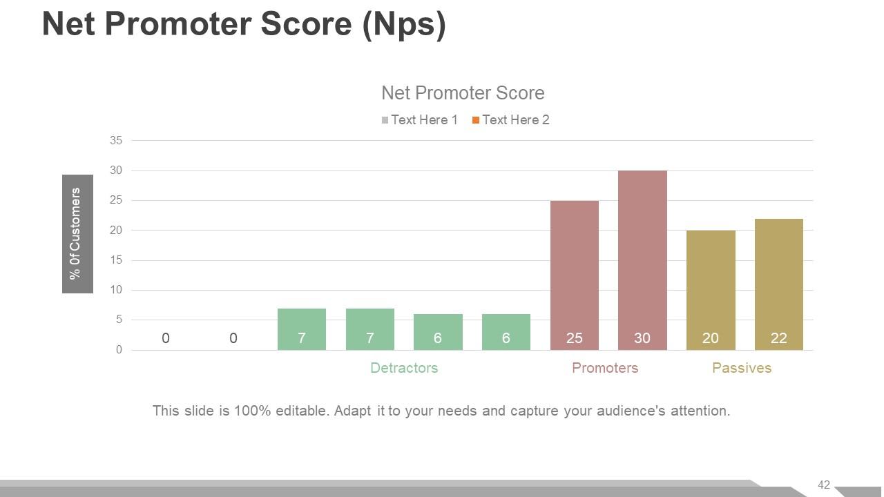
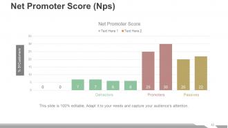
Slide 42: This slide also shows Net Promoter Score (Nps) in a graphical form.
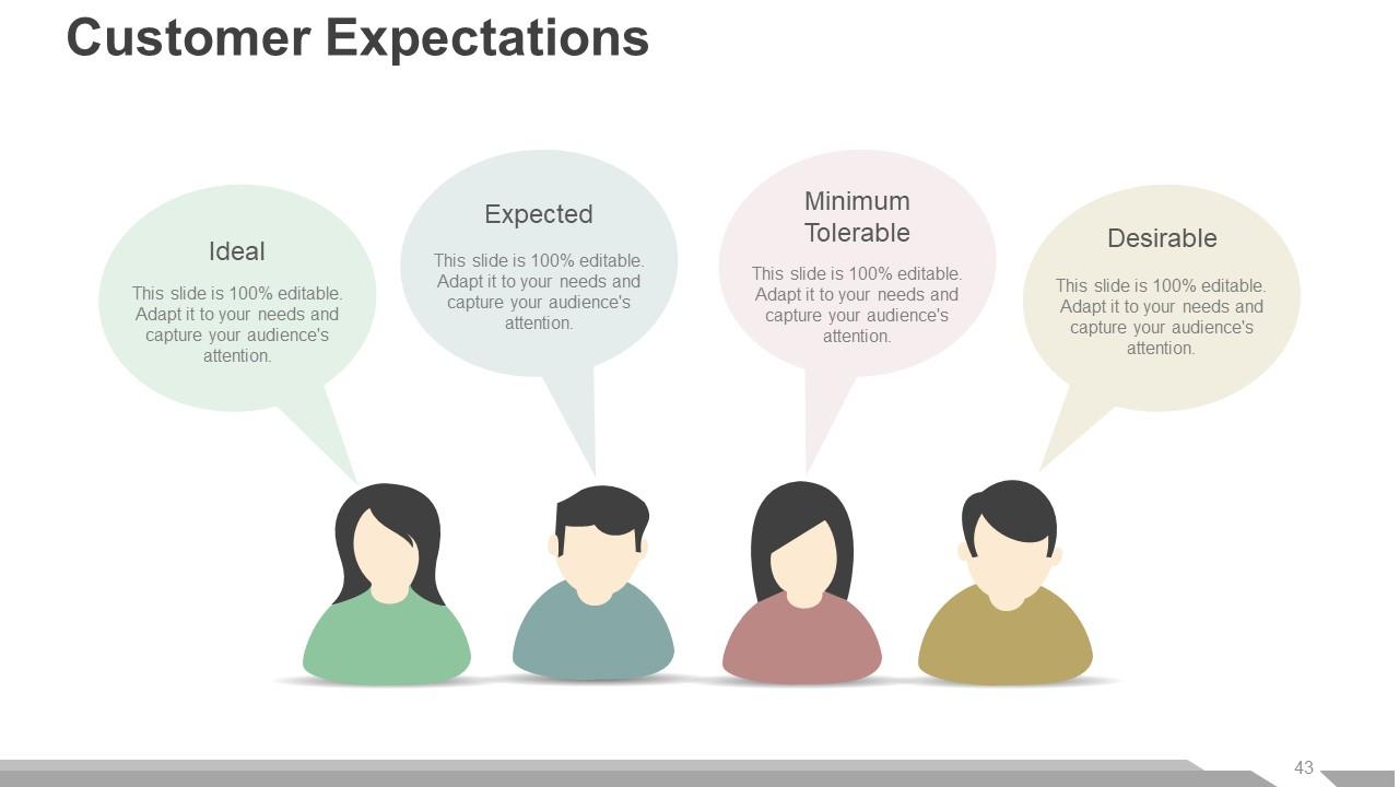
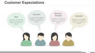
Slide 43: This slide presents Customer Expectations infographic with the following parameters- Ideal, Expected, Minimum Tolerable, Desirable.
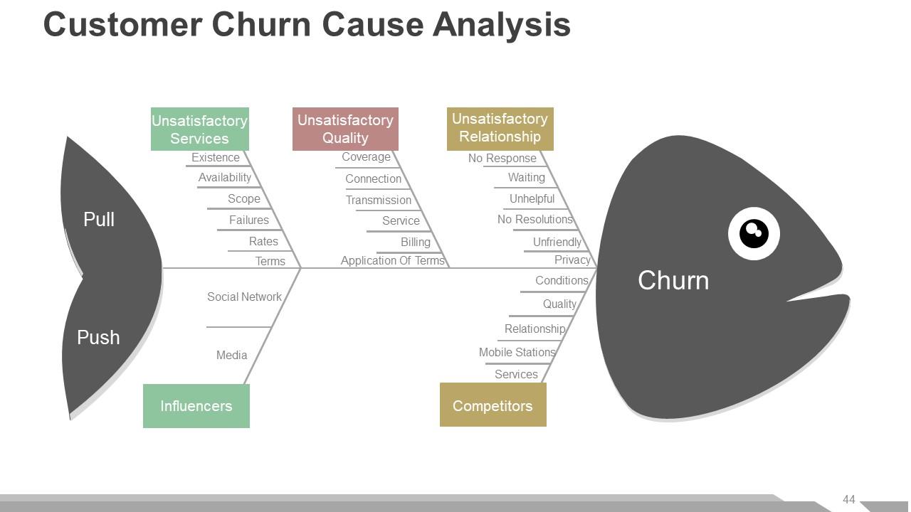
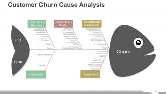
Slide 44: This slide presents Customer Churn Cause Analysis in a fish bone diagram form showing- Media, Social Network, Existence, Availability, Scope, Failures, Rates, Terms, Influencers, Unsatisfactory Services, Coverage, Connection, Transmission, Service, Billing, Application Of Terms, Unsatisfactory Quality, Mobile Stations, Services, Conditions, Quality, Relationship, No Response, Waiting, Unhelpful, No Resolutions, Unfriendly, Privacy, Competitors, Unsatisfactory Relationship, Pull, Push, Churn.
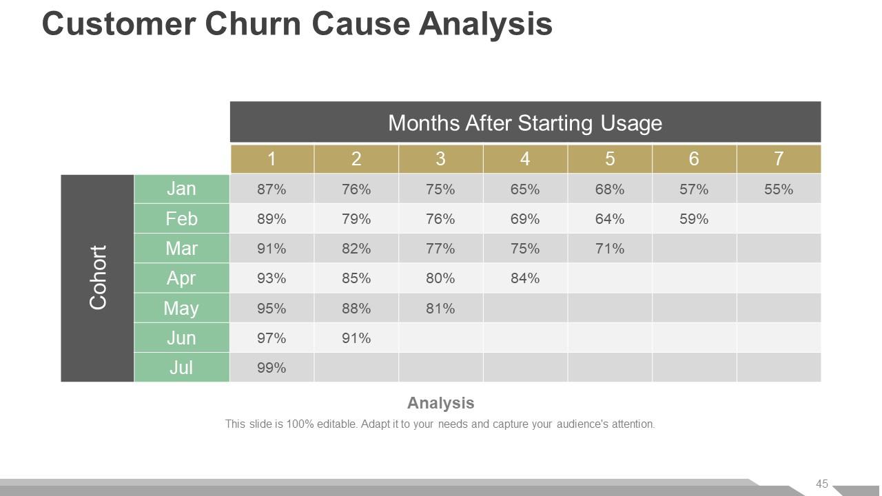
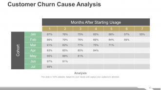
Slide 45: This slide also shows Customer Churn Cause Analysis.
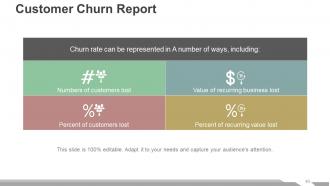
Slide 46: This slide shows Customer Churn Report with the following components- Numbers of customers lost, Value of recurring business lost, Percent of customers lost, Percent of recurring value lost.
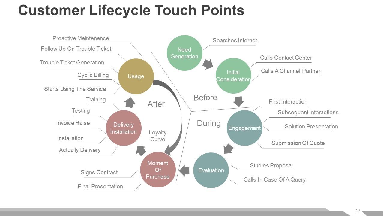
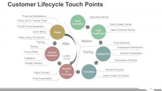
Slide 47: This slide shows Customer Lifecycle Touch Points with the following content- Proactive Maintenance, Follow Up On Trouble Ticket, Trouble Ticket Generation, Cyclic Billing, Starts Using The Service, Training, Testing, Invoice Raise, Installation, Actually Delivery, Signs Contract, Final Presentation, Searches Internet, Calls Contact Center, Calls A Channel Partner, First Interaction, Subsequent Interactions, Solution Presentation, Submission Of Quote, Calls In Case Of A Query, Studies Proposal, Loyalty Curve, Before, During, After, Need Generation, Initial Consideration, Engagement, Evaluation, Moment Of Purchase, Delivery, Installation, Usage.
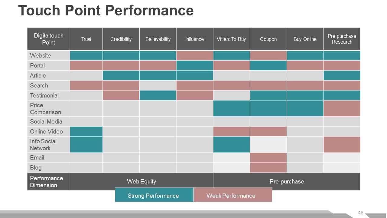
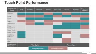
Slide 48: This slide shows Touch Point Performance with the following two parameters- Strong Performance, Weak Performance.
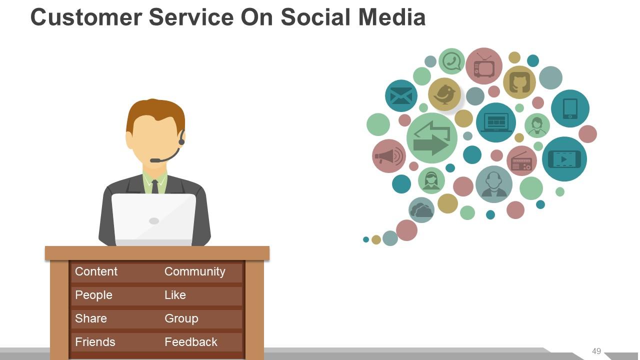
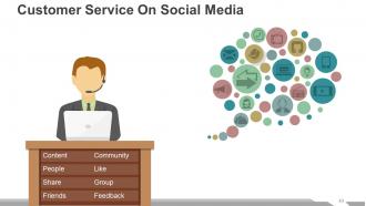
Slide 49: This slide shows Customer Service On Social Media with- Content, Community, Share, Group, Friends, Feedback, People, Like.
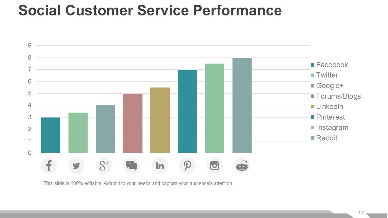
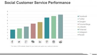
Slide 50: This slide shows Social Customer Service Performance graph.
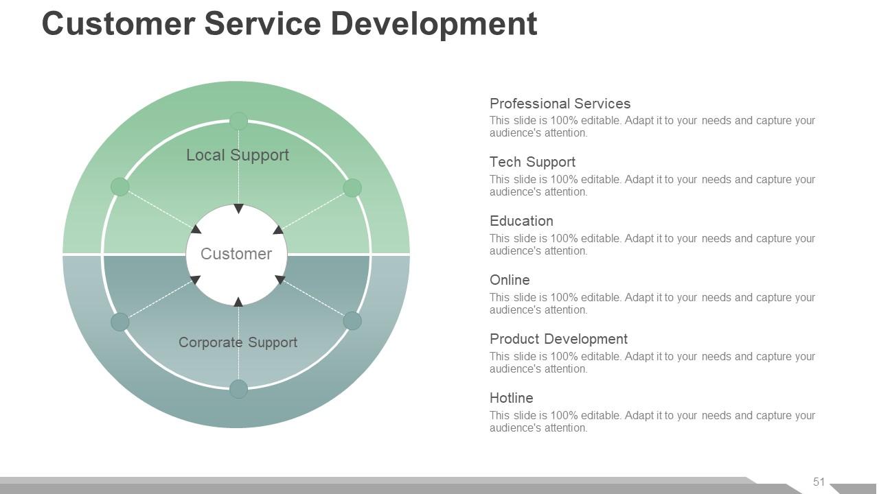
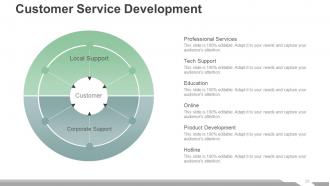
Slide 51: This slide shows Customer Service Development with- Professional Services, Tech Support, Education, Online, Product Development, Hotline.
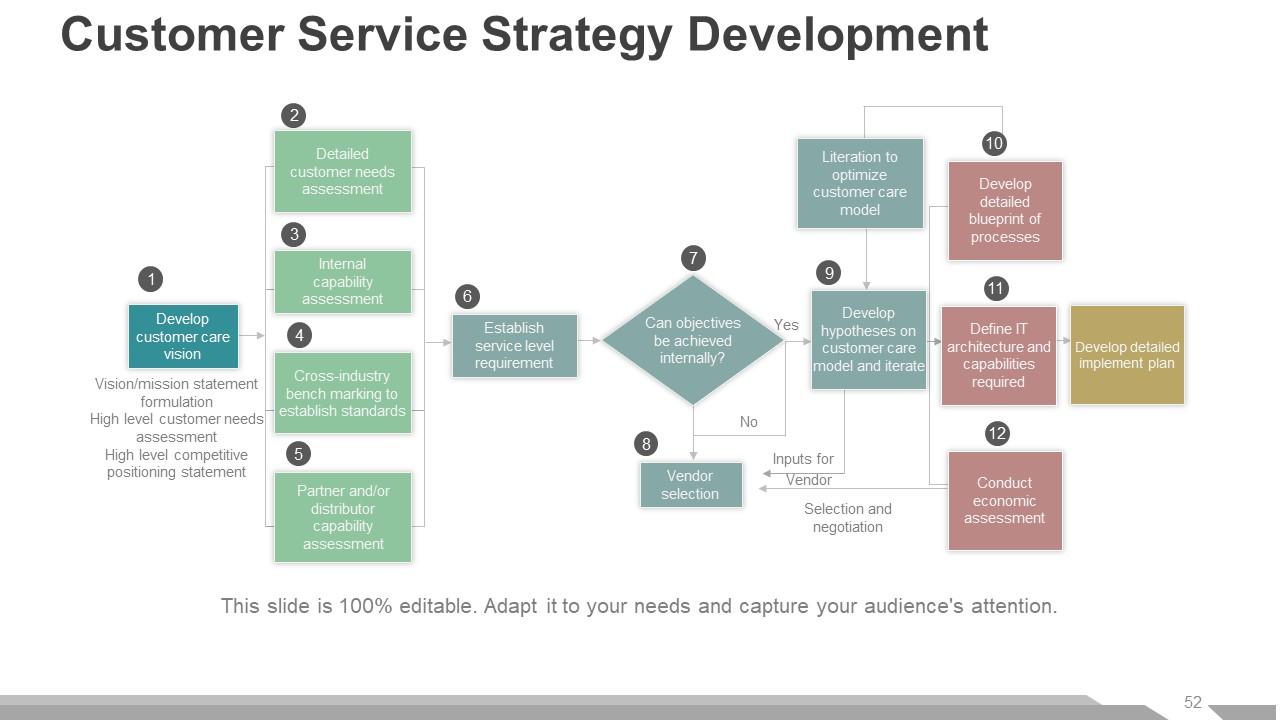
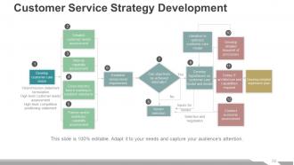
Slide 52: This slide presents Customer Service Strategy Development in a flow chart form.
Slide 53: This slide is titled Additional Slides to move forward. You can change the slide content as per need.
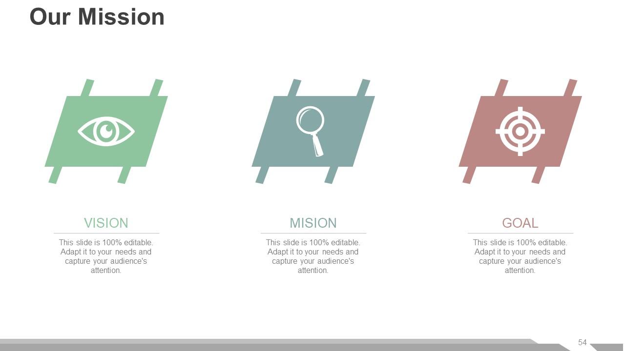
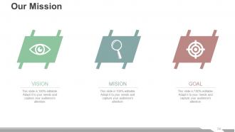
Slide 54: This is Our Mission slide to showcase vision, mission and goals.
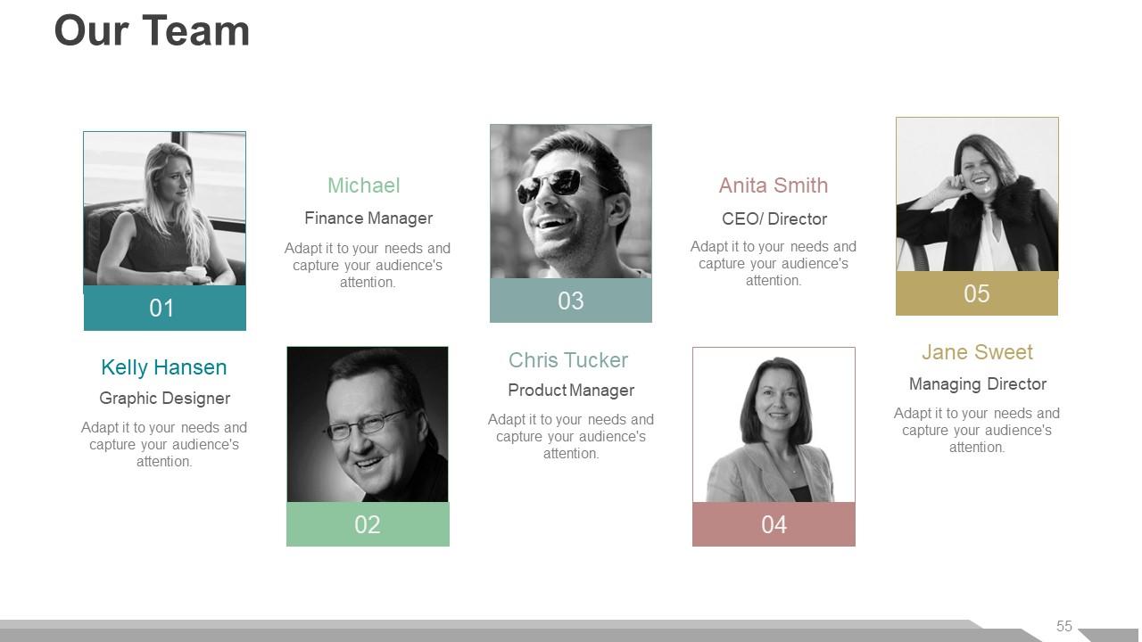
Slide 55: This slide helps depict Our Team with text boxes to fill in the name and designation.
Slide 56: This is an About Us slide. State team/ company specifications here.
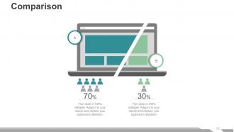
Slide 57: This is a Comparison slide to show comparison of two entities etc.
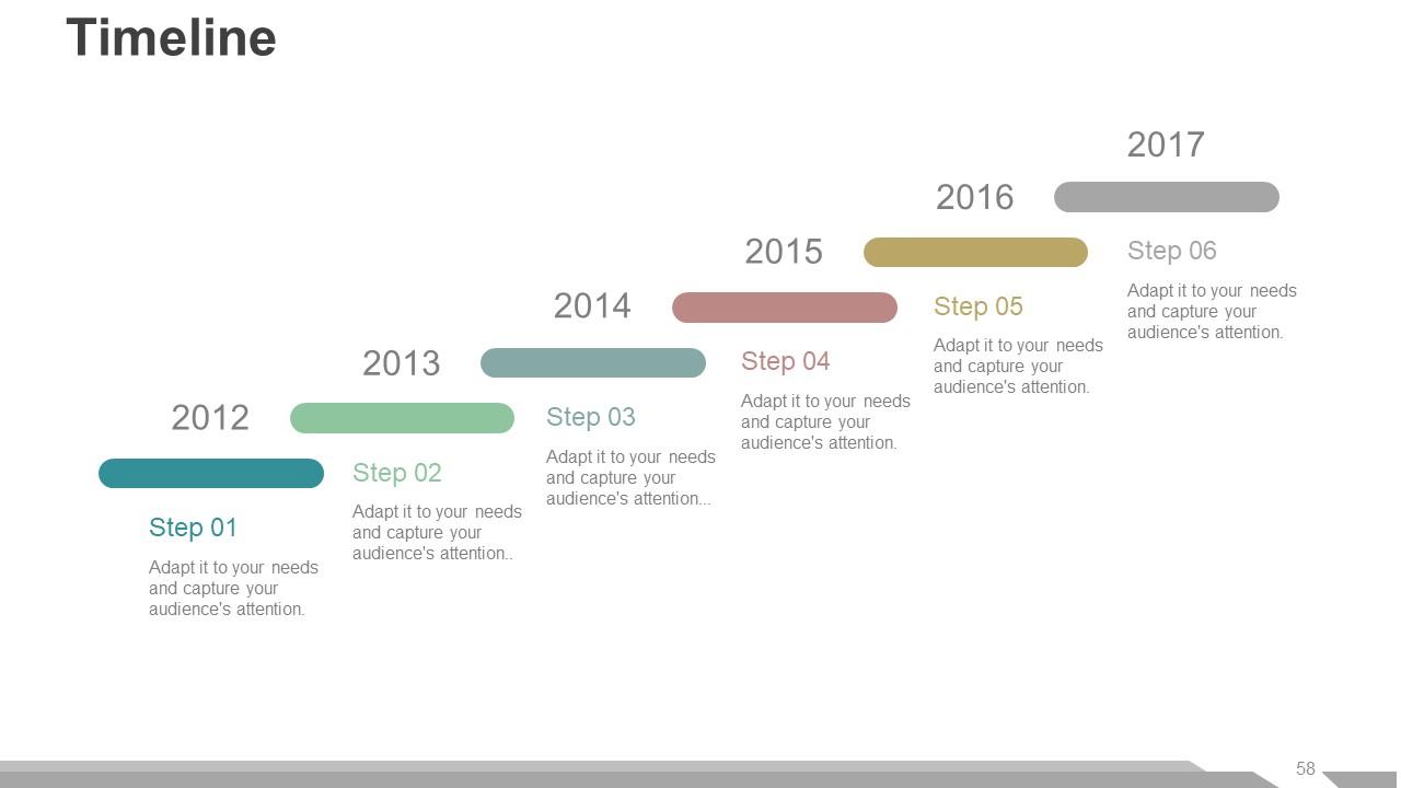
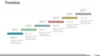
Slide 58: This is a Timeline slide to present important dates, journey, evolution, milestones etc.
Slide 59: This is a Thank You slide with Email, Address# street number, city, state, Contact Numbers.
Customer service review powerpoint presentation slides with all 59 slides:
Cut down the anticipation with our Customer Service Review Powerpoint Presentation Slides. Get it completed before expected.
-
Commendable slides with attractive designs. Extremely pleased with the fact that they are easy to modify. Great work!
-
I discovered this website through a google search, the services matched my needs perfectly and the pricing was very reasonable. I was thrilled with the product and the customer service. I will definitely use their slides again for my presentations and recommend them to other colleagues.
