Customer Support Quality Assurance Dashboards Edu Ppt
Try Before you Buy Download Free Sample Product
Audience
Editable
of Time
This set of slides contains the dashboards to monitor the effectiveness of the customer service team. The major KPIs covered are first call resolution rate, unresolved call rate, average response time by team, net promoter score NPS, etc.

People who downloaded this PowerPoint presentation also viewed the following :
Content of this Powerpoint Presentation
Slide
1
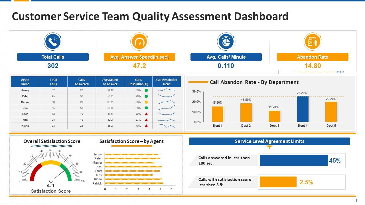
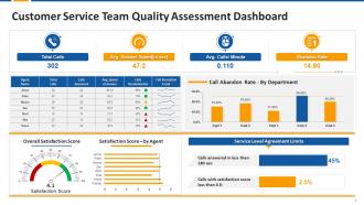
This slide
covers customer support dashboard including KPIs like average speed of answer
calls, CR trend, Call resolution, abandon rate, average call per minutes,
customer satisfaction score etc.
Slide
2
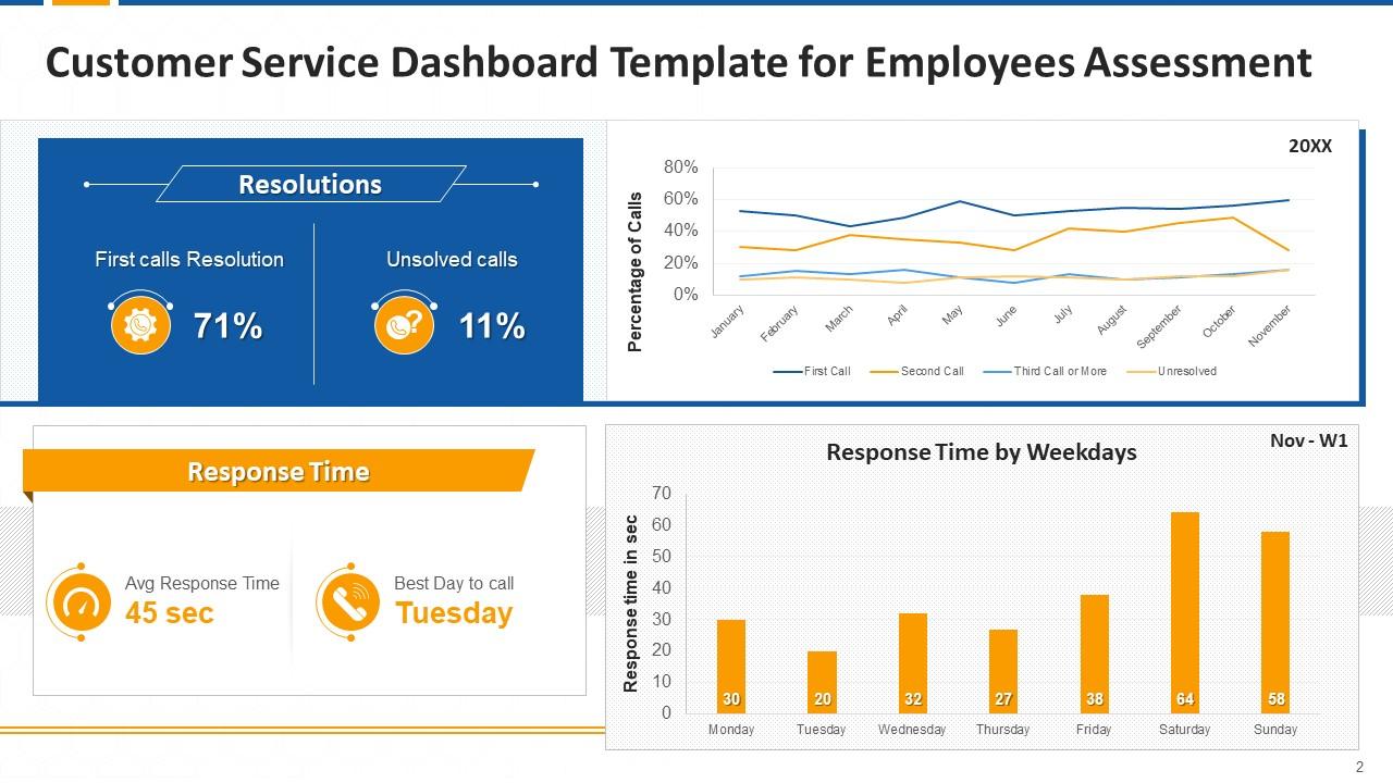
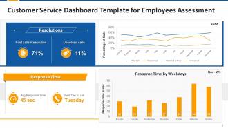
This slide
covers KPI dashboard for customer support team audit. It includes metrics such
as first call resolution rate, unresolved call rate, average response time by
team etc.
Slide
3
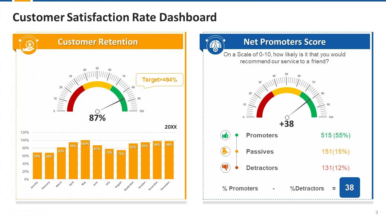
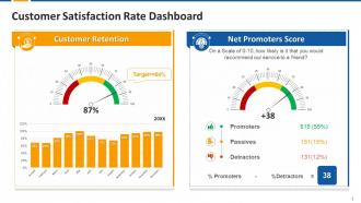
This slide
covers customer satisfaction key performance indicators such as net promoter
score (NPS) and customer retention rate.
Slide
4
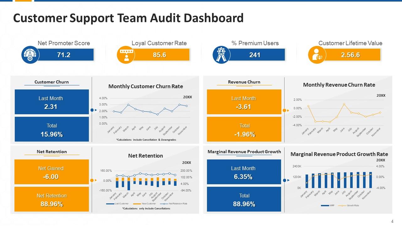
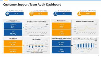
This slide
covers Customer service quality assurance (QA) dashboard. It includes KPIs such
as NPS, loyal customer rate, CLV, churn rate, net retention, MRR growth etc.
Slide
5
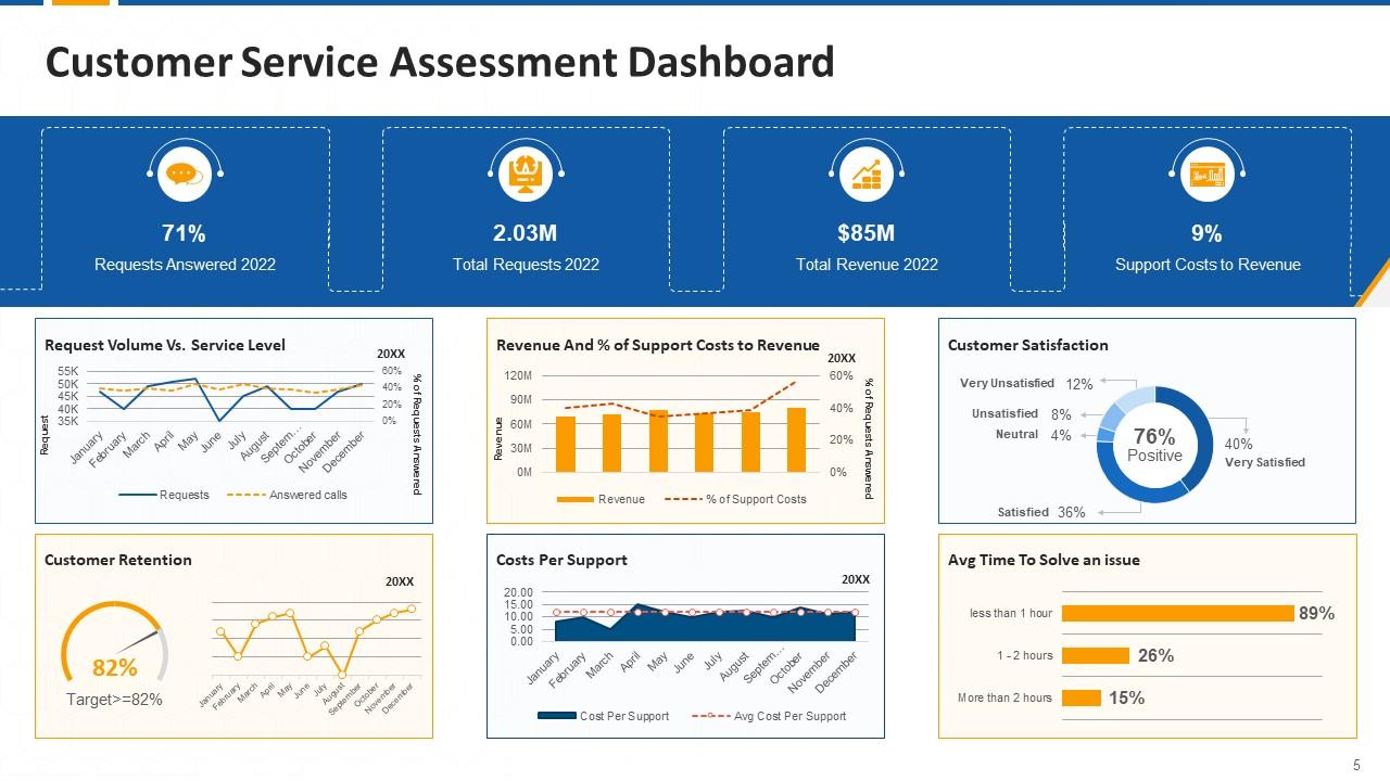
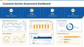
This slide
covers customer support metrics such as customer retention rate, average time
to solve an issue, customer satisfaction, total request, request answered etc.
Customer Support Quality Assurance Dashboards Edu Ppt with all 21 slides:
Use our Customer Support Quality Assurance Dashboards Edu Ppt to effectively help you save your valuable time. They are readymade to fit into any presentation structure.
FAQs for Customer Support Quality Assurance
For your dashboard, grab the basics first: first contact resolution, CSAT scores, and response times. Quality stuff matters too - escalation rates, how accurate your resolutions actually are, whether agents follow protocols. I always include agent metrics like handle time and knowledge base usage because it shows you where training's needed. Honestly, speed means nothing if you're giving crappy answers. Keep it to maybe 6-8 metrics total or your dashboard becomes this overwhelming mess nobody wants to look at. Balance is everything here.
So dashboards are honestly a game-changer for tracking satisfaction stuff. You can see CSAT scores, NPS ratings, resolution times - all that data visualized over weeks or months instead of drowning in spreadsheets (which I hate). The cool part? You'll spot trends right away, like satisfaction tanking after product updates or jumping up post-training. Break it down by team or product line to figure out what's actually causing changes. Oh, and set alerts when scores drop below whatever threshold you pick. That way you can fix problems before they get ugly.
Response time tracking is probably your best starting point - super easy to set up and you'll immediately see who's lagging. Ticket categorization and sentiment analysis save tons of manual work, though honestly the sentiment stuff misses nuance sometimes. Grammar and tone scoring works great if your team uses templates. I've worked with teams doing crazy keyword detection for compliance red flags and auto-escalations. The sentiment analysis isn't bulletproof but it'll catch obviously pissed off customers you might overlook. Quality score calculations happen automatically too. Just don't try implementing everything at once - start simple and build from there.
Hook your dashboard straight into the ticketing system and QA tools so everything updates automatically every few minutes. Seriously, don't do manual updates - I've watched teams go insane trying to keep up with that. Build in alerts for weird data like missing timestamps or crazy scores. Someone should randomly check a few metrics against raw data weekly, just to be safe. Oh and set up those validation rules from day one! Way easier than explaining to your boss why the numbers looked completely wrong for a week.
Look, customer feedback is where the real insights live - way more valuable than whatever metrics you think matter. Pull sentiment scores and complaint themes straight into your dashboard because that's your actual pain points right there. Perfect call times mean nothing if people are still pissed off, you know? What works is mapping feedback to specific QA stuff. Customers complaining agents don't listen? Track your active listening scores and watch the patterns. Honestly, I'd just grab your top 3 feedback themes from this quarter and build metrics around those first. Way easier than trying to boil the ocean.
Honestly, charts and visuals save your sanity when you're drowning in support tickets. Heat maps instantly show peak hours - way better than scrolling through endless rows of data. Color-coded satisfaction scores? You'll spot problems immediately. Progress bars for SLA stuff give you those "oh crap" moments when teams are falling behind. I mean, who wants to stare at spreadsheets all day anyway? Your brain processes visual info so much faster. Quick charts help you make actual decisions instead of getting buried in numbers. Trust me, it makes the whole job less soul-crushing.
Honestly, the hardest part is getting people to actually look at the thing regularly instead of just peeking once and never coming back. Data quality will drive you nuts too - messy data makes everything pointless no matter how nice it looks. You'll probably overthink the metrics at first (I definitely did). Too many and everyone gets overwhelmed, too few and you miss stuff that matters. Different people want to see totally different views of the same numbers, which gets messy fast. Just start with maybe 3-5 metrics your team genuinely cares about, then build from there.
Honestly? Daily if you can swing it, but weekly at bare minimum. Ticket quality shifts super fast and you don't want problems getting out of hand. Monthly updates to the actual dashboard are usually fine though - unless you're changing processes or seeing weird trends pop up. Match your review schedule to how many tickets you're handling. More volume means more frequent check-ins. I always tell people to start weekly and see how it feels. Oh, and if your team's small, you might get away with less frequent reviews. Really depends on how quickly things can go sideways in your specific situation.
Honestly, dashboards are perfect for this. You can watch performance patterns happen live and pinpoint exactly what your team's struggling with. Track stuff like resolution times and satisfaction scores - way better than just telling someone "do better" without proof, you know? I love how you can drill into individual performance and compare against team averages. Agents can actually see their own progress too, which is surprisingly motivating. Set up weekly reviews where you turn all that data into real development plans. Oh, and you can totally gamify improvement goals if your team's into that.
Honestly, dashboards are clutch for catching issues before customers start freaking out. Track stuff like response times and satisfaction scores - you'll start noticing weird patterns pretty quick. Maybe tickets always spike around certain topics, or some agents keep getting stuck on the same types of problems. Once you get the hang of reading those data signals, it's like having superpowers or whatever. Root causes become way more obvious instead of just putting out fires constantly. Set up alerts when numbers get sketchy so you're not always scrambling to catch up.
So I'd probably go with Tableau or Power BI for the main dashboard stuff - they're both really good at pulling from ticketing systems and making everything interactive. Zendesk and Salesforce have their own dashboards built in, but they're kinda basic honestly. Google Data Studio is actually pretty decent if you're watching budget, plus it connects to most APIs without much hassle. Oh and figure out your key metrics first - that'll help you pick which tool handles your specific data sources best. You want something that automatically grabs from your CRM, chat tools, survey platforms, all that stuff.
Map each dashboard to what teams actually need day-to-day. Tier 1 agents? Real-time queues and response times. Supervisors want trends and performance breakdowns. Your billing folks probably don't care about technical resolution rates - they need refund processing times instead. Ask each team what decisions they're making daily. Honestly, most default metrics are just clutter anyway. Build role-based views around their top 3 pain points. I'd start there and ignore everything else. Half the battle is cutting out the noise so people can actually find what matters.
Honestly, the key is making negative feedback feel helpful instead of crushing. I always try to show it next to some positive stuff when I can - like if 15% of calls had issues, mention that call volume was up 30% or whatever. Don't use harsh words like "failed." Say "areas to work on" instead. Break things down into specific categories rather than just dumping vague complaints on people. That's what kills morale fastest. And here's the big one - always give them actual next steps or point them toward training. Otherwise you're just telling someone they suck without helping them fix it, which is pretty useless.
Look, historical data is what makes your dashboard actually useful instead of just pretty numbers. You'll see trends that matter - like whether that 85% satisfaction score is getting better or worse. Honestly, without it you're flying blind. Six months minimum to get solid baselines, then you can spot seasonal patterns and see if your QA changes are doing anything. The cool part? Comparing agent performance over time and figuring out which training actually worked. Way better than just staring at this week's stats and wondering what they mean.
Honestly, I'd start with those big industry reports - Zendesk and Salesforce put out decent benchmarks annually. Support communities like Support Driven are goldmines too since people actually drop real numbers there (way more useful than you'd think). Tools like MaestroQA have anonymized data from their users which helps. But here's the thing - don't compare your B2B metrics to some retail company's stats. That's pointless. Pick maybe 3-5 metrics that actually matter for your business first, then hunt down industry averages for those specific ones. Makes the whole process way less overwhelming.
-
I can always count on your designs for my professional needs. I believe I found a one-stop-shop for PPTs.
-
My search for complete decks ended with SlideTeam. Such a surplus collection of HD PowerPoints. Moreover, their standard and widescreen formats have helped me in delivering bullseye presentations.