Dashboard Of Employee Engagement Survey Results

Rating:
90%
Dashboard Of Employee Engagement Survey Results
Slide 1 of 7
Favourites Favourites

Try Before you Buy Download Free Sample Product

Audience Impress Your
Audience
Editable 100%
Editable
Time Save Hours
of Time
The Biggest Sale is ending soon in
0
0
:
0
0
:
0
0
Rating:
90%
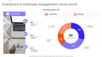
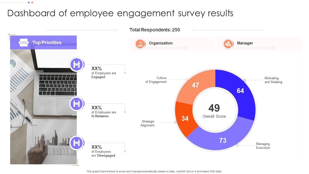
This graph or chart is linked to excel, and changes automatically based on data. Just left click on it and select Edit Data. Introducing our Dashboard Of Employee Engagement Survey Results set of slides. The topics discussed in these slides are Organization, Motivating And Relating, Managing Execution, Strategic Alignment. This is an immediately available PowerPoint presentation that can be conveniently customized. Download it and convince your audience.
FAQs for Dashboard Of Employee

Honestly, start with the basics - engagement surveys, turnover rates, and who's calling in sick all the time. Those'll give you the real picture. Manager effectiveness scores are probably the most important thing though, since bad bosses are usually why people bail. Track retention by department too, plus how long it takes to fill roles. Internal promotions are good to watch. If you're doing pulse surveys, throw those in. I'd add participation in optional stuff like training sessions - tells you if people actually care or they're just going through the motions. But seriously, don't go crazy with metrics. Your dashboard should make sense instantly, not look like a NASA control panel.

Honestly, visualizing your engagement data is a game changer. You can spot patterns instantly instead of drowning in spreadsheet hell. Heat maps show you which departments are tanking. Trend lines reveal when engagement nosedives - maybe after that disastrous all-hands meeting nobody talks about? Bar charts are super simple to start with, but they'll show you stuff you'd never catch otherwise. Like how smaller teams always seem happier, or engagement tanks every January (shocking, I know). Skip the raw data dumps - your brain wasn't built for that. Charts make correlations pop out immediately.

You know how quarterly surveys are basically useless because by then the damage is done? Real-time data fixes that. Daily pulse checks and collaboration metrics show you patterns way earlier - like when your Monday team meetings are killing morale (been there). I've seen managers catch burnout before people actually quit just by tracking productivity dips. Set up alerts for big changes though, or you'll just drown in spreadsheets. The cool part is spotting which initiatives actually work instead of guessing.

Honestly, I'd go for weekly updates minimum - daily's even better if you're not drowning in other stuff. People actually pay attention when the data's fresh, otherwise it becomes like that sad office plant everyone pretends doesn't exist. Weekly works great for most teams since you can spot real trends without bombarding people constantly. Just pick whatever schedule and actually stick to it though. That's the main thing - consistency so your team knows when to check for new stuff. I'd start weekly and see how it goes, then maybe bump it up if people seem into it.

Start with visual hierarchy - put your biggest metrics like engagement scores right up front. Color coding helps but don't go crazy with it. Dashboards turn into hot messes when you stuff too much in (trust me on this one). Make the filters dead simple so managers can actually find what they need by department or whatever. Trend lines beat static snapshots every time. You'll want benchmark data in there too. Oh, and test it with real users first - they always spot the weird stuff you miss when you're too close to it.

Look, the dashboard thing works because it finally gets management and employees talking the same language. You're collecting real feedback and - here's the crucial part - actually doing something with it. Employees can see their input isn't just vanishing into some corporate void, which honestly happens way too often. Trust builds when people know you're listening. Pick maybe two big issues from your data and tell everyone what you're fixing. Don't try to solve everything at once though. The whole point is creating that back-and-forth where both sides actually get each other for once.

So for engagement dashboards, I'd go with Tableau, Power BI, or Google Data Studio. Google's probably your best bet starting out - it's free and won't make you want to pull your hair out learning it. Power BI works great if you're already deep in the Microsoft world. Tableau's super powerful but honestly kind of a pain to learn at first. Oh, and here's the thing - figure out what metrics your leadership actually cares about before you pick anything. I've watched teams build these gorgeous dashboards that nobody ever looks at. Such a waste. Pick whatever fits your budget and how technical you want to get.

Oh totally, demographics make a huge difference in engagement scores. Age is probably the biggest one - younger people obsess over career development while the veterans just want some recognition for once. Departments vary wildly too. Tech folks need their autonomy, sales teams are completely different animals. Gender and generational stuff shows up in communication styles and work-life balance expectations. You should definitely break down your dashboard by these categories so you can actually see what's happening. Makes it way easier to figure out what each group actually needs instead of doing some one-size-fits-all approach.

Data's gonna be your worst nightmare - HR systems are like stubborn toddlers that refuse to share. Getting clean info out of them is brutal. Trust is the other big thing. Employees think you're building some creepy surveillance system, so good luck with that conversation. Oh, and managers? Half of them will ignore whatever insights you give them anyway. Honestly though, just start with a small test group first. Get the data mess sorted early or you'll hate your life later. Be super upfront about what you're doing with their info from the start.

Honestly, these dashboards are game-changers for spotting problems early. Real-time data shows you exactly which teams are struggling and what's causing people to quit. Way better than waiting for exit interviews, right? Visual charts make board presentations so much smoother too - executives hate digging through endless spreadsheets. Set up alerts when engagement scores drop so you're not scrambling later. You can actually see if your retention programs work instead of just hoping. Plus it helps you figure out where to spend your budget. Catching issues before they turn into expensive turnover disasters is huge.

Honestly, predictive analytics is a game changer for this stuff. Your dashboard can catch warning signs way before they blow up - things like survey scores dropping, people calling in sick more, or collaboration just falling off a cliff. I've seen it work really well for predicting who might quit or check out mentally. Plus you can forecast which departments will struggle during crunch time (super helpful for planning). The coolest part? Setting up alerts for risk indicators so you're not blindsided when someone hands in their notice. Way better than scrambling after people already have one foot out the door.

Honestly, your dashboard is like a treasure map if you actually dig into it. Look for patterns - maybe satisfaction is tanking in accounting but engineering looks fine. Those feedback comments usually tell the real story too. Here's what I've found works: drill down into the weird stuff. Team might have decent overall scores but everyone's burned out on work-life balance. That's your smoking gun right there. Don't just stare at numbers though. Use them to start actual conversations with people. Schedule some one-on-ones and ask the awkward follow-up questions about what's really going wrong.

Dude, you need benchmarks or you're just guessing. Like, a 7.2 engagement score could be amazing or terrible depending on your industry. Compare it to what you hit last quarter first - that's the easiest starting point. Then look at industry standards to see how you stack up against competitors. Honestly, I've seen companies freak out over "low" scores that were actually above average for their sector. Historical data shows trends too, which helps you set goals that aren't completely unrealistic. Without context, those numbers are pretty much meaningless.

Definitely anonymize everything so nobody can figure out who said what. Most dashboard platforms have settings where you need at least 5 people in a group before showing results - super helpful for privacy. Be upfront about what you're collecting and why. I swear, so many companies just... don't bother explaining this stuff to people. Get proper consent first too. Make sure your data storage is locked down tight with the right access controls. Honestly, just think about how you'd want someone handling your own feedback data and do that.

Dude, there are some great examples out there. Microsoft's daily pulse surveys caught team burnout early and boosted productivity by 10%. Pretty smart move. Google did Project Oxygen - used engagement data to figure out what their best managers were doing, then taught everyone else. Salesforce tracks engagement stuff in real-time and matches it up with sales numbers, which honestly makes total sense. Oh and don't go crazy trying to measure everything at once - that's like, recipe for disaster. Start with just a few key things you actually care about.

Ratings and Reviews

90% of 100
Review Form
Write a review
Most Relevant Reviews
  1. 100%

    by Delmar Wagner

    The content is very helpful from business point of view.
  2. 80%

    by James Rodriguez

    I want to express my gratitude to SlideTeam’s presentation design services team for helping me create the best presentation of my life!

2 Item(s)

per page: