Financial performance kpi dashboard showing burn rate opex ratio gross profit

Rating:
90%
Slide 1 of 6

or

Favourites Favourites

Try Before you Buy Download Free Sample Product

Audience Impress Your
Audience
Editable 100%
Editable
Time Save Hours
of Time
The Biggest Sale is ending soon in
0
0
:
0
0
:
0
0
Rating:
90%
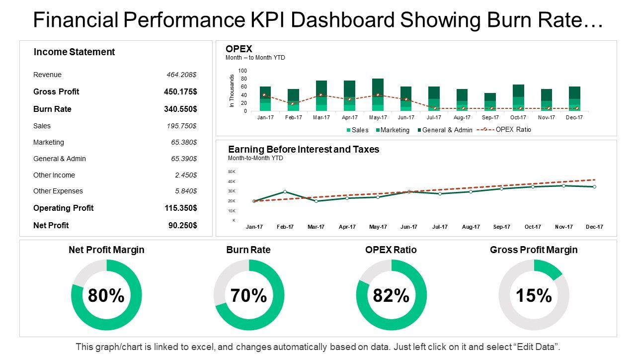
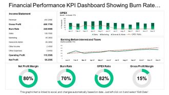
Presenting this set of slides with name - Financial Performance Kpi Dashboard Showing Burn Rate Opex Ratio Gross Profit. This is a four stage process. The stages in this process are Financial Performance, Financial Report, Financial Review.

Content of this Powerpoint Presentation

Description:

The image is a PowerPoint slide titled "Financial Performance KPI Dashboard Showing Burn Rate." It is a comprehensive snapshot of a company's financial metrics over time. This dashboard is designed to provide a quick overview of key performance indicators (KPIs) crucial for financial analysis and decision-making. The slide is divided into several sections:

1. Income Statement: 

A tabulated representation of the company's financials, including Revenue, Gross Profit, Burn Rate, Sales, Marketing, General & Admin (G&A) expenses, Other Income, Other Expenses, Operating Profit, and Net Profit.

2. OPEX (Operational Expenditure): 

A bar graph showing month-to-month Year-To-Date (YTD) operational expenses categorized by Sales, Marketing, and G&A, along with an OPEX Ratio trend line.

3. Earning Before Interest and Taxes (EBIT): 

A line graph depicting the EBIT trend over the year, allowing for a quick assessment of profitability before accounting for interest and tax expenses.

4. Key Financial Ratios: 

Donut charts visualizing Net Profit Margin, Burn Rate, OPEX Ratio, and Gross Profit Margin, each providing a snapshot of the company's financial efficiency and health.

The note at the bottom indicates that the graph/chart is linked to an Excel sheet, allowing for dynamic updating of the data presented.

Use Cases:

This type of  slide can be used in various industries:

1. Technology:

Use: Tracking financial health of tech startups.

Presenter: CFO or Financial Analyst.

Audience: Investors, internal management.

2. Manufacturing:

Use: Monitoring operational costs and profitability.

Presenter: Operations Manager.

Audience: Board members, operational team.

3. Healthcare:

Use: Financial oversight in hospital management.

Presenter: Healthcare Administrator.

Audience: Hospital board, department heads.

4. Retail:

Use: Assessing store performance and profit margins.

Presenter: Retail Chain Manager.

Audience: Store managers, shareholders.

5. Consulting:

Use: Demonstrating financial KPIs to advisory clients.

Presenter: Management Consultant.

Audience: Client leadership teams.

6. Energy:

Use: Evaluating cost structures in energy projects.

Presenter: Energy Analyst.

Audience: Investors, regulatory bodies.

7. Non-Profit:

Use: Reporting financial status to donors and trustees.

Presenter: Non-profit Treasurer.

Audience: Donors, board members, regulatory agencies.

FAQs for Financial performance kpi dashboard showing burn rate opex

Honestly, just stick to the big ones first - revenue, profit margins, cash flow, and ROI. Those will tell you everything you need to know about how things are actually going. If cash is tight (been there), definitely track your accounts receivable aging and burn rate too. Working capital and debt-to-equity are solid additions for the full picture. Don't go crazy with too many metrics though. Maybe 8-10 max on your main dashboard or you'll just overwhelm everyone. Start simple with these basics, then you can always layer on more specific stuff later based on what people actually want to see.

Dude, visualization is a total game-changer for financial stuff. Raw spreadsheet data is basically useless - you'll miss everything important buried in those rows. But throw it into charts and heat maps? Suddenly you can spot trends and see which areas are actually crushing it vs completely bombing. Bar charts work great for starting out, then add time-based views so you catch seasonal patterns. The crazy part is how correlations just pop out that you'd never notice otherwise. Like I was looking at our customer costs the other day and boom - clear spike right before our revenue tanked. Makes so much more sense visually.

Look, real-time data completely changes the game for financial dashboards. You'll catch problems before they blow up and spot opportunities as they happen. Static reports? Honestly, they're like trying to navigate with a map from last month. Pretty useless when markets shift overnight. The key is figuring out what actually needs live updates - maybe cash flow and critical ratios - versus stuff that's fine refreshing daily. I've seen too many people go overboard and make everything real-time when half their metrics barely change week to week. Focus on what moves fast and matters most.

Honestly, I'd figure out your main financial goals first, then pick KPIs that actually track those. Cash flow matters more than revenue? Focus on operating cash flow ratio and days sales outstanding - not the flashy stuff that looks impressive but doesn't help. Most dashboard tools are pretty flexible these days, so you can set up custom views and alerts when things hit certain numbers. Here's the thing though - don't go overboard. I've seen too many dashboards with like 20 metrics that nobody looks at. Stick to maybe 5-7 things your team will genuinely use to make decisions.

Honestly, the worst thing you can do is stuff everything onto one screen. Pick maybe 5-7 metrics that actually matter for decisions - anything more just confuses people. Skip the vanity stuff too (like total page views) and focus on what drives revenue instead. Your data needs to be fresh and reliable, otherwise nobody trusts it. Oh, and don't go crazy with colors - I've seen dashboards that look like someone threw up a bag of Skittles. Keep it simple so your team can actually use the thing to make smart calls about money.

Honestly, your software choice will determine if people actually use this thing or ignore it completely. Drag-and-drop tools like Tableau and Power BI are lifesavers - no coding needed to tweak KPIs. But some platforms? You'll need SQL just to change a damn filter, which is brutal. Speed matters too. Nobody's waiting 30 seconds for charts to load. Plus think about mobile access and whether your non-finance folks can figure it out without calling IT every five minutes. Test whatever you're considering with actual users first - I've seen too many "perfect" dashboards gather digital dust because they were impossible to navigate.

Honestly, start with automated validation checks - they'll catch weird variances before stuff hits your dashboard. Data errors are such a pain to fix later. Pull from single sources when you can (avoids version chaos), and do monthly reconciliations against your GL. That part's boring but necessary. Document what everything means too so your team isn't measuring apples vs oranges. Oh, and set up flags for missing data points. The validation rules give you the most value upfront, so tackle those first. Once that's running smooth, the rest gets way easier.

Your dashboard needs to tell a story people actually give a shit about. Executives want the big picture stuff - trends and why numbers changed. Department heads? They want to dig into their own metrics. Interactive dashboards crush static reports every time because people love poking around data themselves. Don't just dump numbers on them - call out the important insights with annotations or whatever. Oh, and set up alerts for big changes so they stay interested between meetings. Regular walkthrough sessions are clutch for getting feedback on what's actually useful.

So leading indicators predict what's coming - stuff like your sales pipeline, how much you're spending to get new customers, employee happiness surveys. Lagging indicators? That's what already went down - revenue, profits, churn rates. Most execs get totally fixated on the lagging stuff (which honestly makes sense, it's concrete), but you really need both. The leading ones let you fix things before they tank your numbers. Lagging confirms if your moves actually paid off. I'd pick 2-3 leading indicators that have historically matched up with your main lagging metrics. That combo tells the whole story.

Check your financial KPIs monthly at least - weekly's even better though. For fast-moving businesses, daily cash flow and revenue tracking makes sense. I've watched too many teams build these fancy dashboards that nobody looks at for months, which is honestly just a waste of time. Start monthly and see what works. Then bump up the frequency for metrics that actually affect your day-to-day decisions or swing around a lot. Really depends on your business cycle and how quickly you need to pivot when something's off.

Dude, adding forecasting to your KPI dashboard is seriously worth it. Instead of just seeing what already went down, you'll actually spot trends before they smack you in the face. Cash flow problems? You'll see them coming weeks ahead. Makes resource decisions way easier too - like, you're not flying blind anymore. I probably should've started using it sooner honestly. Your whole dashboard shifts from just reporting old news to actually predicting what's next. Try starting with basic 3-month rolling projections first, don't overcomplicate it.

So dashboards are honestly a game changer - they show visual patterns that make weird trends pop out right away. Like if your revenue suddenly tanks or cash flow starts heading south, you'll catch it fast instead of missing it buried in some Excel hell. Most good ones color-code the scary stuff or send alerts when things get wonky. I'd probably start with just your top 5-7 KPIs though, don't go crazy at first. Way easier than manually checking a million spreadsheets every week. You can even set it to ping you automatically when numbers drift outside normal ranges.

Honestly, just pick the metrics that actually matter for your industry. Retail? You're looking at inventory turnover and same-store sales. SaaS companies need to watch monthly recurring revenue, churn, and customer acquisition costs - those will make or break you. Manufacturing is all about production efficiency and defect rates. Healthcare focuses on patient satisfaction and readmission rates instead. Don't get caught up tracking vanity metrics that sound cool but don't help anyone make real decisions. Stick to maybe 5-7 KPIs max that your execs actually use. Trust me, less is more here.

Honestly, user feedback makes or breaks these things. Ask people what metrics they can't find and which charts make zero sense. I've watched so many gorgeous dashboards collect dust because nobody bothered checking if they're actually helpful. Do quick quarterly sessions or send surveys - whatever works. Sometimes I'll literally just peek over shoulders to see where people get stuck (weird but effective). Focus on fixing the biggest complaints first. Your dashboard isn't some finished masterpiece - it should change as your team figures out what they actually need day-to-day.

Start with role-based access - that's your biggest win. Finance can see everything, but other departments only get what they need. Don't mess around with MFA either, seriously just turn it on. SSO makes life easier too. Encrypt everything in transit and at rest, plus log who's looking at what. Trust me, you'll thank yourself when someone doesn't accidentally blast salary info to everyone (happened at my last job, total nightmare). Oh and do quarterly reviews to clean up old users - people forget about that part but it matters.

Ratings and Reviews

90% of 100
Review Form
Write a review
Most Relevant Reviews
  1. 100%

    by Donovan Cunningham

    Helpful product design for delivering presentation.
  2. 80%

    by Dustin Perkins

    Very well designed and informative templates.

2 Item(s)

per page: