Health And Safety Metrics Dashboard Showing Total Incidents
Try Before you Buy Download Free Sample Product
Audience
Editable
of Time
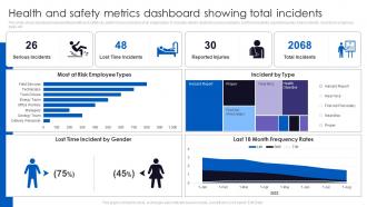
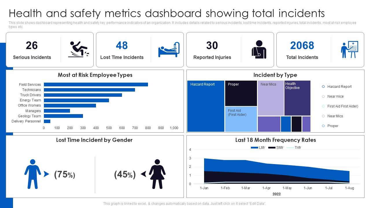
This slide shows dashboard representing health and safety key performance indicators of an organization. It includes details related to serious incidents, lost time incidents, reported injuries, total incidents, most at risk employee types etc.
People who downloaded this PowerPoint presentation also viewed the following :
Health And Safety Metrics Dashboard Showing Total Incidents with all 7 slides:
Use our Health And Safety Metrics Dashboard Showing Total Incidents to effectively help you save your valuable time. They are readymade to fit into any presentation structure.
FAQs for Health And Safety Metrics Dashboard
Start with the basic stuff - injury rates, lost time incidents, near-miss frequency. That's your baseline data showing what already went wrong. The real game-changer though? Leading indicators. Training completion rates, hazard reports from your team, safety audit scores - this is how you catch problems before someone gets hurt. Don't sleep on incident severity rates either since that tells you how bad things actually got. I'd honestly focus on getting these dialed in first, then you can add the fancy industry-specific metrics later once you've got your system running smoothly.
Honestly, data analytics can totally change how you handle safety reporting. Pick one metric you're already tracking and start digging into what actually drives it. Look for leading indicators - stuff like near-misses or training completion rates that happen before accidents do. Real-time dashboards are pretty sweet because they'll automatically flag weird trends before they become problems. You can benchmark against industry standards too, which helps when you need to justify safety spending to the higher-ups. Don't overthink it though - starting small works better than trying to revolutionize everything at once.
So you've got two main safety metrics that actually matter. Incident rates track all recordable injuries per 100 workers - gives you the full picture. LTIFR is different though, only counts injuries bad enough that people miss work days. That's the stuff that really hurts your bottom line. Both help you spot trouble areas and show leadership why you need more safety budget. Honestly, the month-to-month tracking is where you'll see real patterns. When numbers jump, that's when you dig deeper. They're also great for comparing against industry benchmarks - you'll know if you're doing better or worse than similar companies.
You'll want both hard numbers and actual stories from your people. Track the usual stuff - incident rates, near-misses - but also do employee surveys and safety walks. Honestly, some of my best intel comes from just hanging out with workers on their breaks (they're way more honest then). The metrics show you what's broken, but talking to people tells you why it's broken. Maybe try a simple dashboard with your KPIs next to actual quotes from recent feedback? Start small though - pick 2-3 key numbers and pair each with something easy like monthly check-in surveys.
Honestly, gamification works pretty well for this stuff. Set up leaderboards for safety observations or give badges when people finish training modules. Monthly challenges are solid too - like which team can go the longest without incidents. Everyone's on their phones constantly anyway, so mobile apps make sense. QR codes at workstations for quick surveys, peer nominations for safe behavior - that kind of thing. The whole point is making it feel less like boring compliance forms and more like something they'd actually want to do. I'd probably just pick one thing first and see how your team responds to it.
Benchmarking shows you exactly how your safety numbers stack up against everyone else in your industry. Sometimes it's a wake-up call - your incident rates might be way higher than you thought. But that's actually good info to have! You'll spot gaps in training or protocols that weren't obvious before. Plus your boss will love having real data when they're deciding where to spend safety budget. Honestly, most companies think they're doing better than they actually are until they see the numbers. Grab your industry's latest benchmarking report and compare - it's pretty eye-opening stuff.
Honestly, EHS software is a game changer for tracking safety stuff. You'll ditch those awful spreadsheets (thank god) and get real-time data on incidents, near-misses, compliance - all automated. No more manual errors screwing things up. The dashboards actually make sense, unlike most software interfaces. It plays nice with whatever systems you're already using too. But here's the real win: you spot problems and trends way before they blow up. I'd say figure out what's driving you crazy about your current setup first - makes picking the right platform so much easier.
First thing - get everyone on the same page about what you're actually measuring. People have wildly different ideas about what counts as a "near miss" vs an actual incident. Document your current mess (we all have one) and figure out where things go sideways. Digital systems are honestly a lifesaver here - way fewer human errors than spreadsheets. Train your team properly and give them templates they can't screw up. Oh, and audit regularly because people drift back to their old habits. The whole point is consistency - if Bob's measuring one way and Sarah's doing something completely different, your data's useless.
Honestly, the biggest pain points are data silos and people just not logging stuff when things happen. Inconsistent reporting is a nightmare too. Your sensors help with the forgetting issue, which is smart. Integration with existing workflows is key - you don't want reporting to feel like a chore. Mobile apps and real-time dashboards actually move the needle. But here's the thing: getting everyone to consistently use the system? That's like 80% of the battle right there. I'd start by figuring out where your biggest data gaps are first. Then hit those with the right combo of tech and training.
So basically, you can use predictive analytics to catch safety issues before they blow up. Feed your accident reports, near-miss stuff, maintenance logs - whatever data you've got - into machine learning models. They'll spot when conditions match up with past incidents. It's pretty wild actually, like the algorithm knows trouble is coming. Your safety team gets alerts and can jump in early with extra training or inspections. I'd start with whatever accidents happen most at your place. Way easier than trying to analyze everything at once.
Honestly, wellness programs are total game-changers for safety stuff. Companies I've seen cut their injury rates by like 20-30% with good programs. Your team stays more alert when they're healthier - both mentally and physically. Fewer accidents happen that way. Oh, and it catches health problems early before they spiral into bigger issues. Absenteeism drops too, plus way fewer workers' comp claims. But here's the thing - you can't just toss gym memberships at everyone and call it a day. Mental health support matters just as much as the physical side. The programs that actually work hit both angles.
Honestly, you've got to speak different languages to different people. Executives want those fancy dashboards with injury rates and compliance stuff - the big picture view. But your frontline folks? They need info they can actually use right now, not some boring spreadsheet. Colorful charts work way better than numbers on a page (trust me on this one). Mix up how you deliver it too - digital displays where people take breaks, quick team meetings, maybe some simple graphics in newsletters. The trick is making each group feel like the data actually matters for their specific job, not just random stats floating around.
Dude, don't mess around with safety reporting - the legal consequences are brutal. OSHA fines can hit $145,000 per violation, which is insane. If someone gets injured because you fudged numbers, you're looking at criminal charges and lawsuits. Executives can face personal liability too. The worst part? Once investigators suspect deliberate falsification, they dig deeper into everything. Your company's reputation gets trashed, plus you'll have regulators breathing down your neck forever. I know paperwork sucks, but triple-check those reports before submitting. Trust me, the headache of being thorough beats getting sued into oblivion.
So here's the thing - tracking safety stuff forces leadership to actually pay attention to what's going wrong. You measure injury rates, near-misses, all that data, and suddenly they can't pretend everything's fine. Employees notice when you're actually counting their concerns too, builds way more trust. I've watched whole companies flip their approach once they started measuring the right things. Oh, and focus on the forward-looking metrics first - like how many people finished safety training or reported hazards. Don't just wait around counting accidents after they happen.
Look, proper training seriously cuts down on workplace injuries and all those OSHA headaches nobody wants to deal with. Your employees actually start catching problems before they blow up into real incidents. Plus they'll follow safety protocols way more consistently - which honestly saves everyone from drama later. The data backs this up too. Training completion rates go up, safety observations improve, and injury frequency drops. I'd start tracking how effective your training actually is through quick assessments. Then compare that against your incident reports. Trust me, the ROI becomes pretty obvious once you see the numbers side by side.
-
I am glad to have come across Slideteam. I was searching for some unique presentations and templates for my business. There are a lot of alternatives available here.
-
“I required a slide for a board meeting and was so satisfied with the final result !! So much went into designing the slide and the communication was amazing! Can’t wait to have my next slide!”