Hourly timeline chart ppt slide templates
Try Before you Buy Download Free Sample Product
Audience
Editable
of Time
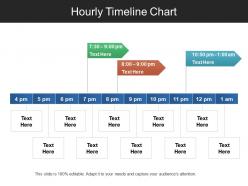
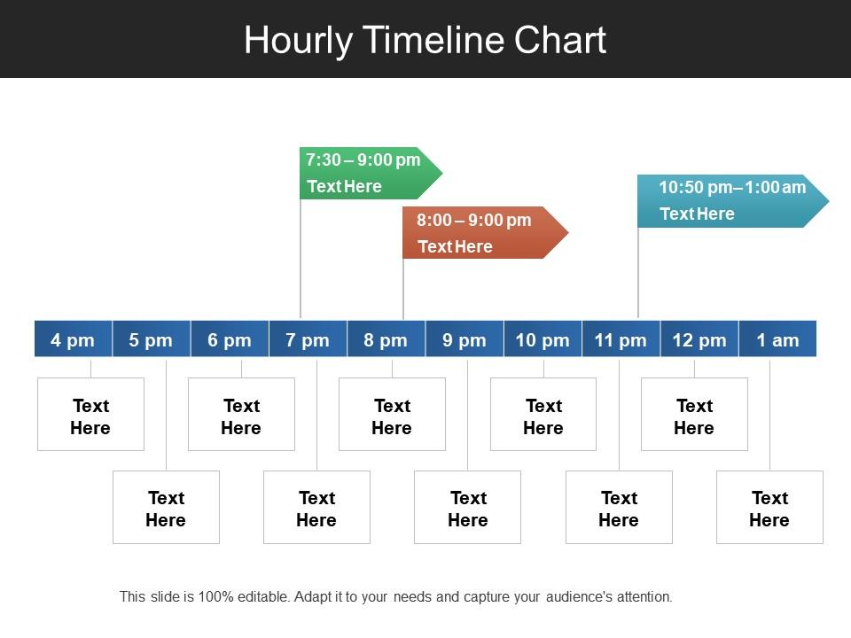
Regulate your daily business activities with our hourly timeline chart PPT slide. It will work as a management guiding tool used by the employees to known about the process which needs to be followed for achieving the set daily targets. You can also visualize the changes within the process with this business timeline PPT model. You can also use this Presentation design for developing a daily project schedule for your company projects. It also helps in streamlining the various functions related to your projects. This process roadmap timeline PPT design will also help in representing the stages of your company timeline which further helps in defining the milestone f your structure within the stipulated time. With this business process timeline PPT template, you can analyze your existing business model and introduce changes into the same. It also helps in scheduling your business activities in a structured manner. Therefore, just download and start customizing this organizational timeline PPT image slide. Get by with a little help from our Hourly Timeline Chart Ppt Slide Templates. They will put your act together.
People who downloaded this PowerPoint presentation also viewed the following :
Hourly timeline chart ppt slide templates with all 5 slides:
Handle complications with our Hourly Timeline Chart Ppt Slide Templates. Find avenues to ease the burden.
FAQs for Hourly timeline chart
Hourly charts are perfect when you need to show super detailed timelines - like hour-by-hour project schedules or event planning. They make complex workflows way easier to follow than those broad daily/weekly charts. Your audience can spot problems instantly - bottlenecks, overlapping tasks, timing issues, all that stuff. Honestly, clients eat this up because it shows you've really thought things through (maybe it's the detail that impresses them?). Great for project kickoffs where you're mapping out launch day activities. Short answer: they give you crystal clear visibility into workflows that other chart types just miss.
Dude, these hourly timeline charts are actually game-changers for project stuff. I was super skeptical too but they show you SO much detail - like you can see exactly when tasks bump into each other and who's swamped at what time. Way better than regular Gantt charts for catching problems early. They've literally saved me from those awkward "wait, we're both supposed to be doing X at 3pm?" moments more times than I can count. Perfect for sprint planning or anything with tight deadlines. You'll spot conflicts before they become actual disasters. Trust me on this one.
Excel or Google Sheets are solid starting points since you've probably got them already. Both handle time data pretty well. Tableau and Power BI are where it's at if you want something interactive with good filtering - way more polished. I've actually seen people pull off decent timelines in PowerPoint too, though that's gonna be more tedious manual work. Timeline JS or Canva work fine for quick stuff. Honestly? Just start with Excel to mess around and see what you need, then upgrade to something fancier if your chart needs more bells and whistles.
Honestly, start with your most urgent stuff first and build around that. Mark clear time chunks - like every hour or two depending how long this thing runs. Write out what you're actually doing for each block, not just vague descriptions. Dependencies are huge - show which tasks need other ones finished first. Buffer time is a must because everything takes way longer than you think it will. I learned that the hard way! Color coding different activity types makes it way easier to scan quickly. Don't forget actual dates and who's doing what if it's a team thing.
Honestly, it's all about how zoomed-in you want to get. Hourly charts let you catch stuff that daily views totally miss - like when your site crashes every Tuesday at 2pm or whatever. Daily timelines work fine for spotting trends over months, but hourly is where the good stuff hides. You'll see exactly when your team's most productive, when servers slow down during lunch, all that operational detail. I always flip to hourly when something's acting weird because you can pinpoint the exact moment things go sideways. Way more useful for troubleshooting than those big-picture weekly charts.
Hospitals and manufacturing plants absolutely crush it with hourly charts. When you're tracking shift changes or production lines, that hour-by-hour breakdown is gold. Logistics companies do this too - they're obsessed with delivery timing. Oh, and call centers! They watch those phone volume spikes like hawks throughout the day. Basically, if your team is constantly asking "wait, what happened around 3 PM yesterday?" then you need these charts. I've seen people discover patterns they never knew existed once they start tracking stuff hourly. It's wild how much timing impacts everything.
Yeah, they're pretty great for productivity stuff! I map out my whole day in time blocks - meetings, actual work, breaks, plus those weird internet spirals we all do. Way more realistic than regular to-do lists where you pretend everything will magically fit. Honestly, you start seeing patterns fast. Like when you're actually sharp vs when you're just pretending to work. The random time-wasters become super obvious too. Just track for a week or so - you'll probably be surprised at where your time actually goes. I was shocked how much I spend on "quick" Slack checks.
Make sure your time labels are super clear - nobody wants to squint at tiny text wondering if that's 2 or 3pm. I always go left to right chronologically (obviously) and align everything properly with the time slots. Color coding is honestly a game changer, especially when you're tracking different categories. Don't go crazy on the vertical axis though. Like, the whole point is showing patterns over time, not cramming every detail possible. Oh and definitely have someone else glance at it first - you'll miss obvious stuff after staring at it forever!
Dude, color-coding will save your sanity. Trust me on this one. I used to make these boring gray timelines that were impossible to read - never again! Pick colors that actually make sense: red for urgent stuff, blue for meetings, green for regular project work. You can organize by task type, priority, team members, whatever works for your situation. The trick is using colors that are different enough to spot quickly. Oh, and don't forget to add a legend somewhere or people will bug you asking what everything means. Makes such a huge difference when you're trying to scan through your day.
You'll definitely need timestamps and the actual values you're tracking. Make sure your time intervals stay consistent though - mixing hourly data with random 15-minute chunks will mess everything up. Labels are crucial so people know what's happening at each point. Don't forget dates if you're spanning multiple days, and throw in any categories that explain the patterns. I learned this the hard way on my last project. Having clear reference points matters too, otherwise nobody can interpret what they're looking at. Get your data clean first and the chart becomes way easier.
Honestly, hourly timelines are perfect for this kind of thing. They let you show the whole "before, during, after" story instead of just dumping facts on people. I've used them for crisis situations, product launches, customer journeys - basically anything where timing matters. What's cool is how they make your audience feel like they're actually there experiencing it with you. Way more engaging than boring bullet points, you know? Oh, and here's a tip - pick like 3 or 4 key moments on your timeline and really pause to tell little stories at each one. Makes it stick better.
Don't cram everything into tiny hourly chunks - it gets messy fast. Also watch your time intervals and keep them consistent. Labels matter way more than you'd think, so make sure people can actually tell what hour they're looking at. Colors are tricky - I've seen some truly horrible rainbow disasters that nobody could read. Oh, and if you're dealing with multiple time zones, that's a whole other headache to plan for. Sometimes you don't even need hourly detail anyway. Maybe try 4-hour blocks first? Keep your y-axis steady and honestly just think about what you're actually trying to show people.
Honestly, hourly charts are a game changer - you'll catch stuff that weekly views totally hide. Like I had no idea our site traffic actually peaked at 2pm until I started tracking hourly. You can spot weird spikes, see when customers are actually browsing (not when you think they are), and compare different days side by side. The cyclical patterns are wild once you notice them. Just plot your main metrics for one week and see what jumps out. Trust me, there's probably some trend you're missing right now that could actually matter for your business.
Dude, progressive animation is where it's at - reveal each hour as you're talking instead of dumping everything at once. Color code different activities or intensity levels. Have you tried circular clock formats? Way cooler than boring horizontal bars. Racing bar charts are honestly my favorite thing ever - watching hours compete in real-time is so satisfying. If you've got photos from those time periods, overlay them on the timeline. Makes it feel like people are actually living through it instead of just staring at another static chart. The whole point is making them experience it unfolding, you know?
Your time intervals totally change what you'll see in the data. Daily or weekly views smooth out those crazy hourly spikes - you might miss rush hour patterns or when everyone's grabbing lunch. I've literally watched people overlook major problems because they picked the wrong scale. But going minute-by-minute creates too much noise and you lose the big picture. For hourly stuff, half-hour or hour intervals work best. Oh, and figure out what decision you're actually trying to make first - that'll guide everything else.
-
Very unique, user-friendly presentation interface.
-
Awesomely designed templates, Easy to understand.