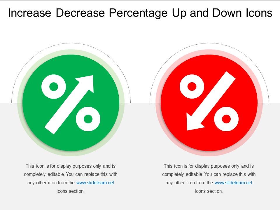
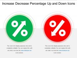
Increase decrease percentage up and down icons
Try Before you Buy Download Free Sample Product
Audience
Editable
of Time
Elaborate on the facilities that enthralled you with our Increase Decrease Percentage Up And Down Icons. Acquaint folks with your favorite destination.
People who downloaded this PowerPoint presentation also viewed the following :
Increase decrease percentage up and down icons with all 5 slides:
Our Increase Decrease Percentage Up And Down Icons ensure absolutely amazing growth. Accelerate faster towards your goals.
FAQs for Increase decrease percentage up
Oh, those are just visual ways to show percentages instead of boring numbers. Like when you see a circle that's mostly filled vs just "75%" - your brain gets it instantly. Way more engaging than plain text, honestly. You can use them for progress updates, survey data, budget stuff, basically anything where you're showing parts of a whole. Just don't go crazy with the design - simple shapes and consistent colors work best. Otherwise people spend more time figuring out what they're looking at than actually understanding your data. Trust me on that one.
Honestly, percentage icons are game-changers for presenting data. Your brain processes a half-filled circle way faster than scanning "73% vs 27%" in some boring table. Perfect for those meetings where half the room glazes over at spreadsheets - you know exactly who I'm talking about. They're clutch for survey results or completion rates where you want people to get the gist quickly. Sure, you lose some precision, but most of the time that instant visual comparison is worth way more than exact decimal points. Before/after stuff works great with these too.
Honestly, just go with high-contrast stuff that people can actually read. Blue and white is solid for work presentations, and those green-to-red gradients look really good for showing performance data. I'm kind of obsessed with using one accent color against a neutral background lately - keeps everything looking clean. Don't use yellow or orange as your main colors though, they're impossible to see from far away. If your company colors are bold enough, use those. Otherwise blue and gray combinations work everywhere and never look bad, no matter what weird lighting you're dealing with.
Honestly, percentage icons are so much better for getting your point across quickly. People see those little figures and instantly get it - no confusing axes to figure out. They look super clean in presentations too, especially when you're showing executives one big stat. But here's the thing - they only work for simple stuff. You can't really show quarterly trends with tiny human icons, you know? That's where regular charts come back into play. For complex data or anything over time, stick with traditional charts. But if it's just one percentage or basic comparison? Go with icons every time.
Honestly, just pick one style and stick with it - nobody wants slides that look like a disco ball threw up. Make the numbers big enough so people in the back can actually see them, and don't forget to include the actual percentage alongside your fancy icons. I learned this the hard way, but never cram more than 3-4 comparisons on one slide or you'll lose everyone. Put them close to whatever data they're supporting. Oh, and definitely check how they look on different screens first - I've had percentage graphics go completely haywire on certain projectors before.
Percentage icons are honestly a game-changer for making data actually interesting. Like, instead of some boring bar chart showing "75% prefer mobile," just make 100 tiny phone icons - 75 green, 25 gray. People get it instantly. Our brains are way better with visuals than numbers anyway. You can get creative too - pizza slices for food surveys, little battery symbols for energy stuff. The key is keeping icons simple so the percentage jumps out immediately. Oh, and don't forget to stick the actual number somewhere for screen readers and stuff.
Honestly, percentage icons are game-changers for presentations. They turn dry numbers into something people actually want to look at - like instead of just saying "47% of customers," you show it visually and boom, instant understanding. People process images way faster than text anyway. They're perfect when you're comparing different percentages or tracking progress toward something. Plus they save you from those awful slides that are just wall-to-wall bullet points (ugh, the worst). Just make sure your icons actually make sense with your content and don't go overboard with fancy designs - the data should still be the star.
Honestly, there's no official rulebook for percentage icons - most design systems just lump them in with other data viz stuff. Your industry matters though. Fintech companies play it super safe with colors and styling, but if you're doing gaming or fitness apps you can get way more creative. Just stay consistent with whatever visual language you've already got going. Oh, and obviously make sure people can actually read the numbers lol. I'd peek at what your competitors are doing first, then document whatever you pick so your team stays on the same page.
Definitely swap out any colors that don't translate well. Like red screams "danger" here but means good luck in China - so those red percentage icons could totally backfire there. Green isn't universally "good" either, especially in some Middle Eastern cultures where it has religious significance. Honestly? I'd just stick with neutral blues and grays most of the time. Way less headache. Also ditch currency symbols or country-specific stuff in your icons. Simple geometric shapes work everywhere - arrows, basic bar fills, that kind of thing. Oh, and definitely run designs by local team members first if you can!
Honestly, I'd go straight to Figma for this - it's web-based so you can easily share with your team later. Adobe Illustrator gives you way more control if you need super detailed vector work, but Figma handles most icon projects just fine. Canva's decent for basic stuff but kinda limiting once you want real customization. After Effects if you're doing animations, obviously. I used to be all about Illustrator but honestly? Figma's just so much more convenient these days. Start there and see if it covers what you need.
Dude, animated percentage icons are totally worth it - they bump up viewer retention by like 15-25% over static ones. Movement just catches our eye, you know? There's something weirdly addictive about watching those progress bars fill up or numbers tick higher. Your brain literally can't ignore it. Don't go crazy with the animations though - keep them smooth and time them with whatever you're saying. Otherwise people get distracted or bored waiting. Oh, and if you're doing any data stuff, animated percentages are basically a must. They make boring stats actually watchable.
Don't make your fonts tiny - nobody can read that stuff from the back row. Also, I hate when people make icons that don't actually match their percentages (like a 30% bar that looks way bigger). Cramming too many comparisons on one slide just confuses everyone. Skip the percentage icons entirely if your data needs more explanation. High-contrast colors are your friend here. Oh, and this might sound obvious but I've seen it happen - make sure your percentages actually add to 100% when they should!
Honestly, percentage icons are such an underrated way to strengthen your brand. Use the same colors and style as your main brand palette - it creates this cohesive look that people start recognizing without even realizing it. I've seen companies absolutely crush this with custom percentage graphics that feel totally unique to them. Like, throw in your brand fonts or even sneaky little logo elements into the percentage displays. The worst thing is when your data looks like generic stock stuff (ugh, so boring). Make it feel intentionally yours, you know? Your visuals should scream your brand's personality.
Hey! So for finance stuff, definitely go with circular progress rings - they look super clean and professional. Bar charts work well too, especially if you're showing trends going up or down. Honestly, finance people hate flashy stuff, so keep it simple. Make sure your icons match your brand colors and are the same size throughout. Oh, and here's something I learned the hard way - test how they look on different screens first. I once had icons that looked perfect on my laptop but were tiny on the big conference room screen. Not fun explaining quarterly results when nobody can see your visuals!
Dude, percentage icons are a game changer. Your brain just gets visual stuff way faster than numbers - like seeing a half-full progress bar vs reading "47 out of 83 tasks done." It's wild how much quicker you can spot what's working and what isn't. When I started using them in dashboards, meetings actually moved faster because everyone could instantly see the patterns. No more squinting at spreadsheets trying to figure out if we're behind or ahead. Honestly makes presenting to higher-ups so much smoother when they can just glance and know what's up.
-
Unique research projects to present in meeting.
-
Unique design & color.