Introduction icons ppt powerpoint presentation file diagrams

Introduction icons ppt powerpoint presentation file diagrams
Slide 1 of 5
Favourites Favourites

Try Before you Buy Download Free Sample Product

Audience Impress Your
Audience
Editable 100%
Editable
Time Save Hours
of Time
The Biggest Sale is ending soon in
0
0
:
0
0
:
0
0
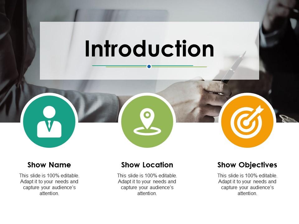
Presenting this set of slides with name - Introduction Icons Ppt Powerpoint Presentation File Diagrams. This is an editable three stages graphic that deals with topics like Introduction, Business, Marketing, Strategy, Icons to help convey your message better graphically. This product is a premium product available for immediate download, and is 100 percent editable in Powerpoint. Download this now and use it in your presentations to impress your audience.

People who downloaded this PowerPoint presentation also viewed the following :

FAQs for Introduction icons ppt powerpoint

Honestly, icons are a game-changer for presentations. They break up all that boring text and help people "get it" instantly - like, our brains process images crazy fast compared to reading. Your slides end up looking way more professional too. Just don't go nuts with them or it gets messy real quick. I learned that the hard way lol. Stick with simple ones that actually make sense for what you're talking about. The difference in how engaged people get is pretty noticeable once you start using them right.

Honestly, good icons are a game changer for engagement. People see a recognizable icon and instantly know what it does - no reading required. You know how you immediately abandon apps with weird, confusing icons? That's exactly what you're avoiding. When users can navigate quickly without thinking too hard, they stick around way longer. I'd say go with the obvious choices first - house icon for home, that kind of thing. Oh, and definitely test them with actual people before launching. Sometimes what seems super clear to you makes zero sense to everyone else.

Okay so basically vector icons can scale up or down without getting all pixelated and gross. Raster ones (like PNGs) have fixed pixels, so they look fine at their normal size but get blurry when you stretch them. I made this mistake once in a big presentation - had to use these tiny icons blown up on a huge screen and they looked terrible lol. For your deck, definitely go with SVGs or other vector formats. They'll stay crisp no matter what size you need. Trust me, it's way better than having chunky pixelated icons ruining your slides.

Oh totally! Each industry has its own unwritten rules for icons. Healthcare sticks with those trustworthy blues and greens - you know, clean medical crosses and soft rounded edges. Finance is all about looking serious with dark blues, grays, and sharp geometric shapes that basically say "we won't lose your money." Tech gets to have all the fun with bright colors and playful designs (honestly kind of jealous). Legal and government though? Super conservative palettes and traditional symbols only. Just peek at 4-5 big competitors in your space and you'll spot the patterns pretty quickly. That's your starting point right there.

Icons are basically visual shortcuts that make your data way easier to digest. Replace those chunky text labels with stuff people already get - like a house for real estate numbers or a shopping cart for sales data. They're perfect for organizing info and showing processes in a way that flows naturally. Honestly, consistency is everything here. Pick one style and don't mix it up. Also, don't overdo it - I've seen presentations that look like emoji explosions and it's... not great. Process flows are where icons really shine though. Your audience will follow along without even thinking about it.

Honestly, consistency is huge with icons - don't mix outline ones with filled ones, it looks messy. Make them big enough that people in the back can actually see them! I've sat through way too many presentations where the icons were basically invisible. Stick with symbols everyone recognizes, and give them proper spacing around your text. The main thing? Only use them if they actually help your message. Random decorative icons are just distracting. Oh, and definitely check how they look from across the room before you present - you'd be surprised how different things appear from a distance.

Oh man, icons are tricky across cultures! Red screams "danger" to us but means good luck in China. Hand gestures are even worse - I learned that one the hard way. Plus you've got religious symbols, reading patterns (right-to-left vs left-to-right), different animal meanings. Honestly, testing with actual users from those markets is your best move. When in doubt though? Stick with the boring but universal stuff - play buttons, magnifying glasses, those basic icons everyone recognizes. Way safer than accidentally offending half your audience.

Oh man, don't mix different icon styles - it looks super sloppy. Keep everything consistent throughout your deck. Also make sure they're big enough that people in the back can actually see them! I've watched so many presentations where someone uses these weird abstract icons and everyone's just sitting there confused. Like, what does that even mean? Stick with obvious ones people recognize instantly. And honestly, only use them if they actually add something to your point - don't just throw them in randomly to fill space. Quick tip: step back from your laptop before presenting to check if they're visible.

Icons basically help people scan your content way faster - they create this visual flow that pulls the eye to important stuff. Your brain processes visual + text together, so it's like giving readers a shortcut. Just don't throw random icons everywhere (I see this mistake constantly). A lightbulb next to "Key Insights"? Perfect. A random star icon? Pointless. Try swapping out some bullet points with relevant icons and watch your layouts get so much cleaner. It's honestly one of those small changes that makes everything look more professional without much effort.

Dude, Noun Project is amazing for this stuff - seriously has everything you could want. Flaticon and Icons8 are solid choices too, especially if you're trying to keep it free. I used to be that person who'd waste forever trying to make my own icons... yeah, don't do that lol. Feather Icons has really clean minimal stuff if that's your vibe, or check out Iconify for more premium options. Oh and whatever you pick, just use the same style throughout the whole thing. Trust me, mixing different icon styles looks super weird.

So basically you can tweak the color, size, stroke weight, and style to match your brand. Most icon libraries let you do this directly, or just throw them into Figma/Illustrator if you need more control. The trick is keeping everything consistent - same corner style, same visual treatment, all that. Users definitely notice when icons look off or don't match. Oh, and make a quick style guide doc with your specs! That way when someone else on your team adds new icons, they won't accidentally mess up the whole vibe you've got going.

Honestly, icons are like visual shortcuts that keep people from drowning in text. A lightbulb for ideas, warning triangle for problems - that stuff just clicks better than boring bullet points. They guide your audience through the story too, kind of like breadcrumbs leading from one point to the next. Way more engaging than staring at paragraphs of words! Pick maybe 3-4 icons that match your main themes and stick with them throughout. Oh and they create these little emotional connections that people actually remember later. Trust me, your deck will feel so much cleaner.

So outlined icons are everywhere right now - they just look cleaner than the filled versions. Colors are back in a big way too, like we're finally done with that boring black and white phase. 3D and isometric stuff is having a moment again, which is kinda fun. Oh, and hand-drawn icons that look slightly imperfect? Those are huge because they feel more human. Honestly the rainbow gradient thing is getting a bit much for my taste, but people eat it up. For your presentations, I'd go with outlined icons in maybe 2-3 colors that match your brand. Keep them simple so people can actually see them from far away.

Honestly, icons are like little road signs for your brain - they break up all that text into chunks people can actually digest. I do this thing where I treat each icon like a mini chapter heading, you know? Pick ones that actually make sense for what you're talking about though. Random graphics just look messy. Find a matching set and stick with it. Your readers' eyes will naturally follow the icons down the page, which is exactly what you want. Start by figuring out your main sections first, then just match each one with something relevant. Works way better than walls of text!

Honestly, I'd start with Figma - it's free and pretty much does everything you need. Adobe Illustrator is obviously the fancy professional choice, but unless you're doing this constantly, it's probably overkill (and expensive). Canva's decent if you want something super easy with templates you can just tweak. Oh, and Sketch is solid too but Mac only, which is annoying. I've been using Figma for like everything lately and rarely need anything else. Try the free version first - you can always upgrade later if you get into it.

Ratings and Reviews

0% of 100
Review Form
Write a review
Most Relevant Reviews

No Reviews