KPI Dashboard for Tracking Project Team Performance App developer playbook
Try Before you Buy Download Free Sample Product
Audience
Editable
of Time
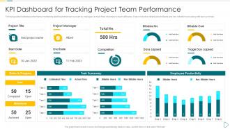
Following slide illustrates performance monitoring dashboard that can be used by managers to track their developers team efficiency. It also includes details about billable and non billable hours along with task summary.
People who downloaded this PowerPoint presentation also viewed the following :
KPI Dashboard for Tracking Project Team Performance App developer playbook with all 7 slides:
Use our KPI Dashboard for Tracking Project Team Performance App developer playbook to effectively help you save your valuable time. They are readymade to fit into any presentation structure.
FAQs for KPI Dashboard for Tracking Project Team Performance
Honestly, keep it simple - grab 5-7 metrics that actually move the needle for you. Make sure the data's fresh (real-time if possible) and use charts that show trends super clearly. I learned this the hard way, but put your most critical stuff at the top where you'll see it first. Don't get sucked into adding every fancy widget you find - that just makes everything cluttered and confusing. Include your targets or benchmarks so you know immediately if things are going well or if you need to panic. The whole thing should tell you a story about how you're performing. You can always add more bells and whistles once you've got the foundation working.
Look, first thing - connect your KPIs straight to what you're actually trying to achieve. Revenue goals? Track conversion rates and average order value, not pointless stuff like page views. Don't fall into that trap where you're measuring everything just because the data's there. I learned this the hard way lol. Ask yourself: does this number actually help me decide what to do next? Pick 3-5 metrics max to start. See how your team responds to them, then add more if needed. Honestly, the only KPIs worth having are ones that make you act differently.
Honestly, dashboards without good visuals are pretty useless. Raw data in spreadsheets? Your brain just can't process that fast enough. Charts and color-coding let you spot problems instantly - like, red means bad, green means good, done. Way better than scanning through endless rows of numbers. The trick is picking charts that actually fit your data type. Also keep your colors consistent or people get confused every time they open it. I learned that the hard way when our sales team kept asking what the purple bars meant. Short version: make it visual so you can make decisions without thinking too hard.
Check your KPIs every 1-2 weeks, monthly at the very least. Honestly, I've watched so many teams let their dashboards turn into digital junkyards - metrics everywhere that nobody even looks at anymore. Here's the thing: if you're not actually using a KPI to make decisions or track real progress, just get rid of it. Your dashboard needs to stay aligned with what matters now, not six months ago. Trust me on this one - set up a calendar reminder to regularly audit what's actually moving the needle. Otherwise you'll end up with a bunch of pretty charts that don't help anyone.
Honestly, the worst thing you can do is cram everything onto one screen - it just becomes visual noise. Pick metrics that actually matter for decisions, not stuff that just looks cool in meetings. Mobile responsiveness is huge too since everyone's constantly checking these things on their phones now. Keep your colors consistent or people get confused. Oh, and if someone can't find the main insight in like 3 seconds, you've made it too complicated. The whole point is that stakeholders can actually do something with what they're seeing, not just stare at fancy graphs.
Honestly, real-time data integration is what separates useful dashboards from glorified PowerPoints. Your data updates automatically, so you catch problems right when they happen instead of finding out about them in some dusty weekly report. It's like having your finger on the pulse vs waiting for the coroner's report, you know? You'll spot trends earlier and fix issues before they blow up into major headaches. The trick is connecting automated feeds from your main systems - saves you from manually updating everything constantly. Which, let's be real, nobody has time for anyway.
For KPI dashboards, most companies go with Tableau, Power BI, or Looker. Power BI's great if you're already using Microsoft stuff. Tableau has incredible visuals but gets expensive fast - learned that the hard way at my last job. Google Data Studio works fine for simpler needs, or honestly even Excel if your data isn't crazy complex. The best tool really comes down to your budget and what you're connecting to. I'd start with Power BI's free trial or Data Studio since they won't cost you anything upfront. You can always upgrade later once you figure out what actually works for your setup.
Honestly, the biggest mistake I see is people tracking vanity metrics that look good but don't actually matter. Start with what leadership really cares about - if it's customer retention, why are you measuring random website clicks? Map everything back to your actual strategic goals first. Get input from other departments too because they'll catch blind spots you missed. I learned this the hard way when our sales team was tracking completely different stuff than marketing. Set up quarterly check-ins to ruthlessly cut KPIs that aren't driving real decisions. Your dashboard should be lean and focused, not some overwhelming mess with fifty different charts.
Honestly, you've gotta match your KPI dashboard to whoever's looking at it. Executives just want the high-level stuff - red/yellow/green indicators they can scan in 30 seconds. Middle managers need more meat though, like trends and operational details to figure out what's actually happening. Your frontline people? They want real-time numbers they can do something about today. I've watched so many teams build these "one size fits all" dashboards that end up being completely useless. Way better to have separate views or at least good filters so everyone sees what actually matters for their job.
Honestly, KPI dashboards are game-changers because they put everyone's numbers right out there. No hiding when things go sideways. Pick 3-5 metrics that actually move the needle - not just stuff that looks impressive but doesn't matter. People perform way better when they know you're tracking their progress, it's wild how that works. Set clear targets for each person and review the dashboard regularly. You'll catch problems early instead of scrambling later. Oh, and don't get sucked into vanity metrics that make you feel good but don't impact results.
So I'd look at login frequency and how long people actually spend on the dashboard. Click-through rates on your KPIs matter too - which ones do they drill into? Decision speed is huge though. Are teams moving faster now? Honestly, the dead giveaway is when people stop bugging you for one-off reports every five minutes. That's when you know it's working. Check if they're actually referencing dashboard data in meetings instead of scrambling for their own numbers. User feedback helps, but really - if it's not cutting down manual requests and speeding things up, something's off.
Look up what KPIs the big players in your industry actually track - it's way better than shooting in the dark. You'll get a solid starting point without having to reinvent the wheel. Plus you can see how you stack up against competitors, which honestly is half the battle. These standards help you spot blind spots too. But don't just copy-paste everything though. Take what makes sense for your business and tweak it from there. I'd start with whatever the top 3-4 companies in your space are obsessing over, then make it yours.
Dude, cramming too many metrics on one dashboard is like showing someone 50 photos from your vacation - they'll just zone out. People can't process all that info at once. Your team ends up either ignoring everything or wasting time on numbers that don't actually matter. I learned this the hard way at my last job tbh. Keep it to maybe 5-7 key metrics max per view. Create separate dashboards for different teams instead. Trust me, less is way more when it comes to getting people to actually use the thing.
User feedback is honestly your best friend here - it shows you what's actually broken vs what just looks nice. People will straight up tell you when they can't find important stuff or when charts make zero sense. Watch what features get ignored too, that's super telling. I've seen gorgeous dashboards that nobody touches because they're just not practical. Regular feedback sessions are clutch, but you gotta actually make the changes or people will stop caring. Focus on the stuff they use most instead of adding more bells and whistles.
Honestly, mobile KPI dashboards are a total game-changer. You can check your metrics during your morning coffee or while stuck in traffic - beats waiting until you're back at your computer. The push notifications are clutch too because you'll know immediately if something's tanking. I learned this the hard way when our conversion rate dropped 30% on a Friday afternoon and I didn't find out until Monday. Make sure the charts actually look good on your phone though. Nobody's got time to zoom in on microscopic graphs.
-
Eye-catching PPT designs, outstanding team, and best customer service. I’m a super satisfied customer here!
-
Great designs, Easily Editable.