Kpi dashboard to monitor software agile software quality assurance model it ppt clipart
Try Before you Buy Download Free Sample Product
Audience
Editable
of Time
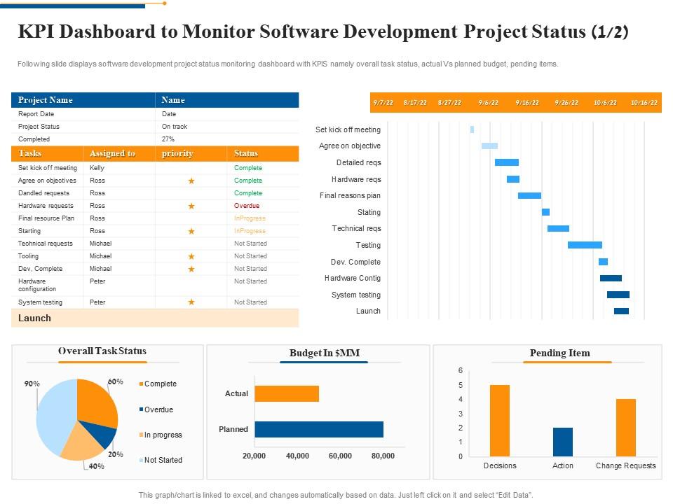
Following slide displays software development project status monitoring dashboard with KPIS namely overall task status, actual Vs planned budget, pending items.
People who downloaded this PowerPoint presentation also viewed the following :
Kpi dashboard to monitor software agile software quality assurance model it ppt clipart with all 2 slides:
Use our KPI Dashboard To Monitor Software Agile Software Quality Assurance Model IT Ppt Clipart to effectively help you save your valuable time. They are readymade to fit into any presentation structure.
FAQs for Kpi dashboard to monitor software agile software quality assurance model
Effective KPI dashboards include clear visual metrics, real-time data integration, customizable views, drill-down capabilities, and automated alerts for threshold breaches. These components streamline decision-making by delivering instant performance insights, enabling quick identification of trends and anomalies, with many organizations finding that well-designed dashboards significantly enhance operational efficiency and strategic responsiveness.
Businesses should select KPIs by aligning metrics with strategic objectives, stakeholder needs, and departmental goals, while ensuring data accuracy and actionability. Through comprehensive analysis of customer acquisition costs, revenue growth, operational efficiency, and employee performance metrics, organizations streamline decision-making processes, enhance resource allocation, and ultimately deliver measurable competitive advantage across all business functions.
Effective KPI dashboard visuals include gauge charts for target progress, line graphs for trend analysis, bar charts for comparisons, heat maps for performance matrices, and scorecard tables for multiple metrics. These visualization types enhance decision-making by presenting complex data clearly, enabling executives to quickly identify performance gaps, track progress against goals, and prioritize strategic initiatives across departments.
KPI dashboards should be updated based on business needs and data criticality, with real-time updates for operational metrics, daily updates for sales and customer data, and weekly or monthly updates for strategic performance indicators. Organizations in fast-paced sectors like retail and financial services increasingly find that automated, frequent updates enhance decision-making speed and competitive responsiveness.
User experience plays a critical role in KPI dashboard design by determining data accessibility, visual clarity, navigation intuitiveness, and actionable insight delivery. Through strategic UX design, organizations streamline decision-making processes, reduce analysis time, and enhance stakeholder engagement, with many financial services and healthcare institutions finding that well-designed dashboards significantly improve operational efficiency and strategic responsiveness.
Real-time data integration enhances KPI dashboards by providing instant visibility into performance metrics, enabling immediate decision-making, and eliminating delays from manual data updates. Through automated data feeds, organizations can monitor critical indicators continuously, respond quickly to emerging trends, and maintain accurate performance tracking, with many finding that real-time insights deliver competitive advantages and improved operational efficiency.
Common KPI dashboard mistakes include overcrowding with excessive metrics, using inappropriate visualizations, lacking clear context or targets, displaying outdated data, and ignoring user needs. These pitfalls reduce dashboard effectiveness by overwhelming users, hindering quick decision-making, and ultimately diminishing strategic value, with many organizations finding that focused, user-centric designs deliver significantly better business outcomes.
Organizations ensure KPI dashboard alignment through regular strategy reviews, stakeholder feedback sessions, and performance metric audits that connect directly to evolving business objectives. By conducting quarterly alignment assessments, involving department heads in KPI selection, and implementing automated data validation processes, companies maintain dashboard relevance while enabling data-driven decisions that deliver measurable competitive advantage.
**INPUT**: What are the best practices for presenting data insights in a KPI dashboard? **OUTPUT**: Best practices for presenting KPI dashboard insights include using clear visualizations, maintaining consistent color schemes, prioritizing key metrics above the fold, implementing intuitive navigation, and providing contextual comparisons. These approaches streamline decision-making by reducing cognitive load, enhancing data accessibility, and enabling faster pattern recognition, with many organizations finding that well-designed dashboards ultimately deliver improved operational efficiency and strategic alignment. **Word count: 58 words**
KPIs can be tailored by aligning metrics with each department's specific objectives, responsibilities, and success factors, such as sales revenue for sales teams, customer satisfaction scores for service departments, and production efficiency for manufacturing. Through strategic customization, organizations streamline performance measurement, enhance departmental accountability, and ultimately deliver better cross-functional alignment, with many finding that tailored KPIs significantly improve both individual and organizational outcomes.
**INPUT**: What tools or software are recommended for building KPI dashboards? **OUTPUT**: Recommended KPI dashboard tools include Tableau, Power BI, Google Data Studio, Looker, and Qlik Sense, each offering unique visualization capabilities and integration options. These platforms streamline data analysis by connecting multiple sources, automating updates, and delivering real-time insights, with many organizations finding that strategic tool selection enhances decision-making speed and operational efficiency. **Word count: 56 words**
Benchmarking and KPI tracking contribute to long-term success by establishing performance baselines, identifying improvement opportunities, enabling data-driven decisions, and maintaining competitive positioning through continuous monitoring. These practices streamline strategic planning and resource allocation across organizations, with many companies finding that consistent tracking delivers enhanced operational efficiency, faster market responsiveness, and sustainable competitive advantage.
Narrative elements can be incorporated through contextual annotations, trend explanations, performance stories, and visual storytelling techniques that transform raw metrics into compelling business insights. These storytelling approaches enhance dashboard effectiveness by connecting data points to strategic outcomes, highlighting progress narratives, and providing actionable context, with many organizations finding that narrative-driven dashboards significantly improve stakeholder engagement and decision-making clarity.
Essential customer satisfaction metrics include Net Promoter Score (NPS), Customer Satisfaction Score (CSAT), Customer Effort Score (CES), retention rates, and complaint resolution times. These metrics enable organizations to monitor service quality, identify improvement opportunities, and enhance customer experiences, with many retail and financial services companies finding that integrated satisfaction tracking ultimately delivers improved loyalty and competitive advantage.
Mobile compatibility enhances KPI dashboard accessibility by enabling real-time data access, supporting remote work flexibility, and facilitating instant decision-making from any location. Through responsive design and mobile-optimized interfaces, teams in sales, operations, and project management can monitor performance metrics during travel, client meetings, or field work, ultimately streamlining communication and accelerating response times across organizations.
-
Professional and unique presentations.
-
Innovative and Colorful designs.
-
Awesomely designed templates, Easy to understand.
-
Use of different colors is good. It's simple and attractive.