Transportation, Airline KPI Dashboard PowerPoint Templates
-
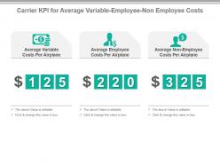 Carrier kpi for average variable employee non employee costs presentation slide
Presenting carrier kpi for average variable employee non employee costs presentation slide. This presentation slide shows three Key Performance Indicators or KPIs in a Dashboard style design. The first KPI that can be shown is Average Variable Costs Per Airplane. The second KPI is Average Employee Costs Per Airplane and the third is Average Non Employee Costs Per Airplane. These KPI Powerpoint graphics are all data driven, and the shape automatically adjusts according to your data. Just right click on the KPI graphic, enter the right value and the shape will adjust automatically. Make a visual impact with our KPI slides.
-
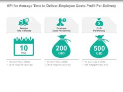 Kpi for average time to deliver employee costs profit per delivery powerpoint slide
Presenting kpi for average time to deliver employee costs profit per delivery powerpoint slide. This presentation slide shows three Key Performance Indicators or KPIs in a Dashboard style design. The first KPI that can be shown is Average Time to Deliver. The second KPI is Employee Costs Per Delivery and the third is Profit Per Delivery. These KPI Powerpoint graphics are all data driven, and the shape automatically adjusts according to your data. Just right click on the KPI graphic, enter the right value and the shape will adjust automatically. Make a visual impact with our KPI slides.
-
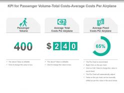 Kpi for passenger volume total costs average costs per airplane presentation slide
Presenting kpi for passenger volume total costs average costs per airplane presentation slide. This presentation slide shows Three Key Performance Indicators or KPIs in a Dashboard style design. The first KPI that can be shown is Passenger Volume. The second KPI is Average Total Costs Per Airplane. The third is Average Fixed Costs Per Airplane. These KPI Powerpoint graphics are all data driven, and the shape automatically adjusts according to your data. Just right click on the KPI graphic, enter the right value and the shape will adjust automatically. Make a visual impact with our KPI slides.
-
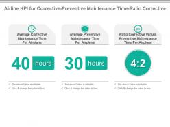 Airline kpi for corrective preventive maintenance time ratio corrective powerpoint slide
Presenting airline kpi for corrective preventive maintenance time ratio corrective powerpoint slide. This presentation slide shows three Key Performance Indicators or KPIs in a Dashboard style design. The first KPI that can be shown is Average Corrective Maintenance Time Per Airplane. The second KPI is Average Preventive Maintenance Time Per Airplane and the third is Ratio Corrective Versus Preventive Maintenance Time Per Airplane. These KPI Powerpoint graphics are all data driven, and the shape automatically adjusts according to your data. Just right click on the KPI graphic, enter the right value and the shape will adjust automatically. Make a visual impact with our KPI slides.
-
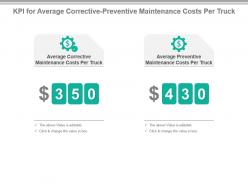 Kpi for average corrective preventive maintenance costs per truck powerpoint slide
Presenting kpi for average corrective preventive maintenance costs per truck powerpoint slide. This presentation slide shows two Key Performance Indicators or KPIs in a Dashboard style design. The first KPI that can be shown is Average Corrective Maintenance Costs Per Truck. The second KPI is Average Preventive Maintenance Costs Per Truck. These KPI Powerpoint graphics are all data driven, and the shape automatically adjusts according to your data. Just right click on the KPI graphic, enter the right value and the shape will adjust automatically. Make a visual impact with our KPI slides.
-
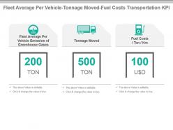 Fleet average per vehicle tonnage moved fuel costs transportation kpi ppt slide
Presenting fleet average per vehicle tonnage moved fuel costs transportation kpi ppt slide. This presentation slide shows three Key Performance Indicators or KPIs in a Dashboard style design. The first KPI that can be shown is Fleet Average Per Vehicle Emission of Greenhouse Gases. The second KPI is Tonnage Moved and the third is Fuel Costs Ton Km. These KPI Powerpoint graphics are all data driven, and the shape automatically adjusts according to your data. Just right click on the KPI graphic, enter the right value and the shape will adjust automatically. Make a visual impact with our KPI slides.
-
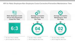 Kpi for ratio employee non employee costs corrective preventive maintenance time powerpoint slide
Presenting kpi for ratio employee non employee costs corrective preventive maintenance time powerpoint slide. This presentation slide shows Three Key Performance Indicators or KPIs in a Dashboard style design. The first KPI that can be shown is Ratio Employee Costs Versus Non Employee Costs Per Train. The second KPI is Average Corrective Maintenance Time Per Train. The third is Average Preventive Maintenance Time Per Train. These KPI Powerpoint graphics are all data driven, and the shape automatically adjusts according to your data. Just right click on the KPI graphic, enter the right value and the shape will adjust automatically. Make a visual impact with our KPI slides.
-
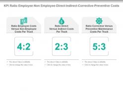 Kpi ratio employee non employee direct indirect corrective preventive costs presentation slide
Presenting kpi ratio employee non employee direct indirect corrective preventive costs presentation slide. This presentation slide shows Three Key Performance Indicators or KPIs in a Dashboard style design. The first KPI that can be shown is Ratio Employee Costs Versus Non Employee Costs Per Truck. The second KPI is Ratio Direct Versus Indirect CostsPer Truck. The third is Ratio Corrective Versus Preventive Maintenance Costs Per Truck. These KPI Powerpoint graphics are all data driven, and the shape automatically adjusts according to your data. Just right click on the KPI graphic, enter the right value and the shape will adjust automatically. Make a visual impact with our KPI slides.
-
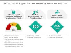 Kpi for ground support equipment noise exceedances labor cost powerpoint slide
Presenting kpi for ground support equipment noise exceedances labor cost powerpoint slide. This presentation slide shows three Key Performance Indicators or KPIs in a Dashboard style design. The first KPI that can be shown is of Ground Support Equipment Certified as a Low Emissions Vehicle. The second KPI is Total Noise Exceedances Per 1000 Flight Operations and the third is Labor Cost Per Aircraft Movement. These KPI Powerpoint graphics are all data driven, and the shape automatically adjusts according to your data. Just right click on the KPI graphic, enter the right value and the shape will adjust automatically. Make a visual impact with our KPI slides.
-
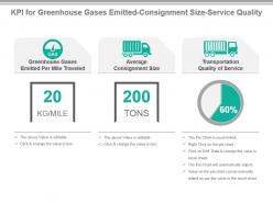 Kpi for greenhouse gases emitted consignment size service quality ppt slide
Presenting kpi for greenhouse gases emitted consignment size service quality ppt slide. This presentation slide shows three Key Performance Indicators or KPIs in a Dashboard style design. The first KPI that can be shown is Greenhouse Gases Emitted Per Mile Traveled. The second KPI is Average Consignment Size and the third is Transportation Quality of Service. These KPI Powerpoint graphics are all data driven, and the shape automatically adjusts according to your data. Just right click on the KPI graphic, enter the right value and the shape will adjust automatically. Make a visual impact with our KPI slides.
-
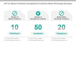 Kpi for marpol violations navigational incidents water discharge damages powerpoint slide
Presenting kpi for marpol violations navigational incidents water discharge damages powerpoint slide. This presentation slide shows three Key Performance Indicators or KPIs in a Dashboard style design. The first KPI that can be shown is Number of Marpol Violations. The second KPI is Number of Navigational Incidents and the third is Ballast Water Discharge Violations. These KPI Powerpoint graphics are all data driven, and the shape automatically adjusts according to your data. Just right click on the KPI graphic, enter the right value and the shape will adjust automatically. Make a visual impact with our KPI slides.
-
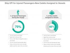 Ship kpi for injured passengers new cadets assigned to vessels ppt slide
Presenting ship kpi for injured passengers new cadets assigned to vessels ppt slide. This presentation slide shows two Key Performance Indicators or KPIs in a Dashboard style design. The first KPI that can be shown is percentage of Injured Passengers During Sea Voyage. The second KPI is percentage of New Cadets Assigned to Vessels. These KPI Powerpoint graphics are all data driven, and the shape automatically adjusts according to your data. Just right click on the KPI graphic, enter the right value and the shape will adjust automatically. Make a visual impact with our KPI slides.
-
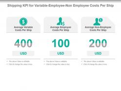 Shipping kpi for variable employee non employee costs per ship presentation slide
Presenting shipping kpi for variable employee non employee costs per ship presentation slide. This presentation slide shows three Key Performance Indicators or KPIs in a Dashboard style design. The first KPI that can be shown is Average Variable Costs Per Ship. The second KPI is Average Employee Costs Per Ship and the third is Average Non Employee Costs Per Ship. These KPI Powerpoint graphics are all data driven, and the shape automatically adjusts according to your data. Just right click on the KPI graphic, enter the right value and the shape will adjust automatically. Make a visual impact with our KPI slides.
-
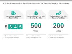 Kpi for revenue per available seats co2e emissions nox emissions ppt slide
Presenting kpi for revenue per available seats co2e emissions nox emissions ppt slide. This presentation slide shows Three Key Performance Indicators or KPIs in a Dashboard style design. The first KPI that can be shown is Revenue Per Available Seat Per Mile. The second KPI is CO2e Emissions Per 1000 Revenue Ton Miles. The third is Nox Emissions Per 1000 Revenue Ton Miles. These KPI Powerpoint graphics are all data driven, and the shape automatically adjusts according to your data. Just right click on the KPI graphic, enter the right value and the shape will adjust automatically. Make a visual impact with our KPI slides.
-
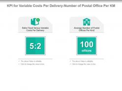 Kpi for variable costs per delivery number of postal office per km powerpoint slide
Presenting kpi for variable costs per delivery number of postal office per km powerpoint slide. This presentation slide shows Two Key Performance Indicators or KPIs in a Dashboard style design. The first KPI that can be shown is Ratio Fixed Versus Variable Costs Per Delivery. The second KPI is Average Number of Postal Offices Per Km2. These KPI Powerpoint graphics are all data driven, and the shape automatically adjusts according to your data. Just right click on the KPI graphic, enter the right value and the shape will adjust automatically. Make a visual impact with our KPI slides.
-
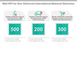 Mail kpi for non delivered international national deliveries powerpoint slide
Presenting mail kpi for non delivered international national deliveries powerpoint slide. This presentation slide shows Three Key Performance Indicators or KPIs in a Dashboard style design. The first KPI that can be shown is Number of Deliveries That are Not Delivered Per 100000 International Deliveries. The second KPI is Number of Deliveries That are Not Delivered Per 100000 National Deliveries. The third is Number of Deliveries That are Not Delivered Correctly First Time Per 100000 International Deliveries. These KPI Powerpoint graphics are all data driven, and the shape automatically adjusts according to your data. Just right click on the KPI graphic, enter the right value and the shape will adjust automatically. Make a visual impact with our KPI slides.
-
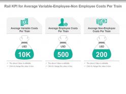 Rail kpi for average variable employee non employee costs per train ppt slide
Presenting rail kpi for average variable employee non employee costs per train ppt slide. This presentation slide shows Three Key Performance Indicators or KPIs in a Dashboard style design. The first KPI that can be shown is Average Variable Costs Per Train. The second KPI is Average Employee Costs Per Train. The third is Average Non Employee Costs Per Train. These KPI Powerpoint graphics are all data driven, and the shape automatically adjusts according to your data. Just right click on the KPI graphic, enter the right value and the shape will adjust automatically. Make a visual impact with our KPI slides.
-
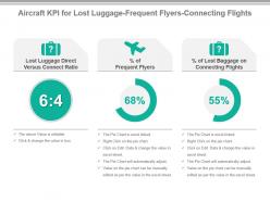 Aircraft kpi for lost luggage frequent flyers connecting flights ppt slide
Presenting aircraft kpi for lost luggage frequent flyers connecting flights ppt slide. This presentation slide shows three Key Performance Indicators or KPIs in a Dashboard style design. The first KPI that can be shown is Lost Luggage Direct Versus Connect Ratio. The second KPI is percentage of Frequent Flyers and the third is percentage of Lost Baggage on Connecting Flights. These KPI Powerpoint graphics are all data driven, and the shape automatically adjusts according to your data. Just right click on the KPI graphic, enter the right value and the shape will adjust automatically. Make a visual impact with our KPI slides.
-
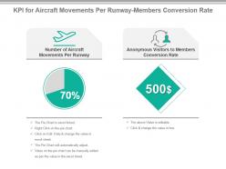 Kpi for aircraft movements per runway members conversion rate presentation slide
Presenting kpi for aircraft movements per runway members conversion rate presentation slide. This presentation slide shows two Key Performance Indicators or KPIs in a Dashboard style design. The first KPI that can be shown is Number of Aircraft Movements Per Runway. The second KPI is Anonymous Visitors to Members Conversion Rate. These KPI Powerpoint graphics are all data driven, and the shape automatically adjusts according to your data. Just right click on the KPI graphic, enter the right value and the shape will adjust automatically. Make a visual impact with our KPI slides.
-
 Kpi for average maintenance costs maintenance time per truck ppt slide
Presenting kpi for average maintenance costs maintenance time per truck ppt slide. This presentation slide shows two Key Performance Indicators or KPIs in a Dashboard style design. The first KPI that can be shown is Average Maintenance Costs Per Truck. The second KPI is Average Maintenance Time Per Truck. These KPI Powerpoint graphics are all data driven, and the shape automatically adjusts according to your data. Just right click on the KPI graphic, enter the right value and the shape will adjust automatically. Make a visual impact with our KPI slides.
-
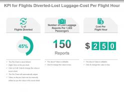 Kpi for flights diverted lost luggage cost per flight hour ppt slide
Presenting kpi for flights diverted lost luggage cost per flight hour ppt slide. This presentation slide shows three Key Performance Indicators or KPIs in a Dashboard style design. The first KPI that can be shown is percentage of Flights Diverted. The second KPI is Number of Lost Luggage Reports Per 1,000 Passengers and the third is Cost Per Flight Hour. These KPI Powerpoint graphics are all data driven, and the shape automatically adjusts according to your data. Just right click on the KPI graphic, enter the right value and the shape will adjust automatically. Make a visual impact with our KPI slides.
-
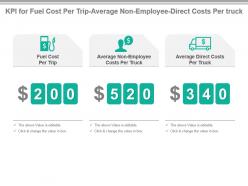 Kpi for fuel cost per trip average non employee direct costs per truck presentation slide
Presenting kpi for fuel cost per trip average non employee direct costs per truck presentation slide. This presentation slide shows three Key Performance Indicators or KPIs in a Dashboard style design. The first KPI that can be shown is Fuel Cost Per Trip. The second KPI is Average Non Employee Costs Per Truck and the third is Average Direct Costs Per Truck. These KPI Powerpoint graphics are all data driven, and the shape automatically adjusts according to your data. Just right click on the KPI graphic, enter the right value and the shape will adjust automatically. Make a visual impact with our KPI slides.
-
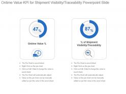 Ontime value kpi for shipment visibility traceability powerpoint slide
Presenting ontime value kpi for shipment visibility traceability powerpoint slide. This presentation slide shows two Key Performance Indicators or KPIs in a Dashboard style design. The first KPI that can be shown is Ontime Value percentage. The second KPI is percentage of Shipment Visibility Traceability. These KPI Powerpoint graphics are all data driven, and the shape automatically adjusts according to your data. Just right click on the KPI graphic, enter the right value and the shape will adjust automatically. Make a visual impact with our KPI slides.
-
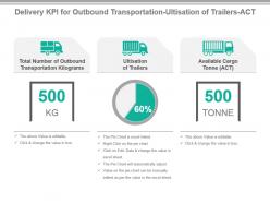 Delivery kpi for outbound transportation utilization of trailers act powerpoint slide
Presenting delivery kpi for outbound transportation utilization of trailers act powerpoint slide. This presentation slide shows three Key Performance Indicators or KPIs in a Dashboard style design. The first KPI that can be shown is Total Number of Outbound Transportation Kilograms. The second KPI is Ultisation of Trailers and the third is Available Cargo Tonne ACT. These KPI Powerpoint graphics are all data driven, and the shape automatically adjusts according to your data. Just right click on the KPI graphic, enter the right value and the shape will adjust automatically. Make a visual impact with our KPI slides.
-
 Kpi for import export cost fuel usage outbound transportation cost presentation slide
Presenting kpi for import export cost fuel usage outbound transportation cost presentation slide. This presentation slide shows three Key Performance Indicators or KPIs in a Dashboard style design. The first KPI that can be shown is Average Cost Involved With Import or Export Transaction. The second KPI is Fuel Usage Ton Km and the third is Total Outbound Transportation Cost. These KPI Powerpoint graphics are all data driven, and the shape automatically adjusts according to your data. Just right click on the KPI graphic, enter the right value and the shape will adjust automatically. Make a visual impact with our KPI slides.
-
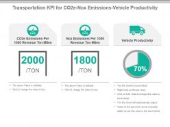 Transportation kpi for co2e nox emissions vehicle productivity powerpoint slide
Presenting transportation kpi for co2e nox emissions vehicle productivity powerpoint slide. This presentation slide shows three Key Performance Indicators or KPIs in a Dashboard style design. The first KPI that can be shown is CO2e Emissions Per 1000 Revenue Ton Miles. The second KPI is Nox Emissions Per 1000 Revenue Ton Miles and the third is Vehicle Productivity. These KPI Powerpoint graphics are all data driven, and the shape automatically adjusts according to your data. Just right click on the KPI graphic, enter the right value and the shape will adjust automatically. Make a visual impact with our KPI slides.
-
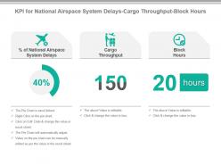 Kpi for national airspace system delays cargo throughput block hours ppt slide
Presenting kpi for national airspace system delays cargo throughput block hours ppt slide. This presentation slide shows Three Key Performance Indicators or KPIs in a Dashboard style design. The first KPI that can be shown is Percentage of National Airspace System Delays. The second KPI is Cargo Throughput. The third is Block Hours. These KPI Powerpoint graphics are all data driven, and the shape automatically adjusts according to your data. Just right click on the KPI graphic, enter the right value and the shape will adjust automatically. Make a visual impact with our KPI slides.
-
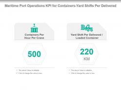 Maritime port operations kpi for containers yard shifts per delivered powerpoint slide
Presenting maritime port operations kpi for containers yard shifts per delivered powerpoint slide. This presentation slide shows Two Key Performance Indicators or KPIs in a Dashboard style design. The first KPI that can be shown is Containers Per Hour Per Crane. The second KPI is Yard Shift Per Delivered Loaded Container. These KPI Powerpoint graphics are all data driven, and the shape automatically adjusts according to your data. Just right click on the KPI graphic, enter the right value and the shape will adjust automatically. Make a visual impact with our KPI slides.
-
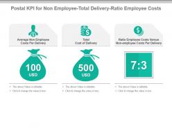 Postal kpi for non employee total delivery ratio employee costs presentation slide
Presenting postal kpi for non employee total delivery ratio employee costs presentation slide. This presentation slide shows Three Key Performance Indicators or KPIs in a Dashboard style design. The first KPI that can be shown is Average Non Employee Costs Per Delivery. The second KPI is Total Cost of Delivery. The third is Ratio Employee Costs Versus Non employee Costs Per Delivery. These KPI Powerpoint graphics are all data driven, and the shape automatically adjusts according to your data. Just right click on the KPI graphic, enter the right value and the shape will adjust automatically. Make a visual impact with our KPI slides.
-
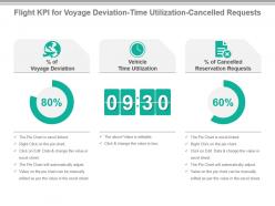 Flight kpi for voyage deviation time utilization cancelled requests powerpoint slide
Presenting flight kpi for voyage deviation time utilization cancelled requests powerpoint slide. This presentation slide shows three Key Performance Indicators or KPIs in a Dashboard style design. The first KPI that can be shown is percentage of Voyage Deviation. The second KPI is Vehicle Time Utilization and the third is percentages of Cancelled Reservation Requests. These KPI Powerpoint graphics are all data driven, and the shape automatically adjusts according to your data. Just right click on the KPI graphic, enter the right value and the shape will adjust automatically. Make a visual impact with our KPI slides.
-
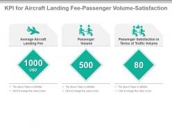 Kpi for aircraft landing fee passenger volume satisfaction ppt slide
Presenting kpi for aircraft landing fee passenger volume satisfaction ppt slide. This presentation slide shows three Key Performance Indicators or KPIs in a Dashboard style design. The first KPI that can be shown is Average Aircraft Landing Fee. The second KPI is Passenger Volume and the third is Passenger Satisfaction in Terms of Traffic Volume. These KPI Powerpoint graphics are all data driven, and the shape automatically adjusts according to your data. Just right click on the KPI graphic, enter the right value and the shape will adjust automatically. Make a visual impact with our KPI slides.
-
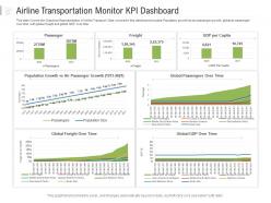 Airline transportation monitor kpi dashboard powerpoint template
This slide Covers the Graphical Representation of Airline Transport. Data covered in this dashboard includes-Population growth bs air passenger growth, global air passenger over time with global freight and global GDP over time. This is a Airline Transportation Monitor KPI Dashboard Powerpoint Template featuring in built editable components to add your personal touches. Tailor this template as per your liking and display it on a widescreen or standard screen, the choice is yours.
-
 Transportation Metrics Truck Colored Icon In Powerpoint Pptx Png And Editable Eps Format
Give your next presentation a sophisticated, yet modern look with this 100 percent editable Transportation metrics truck colored icon in powerpoint pptx png and editable eps format. Choose from a variety of customizable formats such as PPTx, png, eps. You can use these icons for your presentations, banners, templates, One-pagers that suit your business needs.
-
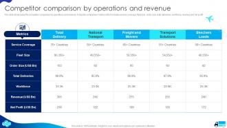 Cargo Transport Company Profile Competitor Comparison By Operations And Revenue
The slide showcases the competitor comparison by operations and revenue. It depicts comparison metrics which includes service coverage, fleet size, order size, total deliveries, workforce, revenue and net profit. Present the topic in a bit more detail with this Cargo Transport Company Profile Competitor Comparison By Operations And Revenue. Use it as a tool for discussion and navigation on Competitor, Comparison, Operations. This template is free to edit as deemed fit for your organization. Therefore download it now.
-
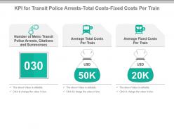 Kpi for transit police arrests total costs fixed costs per train powerpoint slide
Presenting kpi for transit police arrests total costs fixed costs per train powerpoint slide. This presentation slide shows Three Key Performance Indicators or KPIs in a Dashboard style design. The first KPI that can be shown is Number of Metro Transit Police Arrests, Citations and Summonses. The second KPI is Average Total Costs Per Train. The third is Average Fixed Costs Per Train. These KPI Powerpoint graphics are all data driven, and the shape automatically adjusts according to your data. Just right click on the KPI graphic, enter the right value and the shape will adjust automatically. Make a visual impact with our KPI slides.
-
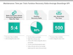 Maintenance time per train farebox recovery ratio average boardings kpi presentation slide
Presenting maintenance time per train farebox recovery ratio average boardings kpi presentation slide. This presentation slide shows Three Key Performance Indicators or KPIs in a Dashboard style design. The first KPI that can be shown is Ratio Corrective Versus Preventive Maintenance Time Per Train. The second KPI is Farebox Recovery Ratio. The third is Avg Boardings Per Hour. These KPI Powerpoint graphics are all data driven, and the shape automatically adjusts according to your data. Just right click on the KPI graphic, enter the right value and the shape will adjust automatically. Make a visual impact with our KPI slides.
-
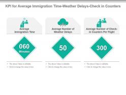 Kpi for average immigration time weather delays check in counters powerpoint slide
Presenting kpi for average immigration time weather delays check in counters powerpoint slide. This presentation slide shows three Key Performance Indicators or KPIs in a Dashboard style design. The first KPI that can be shown is Average Immigration Time. The second KPI is Average Number of Weather Delays and the third is Average Number of Check in Counters Per Flight. These KPI Powerpoint graphics are all data driven, and the shape automatically adjusts according to your data. Just right click on the KPI graphic, enter the right value and the shape will adjust automatically. Make a visual impact with our KPI slides.
-
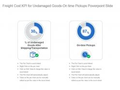 Freight cost kpi for undamaged goods on time pickups powerpoint slide
Presenting freight cost kpi for undamaged goods on time pickups powerpoint slide. This presentation slide shows two Key Performance Indicators or KPIs in a Dashboard style design. The first KPI that can be shown is percentage of Undamaged Goods After Shipping Transportation. The second KPI is On time Pickups. These KPI Powerpoint graphics are all data driven, and the shape automatically adjusts according to your data. Just right click on the KPI graphic, enter the right value and the shape will adjust automatically. Make a visual impact with our KPI slides.
-
 Kpi for freight revenue stops per trip orders arrived at right location presentation slide
Presenting kpi for freight revenue stops per trip orders arrived at right location presentation slide. This presentation slide shows three Key Performance Indicators or KPIs in a Dashboard style design. The first KPI that can be shown is Average Freight Revenue Per Ton Mile. The second KPI is Average Number of Stops Per Trip and the third is percentage of Orders Items Arrives at the Right Location. These KPI Powerpoint graphics are all data driven, and the shape automatically adjusts according to your data. Just right click on the KPI graphic, enter the right value and the shape will adjust automatically. Make a visual impact with our KPI slides.
-
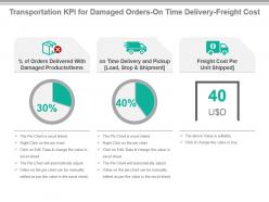 Transportation kpi for damaged orders on time delivery freight cost ppt slide
Presenting transportation kpi for damaged orders on time delivery freight cost ppt slide. This presentation slide shows three Key Performance Indicators or KPIs in a Dashboard style design. The first KPI that can be shown is percentage of Orders Delivered With Damaged Products Items. The second KPI is on Time Delivery and Pickup Load, Stop and Shipment and the third is Freight Cost Per Unit Shipped. These KPI Powerpoint graphics are all data driven, and the shape automatically adjusts according to your data. Just right click on the KPI graphic, enter the right value and the shape will adjust automatically. Make a visual impact with our KPI slides.
-
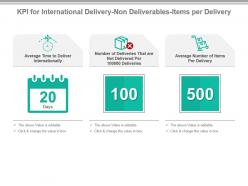 Kpi for international delivery non deliverables items per delivery powerpoint slide
Presenting kpi for international delivery non deliverables items per delivery powerpoint slide. This presentation slide shows Three Key Performance Indicators or KPIs in a Dashboard style design. The first KPI that can be shown is Average Time to Deliver Internationally. The second KPI is Number of Deliveries That are Not Delivered Per 100000 Deliveries. The third is Average Number of Items Per Delivery. These KPI Powerpoint graphics are all data driven, and the shape automatically adjusts according to your data. Just right click on the KPI graphic, enter the right value and the shape will adjust automatically. Make a visual impact with our KPI slides.
-
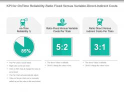 Kpi for on time reliability ratio fixed versus variable direct indirect costs ppt slide
Presenting kpi for on time reliability ratio fixed versus variable direct indirect costs ppt slide. This presentation slide shows Three Key Performance Indicators or KPIs in a Dashboard style design. The first KPI that can be shown is on Time Reliability Percentage. The second KPI is Ratio Fixed Versus Variable Costs Per Train. The third is Ratio Direct Versus Indirect Costs Per Train. These KPI Powerpoint graphics are all data driven, and the shape automatically adjusts according to your data. Just right click on the KPI graphic, enter the right value and the shape will adjust automatically. Make a visual impact with our KPI slides.
-
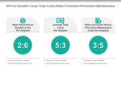 Kpi for variable costs total costs ratio corrective preventive maintenance ppt slide
Presenting kpi for variable costs total costs ratio corrective preventive maintenance ppt slide. This presentation slide shows Three Key Performance Indicators or KPIs in a Dashboard style design. The first KPI that can be shown is Ratio Fixed Versus Variable Costs Per Airplane. The second KPI is Average Total Costs Per Airplane. The third is Ratio Corrective Versus Preventive Maintenance Costs Per Airplane. These KPI Powerpoint graphics are all data driven, and the shape automatically adjusts according to your data. Just right click on the KPI graphic, enter the right value and the shape will adjust automatically. Make a visual impact with our KPI slides.
-
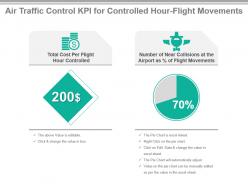 Air traffic control kpi for controlled hour flight movements powerpoint slide
Presenting air traffic control kpi for controlled hour flight movements powerpoint slide. This presentation slide shows two Key Performance Indicators or KPIs in a Dashboard style design. The first KPI that can be shown is Total Cost Per Flight Hour Controlled. The second KPI is Number of Near Collisions at the Airport as percentage of Flight Movements. These KPI Powerpoint graphics are all data driven, and the shape automatically adjusts according to your data. Just right click on the KPI graphic, enter the right value and the shape will adjust automatically. Make a visual impact with our KPI slides.
-
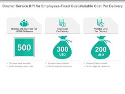 Courier service kpi for employees fixed cost variable cost per delivery presentation slide
Presenting courier service kpi for employees fixed cost variable cost per delivery presentation slide. This presentation slide shows three Key Performance Indicators or KPIs in a Dashboard style design. The first KPI that can be shown is Number of Employees Per 100000 Deliveries. The second KPI is Fixed Cost Per Delivery and the third is Variable Cost Per Delivery. These KPI Powerpoint graphics are all data driven, and the shape automatically adjusts according to your data. Just right click on the KPI graphic, enter the right value and the shape will adjust automatically. Make a visual impact with our KPI slides.
-
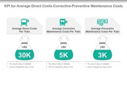 Kpi for average direct costs corrective preventive maintenance costs ppt slide
Presenting kpi for average direct costs corrective preventive maintenance costs ppt slide. This presentation slide shows three Key Performance Indicators or KPIs in a Dashboard style design. The first KPI that can be shown is Average Direct Costs Per Train. The second KPI is Average Corrective Maintenance Costs Per Train and the third is Average Preventive Maintenance Costs Per Train. These KPI Powerpoint graphics are all data driven, and the shape automatically adjusts according to your data. Just right click on the KPI graphic, enter the right value and the shape will adjust automatically. Make a visual impact with our KPI slides.
-
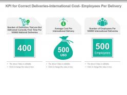 Kpi for correct deliveries international cost employees per delivery presentation slide
Presenting kpi for correct deliveries international cost employees per delivery presentation slide. This presentation slide shows three Key Performance Indicators or KPIs in a Dashboard style design. The first KPI that can be shown is Number of Deliveries That are Not Delivered Correctly First Time Per 100000 National Deliveries. The second KPI is Average Cost Per International Delivery and the third is Number of Employees Per 100000 International Deliveries. These KPI Powerpoint graphics are all data driven, and the shape automatically adjusts according to your data. Just right click on the KPI graphic, enter the right value and the shape will adjust automatically. Make a visual impact with our KPI slides.
-
 Kpi for crime rate per trip escalator system profit per train powerpoint slide
Presenting kpi for crime rate per trip escalator system profit per train powerpoint slide. This presentation slide shows three Key Performance Indicators or KPIs in a Dashboard style design. The first KPI that can be shown is Crime Rate Per Million Passenger Trips. The second KPI is Escalator System Availability and the third is Profit Per Train. These KPI Powerpoint graphics are all data driven, and the shape automatically adjusts according to your data. Just right click on the KPI graphic, enter the right value and the shape will adjust automatically. Make a visual impact with our KPI slides.
-
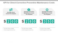 Kpi for direct corrective preventive maintenance costs presentation slide
Presenting kpi for direct corrective preventive maintenance costs presentation slide. This presentation slide shows three Key Performance Indicators or KPIs in a Dashboard style design. The first KPI that can be shown is Average Direct Costs Per Airplane. The second KPI is Average Corrective Maintenance Costs Per Airplane and the third is Average Preventive Maintenance Costs Per Airplane. These KPI Powerpoint graphics are all data driven, and the shape automatically adjusts according to your data. Just right click on the KPI graphic, enter the right value and the shape will adjust automatically. Make a visual impact with our KPI slides.
-
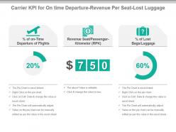 Carrier kpi for on time departure revenue per seat lost luggage ppt slide
Presenting carrier kpi for on time departure revenue per seat lost luggage ppt slide. This presentation slide shows three Key Performance Indicators or KPIs in a Dashboard style design. The first KPI that can be shown is percentage of on Time Departure of Flights. The second KPI is Revenue Seat Passenger Kilometer RPK and the third is percentage of Lost Bags Luggage. These KPI Powerpoint graphics are all data driven, and the shape automatically adjusts according to your data. Just right click on the KPI graphic, enter the right value and the shape will adjust automatically. Make a visual impact with our KPI slides.
-
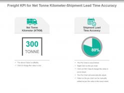 Freight kpi for net tonne kilometer shipment lead time accuracy powerpoint slide
Presenting freight kpi for net tonne kilometer shipment lead time accuracy powerpoint slide. This presentation slide shows two Key Performance Indicators or KPIs in a Dashboard style design. The first KPI that can be shown is Net Tonne Kilometer NTKM. The second KPI is Shipment Lead Time Accuracy. These KPI Powerpoint graphics are all data driven, and the shape automatically adjusts according to your data. Just right click on the KPI graphic, enter the right value and the shape will adjust automatically. Make a visual impact with our KPI slides.
-
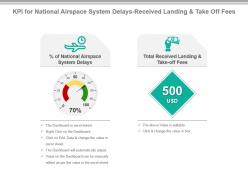 Kpi for national airspace system delays received landing and take off fees presentation slide
Presenting kpi for national airspace system delays received landing and take off fees presentation slide. This presentation slide shows Two Key Performance Indicators or KPIs in a Dashboard style design. The first KPI that can be shown is Percentage of National Airspace System Delays. The second KPI is Total Received Landing and Take off Fees. These KPI Powerpoint graphics are all data driven, and the shape automatically adjusts according to your data. Just right click on the KPI graphic, enter the right value and the shape will adjust automatically. Make a visual impact with our KPI slides.
-
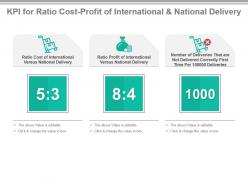 Kpi for ratio cost profit of international and national delivery presentation slide
Presenting kpi for ratio cost profit of international and national delivery presentation slide. This presentation slide shows Three Key Performance Indicators or KPIs in a Dashboard style design. The first KPI that can be shown is Ratio Cost of International Versus National Delivery. The second KPI is Ratio Profit of International Versus National Delivery. The third is Number of Deliveries That are Not Delivered Correctly First Time Per 100000 Deliveries. These KPI Powerpoint graphics are all data driven, and the shape automatically adjusts according to your data. Just right click on the KPI graphic, enter the right value and the shape will adjust automatically. Make a visual impact with our KPI slides.
-
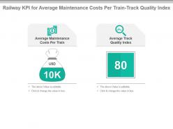 Railway kpi for average maintenance costs per train track quality index powerpoint slide
Presenting railway kpi for average maintenance costs per train track quality index powerpoint slide. This presentation slide shows Two Key Performance Indicators or KPIs in a Dashboard style design. The first KPI that can be shown is Average Maintenance Costs Per Train. The second KPI is Average Track Quality Index. These KPI Powerpoint graphics are all data driven, and the shape automatically adjusts according to your data. Just right click on the KPI graphic, enter the right value and the shape will adjust automatically. Make a visual impact with our KPI slides.
-
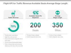 Flight kpi for traffic revenue available seats average stage length presentation slide
Presenting flight kpi for traffic revenue available seats average stage length presentation slide. This presentation slide shows three Key Performance Indicators or KPIs in a Dashboard style design. The first KPI that can be shown is percentage of Traffic Revenue. The second KPI is Available Seats Per Departure and the third is Average Stage Length. These KPI Powerpoint graphics are all data driven, and the shape automatically adjusts according to your data. Just right click on the KPI graphic, enter the right value and the shape will adjust automatically. Make a visual impact with our KPI slides.
-
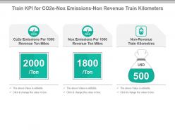 Train kpi for co2e nox emissions non revenue train kilometers powerpoint slide
Presenting train kpi for co2e nox emissions non revenue train kilometers powerpoint slide. This presentation slide shows Three Key Performance Indicators or KPIs in a Dashboard style design. The first KPI that can be shown is Co2e Emissions Per 1000 Revenue Ton Miles. The second KPI is Nox Emissions Per 1000 Revenue Ton Miles. The third is Non Revenue Train Kilometres. These KPI Powerpoint graphics are all data driven, and the shape automatically adjusts according to your data. Just right click on the KPI graphic, enter the right value and the shape will adjust automatically. Make a visual impact with our KPI slides.
-
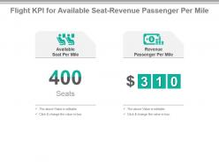 Flight kpi for available seat revenue passenger per mile ppt slide
Presenting flight kpi for available seat revenue passenger per mile ppt slide. This presentation slide shows two Key Performance Indicators or KPIs in a Dashboard style design. The first KPI that can be shown is Available Seat Per Mile. The second KPI is Revenue Passenger Per Mile. These KPI Powerpoint graphics are all data driven, and the shape automatically adjusts according to your data. Just right click on the KPI graphic, enter the right value and the shape will adjust automatically. Make a visual impact with our KPI slides.
-
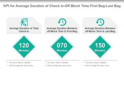 Kpi for average duration of check in off block time first bag last bag presentation slide
Presenting kpi for average duration of check in off block time first bag last bag presentation slide. This presentation slide shows three Key Performance Indicators or KPIs in a Dashboard style design. The first KPI that can be shown is Average Duration of Total Check in. The second KPI is Average Duration Between off Block Time And First Bag and the third is Average Duration Between off Block Time And Last Bag. These KPI Powerpoint graphics are all data driven, and the shape automatically adjusts according to your data. Just right click on the KPI graphic, enter the right value and the shape will adjust automatically. Make a visual impact with our KPI slides.
-
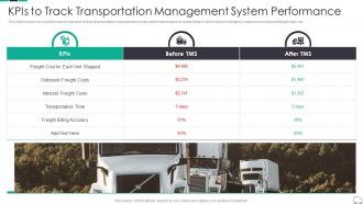 Kpis To Track Transportation Management System Continuous Process Improvement In Supply Chain
This slide focuses on key performance indicators to track transportation management system performance which includes freight cost for each unit shipped, outbound and inbound freight costs, etc. Present the topic in a bit more detail with this Kpis To Track Transportation Management System Continuous Process Improvement In Supply Chain. Use it as a tool for discussion and navigation on Transportation, Management, Performance. This template is free to edit as deemed fit for your organization. Therefore download it now.
-
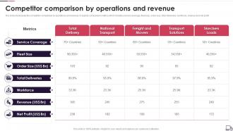 Logistics Transport Company Profile Competitor Comparison By Operations And Revenue
The slide showcases the competitor comparison by operations and revenue. It depicts comparison metrics which includes service coverage, fleet size, order size, total deliveries, workforce, revenue and net profit. Present the topic in a bit more detail with this Logistics Transport Company Profile Competitor Comparison By Operations And Revenue. Use it as a tool for discussion and navigation on Service Coverage, Fleet Size, Order Size, Total Deliveries, Workforce, Net Profit. This template is free to edit as deemed fit for your organization. Therefore download it now.


