Limitations of statistics ppt design
Try Before you Buy Download Free Sample Product
Audience
Editable
of Time
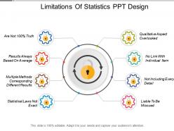
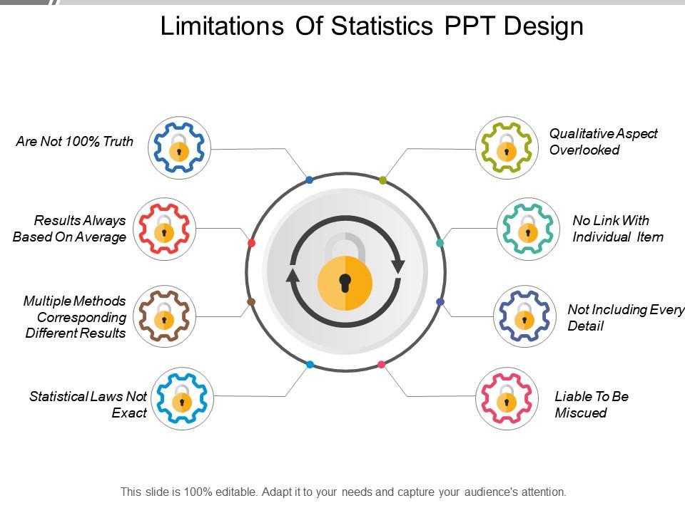
Showing out of the box creative to produce a visual impact through our, limitations of statistics PPT design. We have shown a flat illustration of gear wheels to show business limitations through an eight-stage process. Stay through and cover up various aspects hindering your outcome through these stages which are, qualitative aspects overload, no link with an individual item, not including every detail, liable to be misused, statistical laws not exact, multiple methods corresponding different results, results always based on average, not including 100% valid information. Incorporate this layout in your business meetings to show various statistics and problem-solving techniques. Get your point across with ease and bind your audience through our means. This rescue PPT layout can be used by professionals from a distinct background for displaying business data through a bright image Predesigns format to make it easier for you to display information and save time. Download our, limitations of statistics PPT design and overcome hurdles with ease. Coveted dreams acquire form with our Limitations Of Statistics Ppt Design. They will develop before your eyes.
People who downloaded this PowerPoint presentation also viewed the following :
Limitations of statistics ppt design with all 5 slides:
Folks are bound to give consent due to our Limitations Of Statistics Ppt Design. Be able to effectively argue your case.
FAQs for Limitations of
Ugh, the worst trap is thinking statistical significance means something actually matters in real life. Like, you could get a "significant" result that's a 0.001% improvement - completely useless. Researchers also do this sketchy thing called p-hacking where they mess with their data until they hit that magical 0.05 number. Plus people assume non-significant results mean there's definitely no effect, but maybe your sample size just sucked. I learned this the hard way in grad school - you've gotta check effect sizes and confidence intervals too, not just p-values.
You need both big samples AND diverse ones - they're like a package deal. Big samples cut down on error and give you more power to spot real patterns. But here's the catch: even 10,000 people won't help if they're all the same type. Remember those landline surveys that completely missed younger folks? That's what happens when you ignore diversity. I'd say shoot for enough participants to catch meaningful differences while actually reflecting who you're studying. It's honestly pointless having tons of data from the wrong crowd.
Ugh, bias is honestly the worst thing that can wreck your stats. Like, you could have everything else perfect - sample size, methods, whatever - but if there's bias sneaking into how you collected the data, you're screwed. Selection bias, confirmation bias, response bias... there's so many ways it can go wrong. The really annoying part? Biased results look completely legit at first glance. I learned this the hard way in my research methods class. Always double-check where your data came from and how it was gathered before trusting anything.
Just be super honest about what your study can't do - put that stuff right in the results, don't hide it. Your sample size sucked? Say it. There might be other explanations for what you found? Talk about those too. Honestly, nothing's worse than papers that act like they solved everything when they didn't. Say things "suggest" rather than claiming you proved anything. Oh, and definitely mention if your results might not apply to other groups or situations. Reviewers aren't stupid - they'll catch the weak spots anyway, so you might as well get ahead of it. Then just wrap up with what someone should actually study next.
So correlation just shows two things moving together - doesn't mean one causes the other though. Could be a third thing driving both, or maybe it's backwards causation, or honestly just random coincidence. Like ice cream sales and drowning deaths correlate because they both spike in summer, which is kinda obvious when you think about it. When you're doing your analysis, don't jump to causal claims from this kind of data. Watch out for confounding variables and say stuff like "associated with" instead of "causes." You'll need experimental data if you actually want to prove causation.
First things first - plot your data to see what you're working with. Boxplots work great for spotting those weird outliers. Once you find them, median and IQR are way better than mean/standard deviation since they don't freak out over extreme values. Trimmed means are solid too (just chuck the top and bottom percentages). Log transformations can be surprisingly helpful, though honestly that depends on your data type. For regression stuff, try Huber or Tukey's bisquare methods. You could also cap extreme values with Winsorizing - it's less dramatic than removing data points entirely. Pick whatever fits your analysis goals best.
Dude, your data collection is literally everything. Biased sampling will screw you over - like if you only survey volunteers, your results are toast no matter how fancy your analysis gets later. Random sampling? That's your best bet for accuracy. Convenience sampling seems tempting since it's way easier, but it'll totally mislead you. Plus self-reported stuff brings in response bias, and tiny sample sizes just make everything worse. I learned this the hard way in my stats class lol. Always question how the data was collected before you trust any findings. Document what went wrong too.
Dude, bad stats can seriously mess people up - like affecting whether someone gets hired or loses healthcare coverage. Healthcare stuff scares me the most honestly, because if you're wrong about a treatment, people could literally die. Cherry-picking data is super common too. People just grab whatever numbers support what they already believe. You'll lose all credibility if you keep putting out misleading info, even by accident. Best bet? Be upfront about where your data came from and what might be sketchy about it. Always think - who gets screwed if I'm totally off base here?
Honestly, descriptive stats can be super misleading. Outliers totally wreck your averages - like one billionaire in a room makes everyone look rich on paper. Multiple subgroups are another trap. Your overall mean might seem fine while each group is actually doing something completely different. I learned this the hard way in my stats class lol. Non-linear stuff and time patterns just disappear too. Correlations? Forget about it with basic summary stats. Really though, just plot your data first. Those pretty summary numbers lie way more than you'd think.
Dude, be super careful with charts and graphs - they can totally mess with your head. Truncated axes make tiny changes look huge. Cherry-picked timeframes hide the real story. Your brain wants to see patterns everywhere, which makes these tricks extra dangerous. I swear I see misleading visuals constantly, especially during election season or whatever. Always double-check the scales and labels first. Does the visual actually match the raw numbers? When you're making your own charts, pick ones that show the truth. Don't be that person who loses credibility over a sketchy graph.
Oh man, messy data will be your biggest headache - missing values everywhere, weird outliers that make no sense. Most models assume perfect normal distributions and clean linear relationships, which honestly is a joke in real life. You know how everyone says correlation isn't causation? Yeah, it's annoying to hear but you'll fall into that trap constantly. Your model might crush it on old data then completely bomb when predicting new stuff because, surprise, the world changes. I always test with fresh data since these things are more like educated guesses than magic prediction machines.
Dude, people manipulate stats constantly - cherry-picking data, making misleading charts, claiming correlation proves causation. Politicians will cite unemployment without context. News outlets love those dramatic percentage changes that mean nothing. Companies compare totally different datasets to make their point. What really gets me is how fast this stuff spreads on social media before anyone fact-checks it. Most people just don't know enough about statistics to catch the BS. Before you share something that seems crazy compelling, just ask: who's the source? What's the sample size? Are they actually showing the whole story?
Ugh, yeah small samples are the worst for stats. They basically give you garbage results that don't represent who you're actually studying. Your confidence intervals get ridiculously wide and you lose statistical power. The findings won't apply to your real population either - which is honestly the whole point of doing research in the first place. You need a decent sample size that actually captures how diverse your group is. I always double-check my sample makeup before I trust any results, learned that one the hard way.
Oh man, this is huge. The same data can look totally different depending on who you're looking at. Like, low survey responses might seem bad but could just mean people in that culture prefer face-to-face conversations - I had to learn this lesson the messy way on a project. People interpret risk stats differently, have different privacy boundaries, you name it. You've gotta build some cultural understanding into how you analyze stuff. Maybe find people from those communities who can actually explain what your numbers mean? Trust me, it makes a world of difference.
Dude, ML and AI are total game-changers for handling huge datasets and crazy complex patterns. Traditional stats just can't keep up. Cloud computing means you can actually crunch massive numbers without going broke or waiting forever - honestly the speed difference from even 5 years ago blows my mind. Those automated data cleaning tools are a lifesaver too, saves you from fixing messy data all day. Oh, and definitely check out Python or R libraries when you get a chance. Advanced visualization software helps catch trends you'd totally miss otherwise. Trust me, it'll open up so many new possibilities for your projects.
-
Helpful product design for delivering presentation.
-
Nice and innovative design.