List of ideas for effective marketing ppt images gallery
Try Before you Buy Download Free Sample Product
Audience
Editable
of Time
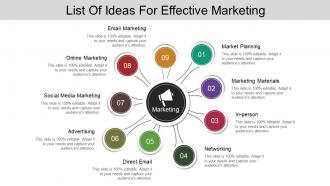
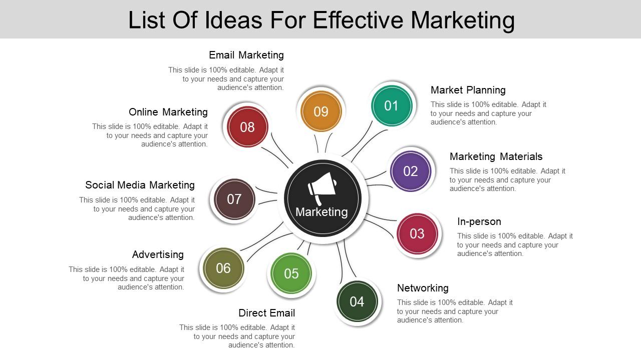
Be able to effortlessly display proper strategies to increase marketing using our list of ideas for effective marketing PPT images gallery. Using this round circular cycle diagram model you can business related processes like market planning, marketing materials, in person, networking, direct Email, advertising, social media marketing, online marketing, Email marketing, etc. The checklist PowerPoint presentation will let you discuss the various necessary points on which you need to focus if you wish for a growing marketing agenda. This list of ideas for effective marketing PPT template has been designed using high resolution and premium quality slides which will enhance the quality of your presentation. Our business experts have skillfully for business professionals like you designed this marketing strategy PowerPoint presentation. It is highly recommended that you download and use this ideas and innovations business template as it is totally user-friendly and ready to use. So hit the download button and make most of the features of this slideshow presentation as it will help you reach new heights of success. Everyone gets equal attention with our List Of Ideas For Effective Marketing Ppt Images Gallery. Avoid alienating any colleagues.
People who downloaded this PowerPoint presentation also viewed the following :
List of ideas for effective marketing ppt images gallery with all 5 slides:
Our List Of Ideas For Effective Marketing Ppt Images Gallery ensure general approval. Your ideas are bound to be accepted.
FAQs for List of ideas for effective marketing
Honestly, three things will make or break your presentation images: visual hierarchy, consistent branding, and one clear focal point. People should get it immediately without squinting. High contrast text is crucial - I've watched too many gorgeous slides that were completely unreadable from row three! Your colors need to match brand guidelines, obviously. One main element should grab attention first. Those cheesy stock photos with everyone grinning? Skip them. Oh, and build a template library now so you're not panicking at 2am before your presentation. Trust me on that one.
So colors actually mess with people's emotions way more than you'd think. Red gets people hyped and creates that "buy now!" feeling - perfect for sales stuff. Banks always go blue because it screams trustworthy and chill. Green's your go-to for anything eco or growth-related. Yellow and orange are attention magnets, but honestly they can look kinda cheap if you go overboard. I'd pick maybe 2-3 colors that match your brand's vibe, then just see how people react. The whole point is making people feel what you want them to feel so they'll actually do something about it.
Age isn't everything when it comes to visuals. Yeah, younger people usually dig authentic stuff - real people, diverse faces, candid shots instead of cheesy stock photos. Older folks often want polished, trustworthy-looking images. But honestly? Sometimes a 50-year-old gym rat connects with the same high-energy pics as someone half their age. It's more about lifestyle than birthdate, you know? I'd test different styles with your actual audience segments. Let the engagement numbers tell you what's working instead of guessing based on demographics alone.
Think of your branding as the foundation, not the main event. Set up your visual framework first—colors, fonts, where your logo goes. Then let your creative stuff tell the story. Honestly, I've seen way too many presentations where logos are plastered everywhere and it just looks messy. Your brand elements should work more like anchors that hold everything together. Give your visuals space to actually connect with people emotionally. I always start by figuring out my brand boundaries first, then I'll push the creative limits within those rules.
Honestly, whitespace is like your cheat code for making marketing images actually work. It stops everything from looking like a hot mess and gives people's eyes somewhere to chill before they focus on what you're selling. Without it? Pure visual chaos - like when someone talks without taking any breaths. Don't feel like you need to cram every inch with stuff. That's actually counterproductive and kills engagement. Good whitespace makes your text easier to read and your products stand out way more. Plus it just looks more expensive somehow. Quick test when you're reviewing images: where does your eye land first? If you can't tell, you probably need more breathing room.
Honestly, infographics are a game-changer for boring data. People's brains just process visuals way better than walls of text - it's wild how much more they actually remember. You can map out timelines, show how things connect, or break down complicated processes without losing everyone halfway through. I used to hate making them (seemed like extra work), but now I'm convinced. Charts and icons guide people through your story naturally instead of making them slog through bullet points. Next time you've got a dense presentation, try turning it into an infographic. You'll be surprised how much easier it is for people to follow your logic.
Ugh, definitely stick with legit stock photo sites - Shutterstock, Getty, or Unsplash if you need free ones. Just double-check the license stuff because some need attribution or can't be used commercially. We actually got slapped with a cease and desist once (nightmare). Custom photos are honestly the best route if you've got the budget since you own everything outright. Don't just grab random pics from Google - that's copyright hell waiting to happen. Oh, and keep a spreadsheet of where each image came from. Sounds boring but your legal team will love you for it later.
UGC is seriously underrated for marketing galleries. Real customer photos and reviews hit different than those perfect stock images - people actually trust them. I'd focus on collecting photos from social media, customer reviews, maybe run some contests too. Branded hashtags work pretty well for getting submissions flowing. Just make sure you're getting permission before using anyone's stuff (learned that the hard way). Set up some kind of regular process to find the good content and swap it into your galleries. Trust me, the authentic vibe will get way more engagement than anything polished.
Honestly? Stock photos are perfect when you're in a crunch or don't have much budget. Blog posts, random social content - totally fine there. But here's the thing: I've literally seen three different companies use the exact same "diverse team meeting" stock photo. So embarrassing! Custom photography is where you should spend money on the stuff that actually matters. Product shots, major campaign launches, anything that's supposed to scream "this is us." Mix it up though - stock for everyday content, custom for the hero moments. Oh, and avoid anything that looks too stock-y if that makes sense.
Honestly, just nail these three things: file size, format, and making stuff work on mobile. Compress your biggest images first - that's where you'll actually notice a difference. WebP gives you amazing compression, but throw in JPEG backups since some browsers are still stuck in the past. Keep files under 100KB if you can swing it. Use srcset so mobile users aren't downloading massive desktop images. Don't forget alt text either. Oh, and test your load times on actual phone data, not your blazing fast office internet - that's where most people will hate you if it's slow.
Dude, spreadsheets are soul-crushing to look at. Turn that boring data into something people actually want to see - infographics, charts, whatever works. Colors and icons help tons for highlighting the important stuff. I learned this the hard way after watching people completely zone out during presentations. Bar charts and dashboards get way more attention than rows of numbers ever will. Oh, and comparison images work great too. Figure out your main point first, then build visuals around that. It's honestly night and day how much better people respond to visual stories versus raw data dumps.
Dude, animated stuff works so much better - like 20-30% more engagement than static images. Your brain just notices movement automatically, so things like hover effects or those looping cinemagraph things grab attention way longer. Don't go nuts though! Nobody wants flashy 2003 MySpace vibes. I'd test animated versions of whatever images are already doing well for you. Honestly, smooth and purposeful beats crazy and distracting every time. You'll probably see your click-through rates jump pretty fast once people actually stick around longer on your page.
Okay so basically whatever's trending on social media is gonna shape what visuals your audience expects. Right now if minimalist stuff is everywhere, you want clean simple images. Bold colors trending? That's what people expect from brands too. Instagram and TikTok literally set the visual tone for everything - it's crazy how much influence they have. You gotta refresh your image library every few months or you'll look super outdated next to competitors who stay current. Pinterest's another big one to watch. The shifts happen so fast it's honestly exhausting sometimes, but that's just how it works now.
For most stuff, just start with Canva - it's crazy easy and has templates for everything. Adobe's where you go if you want full control, but honestly the learning curve is brutal. Figma's solid too, especially when you're working with other people since it's all online. I always end up tweaking things in Canva way longer than I should lol. Oh, and for presentations? Skip PowerPoint and try Pitch or Beautiful.AI instead - they'll make you look way more professional. Canva's still your best bet though, you can whip something up in like 5 minutes.
Dude, you've gotta be careful with images across different cultures - I've seen campaigns crash and burn over this stuff. White means purity here but it's for mourning in parts of Asia. Hand gestures? Some are straight-up offensive depending where you are. Beauty standards are wildly different too, plus what's okay to show regarding skin or touching varies massively. Family setups in your ads might not even make sense in certain regions. Religious stuff is another minefield entirely. Honestly, just run everything past someone local before you launch - saves you from looking like an idiot later.
-
Thanks for all your great templates they have saved me lots of time and accelerate my presentations. Great product, keep them up!
-
The Designed Graphic are very professional and classic.