Objective update powerpoint ppt template bundles

Rating:
90%
Objective update powerpoint ppt template bundles
Slide 1 of 15
Favourites Favourites

Try Before you Buy Download Free Sample Product

Audience Impress Your
Audience
Editable 100%
Editable
Time Save Hours
of Time
The Biggest Sale is ending soon in
0
0
:
0
0
:
0
0
Rating:
90%
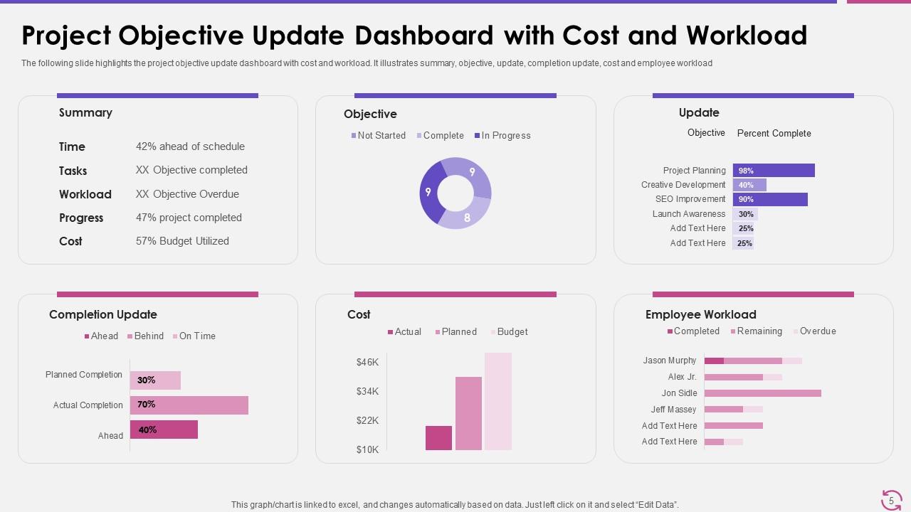
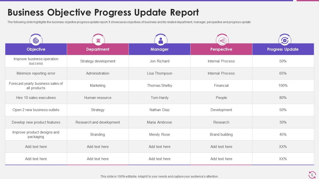
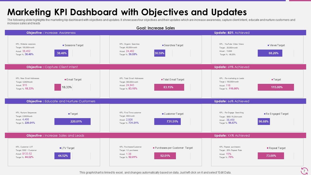
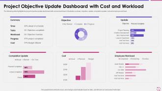
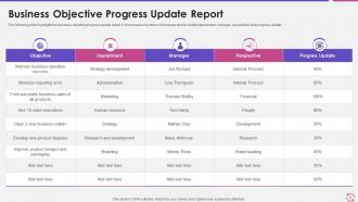
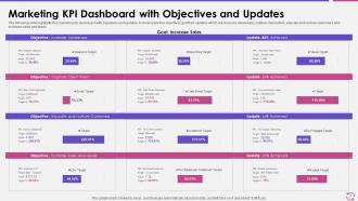
If you require a professional template with great design, then this Objective Update Powerpoint Ppt Template Bundles is an ideal fit for you. Deploy it to enthrall your audience and increase your presentation threshold with the right graphics, images, and structure. Portray your ideas and vision using ten slides included in this complete deck. This template is suitable for expert discussion meetings presenting your views on the topic. With a variety of slides having the same thematic representation, this template can be regarded as a complete package. It employs some of the best design practices, so everything is well-structured. Not only this, it responds to all your needs and requirements by quickly adapting itself to the changes you make. This PPT slideshow is available for immediate download in PNG, JPG, and PDF formats, further enhancing its usability. Grab it by clicking the download button.

FAQs for Objective update powerpoint

Focus on colors first - stick to 2-3 that actually look good together. For fonts, don't overthink it. Simple beats fancy every time, trust me. Your slide layouts need to be consistent though - like having the same setup for title slides, content slides, etc. Oh and test everything on different screens because you never know what janky projector you'll end up with. Put your logo somewhere consistent but don't make it huge and annoying. I'd start with whatever slide types you'll use most, then work from there. Makes the whole process way less overwhelming.

Honestly, a good template just keeps people from getting distracted by your wonky fonts or weird spacing. Your audience will actually listen instead of mentally fixing your slides (trust me, we've all been there). Templates also help guide where people look first - like putting the important stuff where eyes naturally go. I always test mine beforehand because nothing's worse than realizing your text is unreadable mid-presentation. Oh, and when you're not stressing about whether things look decent, you can focus on not rambling. Just pick something that fits your vibe and stick with it.

Honestly, consulting and finance firms get the most bang for their buck with custom templates. Real estate agents too - they're always pitching properties. Marketing agencies obviously need theirs to look slick, and healthcare presentations have to hit that professional sweet spot. Law firms are probably the biggest win though, since most attorneys I know can barely use Excel, let alone design slides. Sales teams and startups use them constantly for investor pitches. If your slides are directly tied to closing deals or impressing C-suite folks, it's worth the investment. Otherwise, you're probably fine with basic templates.

Oh man, this stuff actually matters way more than people think! Bright colors grab attention but can totally overwhelm your audience - I learned that the hard way. Muted colors come across as more professional and trustworthy. For fonts, stick with something clean like Calibri or Arial. Decorative fonts are super tempting but they're honestly just distracting. Keep it simple - 2-3 colors max and one main font. Consistent styling helps people follow along without getting lost. Trust me, your message will land so much better when the design isn't fighting against you.

Honestly, templates are a game changer. I used to spend forever just picking fonts and colors - like 30 minutes of my life gone every time. Now I just focus on what I'm actually trying to say instead of whether this blue looks professional enough (spoiler: it probably does). Your presentations end up looking way more polished too, which makes people take you seriously. Plus people start recognizing your style after a while. My advice? Find one template that doesn't make you cringe and stick with it for a few months at least. You'll thank me later when you're not starting from a blank slide deck every single time.

Yeah, definitely worth it! Custom templates are honestly a lifesaver – your team won't have to start from scratch every time, and everything looks cohesive. Same colors, fonts, logo placement across all your decks. People start recognizing your style right away, which is pretty cool for building credibility. I'd make maybe 3-4 different versions depending on what type of presentation you're doing. Way better than that generic PowerPoint look everyone's sick of. Takes some upfront work but you'll thank yourself later when everything actually matches your brand.

First thing - swap out all that placeholder stuff with your real content. Then mess around with the colors through Design > Variants or just change them manually on each slide. Honestly? Most templates are bloated with way too many slides. Just delete the ones you don't need - your audience will actually pay attention instead of zoning out. Pick fonts that look good together and are easy to read. Oh, and don't forget to rearrange everything so it tells your story properly. Nobody wants to sit through a presentation that jumps all over the place.

Good versatile templates let you flip between widescreen for webinars and standard sizes for handouts without breaking everything. They'll have text-heavy slides for when you're presenting in person, plus cleaner visual layouts that work better virtually - honestly, people zone out so fast on video calls if slides are cluttered. Most come with multiple color schemes too. Dark backgrounds are perfect for projector rooms, while lighter ones don't wash you out on camera. Oh, and look for templates where you can turn interactive stuff on or off depending on your format.

Make sure your template works on all devices - you'll want big fonts (24pt minimum) and high contrast colors. Simple layouts are your friend here. Honestly, I can't tell you how many presentations I've seen that look amazing on laptops but turn into unreadable messes on phones. Stick with 16:9 ratio and don't cram everything onto one slide. Here's what I always do: test it on different screens first, then preview on your phone before you present. Saves you from that awkward moment when half your audience can't read anything.

Dude, multimedia stuff seriously works because it hits people differently than just talking at them. Like, throw in a quick video testimonial and suddenly everyone stops scrolling Instagram. Audio clips feel more real too. Complex ideas? Animations break them down so much better than me just explaining with my hands lol. I've watched the most boring presentations come alive when someone adds an infographic or even just some decent images to split up walls of text. Honestly, try adding just one multimedia thing per main point and you'll see people actually engage instead of zoning out.

Honestly, skip anything too flashy or cluttered - those animations just distract from what you're actually saying. Also watch the fonts... sure, that swirly script looks fancy but good luck reading it from the back row. I learned that one the hard way lol. Make sure it fits your audience too - what works for a team meeting could totally flop with clients. Poor contrast is another killer. You want something clean that won't fight you when you're trying to customize it. Simple beats fancy every time.

Test your template with real content first - don't just admire the pretty colors. Get some people who actually match your audience to look at it. Can they read the text from across the room? Do the colors look weird on different screens? I've watched so many beautiful templates completely fail during live presentations because nobody tested them properly. The design should help your message, not fight against it. Also check if the whole vibe feels right for whoever you're presenting to. Ask colleagues to review actual slides, not just the empty template. They'll tell you if it works or just looks nice.

Honestly, visual hierarchy is everything. Without it, people's eyes just wander around confused. You want bold headings, consistent bullets, good white space - stuff that creates a natural flow. I swear I've watched so many presentations bomb because everything looked equally important and nobody knew where to look first. Complex info becomes way more manageable when it's laid out right. Here's the thing though - pick a template that already does this work for you. Find one with strong structure built in, then just plug your content into it. Let the template handle font sizes and spacing automatically.

Oh totally! Clean, minimal layouts are everything right now - tons of white space and bold sans-serif fonts. Dark mode templates are super popular too, which honestly looks way more professional than I expected. Geometric shapes and gradient overlays are having a moment. Those old bullet-heavy slides? Pretty much dead. Focus on visual storytelling instead - way fewer words per slide. Data visualization elements are getting built right into templates now, which is pretty cool. Check out Slidesgo or Canva to see what's trending, they usually have the newest stuff first.

So there's basically three things to nail down. Color contrast is huge - dark text on light backgrounds, that kind of thing. Font-wise, stick with something clean like Arial and bump your body text to at least 18pt. Oh, and don't just use color to show important stuff - throw in some icons or shapes too. Screen readers work way better when you've got proper headings and alt text on images. Honestly? These changes make presentations cleaner for everyone anyway. Pro tip: flip your template to grayscale real quick to spot any contrast problems.

Ratings and Reviews

90% of 100
Review Form
Write a review
Most Relevant Reviews
  1. 100%

    by Cyril Gibson

    Great quality slides in rapid time.
  2. 80%

    by Daren Henry

    Best Representation of topics, really appreciable.

2 Item(s)

per page: