Online user engagement analytics dashboard snapshot powerpoint template

Rating:
93%
Online user engagement analytics dashboard snapshot powerpoint template
Slide 1 of 2
Favourites Favourites

Try Before you Buy Download Free Sample Product

Audience Impress Your
Audience
Editable 100%
Editable
Time Save Hours
of Time
The Biggest Sale is ending soon in
0
0
:
0
0
:
0
0
Rating:
93%
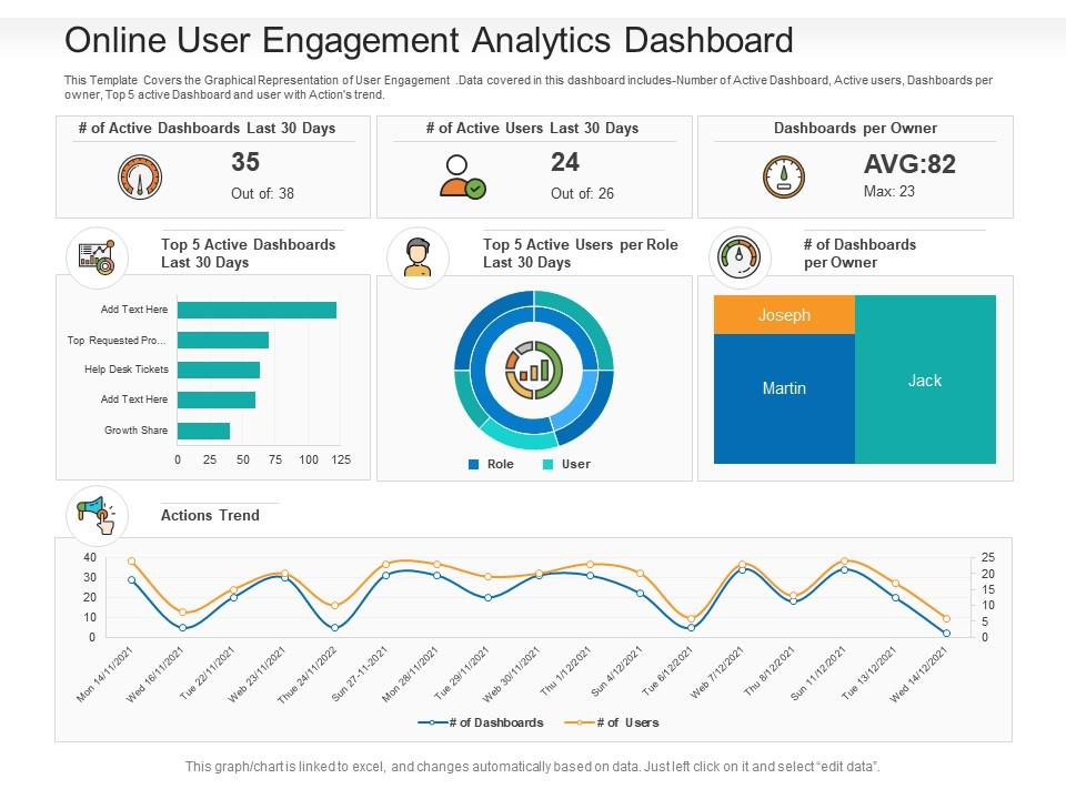
This Template Covers the Graphical Representation of User Engagement. Data covered in this dashboard includes-Number of Active Dashboard, Active users, Dashboards per owner, Top 5 active Dashboard and user with Actions trend. This is a Online User Engagement Analytics Dashboard Snapshot Powerpoint Template featuring in built editable components to add your personal touches. Tailor this template as per your liking and display it on a widescreen or standard screen, the choice is yours.

Content of this Powerpoint Presentation

Description:

The image is a PowerPoint slide titled "Online User Engagement Analytics Dashboard," which displays various data visualization elements to represent user engagement metrics. The slide is designed to be dynamic, with the ability to link graphs and charts to Excel for live data updates. The elements include:

1. # of Active Dashboards Last 30 Days: 

A gauge showing 35 out of 38 dashboards are active.

2. Top 5 Active Dashboards Last 30 Days: 

A horizontal bar graph with placeholders for data.

3. # of Active Users Last 30 Days: 

Another gauge indicating 24 out of 26 users are active.

4. Top 5 Active Users per Role Last 30 Days: 

A donut chart representing user activity by role.

5. Dashboards per Owner: 

A treemap highlighting the distribution of dashboards among three users, Joseph, Martin, and Jack.

6. Actions Trend: 

A line graph comparing the trends of the number of dashboards to the number of users over a given timeframe.

Use Cases:

Industries that can utilize such slides include:

1. Software and SaaS:

Use: Tracking feature engagement and user activity.

Presenter: Product Manager.

Audience: Development Team.

2. E-commerce:

Use: Monitoring dashboard usage for sales and inventory management.

Presenter: E-commerce Analyst.

Audience: Sales and Marketing Teams.

3. Healthcare:

Use: Reviewing engagement with digital health record systems.

Presenter: Healthcare IT Specialist.

Audience: Administrative Staff.

4. Education Technology:

Use: Analyzing engagement with learning management systems.

Presenter: EdTech Data Analyst.

Audience: Educators and Institutional Leadership.

5. Digital Marketing:

Use: Assessing the performance of marketing campaign dashboards.

Presenter: Marketing Data Analyst.

Audience: Marketing and Strategy Teams.

6. Banking and Finance:

Use: Evaluating engagement with online banking dashboards.

Presenter: Digital Banking Manager.

Audience: Customer Service Representatives.

7. Telecommunications:

Use: Measuring user activity on service management platforms.

Presenter: Customer Experience Manager.

Audience: Operations and Support Teams.

FAQs for Online user engagement analytics dashboard

Check your time on page and bounce rate first - that's where you'll see if people actually give a damn about what you wrote. Click-through rates on your CTAs matter too. Session duration is honestly my go-to metric because it shows real engagement, not just accidental clicks. Don't chase vanity stuff like total page views. Scroll depth and conversion funnels are way more useful since they show exactly where you're losing people. Oh, and cohort retention is solid once you get comfortable with the basics.

So basically, engagement analytics will tell you which slides people actually pay attention to and which ones make them bail. Heat maps show where viewers look, how long they stick around on each part, and when they get distracted - honestly the amount of data is kinda creepy. But it's super useful! You can move your important stuff to the spots that get the most eyeballs and cut the boring parts that nobody cares about. Time-on-slide and click rates are good starting points. I'd focus on fixing your go-to templates first since those get the most use.

Honestly, just start with Google Analytics - it's free and shows you the basics like bounce rates and how long people stick around. Each social platform has its own analytics too, but Hootsuite makes it easier to see everything in one place. I'm obsessed with Hotjar though - watching people actually use your site through session recordings is weirdly fascinating (and super helpful). Most email tools like Mailchimp already track opens and clicks for you. Don't overthink it at first. Google Analytics will tell you most of what you need to know about whether people actually care about your content or just bounce immediately.

So basically you split your users into different groups and test stuff like button placement, notification timing, whatever. Track how each version affects your actual engagement - time on site, clicks, all that. Most people screw this up by only looking at conversions though, which is kinda dumb. You want to see both immediate changes and if people stick around long-term. I'd start with testing just one thing first - don't go crazy trying to test everything at once. Then connect those results back to your main engagement metrics and build from there.

Okay so demographic data is basically your cheat sheet for figuring out who's actually engaging with your stuff. Break down your metrics by age and device - you'll find some wild patterns. Like maybe your 25-34 crowd hangs out on product pages way longer, or mobile users from certain areas bounce super quick. I was shocked when I first looked at mine honestly. Don't just stare at the overall numbers though - segment everything by demographics. Otherwise you're missing huge insights that could totally change your content strategy.

So engagement analytics are basically your best friend here - they show which parts of your templates actually grab attention vs. make people click away. Track stuff like how far people scroll, time on different sections, CTA clicks, and dropout points. Heat maps are clutch too since they reveal where people look first. Here's what's wild: if your data shows everyone skips intro slides but stares at charts forever, you know to ditch the fluff and lead with visuals instead. I'd start A/B testing two template versions with different layouts. Let the metrics do the talking - they'll tell you which design patterns actually click with your audience.

Honestly, the warning signs are pretty obvious once you know what to look for. Session duration starts dropping. Bounce rates go up. People aren't clicking your CTAs anymore - that one's brutal to watch. Your social shares basically disappear, and good luck getting comments. The time between visits thing is huge too. Like, people just stop coming back regularly. Conversion rates crashing is the nail in the coffin obviously. Check your analytics weekly instead of waiting a whole month - trust me on this. You can actually fix things before they get really bad that way.

So social media basically throws your analytics into chaos because now you're tracking likes, shares, comments across like 5 different platforms. It's honestly a mess at first. But social drives people back to your actual website, so you've gotta connect those dots somehow. Set up UTM parameters on your social links - trust me on this one, otherwise you'll have no clue where your traffic's coming from. The cool part is seeing how viral posts actually move your overall engagement numbers. Oh and don't sleep on sentiment tracking either, that stuff matters way more than people think.

Know your audience first - execs want conversion rates and revenue, but product teams care more about user behavior stuff. Honestly, visual dashboards beat spreadsheets every single time. Nobody's got patience for raw data dumps. Compare everything to previous periods so people actually understand if numbers are good or bad. The real trick though? Don't just show what happened. Explain why it happened and what you'd do next. That's where you actually add value instead of just being a human calculator.

Honestly, just ask your users what's pissing them off and fix those things first. Send out surveys or throw up quick feedback pop-ups to see what's making people bounce. Most companies I know saw engagement jump like 30-40% just from tackling their biggest complaints. Track your usual stuff - time on site, return visits, clicks - before and after you make changes. That's how you'll know if it actually worked or if you're just guessing. Oh, and don't forget to ask what features they actually want too. Sometimes it's not what's broken but what's missing that kills engagement.

Don't get sucked into vanity metrics like page views - they're basically meaningless if people aren't actually doing anything useful on your site. High bounce rates freak everyone out, but sometimes users just grab what they need and leave, which is totally fine. The real mistake I see constantly? Not breaking down your data by different user groups, so you miss obvious patterns. Oh, and just because two numbers go up together doesn't mean one's causing the other - that's correlation vs causation 101. Always connect your engagement stuff back to actual money or conversions, otherwise you're just playing with pretty charts.

Look, engagement analytics are honestly a game changer - they show you exactly what different groups actually care about. Like, you'll notice younger people go crazy for videos while professionals want those deep-dive articles. Time spent, clicks, shares across segments tell the whole story. I got totally obsessed with this stuff last month (probably spent way too much time in Google Analytics lol). But seriously, once you see which topics perform best for each group, you can stop throwing content at the wall and hoping something sticks. Way better than guessing what people want.

Look, engagement data is basically a cheat code for SEO. When people stick around your site longer and click through multiple pages, Google notices and rewards you with better rankings. I'd start by checking which of your top 10 pages have the best time-on-page stats - those are your winners. Copy whatever makes them work so well. For the duds? Maybe they need catchier headlines or better internal links connecting to other content. Oh, and don't sleep on bounce rate either. High bounce rates are like telling Google your content sucks, even if it doesn't.

Check your analytics weekly - seriously, things change overnight sometimes. Don't freak out if one type of post suddenly tanks though. I made that mistake and changed everything at once, total disaster. Test small tweaks first. Honestly, diversifying platforms saved me when Instagram's algorithm went crazy last year. You should probably start messing around with newer apps now, even the weird ones. Your people might already be hanging out there while you're still posting to crickets elsewhere. The whole "don't put all your eggs in one basket" thing actually matters here.

Dude, real-time analytics are a game changer for webinars. I can literally watch engagement tank during boring parts and immediately switch tactics - throw in a poll or get people talking in chat. The attention metrics tell you everything, honestly. Like if I see consistent drop-offs at the 20-minute mark, that's my cue to add breaks or shake things up earlier next time. Chat activity is probably the most useful metric btw. Track 3-4 key things during your next session and you'll present totally differently when you can actually see what's working.

Ratings and Reviews

93% of 100
Review Form
Write a review
Most Relevant Reviews
  1. 100%

    by Michael Allen

    Use of different colors is good. It's simple and attractive.
  2. 100%

    by Williams Morales

    Great designs, Easily Editable.
  3. 80%

    by Derrick Rice

    The Designed Graphic are very professional and classic.

3 Item(s)

per page: