Parallel timeline diagram including different phases and milestones

Parallel timeline diagram including different phases and milestones
Slide 1 of 2
Favourites Favourites

Try Before you Buy Download Free Sample Product

Audience Impress Your
Audience
Editable 100%
Editable
Time Save Hours
of Time
The Biggest Sale is ending soon in
0
0
:
0
0
:
0
0
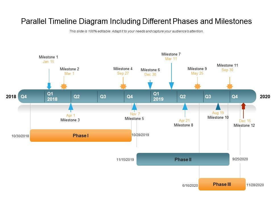
Presenting this set of slides with name Parallel Timeline Diagram Including Different Phases And Milestones. This is a twelve stage process. The stages in this process are Milestone 1 To Milestone 12, Parallel Timeline, Diagram, Phases And Milestones. This is a completely editable PowerPoint presentation and is available for immediate download. Download now and impress your audience.

People who downloaded this PowerPoint presentation also viewed the following :

FAQs for Parallel timeline diagram including different

Honestly, timelines are a game-changer for presentations. Your audience can instantly see the big picture instead of drowning in bullet points. People naturally follow left-to-right flow, so you're controlling how they absorb info. Short sentences hit different too. What I love most is how timelines show cause-and-effect relationships - like why X happened because of Y. They're perfect for highlighting those "oh shit" decision moments (sorry, but you know what I mean). Dense text just makes people's eyes glaze over. Try swapping your boring lists for a visual timeline next time - seriously, the difference is night and day.

Oh man, timelines are a game changer! Your presentation becomes an actual story people can follow instead of random facts thrown together. Start with your key events mapped out chronologically - then build slides around that. People naturally get cause and effect when you show things in order. Way more engaging than boring bullet points (seriously, death by PowerPoint is real). You can create suspense or show how things progressed. Everyone stays on track because the visual flow tells them exactly where you are. It's like giving your audience a roadmap through your content.

Timelines work best when your data follows a clear sequence - stuff like project milestones, product launches, historical events, or mapping user journeys. The key is that timing matters just as much as what actually happened. I've watched people cram random data into timeline format and honestly? It's painful to look at. You want distinct events or phases that occurred at specific times. Great for showing how one thing led to another over time too. Simple test: does the order of these events tell an actual story? If yeah, go timeline. If you're forcing it, probably pick something else.

So timeline style totally changes how people absorb your info. Linear ones are solid for basic chronological stuff, but interactive timelines? Way more engaging since everyone loves clicking around. I've literally watched linear timelines bore entire conference rooms to death lol. Circular designs can help complex historical patterns stick better in people's heads, though some folks get confused at first. Oh, and vertical scrolling timelines crush it on mobile - the engagement numbers don't lie. Really comes down to matching what your audience expects with how complex your data actually is. Try testing different formats if you've got time.

So there's a bunch of good options here. Timeline JS is probably your best bet if you want something free and web-based - super easy to use. Tableau and Power BI are solid for interactive stuff, but they're overkill if you just need a basic timeline. Tiki-Toki's built specifically for this kind of thing too. D3.js gives you crazy control but honestly? Total pain unless you're already into coding. I've even seen people make decent timelines in Google Sheets when they're in a rush. What's this timeline for anyway? That might help narrow it down.

Timeline visualizations are pretty flexible - they work everywhere because you just focus on what each field cares about. Healthcare uses them for patient treatments, medication schedules, that kind of thing. Kids absolutely love seeing history mapped out visually (way better than textbooks honestly). The trick is matching your design to what people need. Medical timelines? Use those little medical icons and color-code by how urgent stuff is. Education ones work great with milestone markers. Figure out what story your industry people need to see chronologically, then just build it around that. Super straightforward once you know your audience.

Dude, don't cram everything onto one timeline - that's the worst mistake I see. Pick your key moments first, then space them consistently. I made this error once and it looked like complete chaos lol. Make sure people can actually READ your text too (shocking how many tiny fonts I've seen). Short sentences work better than long rambling ones. Oh and give each time period clear labels - sounds obvious but you'd be surprised. Honestly, sketch the big events first as anchor points, then fill in around those. Way easier than trying to fit everything at once.

Dude, colors can totally make or break your timeline. Pick the wrong ones and people get confused fast—like don't use red/green together, colorblind folks can't tell them apart. I learned that the hard way once. For chronological stuff, gradients work great. Categories need contrasting colors that actually pop. Too many similar shades just turn into mush nobody can read. Stick to maybe 5-7 colors max, and honestly? Test it with those colorblind simulators first. Your brain will thank you later when stakeholders aren't squinting at your screen asking what's what.

Interactive timelines are so much better than static ones - your audience can actually click around, zoom in, and explore stuff themselves. Way more engaging than just staring at dates on a screen. People can focus on whatever period interests them most or compare different eras side by side. You can pack in tons of complex info without making everyone's eyes glaze over. Honestly, it's like turning a boring history textbook into something you'd actually want to mess around with. Just start small though - maybe add some hover details first, then see what features people actually use before going crazy with bells and whistles.

Honestly, timeline visuals are a game-changer for projects. Map out your phases, deadlines, and major milestones in a straight line - people get it immediately. Gantt charts work, but even basic horizontal timelines do the trick. Use colors or icons to separate different tasks, mark your critical stuff, or show how deliverables connect. It's crazy how fast you'll spot bottlenecks and overlapping deadlines that could mess things up. I usually start with Lucidchart (though PowerPoint works fine too if you're being cheap about it). Seriously worth trying on your next project.

Oh there's so many cool options! Interactive ones where you click through project phases are pretty slick. Vertical layouts work great when you've got parallel workstreams happening. Nike did this spiral thing for their product evolution that looked way cooler than boring horizontal bars. You could try focusing on milestones instead of just dates, or use swimming lanes to show different departments. Animated ones that build as you present are solid too - though honestly they can be overkill sometimes. Figure out your story first, then pick whatever format makes sense.

First thing - get your data in chronological order and figure out which events actually matter to your audience. Use the same time spacing throughout and add visual markers like dots or colors to show different types of events. Trust me, cramming everything in just looks messy. Less is definitely more here. Focus on the story instead of showing every single detail. Your labels should be short but clear enough that they make sense on their own. Oh, and definitely mock it up with real data first - you'll spot patterns you didn't expect once you see everything laid out.

Don't try to cram everything in there chronologically - it'll look like a hot mess. Pick your biggest milestones first and group related stuff together. Seriously, white space is magic for this kind of thing. It stops people's eyes from glazing over. Mix up your font sizes so the major events pop while smaller details stay subtle. Maybe add click-to-expand sections if you've got tons of info? I'd sketch out the must-have events first, then figure out what other details actually matter vs. just cluttering things up.

Honestly, I'd track three main things: can people actually find what they're looking for (task completion), how fast they spot the important stuff, and whether they're getting it right. Also watch if users are actually clicking around different time periods or just leaving immediately - that tells you a lot. Oh, and definitely ask about cognitive overload because timelines can be brutal when they're too packed. But here's the thing - none of this matters if people aren't making better decisions afterward. Figure out what "winning" looks like for your specific situation first, then just pick 2-3 metrics that actually measure that. Don't overthink it.

Honestly, timeline visuals are a game changer because they show the actual flow instead of just dumping info on people. Your audience can follow along step by step without getting lost. They're perfect for project timelines, historical stuff, or really any process where order matters. I can't tell you how many times I've sat through presentations where everything's just randomly listed out - it's painful! The visual format helps people spot where things might get stuck and see how events connect. Oh, and try swim lanes or color coding if you've got different teams involved. Makes it way easier to track who's doing what.

Ratings and Reviews

0% of 100
Review Form
Write a review
Most Relevant Reviews

No Reviews