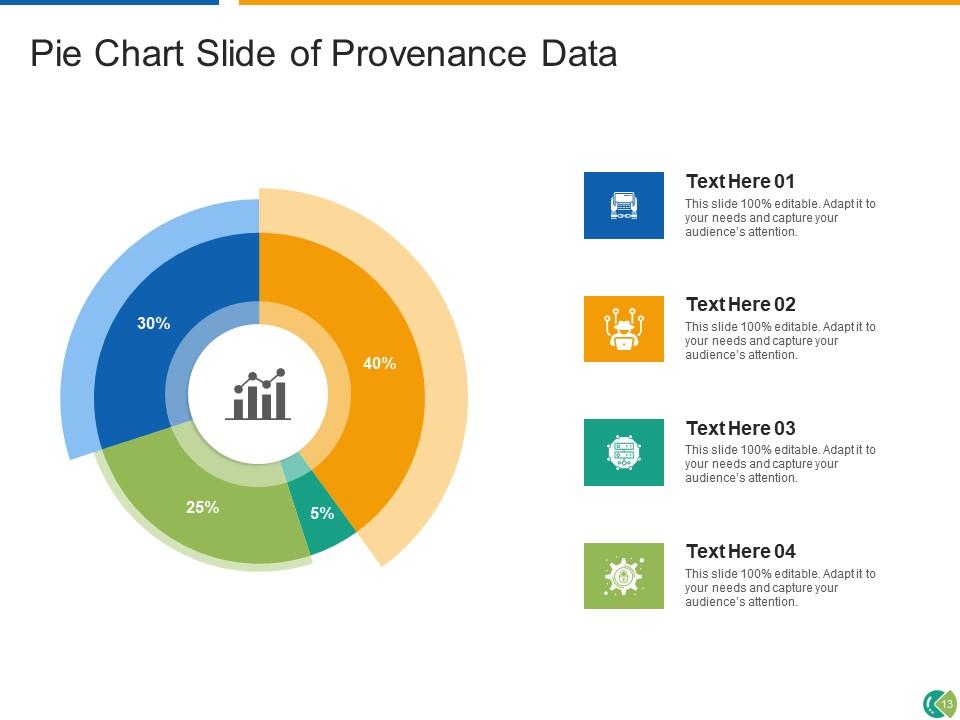
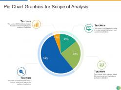
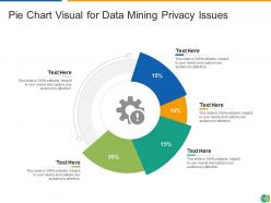
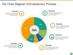
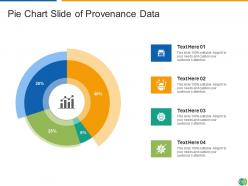
Pie chart analysis management process sales organization provenance data

Rating:
80%
Pie chart analysis management process sales organization provenance data
Slide 1 of 14

or

Favourites Favourites

Try Before you Buy Download Free Sample Product

Audience Impress Your
Audience
Editable 100%
Editable
Time Save Hours
of Time
The Biggest Sale is ending soon in
0
0
:
0
0
:
0
0
Rating:
80%
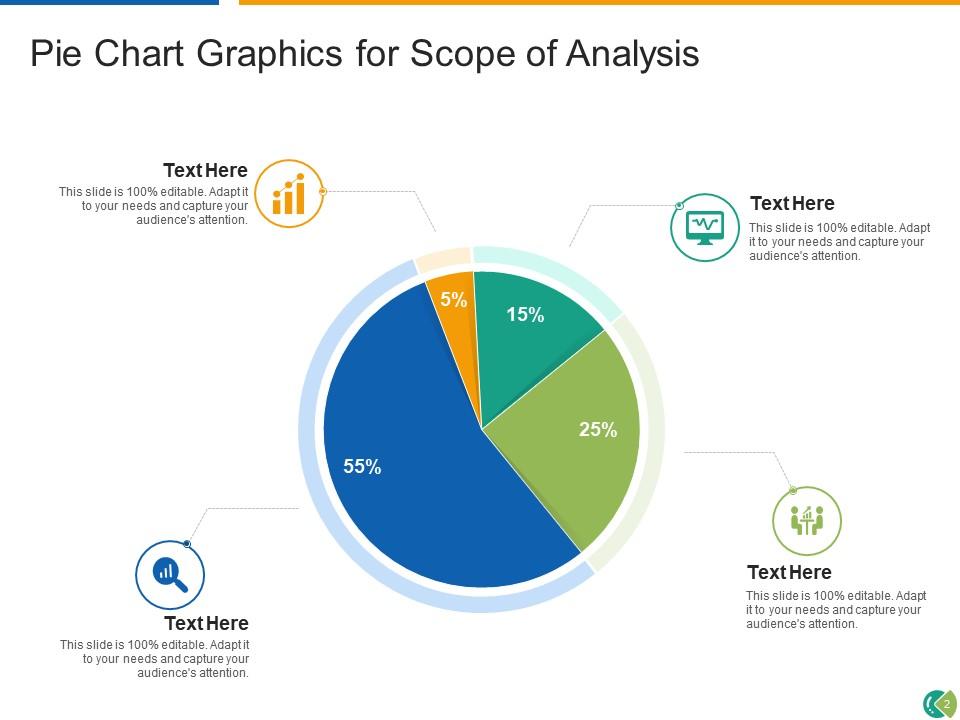
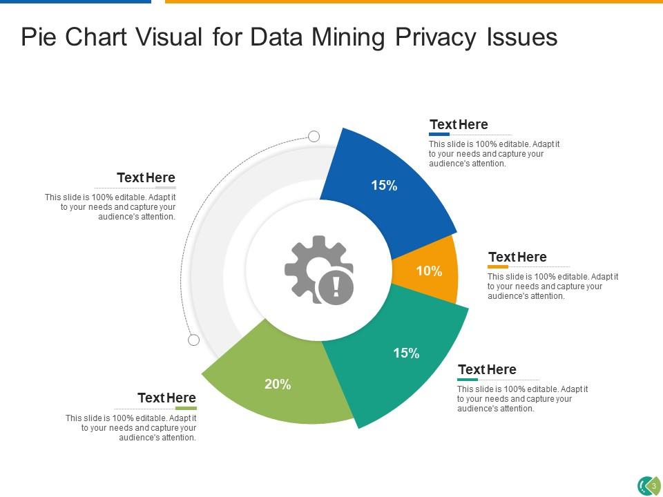
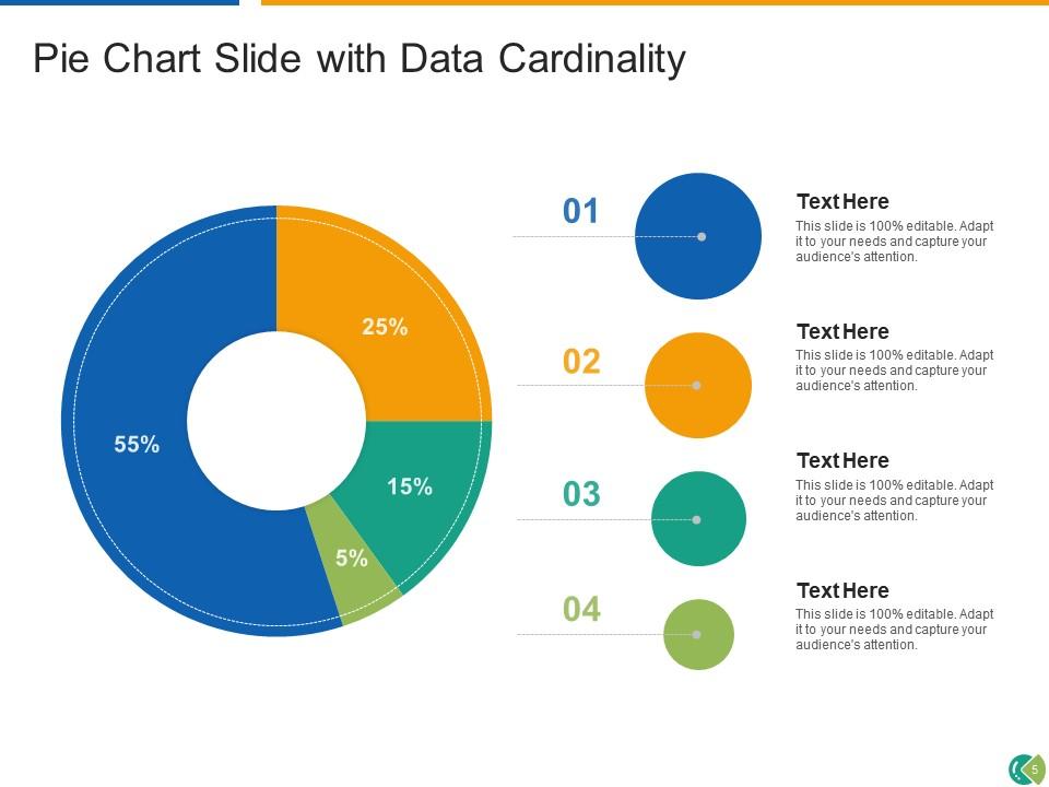
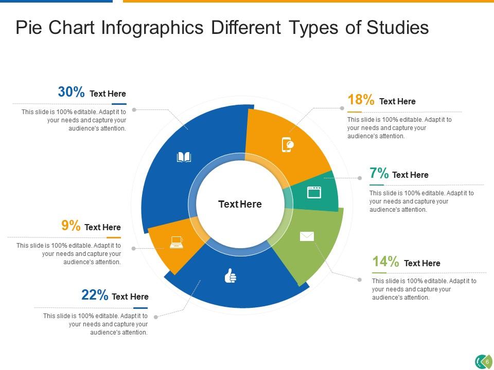
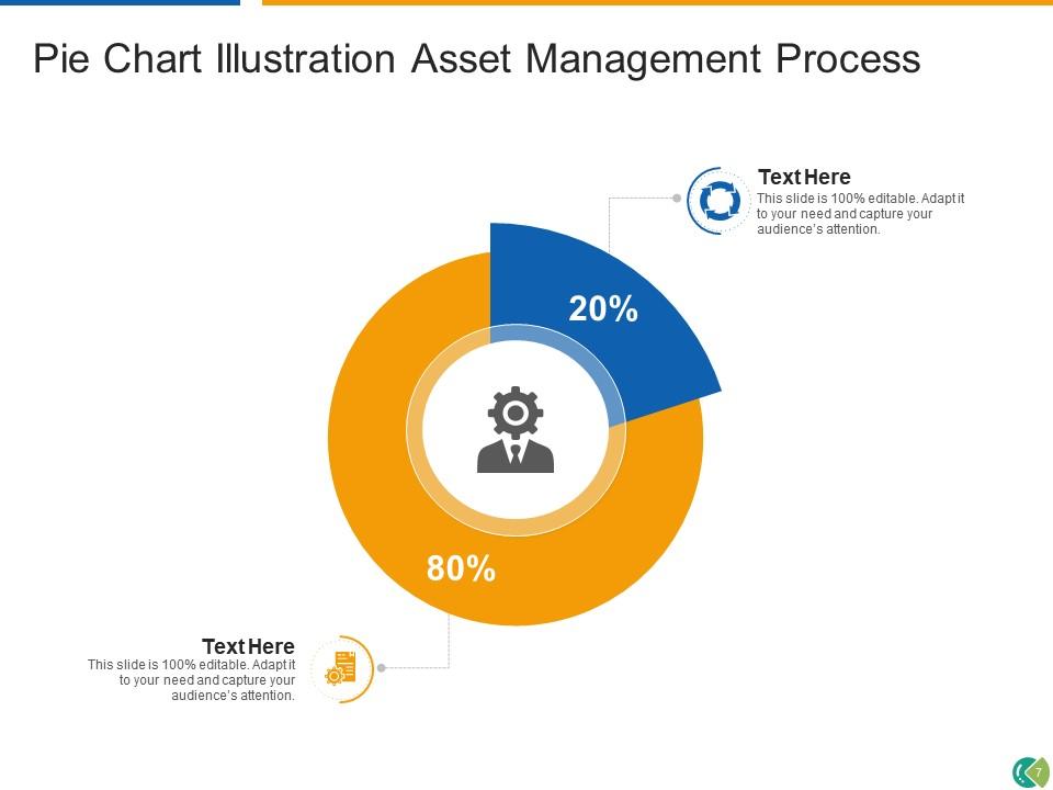
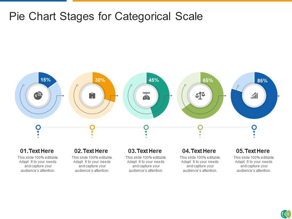
If you require a professional template with great design, then this Pie Chart Analysis Management Process Sales Organization Provenance Data is an ideal fit for you. Deploy it to enthrall your audience and increase your presentation threshold with the right graphics, images, and structure. Portray your ideas and vision using fourteen slides included in this complete deck. This template is suitable for expert discussion meetings presenting your views on the topic. With a variety of slides having the same thematic representation, this template can be regarded as a complete package. It employs some of the best design practices, so everything is well-structured. Not only this, it responds to all your needs and requirements by quickly adapting itself to the changes you make. This PPT slideshow is available for immediate download in PNG, JPG, and PDF formats, further enhancing its usability. Grab it by clicking the download button.

People who downloaded this PowerPoint presentation also viewed the following :

FAQs for Pie chart analysis management process sales

Pie charts offer several key advantages including immediate visual impact, intuitive percentage relationships, simplified data comparison, effective categorical representation, and universal recognition across audiences. These visualization tools streamline complex datasets by enabling quick proportion assessment, enhancing presentation clarity, and facilitating stakeholder understanding, with many organizations finding that pie charts significantly improve decision-making processes and audience engagement.

Effective pie chart color selection involves using high contrast between adjacent segments, limiting the palette to 5-7 distinct colors, and applying consistent color coding that aligns with your brand or data categories. These strategic choices enhance readability and comprehension, with many organizations finding that thoughtful color selection significantly improves audience engagement and data interpretation speed during presentations.

Pie charts are most effective when displaying parts of a whole with fewer than seven categories, comparing relative proportions rather than precise values, and showing simple percentage breakdowns like market share or budget allocation. They excel in scenarios where the relationship between components and the total matters more than exact measurements, with many businesses finding that pie charts effectively communicate high-level distributions in presentations, dashboards, and executive summaries where immediate visual impact trumps detailed analysis.

Common pie chart mistakes include using too many segments, unclear labeling, poor color choices, starting segments at random positions, and including irrelevant data categories. These errors confuse audiences during presentations by creating visual clutter, making comparisons difficult, and obscuring key insights, with many presenters finding that limiting segments to five or fewer and using consistent labeling significantly enhances audience comprehension.

Labels significantly enhance pie chart clarity by providing precise data identification, eliminating guesswork, displaying exact percentages or values, and enabling quick comprehension without color interpretation. Strategic labeling approaches, including direct slice labeling, callout lines, and comprehensive legends, streamline data analysis for stakeholders across sectors like financial reporting and market research, ultimately delivering faster decision-making and improved presentation effectiveness.

3D pie charts significantly hinder accurate data interpretation by creating visual distortions that make slice comparisons difficult, with the three-dimensional perspective often making segments appear larger or smaller than their actual values. While they may seem visually appealing, many data analysts and organizations find that traditional 2D charts deliver clearer insights and more precise decision-making capabilities.

Maintaining proportional accuracy in pie charts requires precise mathematical calculations where each segment represents its exact percentage of the total dataset, verified through consistent data validation and visual review processes. Professional presentation tools automatically calculate these proportions, but manual verification ensures segments visually correspond to actual values, with many analysts cross-referencing data tables to confirm accurate representation before stakeholder presentations.

Context plays a crucial role in pie chart interpretation by providing the background information, data source, time period, sample size, and relevant benchmarks needed for accurate analysis. Without proper context, viewers may misinterpret proportions, draw incorrect conclusions, or miss critical insights, with many analysts finding that contextual framing ultimately determines whether data storytelling delivers meaningful business intelligence.

Interactive elements in pie charts include clickable segments, hover-over tooltips, drill-down capabilities, animated transitions, and dynamic filtering options. These features enhance audience engagement by allowing viewers to explore specific data points, reveal detailed breakdowns, and customize views in real-time, ultimately delivering more compelling presentations and improved data comprehension for stakeholders.

Alternatives to pie charts include stacked bar charts, treemaps, donut charts, waffle charts, and horizontal bar charts. These visualization methods enhance data clarity by enabling precise comparisons, accommodating larger datasets, and streamlining analysis processes, with many organizations finding that bar charts and treemaps deliver superior accuracy in financial reporting and market analysis.

Audience familiarity with pie charts significantly enhances data comprehension by enabling faster pattern recognition, more accurate proportion comparisons, and intuitive understanding of part-to-whole relationships. Experienced viewers can quickly identify key insights, anomalies, and trends, while unfamiliar audiences may struggle with angle interpretation and relative sizing, ultimately requiring additional context or alternative visualization methods for effective communication.

**INPUT**: What software tools are recommended for creating visually appealing pie charts? **OUTPUT**: Recommended software tools for creating visually appealing pie charts include Excel, Tableau, Power BI, Google Charts, and specialized design platforms like Canva or Adobe Illustrator. These tools streamline data visualization by offering customizable templates, interactive features, and professional formatting options, with many organizations finding that strategic chart design enhances stakeholder engagement and accelerates decision-making processes. [Word count: 54 words]

Combining pie charts with bar charts, line graphs, tables, and dashboards creates comprehensive data stories by showing proportions alongside trends, comparisons, and detailed breakdowns. This strategic combination enables organizations to present part-to-whole relationships while providing context through complementary visualizations, with many analysts finding that layered approaches deliver enhanced audience understanding and more actionable business insights.

Categorical data with mutually exclusive parts forming a complete whole works best for pie charts, including budget allocations, market share distributions, demographic breakdowns, survey response percentages, and departmental resource divisions. These data types enable clear visualization of proportional relationships, with many organizations finding that financial allocations, customer segmentation, and operational divisions deliver the most impactful stakeholder communications.

Cultural interpretation of pie charts varies through different color symbolism, reading patterns, and data prioritization approaches across regions. While Western audiences typically read clockwise from 12 o'clock emphasizing largest segments, many Asian markets focus on color meanings and hierarchical data presentation, with Middle Eastern regions often preferring right-to-left visual flow, ultimately requiring localized design strategies for global business communications.

Ratings and Reviews

80% of 100
Review Form
Write a review
Most Relevant Reviews
  1. 80%

    by Evans Mitchell

    Excellent design and quick turnaround.
  2. 80%

    by Darnell Tucker

    Helpful product design for delivering presentation.
  3. 80%

    by O'Neill Reyes

    Great designs, Easily Editable.

3 Item(s)

per page: