Risk Management Kpi Dashboard Showing Cost Of Control And Risk Score
Our Risk Management Kpi Dashboard Showing Cost Of Control And Risk Score ensure a cozy feeling. They will fit your thoughts like a glove.
Our Risk Management Kpi Dashboard Showing Cost Of Control And Risk Score ensure a cozy feeling. They will fit your thoughts..
- Google Slides is a new FREE Presentation software from Google.
- All our content is 100% compatible with Google Slides.
- Just download our designs, and upload them to Google Slides and they will work automatically.
- Amaze your audience with SlideTeam and Google Slides.
-
Want Changes to This PPT Slide? Check out our Presentation Design Services
- WideScreen Aspect ratio is becoming a very popular format. When you download this product, the downloaded ZIP will contain this product in both standard and widescreen format.
-

- Some older products that we have may only be in standard format, but they can easily be converted to widescreen.
- To do this, please open the SlideTeam product in Powerpoint, and go to
- Design ( On the top bar) -> Page Setup -> and select "On-screen Show (16:9)” in the drop down for "Slides Sized for".
- The slide or theme will change to widescreen, and all graphics will adjust automatically. You can similarly convert our content to any other desired screen aspect ratio.
Compatible With Google Slides

Get This In WideScreen
You must be logged in to download this presentation.
PowerPoint presentation slides
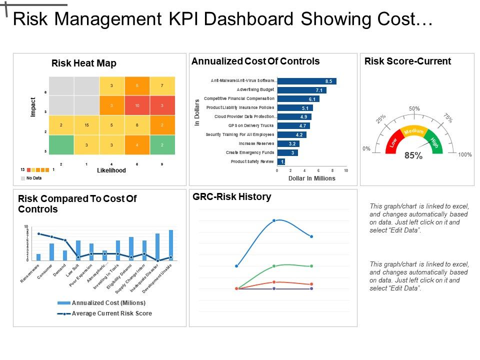
Presenting this set of slides with name - Risk Management Kpi Dashboard Showing Cost Of Control And Risk Score. This is a five stage process. The stages in this process are Risk Management, Risk Assessment, Project Risk.
People who downloaded this PowerPoint presentation also viewed the following :
Content of this Powerpoint Presentation
Description:
The image contains multiple visual elements that form a comprehensive Risk Management KPI (Key Performance Indicator) Dashboard with a focus on displaying the costs associated with various risk controls.
1. Risk Heat Map:
A grid that plots 'Impact' against 'Likelihood', showing relative risk levels using color codes (green for low risk, yellow for medium risk, orange for high risk, and gray for no data). Each cell within the grid contains a number corresponding to specific risks.
2. Annualized Cost of Controls:
A bar graph indicates the monetary amount (in millions of dollars) spent on various risk control measures, such as anti-malware solutions, advertising budgets, financial compensation, insurance policies, and more.
3. Risk Score-Current:
Represented by a speedometer-style gauge showing the organization's overall current risk level at 85%, categorized as 'high'.
4. Risk Compared to Cost of Controls:
A dual-axis chart comparing the average current risk score (line) with the annualized cost (bar) for various risk controls, suggesting the cost-effectiveness or ROI of these controls.
5. GRC-Risk History:
A chart tracking the history of Governance, Risk Management, and Compliance (GRC) over time, plotting three unidentified variables through a line graph.
A note in the bottom right corner indicates that the data in the charts/graphs is linked to an Excel spreadsheet and can be updated by clicking on the chart and selecting "Edit Data."
Use Cases:
This dashboard-style can be applied in a variety of industries, providing strategic insight for decision-makers:
1. Finance:
Use: Tracking financial risks and the cost-effectiveness of mitigation strategies.
Presenter: Chief Financial Officer or Risk Manager.
Audience: Board members, investors, financial analysts.
2. Information Technology:
Use: Monitoring cybersecurity risks and investments in IT security measures.
Presenter: Chief Information Security Officer.
Audience: IT management team, stakeholders, cybersecurity personnel.
3. Healthcare:
Use: Managing patient safety risks and associated control costs.
Presenter: Head of Risk Management.
Audience: Hospital administration, healthcare providers, compliance officers.
4. Insurance:
Use: Analyzing risks and operational control costs for underwriting and claims management.
Presenter: Actuary or Risk Analyst.
Audience: Underwriters, claims adjustors, insurance executives.
5. Manufacturing:
Use: Assessing the impact of supply chain disruptions and quality control risks against their mitigation costs.
Presenter: Operations Manager.
Audience: Production managers, quality assurance teams, supply chain partners.
6. Energy:
Use: Evaluating infrastructure risks and regulatory compliance costs.
Presenter: Energy Risk Management Specialist.
Audience: Regulators, environment, health and safety officers, operations staff.
7. Retail:
Use: Understanding customer data breaches risks and loss prevention expenses.
Presenter: Chief Risk Officer.
Audience: Retail executives, data protection teams, store managers.
Risk Management Kpi Dashboard Showing Cost Of Control And Risk Score with all 6 slides:
Conquer the floor with our Risk Management Kpi Dashboard Showing Cost Of Control And Risk Score. Get folks clapping and clamoring away.
-
mantul
-
Use of icon with content is very relateable, informative and appealing.
-
Very unique and reliable designs.


