Pptx text box for swot analysis for business flat powerpoint design
Try Before you Buy Download Free Sample Product
Audience
Editable
of Time
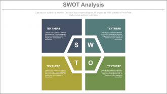
To develop a strong business strategy you will need our PPTx text box for SWOT analysis for business flat PowerPoint design which will help you in creating a powerful tool for your business growth and success. With this PPT slides you can express the fact that while creating a business strategy you need to consider all of your business’s strengths and weaknesses, as well as the opportunities and threats you will face in the marketplace. You can use this Presentation template to describe that for an existing businesses SWOT analysis can be performed at any time to assess the changing business environment and to respond or resolve the same with a compelling and proactive approach. Further our PPT design will help in explaining the fact that such analysis also helps in conducting a review of your established strategy with in a stipulated period of time .Therefore simply start initializing this PowerPoint layout for evaluating the factors of your business prosperity.Acquire greater authority with our pptx Text Box For Swot Analysis For Business Flat Powerpoint Design. They help establish your expertise.
People who downloaded this PowerPoint presentation also viewed the following :
Pptx text box for swot analysis for business flat powerpoint design with all 5 slides:
Ensure fears don't ever haunt you with our pptx Text Box For Swot Analysis For Business Flat Powerpoint Design. They help you exorcise them all.
FAQs for Pptx text box for swot analysis for business
Okay so basically you need those four boxes - Strengths, Weaknesses, Opportunities, and Threats. Internal stuff like your team's skills or budget issues go in the strengths/weaknesses sections. External market things go in opportunities/threats. I'd definitely add bullet points in each section because lists are way easier to follow than paragraphs. Oh and most templates I've seen have a summary area at the bottom - honestly pretty helpful for pulling together the main takeaways. Just don't cram everything together or it'll look messy when you're showing people.
Honestly, good SWOT templates are game-changers for meetings. Clean sections keep people focused instead of getting lost in messy charts or walls of text. When everything's laid out clearly, stakeholders actually contribute better ideas - they can see where their thoughts fit. I've watched terrible templates completely derail strategy sessions, it's painful. Short sentences work. Longer ones help you explain the flow between different sections naturally. Pick something with decent whitespace so it doesn't feel cramped. Your meetings will become way more collaborative once people can follow along visually. Trust me on this one.
Honestly, just go with the classic four-color setup - green for strengths, red for weaknesses, blue for opportunities, and orange for threats. Makes everything way easier to follow. High contrast is your friend here because nobody wants to squint trying to figure out which section they're looking at. Clean design with lots of white space, bold headers for each category. Maybe throw in some simple icons if you're feeling fancy? I always think SWOT slides work best when they're super scannable - people should get your main points at a glance. Oh, and stick with one font throughout. Trust me on this one.
Oh totally! Just swap out the boring generic categories for stuff that actually matters to your business - like "Tech Stack" instead of "Strengths" or whatever. Honestly, I've watched teams waste so much time obsessing over the perfect SWOT format when they should just... start writing? Add your branding, throw in some guiding questions under each section so people know what to focus on. The template's just there to get you going anyway. Make it work for your team and the metrics your stakeholders care about.
Ugh, the worst thing you can do is be super vague - like saying "we have great customer service" without any specifics. Also, don't cram everything into tiny text that no one can read! I've seen so many presentations where people squint at these massive tables from across the room. Make sure your quadrants are balanced too. If you list 10 weaknesses but only 2 strengths, something's off. Keep it visual with bullet points and focus on stuff that actually impacts your strategy. Oh, and definitely test it on someone first - trust me on this one.
Stick with the classic 2x2 grid - there's a reason everyone uses it. Strengths and weaknesses go on top, opportunities and threats below. Bullet points are your friend here, not paragraphs (trust me, nobody's reading chunks of text in meetings). I'd use different colors for internal vs external stuff. Oh, and don't go overboard - maybe 3-5 points per section max or people zone out. One thing that actually helps? Throw in some little icons next to each point. Makes it way easier to remember later and looks less boring than plain text.
Honestly, visuals just make SWOT analysis way less boring to look at. People zone out when you throw text blocks at them. I like using arrows pointing up for strengths, maybe warning icons for threats - stuff that makes sense at a glance. The key is keeping it simple though. I've sat through presentations where someone went crazy with random clipart (why was there a dancing banana?) and it was painful. Short sentences work better than long explanations. Keep your icons consistent across all four quadrants so it doesn't look like a mess. Visual hierarchy is your friend here.
Honestly, SWOT templates are pretty clutch because you get this bird's-eye view of everything at once. Instead of juggling random thoughts, your team can actually see how strengths might neutralize threats or how opportunities could patch up weaknesses. Visual stuff just hits different - everyone stays on the same page instead of going in circles. The cool part is connecting the dots between sections with arrows and mapping out your next moves. I probably use mine way too much, but it really does help you figure out which projects are actually worth your time and which ones you should ditch.
Yeah totally! The basic four-box SWOT works for everyone, but you gotta tweak the questions inside. Tech companies should dig into innovation speed, cyber threats, that kind of stuff. Healthcare's all about patient scores and regulatory nightmares. Retail? Think seasonal swings and supply chain mess-ups. Manufacturing focuses more on efficiency and safety records. Honestly, I'd just grab a standard template first, then brainstorm 3-4 specific things that could make or break companies in your field. That's where you get the real insights anyway - not from generic "what are your strengths" questions.
Oh man, templates are such a game changer! You don't have to mess around building layouts from scratch - just dump your strengths, weaknesses, opportunities and threats into the pre-made sections. The formatting's already done for you, which is clutch when you're scrambling to meet deadlines. Your presentations will look way more polished too. I used to waste so much time on design stuff before I figured this out. Pick one that fits your company vibe and you can actually focus on the analysis part instead of making things look pretty.
You absolutely need current market trends in your SWOT - otherwise you're basically flying blind. They affect everything: new opportunities pop up, weaknesses become way more obvious, and you can see if your strengths actually matter right now. Like, imagine using a SWOT from 2019 today... yikes. Don't just slap trends into one section though. Weave them throughout the whole thing. Oh, and make sure your sources are actually recent and legit - there's so much junk data out there. Your analysis won't help anyone if it's built on outdated info.
Here's what you gotta do with that SWOT - make it actually useful. Look for where your strengths can tackle opportunities head-on, that's where the good stuff happens. Fix your weak spots before they bite you later, especially if they could make threats worse. The trick is finding intersections - like using what you're already great at to handle potential problems. Honestly, most people just stop at the analysis part which is kinda pointless. You need real owners for each item, deadlines, ways to measure progress. Otherwise it's just another PowerPoint collecting dust.
Honestly, just think about who's gonna see this thing first. Executives? They want big visuals, barely any text - they're skimmers. Team leads need the opposite - more detail to actually work with. Also depends if people know SWOT already or you're dealing with newbies who need everything labeled clearly. The format matters too - projecting in a conference room means bigger fonts than if everyone's squinting at laptops on Zoom (learned that one the hard way). Keep it simple though. Fancy design just confuses people when they're trying to brainstorm.
Honestly, collaboration tools are a game changer for SWOT presentations. Live polling works great for getting everyone's take on strengths and weaknesses. You can split people into breakout rooms to work on different sections too. The shared whiteboard thing is clutch - people just drop sticky notes and ideas while you're talking. Way better than droning on for half an hour while everyone zones out. I'd throw in some quick brainstorming after each quadrant. The whole point is building it together instead of just showing them what you already figured out. Makes people actually pay attention.
Check out Apple's investor decks - they nail the clean, minimalist look with lots of white space and simple icons. Tesla does this thing where they use bold colors to separate each SWOT section, makes it super easy to follow. You can find some McKinsey presentations online too (those consultants know their stuff). Even random business school case studies sometimes have surprisingly good designs you can borrow from. Oh, and SlideShare is gold for this - just search "SWOT analysis" and screenshot whatever looks good. Main thing though? Keep it simple. I've seen people go overboard with fancy graphics and it just becomes a mess.
-
Colors used are bright and distinctive.
-
Easily Editable.