Product description slide pitch deck ppt template
Try Before you Buy Download Free Sample Product
Audience
Editable
of Time
Our Product Description Slide Pitch Deck Ppt Template are topically designed to provide an attractive backdrop to any subject. Use them to look like a presentation pro.
People who downloaded this PowerPoint presentation also viewed the following :
Content of this Powerpoint Presentation
Slide 1: This slide displays title i.e. 'Product Description Slide Pitch Deck' and your Company Name.
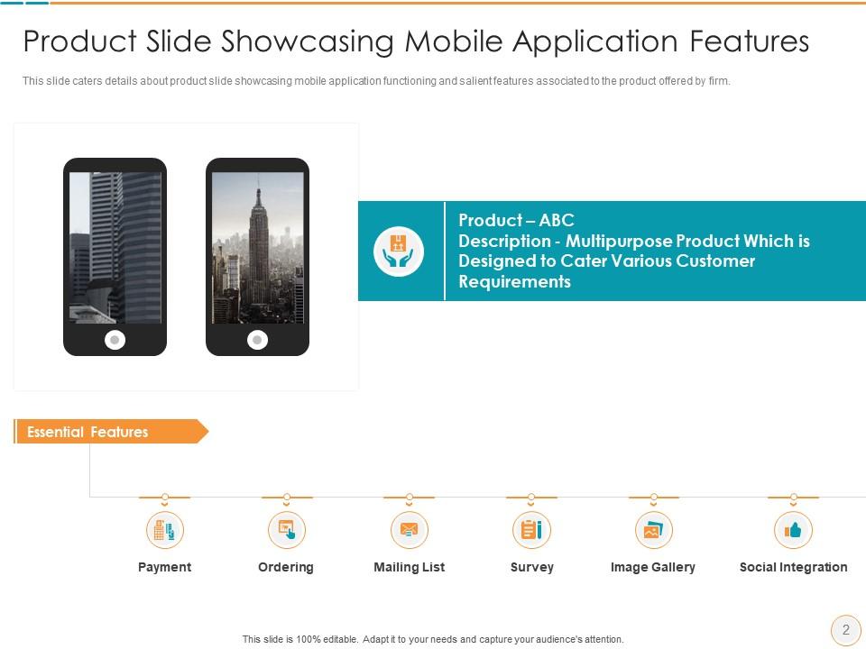
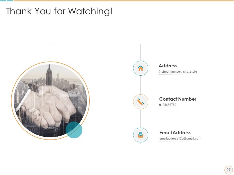
Slide 2: This slide depicts product slide showcasing mobile application functioning and salient features associated to the product.
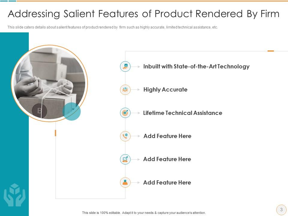
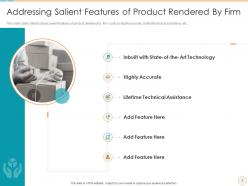
Slide 3: This slide presents salient features of product rendered by firm such as highly accurate, limited technical assistance, etc.
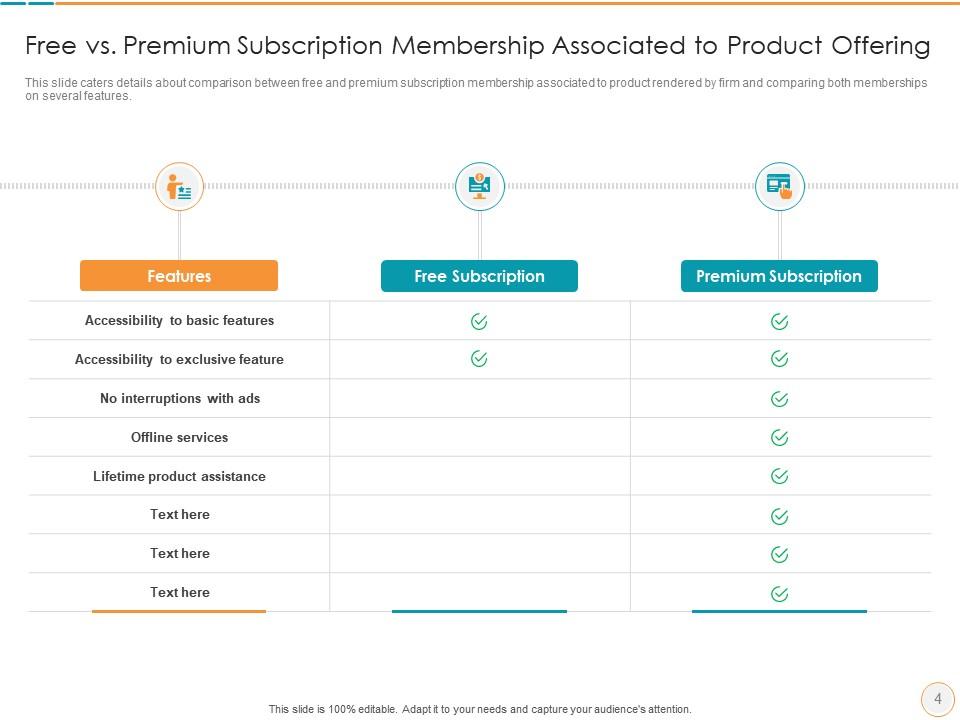
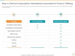
Slide 4: This slide exhibits comparison between free and premium subscription membership associated to product rendered by firm.
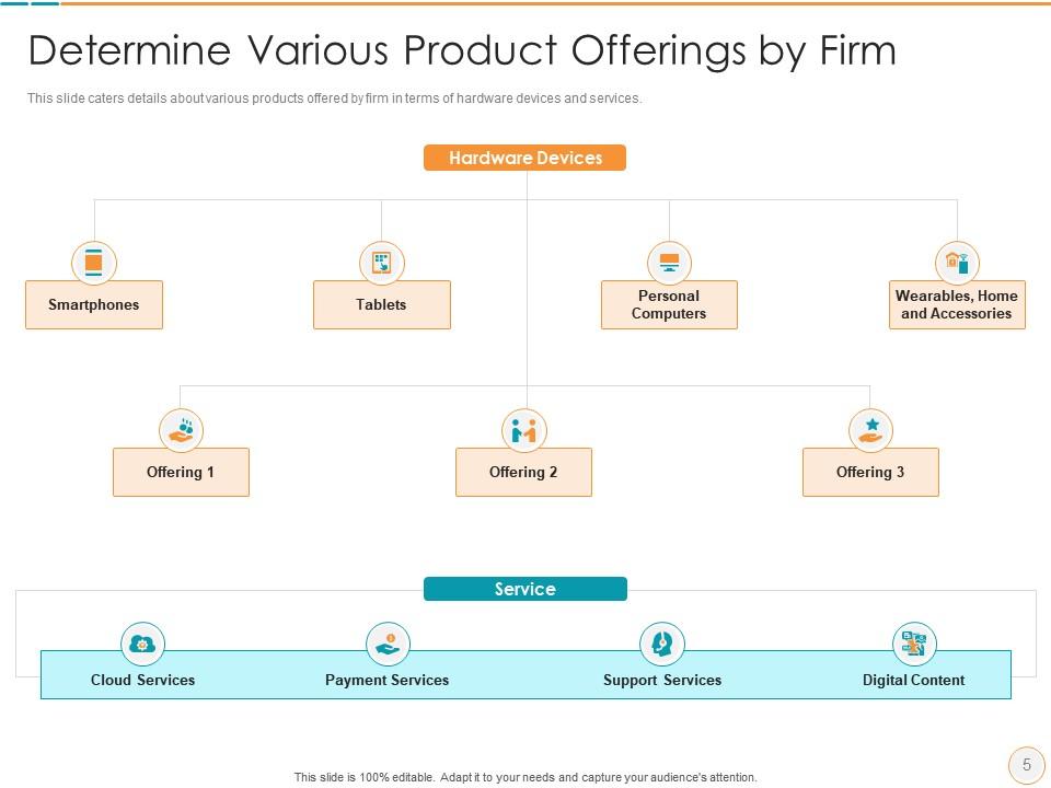
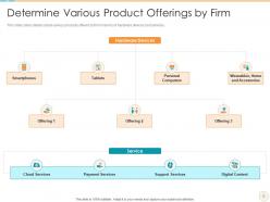
Slide 5: This slide shows various products offered by firm in terms of hardware devices and services.
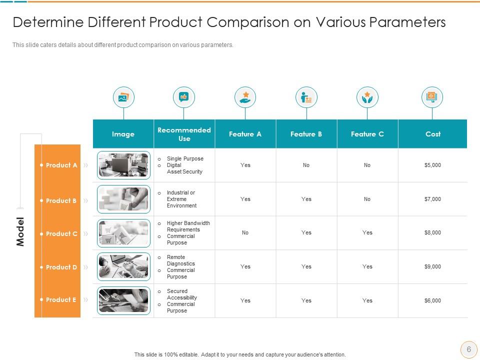
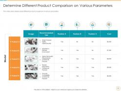
Slide 6: This slide explains different product comparison on various parameters.
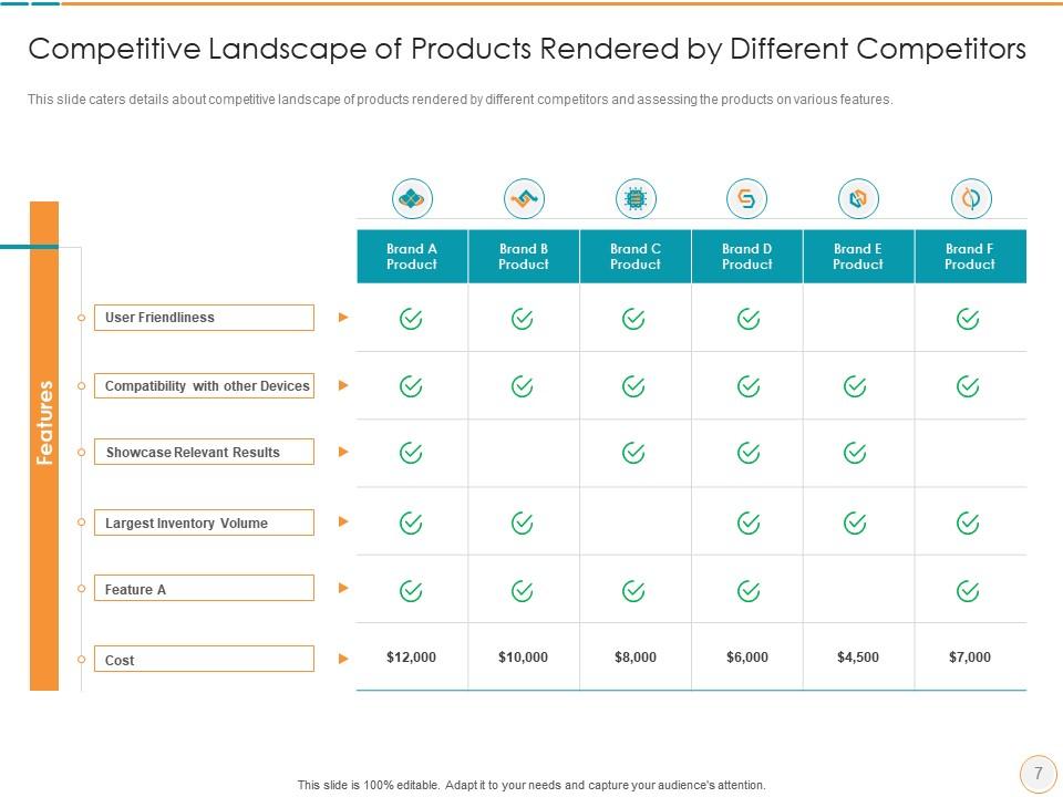
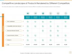
Slide 7: This slide displays competitive landscape of products rendered by different competitors and assessing the products on various features.
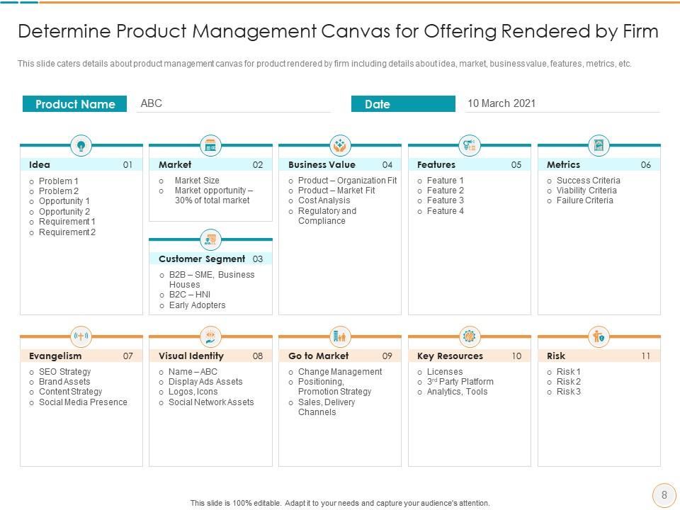
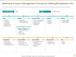
Slide 8: This slide depicts product management canvas for product rendered by firm including details like idea, market, etc.
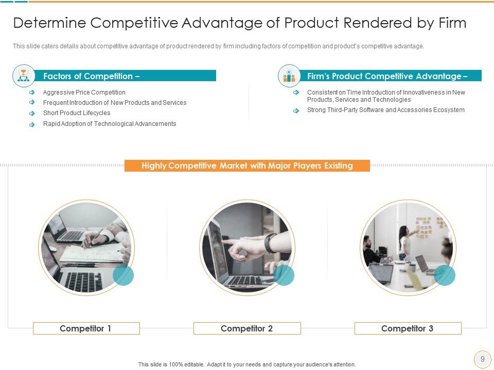
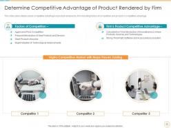
Slide 9: This slide presents competitive advantage of product rendered by firm including factors of competition and product’s competitive advantage.
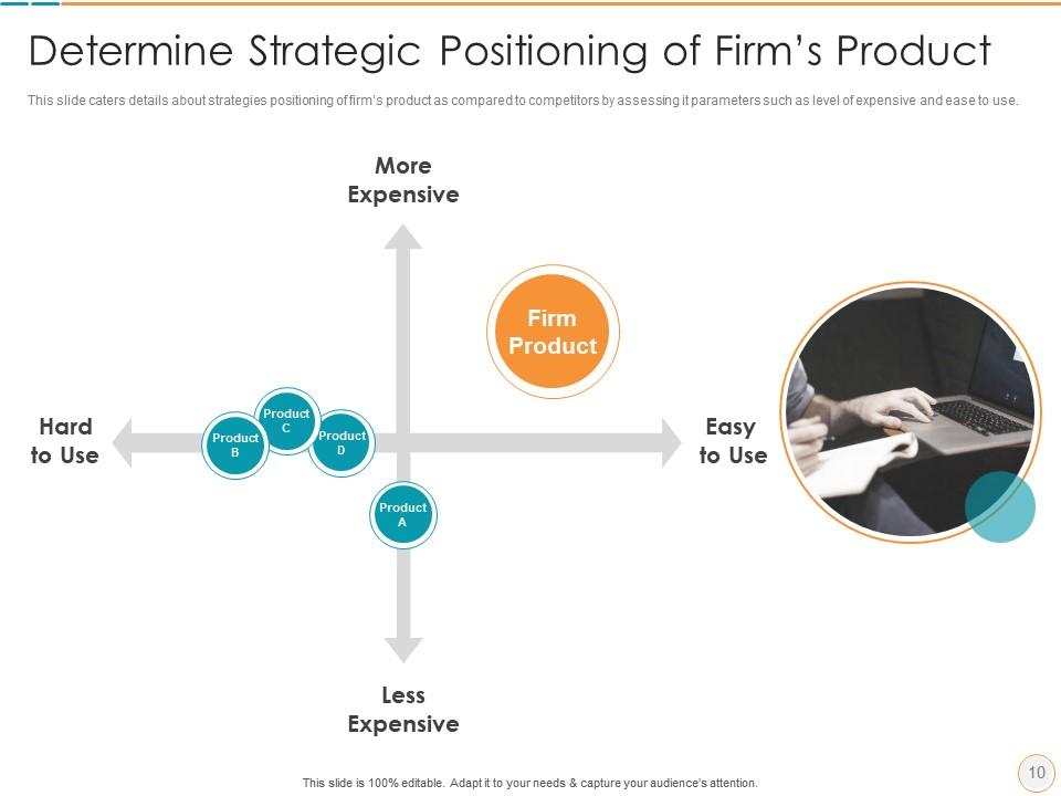
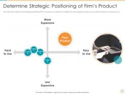
Slide 10: This slide displays strategies positioning of firm’s product as compared to competitors.
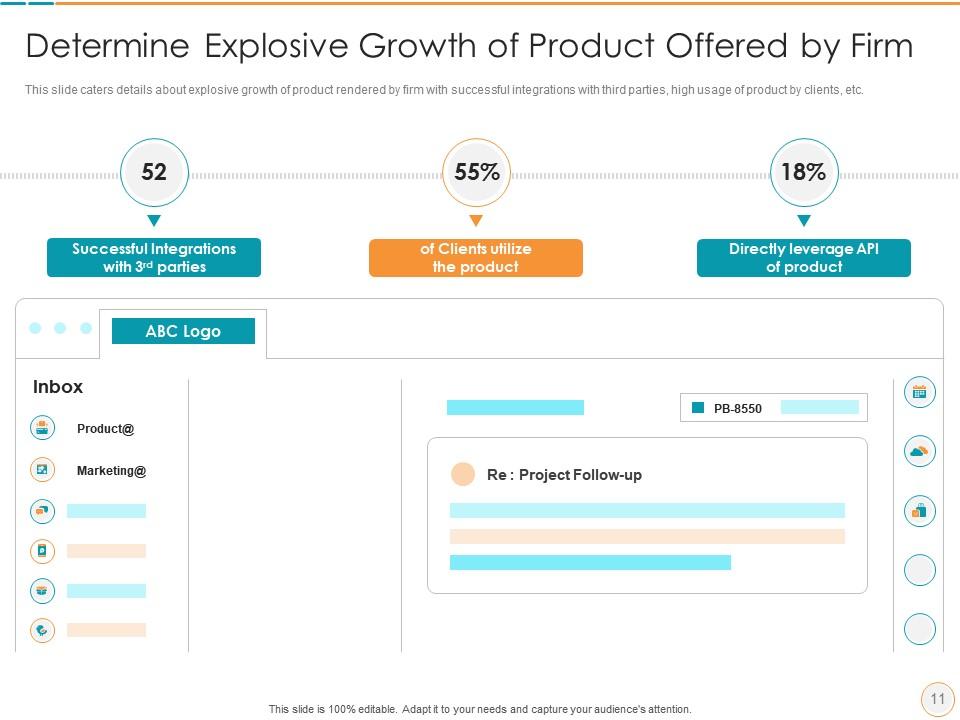
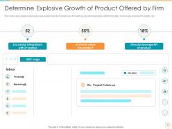
Slide 11: This slide presents explosive growth of product rendered by firm with successful integrations with third parties, etc.
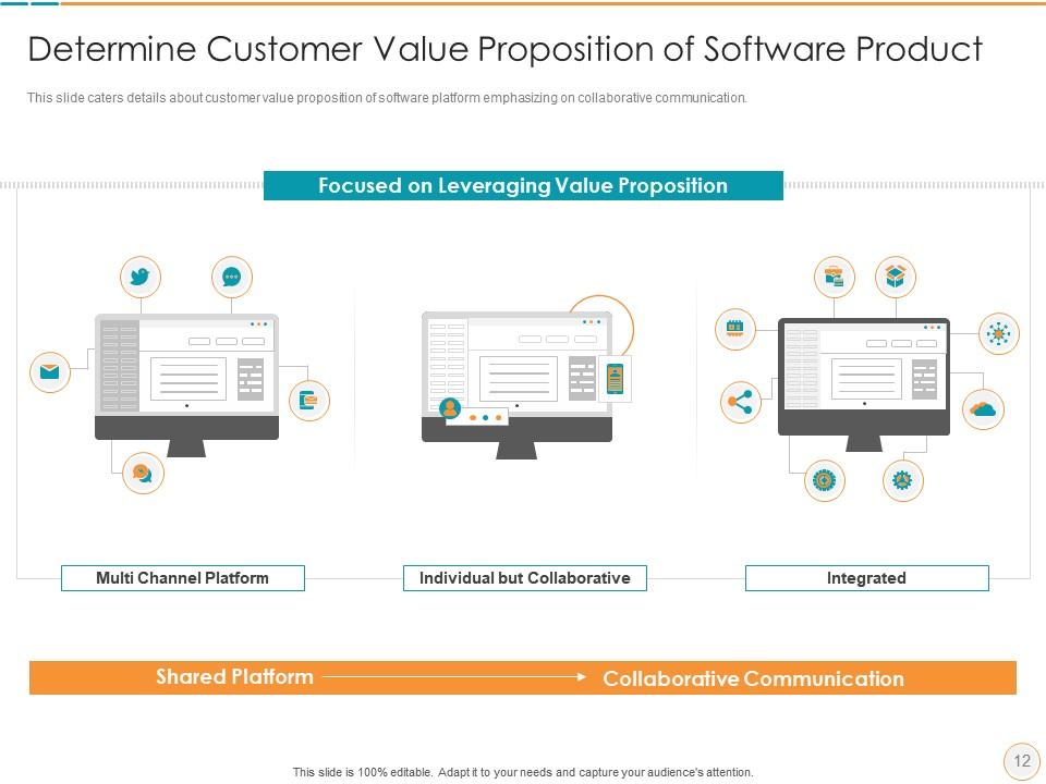
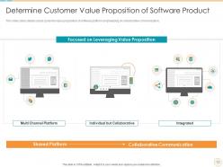
Slide 12: This slide depicts customer value proposition of software platform emphasizing on collaborative communication.
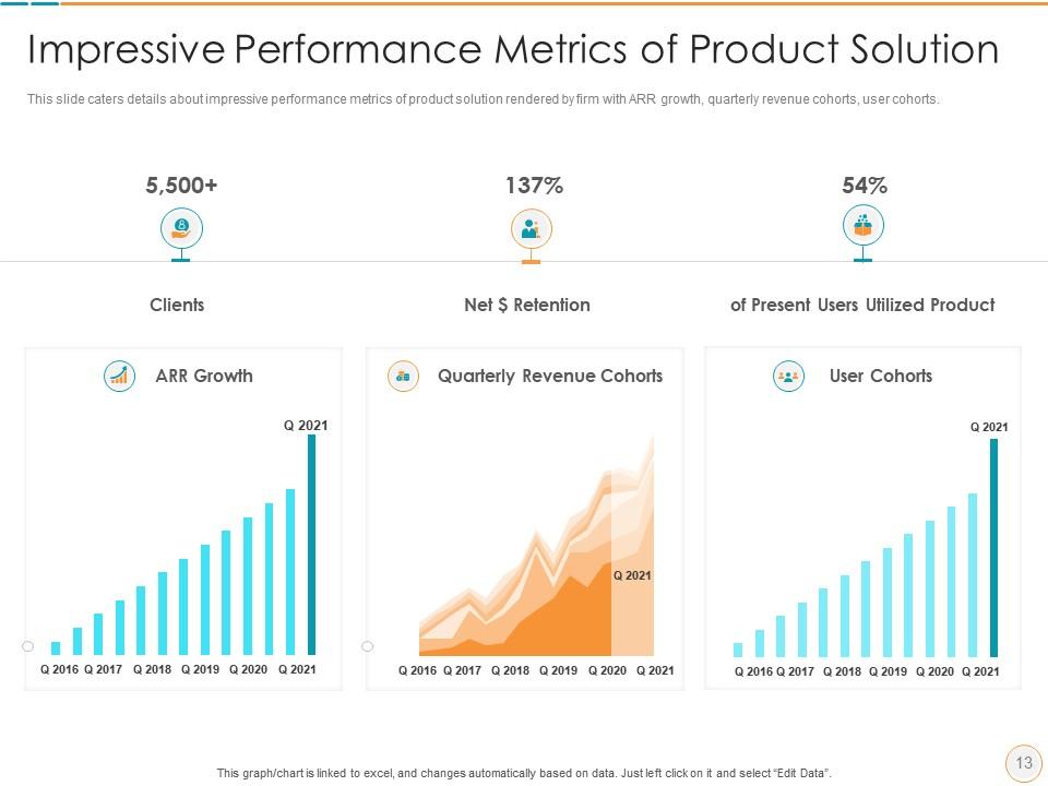
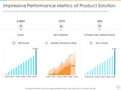
Slide 13: This slide shows impressive performance metrics of product solution rendered by firm with ARR growth, user cohorts, etc.
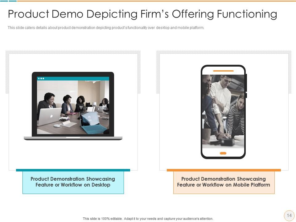
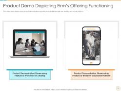
Slide 14: This slide exhibits product demonstration depicting product’s functionality over desktop and mobile platform.
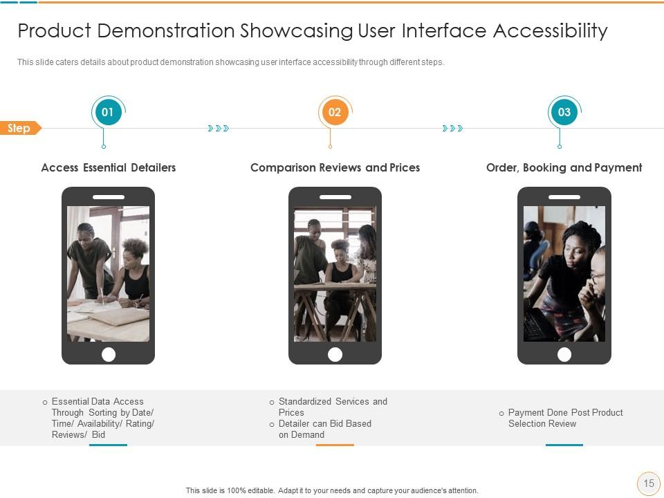
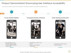
Slide 15: This slide explains product demonstration showcasing user interface accessibility through different steps.
Slide 16: This is the icons slide.
Slide 17: This slide presents title for additional slides.
Slide 18: This slide presents your company's vision, mission and goals.
Slide 19: This slide depicts posts for past experiences of clients.
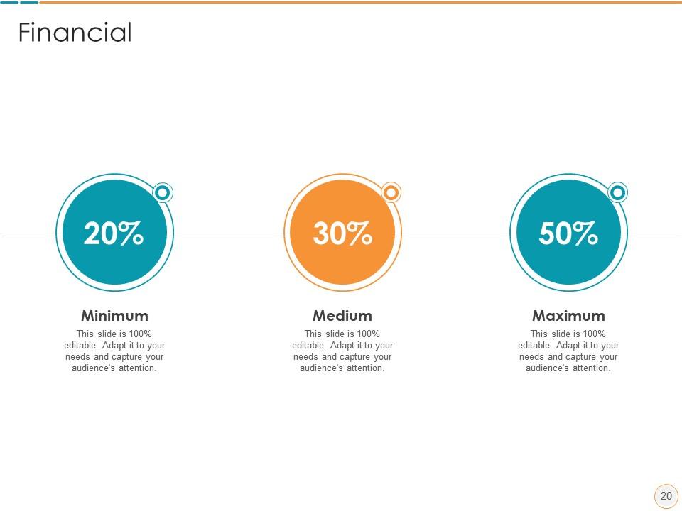
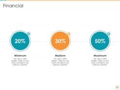
Slide 20: This slide showcases financials.
Slide 21: This slide displays venn.
Slide 22: This slide presents targets.
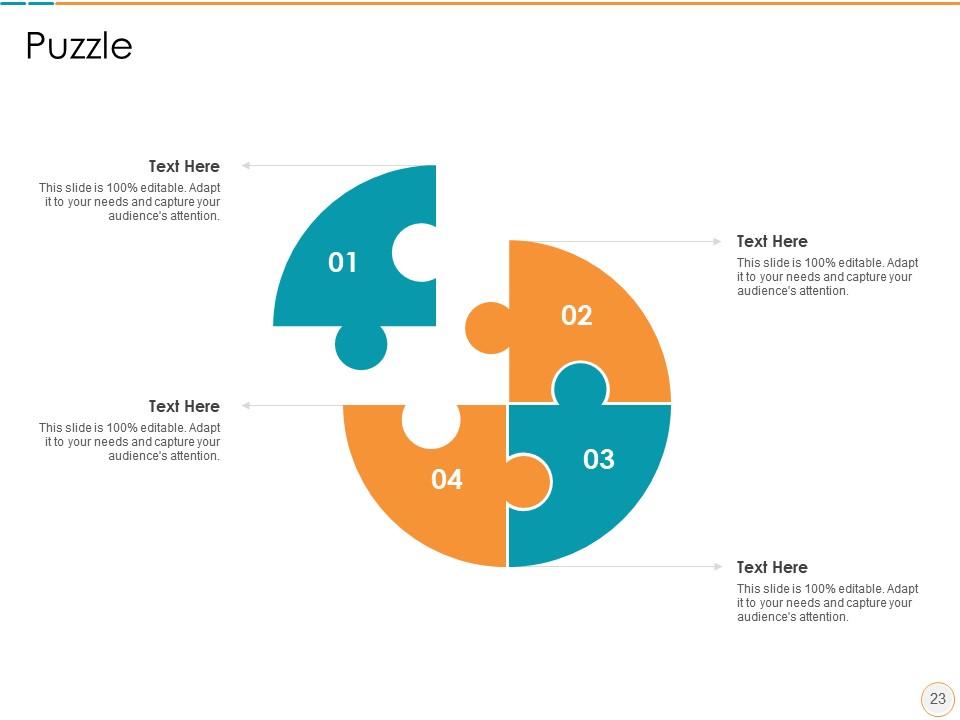
Slide 23: This slide displays puzzle.
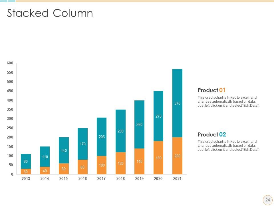
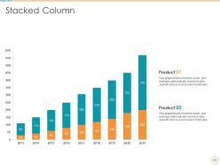
Slide 24: This slide exhibits yearly stacked column charts for different products. The charts are linked to Excel.
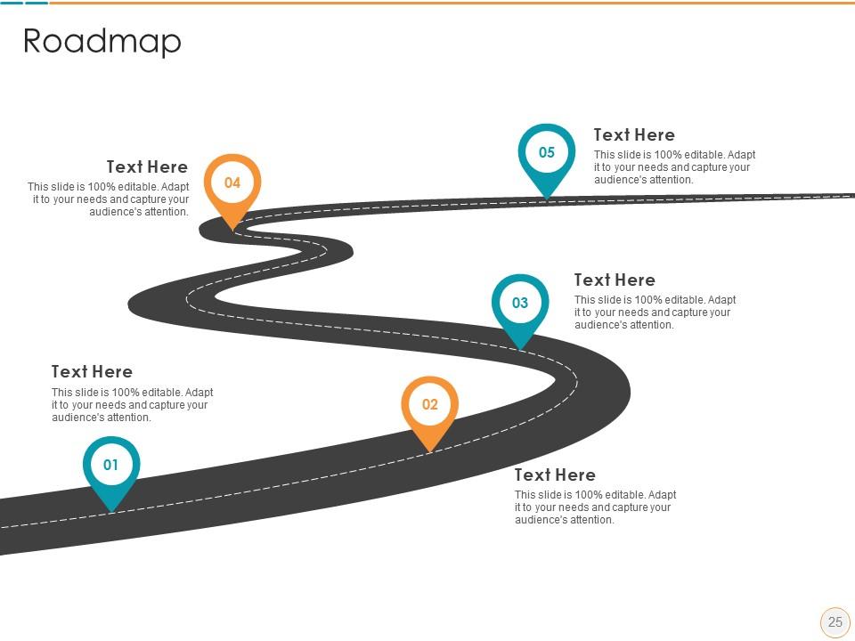
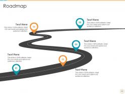
Slide 25: This slide shows roadmap.
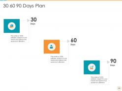
Slide 26: This slide explains 30-60-90 days plan for projects.
Slide 27: This is thank you slide & contains contact details of company like office address, phone no., etc.
Product description slide pitch deck ppt template with all 27 slides:
Use our Product Description Slide Pitch Deck Ppt Template to effectively help you save your valuable time. They are readymade to fit into any presentation structure.
FAQs for Product description slide pitch
Ok so first thing - get a headline that actually says what your product does. None of that vague "revolutionizing workflows" BS. Then list 2-3 benefits (not features - I always mix these up but benefits = what's in it for them). Throw in some proof too, like a stat or customer quote. Makes it way more believable. Use bullet points so people can scan quickly - nobody reads paragraphs on slides anyway. Oh and definitely include a visual of the product actually working. The whole thing should pass the 5-second test where someone immediately gets what you're selling. End with a clear next step or you'll lose them.
Dude, you've gotta use visuals - they're game changers. Screenshots, demos, simple diagrams that actually show your product doing its thing. Way better than boring bullet points that make people's eyes glaze over. Most people learn visually anyway, so they'll remember more when they can see what you're talking about. I learned this the hard way after watching too many people zone out during text-heavy presentations. Just make sure your images are big enough for the people in the back to see, and pick ones that actually back up your main points.
Start with words that hit people's emotions - "exclusive," "breakthrough," stuff like that creates instant want. Paint a picture they can feel, like "buttery soft" beats just saying "soft." Throw in social proof too - "bestseller" or "fan favorite" does magic. Honestly? Weird, quirky descriptions work way better than boring specs sometimes. Benefits first, features second. Also try mixing up your sentence lengths - keeps things interesting. Pick one of your current descriptions and rewrite it with this approach. You'll be shocked how much better it sounds.
Dude, you gotta totally shift your approach depending on who you're talking to. Tech people? Hit them with all the specs and how everything actually functions. But when you're in front of executives, they honestly don't care about that stuff - talk ROI and market potential instead. Sales teams are already thinking about their next pitch, so focus on customer problems and your solution. Same product, totally different angle each time. Like, never mention API stuff to a CEO - they want to hear dollar signs. Figure out what each group actually cares about first, then lead with that. Makes all the difference.
Dude, stop listing features like you're reading a manual. People don't care about "real-time notifications" – they care that Sarah didn't miss her kid's soccer game because your app pinged her about the schedule change. Paint the whole picture, you know? Show them the problem first, then how your product swoops in to save the day. Honestly, stories stick way better than bullet points ever will. Start with a quick customer scenario next time. Then connect your features back to that story. It's like... people need to see themselves in it before they'll actually give a damn.
Here's what works for me: stick to one solid benefit per bullet point and ditch the corporate fluff. Nobody has time to decode your marketing nonsense. I do this thing where I imagine explaining it to my grandma - if she'd be confused in 5 seconds, it's too complicated. Swap out wimpy words like "faster" or "better" with actual numbers. Short sentences hit harder. When you mention a feature, immediately tell them why they should care. Oh, and read everything out loud - you'll catch the weird robotic stuff that way. Trust me on this one.
Check your time-on-slide and click-through rates first - that stuff's actually super revealing. If it's interactive or leads to demos, track conversions too. High bounce rates after your product description? Yeah, that's not good. But honestly, don't just rely on numbers. Get some real feedback through surveys or quick user tests to see if your messaging actually clicks with people. Short sentences work. Longer ones should flow naturally when you need to explain the connection between immediate engagement and whatever action you're hoping they'll take next.
Honestly, the biggest mistake is cramming in every feature instead of focusing on what actually matters to people - how it helps them. Nobody reads walls of text anyway, so keep it short. Skip the technical jargon unless you're presenting to engineers or something. You really need some kind of social proof too - testimonials, reviews, whatever builds trust. Oh, and don't try to solve every problem under the sun. Pick one clear benefit for your headline, then maybe 2-3 supporting points max. That's it.
Just grab short, specific quotes and drop them right next to whatever feature you're talking about. So if you mention easy setup, throw in something like "Setup took me 5 minutes!" - Sarah K. right there. I always put them in little callout boxes or smaller text under each selling point instead of dumping everything at the bottom where people skip over it. Match each quote to the exact thing you're describing in that section - honestly, generic "great product!" stuff is useless. You want testimonials that sound real and hit specific benefits. Way more effective than the typical wall of reviews nobody bothers reading.
White space is your best friend - don't cram everything together. Stick to bullet points because nobody reads paragraphs on slides anyway. High-quality visuals should do most of the heavy lifting, not walls of text. Two fonts max, and use your brand colors consistently. I always left-align text since it's way easier to scan. Here's my test: show someone your slide for three seconds. If they can't tell you the main point, you've got too much going on. Also, make sure there's clear contrast between your headings and body text - size matters for hierarchy. Sounds basic, but you'd be surprised how many people mess this up.
Honestly, it totally depends on your setup. In-person meetings need bigger fonts - like 24pt minimum - because people are sitting at weird angles. Virtual presentations are even trickier since screens make everything look tiny. I bombed a Zoom call once because my "normal" text was basically invisible to everyone else lol. Email slides need way more context since you won't be there explaining stuff. Oh, and definitely test it on whatever platform you're actually using. Your laptop screen lies to you - projectors and phones will humble you real quick.
Dude, you need real numbers that prove people actually want your thing. Throw in specific metrics - like how many users you have or your growth rate over the last quarter. Customer quotes with actual names hit different than anonymous testimonials. Revenue figures are obviously huge if you're allowed to share them. Third-party stuff works too, like industry awards or that one study you probably have bookmarked somewhere. I'd honestly rather see 2-3 solid data points than a wall of stats. The whole "thousands of happy customers" line is so overdone. Show me you've got momentum, not just big dreams.
So basically, animations help people actually pay attention to your product instead of just scrolling past. You can reveal stuff bit by bit - like show the main product first, then have your bullet points pop up one at a time. Way better than dumping everything on them at once, you know? The movement keeps things interesting and helps info stick in their heads. I've seen some pages where callout boxes appear to highlight the good stuff - works pretty well. Just don't make it too flashy or people get annoyed. Keep it clean and purposeful.
Check out Apple's iPhone slides - they nail it with one benefit per slide and zero clutter. Tesla's pretty smart about this too, showing actual performance numbers instead of boring feature lists. Airbnb tells these little stories about real trips (honestly makes me want to book something right now). Notion keeps everything clean with simple before/after shots. They all lead with what you actually get, not technical specs. Pick one of these and really study how they build their slides - then just steal their framework. Works every time.
Honestly, just stick with your usual brand stuff - same colors, fonts, logo spots. Don't switch up your tone either. Like if you're normally chill and friendly, stay that way instead of going all corporate-speak for product descriptions. I've seen so many teams screw this up by getting fancy with random new fonts or whatever. Stay consistent with the messaging customers already know you for. Oh, and make yourself a basic template with all your brand elements locked down. Then you can just plug in different product info for each slide. Way easier than reinventing everything each time.
-
Nice and innovative design.
-
Use of icon with content is very relateable, informative and appealing.
-
Awesome presentation, really professional and easy to edit.
-
Understandable and informative presentation.