Project execution powerpoint layout

Rating:
90%
Project execution powerpoint layout
Slide 1 of 7
Favourites Favourites

Try Before you Buy Download Free Sample Product

Audience Impress Your
Audience
Editable 100%
Editable
Time Save Hours
of Time
The Biggest Sale is ending soon in
0
0
:
0
0
:
0
0
Rating:
90%
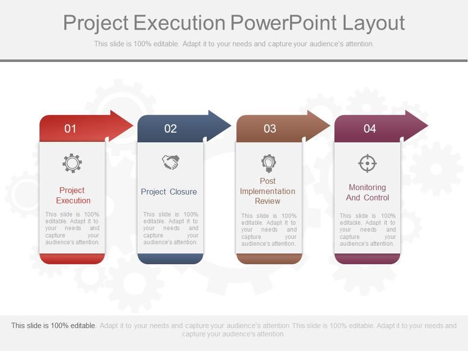
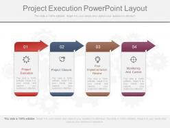
Presenting project execution powerpoint layout. This is a project execution powerpoint layout. This is a four stage process. The stages in this process are project execution, project closure, post implementation review, monitoring and control.

FAQs for Project

Key elements include project timeline with milestones, resource allocation charts, task assignments and responsibilities, progress tracking metrics, and risk management frameworks. These components streamline project communication by providing visual clarity, enabling stakeholder alignment, and facilitating real-time updates, with many organizations finding that structured layouts enhance team coordination and ultimately deliver improved project outcomes and accountability.

Visual hierarchy enhances project execution presentations by organizing information through strategic use of size, color, positioning, and typography to guide audience attention naturally. Through clear headings, contrasting colors for critical milestones, and progressive information flow, project managers can streamline complex timelines and deliverables, ultimately ensuring stakeholders quickly grasp priorities and project status.

**INPUT**: Which design principles should be applied to ensure clarity and engagement in project slides? **OUTPUT**: Key design principles include consistent visual hierarchy, strategic white space utilization, limited color palettes, readable typography, and data visualization alignment with content flow. These approaches streamline information processing by reducing cognitive load, enhancing message retention, and maintaining audience focus throughout presentations, with many project teams finding that clean, structured layouts ultimately deliver faster stakeholder buy-in and clearer decision-making outcomes. **Word count: 58 words**

Color schemes can effectively represent project phases by assigning distinct, sequential colors to each stage, using cooler tones for planning phases and warmer tones for execution and completion phases. Through strategic color coding, project managers enhance visual clarity, streamline stakeholder communication, and create intuitive progress tracking, with many organizations finding that consistent color application across timelines, Gantt charts, and status dashboards ultimately delivers faster decision-making and improved project oversight.

Infographics play a crucial role in project execution presentations by transforming complex data, timelines, and workflows into visually digestible formats that enhance audience comprehension and retention. Through strategic use of charts, process diagrams, and data visualizations, project managers can effectively communicate progress metrics, resource allocation, and milestone achievements, while minimizing cognitive load and ultimately delivering clearer stakeholder understanding.

Timelines can be visually represented through Gantt charts, milestone markers, progress bars, phase diagrams, and calendar views within project execution layouts. These visual elements streamline project tracking by displaying task dependencies, critical path milestones, and completion percentages, with many project managers finding that timeline visualizations enhance team coordination, improve stakeholder communication, and ultimately deliver better project outcomes.

Gantt charts, milestone timelines, burndown charts, progress dashboards, and performance scorecards are most effective for displaying project metrics and KPIs. These visualization tools streamline tracking by showing task dependencies, resource allocation, and completion rates, with many project managers finding that combining multiple chart types delivers comprehensive oversight and enables faster decision-making.

Storytelling techniques enhance project execution presentations by structuring content with clear narrative arcs, incorporating stakeholder journey maps, using data visualization to show progress stories, and framing challenges as plot points with resolutions. These approaches transform technical project updates into compelling narratives that engage executives and team members alike, ultimately improving stakeholder buy-in and project communication effectiveness.

Best practices for citing sources and data in project execution slides include using consistent citation formats, placing references directly beneath charts or data visualizations, maintaining a dedicated sources slide, and ensuring all external data displays publication dates and credibility indicators. These approaches enhance presentation credibility by establishing transparency, enabling stakeholder verification, and demonstrating thorough research methodology, with many organizations finding that proper attribution significantly strengthens project approval rates and executive confidence.

Animations and transitions should enhance key messages by highlighting critical milestones, revealing data progressively, and guiding audience attention through project timelines, while avoiding excessive effects that distract from content. Strategic use includes subtle slide transitions, animated charts that build data points sequentially, and entrance effects for important deliverables, ultimately maintaining professional credibility and audience engagement throughout complex project narratives.

**INPUT**: What considerations should be made for audience engagement during a project execution presentation? **OUTPUT**: Audience engagement considerations include interactive elements, clear visual hierarchies, strategic use of animations, relevant stakeholder-specific content, and regular progress checkpoints throughout the presentation. These approaches enhance comprehension by maintaining attention, facilitating discussion, and ensuring key messages resonate, with many organizations finding that engaged audiences provide more valuable feedback and stronger project support.

Templates can be customized through industry-specific metrics, terminology, compliance frameworks, regulatory requirements, and sector-appropriate visual elements. Healthcare projects might emphasize patient safety milestones and regulatory checkpoints, while manufacturing focuses on production timelines and quality controls, ultimately enabling organizations to maintain professional consistency while addressing unique operational demands and stakeholder expectations.

A project execution overview slide should prioritize timeline milestones, key deliverables, resource allocation, risk mitigation strategies, and current progress status. These elements enable stakeholders to quickly assess project health, identify potential bottlenecks, and make informed decisions, with many organizations finding that clear visual progress indicators and milestone tracking ultimately enhance accountability and delivery success.

Feedback and iterations can be effectively incorporated through structured review cycles, version control systems, stakeholder input sessions, and collaborative design platforms that track changes. These approaches streamline the revision process by enabling real-time collaboration, maintaining design consistency, and ensuring all stakeholder perspectives are integrated, ultimately delivering presentations that resonate with audiences while meeting project objectives efficiently.

Common mistakes include overcrowded slides with excessive text, inconsistent formatting across sections, unclear timeline visualizations, missing stakeholder accountability frameworks, and poor resource allocation displays. These layout errors significantly undermine project communication effectiveness, with many organizations finding that streamlined designs, strategic use of white space, and standardized templates ultimately deliver clearer stakeholder alignment and faster decision-making processes.

Ratings and Reviews

90% of 100
Review Form
Write a review
Most Relevant Reviews
  1. 80%

    by Duncan Berry

    Presentation Design is very nice, good work with the content as well.
  2. 100%

    by Darren Olson

    Use of icon with content is very relateable, informative and appealing.

2 Item(s)

per page: