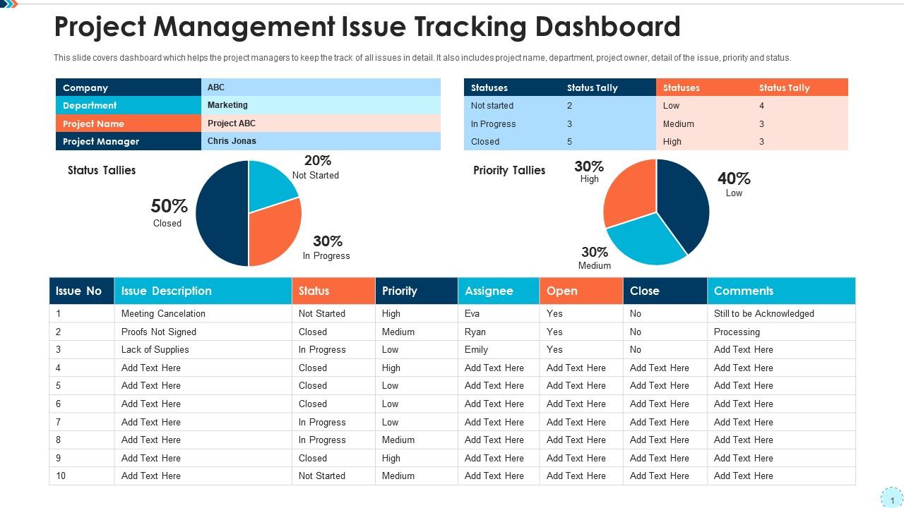
Project management issue tracking dashboard
Try Before you Buy Download Free Sample Product
Audience
Editable
of Time
Our Project Management Issue Tracking Dashboard are topically designed to provide an attractive backdrop to any subject. Use them to look like a presentation pro.
People who downloaded this PowerPoint presentation also viewed the following :
Project management issue tracking dashboard with all 10 slides:
Use our Project Management Issue Tracking Dashboard to effectively help you save your valuable time. They are readymade to fit into any presentation structure.
FAQs for Project management
Focus on metrics that actually matter for decisions - timeline/milestones, budget vs spend, resource allocation, and completion rates. Risk indicators are huge too. I can't tell you how many dashboards I've seen that look slick but completely miss the warning signs. Team workload distribution and quality stuff like defect rates are pretty critical. Keep it visual so people can scan it quickly - nobody wants to dig through spreadsheets in meetings. Start with maybe 5-6 core metrics your stakeholders care about most, then build from there based on what keeps getting asked about.
So basically everyone can see what's going on in one spot instead of constantly asking "wait, what's happening with that thing again?" Task updates, deadlines, who's doing what - it's all right there. People can comment on stuff and flag issues without scheduling yet another meeting (honestly such a relief). The tricky part is getting your team to actually use it consistently instead of reverting back to their old chaotic ways. But once they do? Game changer. No more dropped tasks or confused teammates wondering what they're supposed to be working on.
Honestly, Monday.com and ClickUp are solid choices - both let you customize pretty much everything. Asana's great too if you want something cleaner. I'm obsessed with Notion but fair warning, it takes forever to set up initially (totally worth it though). Power BI or Tableau work if you need fancy analytics pulling from different tools. Even Google Sheets can be surprisingly decent for basic stuff. Oh, and Airtable's somewhere between a spreadsheet and database if that makes sense. Just grab free trials of like 2-3 and test with your real data - you'll know pretty quick which one feels right.
Figure out what decisions your stakeholders are actually trying to make first. Gantt charts are solid for timelines, but they can be pretty overwhelming tbh. Progress bars work well for completion stuff. For budgets, donut charts are your friend - way cleaner than pie charts imo. Simple scorecards are perfect for the big metrics like deadlines and team utilization. Don't just throw bar charts at everything because they're easy. The visualization should match the question you're answering. Test a couple options with real users first and see what makes sense to them.
Honestly, the hardest part is getting your team to actually use it without rolling their eyes. Everyone thinks it's just another layer of busy work on top of their real job. Your data's probably gonna be messy too - I spent weeks cleaning up inconsistent project info before anything made sense. Oh, and don't make my mistake of trying to track literally everything at first. Pick maybe 3-5 metrics that your boss actually looks at. You can always add more weird stuff later, but start with what matters for decisions.
So instead of staring at dead reports all day, real-time integration makes your dashboard actually alive. Tasks update instantly, you see bottlenecks forming before they explode into chaos. Honestly changed everything for me when I started using it. Connect it to whatever tools you're already stuck using - Jira, Slack, those time trackers everyone hates but still needs. No more manual updates or waiting around for Friday reports. You'll spot problems way earlier and can actually fix stuff instead of just reacting to disasters. Way better than being a data entry zombie, trust me.
Honestly, if your team can't figure out the dashboard in like 5 seconds, you've already lost them. Make the navigation super obvious and keep the data easy to scan - when people are stressed about deadlines, they don't want to dig through weird menus. The interface should basically disappear so they can just check status updates and catch problems without even thinking about it. I always tell people to focus on what the team actually looks at every day, not the fancy stuff that wows executives in meetings. Trust me, simple wins every time.
First thing - pick your top 5 KPIs that actually move the needle. Budget variance, timeline stuff, quality metrics. Don't get fancy yet. Set up automated feeds so you're not stuck updating spreadsheets every damn week (learned that one the hard way). Progress bars and those red/yellow/green indicators work great since stakeholders can glance and immediately know what's up. Simple beats comprehensive every time. I'd honestly rather have a basic dashboard that people actually use than some elaborate thing that looks impressive but nobody checks. You can always layer on more metrics once the foundation's solid and everyone's bought in.
Set up automatic syncs - daily minimum, hourly if things move fast. Trust me, manual updates are a nightmare. Focus on metrics that actually matter for decisions, not just pretty numbers that impress people. I wasted so much time on gorgeous charts that literally no one looked at! Monthly reviews help catch when your KPIs stop making sense as projects change. Archive old milestones so you're not drowning in clutter. Always test everything before big meetings because there's nothing worse than broken dashboards in front of stakeholders. Oh, and ask your team what data they actually want - you'll be surprised how wrong your assumptions are.
Honestly, dashboards are like having a crystal ball for your project. You can see budget issues, schedule slips, and resource problems before they become disasters. Real-time visibility beats waiting for those painful weekly meetings where everyone drops bad news on you. I always set up alerts for the stuff that really matters - saves me from nasty surprises. The trick is customizing it to track your project's actual weak spots, not just generic metrics. It's basically project radar that actually works. Way better than flying blind and hoping everything's fine.
Honestly, dashboards are game-changers for keeping stakeholders happy. Instead of sending individual updates to everyone (which is exhausting), you just put all the important stuff - budgets, timelines, risks - in one visual spot. When people ask "how's the project going?" you can literally just point them there. The real-time updates mean nobody's working off old info, and when things go sideways, everyone immediately sees why you need quick decisions. Oh, and set up automatic sharing so it updates them without you doing anything. Trust me, it'll save your sanity during those endless status meetings.
Oh man, it's really about who's looking at it. Your team dashboard? Pack it with everything - task progress, resource stuff, timelines, risk alerts. All the messy details you need to actually get work done. Executive dashboards are completely different beasts though. Those guys just want the big picture: project health, budget numbers, key milestones, maybe some ROI stuff. Honestly, executives' eyes glaze over if you show them too much detail. I learned this the hard way once - showed my CEO our internal dashboard and he was totally lost. Now I keep two separate versions and life's way easier.
Track if people actually use the thing daily - that's your biggest clue. Ask your team monthly whether they'd be screwed without it (honestly, most dashboards just collect digital dust). Are you catching problems earlier now? Project delays going down? I'd also check if stakeholders feel way more in the loop about what's happening. The real win is faster decision-making. Survey users about whether it's solving the original problems you built it for. Oh, and see if they're checking it regularly or just when you ask them to.
Honestly, start with making buttons bigger - nobody wants to stab at tiny links when they're rushing between meetings. Focus on the stuff people actually do on mobile: quick status updates, commenting, approving tasks. Loading speed matters too since project apps can be bloated. Skip cramming complex charts onto phone screens - save those for desktop where they make sense. Test everything with your actual team because what works in theory doesn't always work when someone's thumbing through updates while walking to their car. Mobile should handle the urgent stuff, not replicate every desktop feature.
So basically, look at your last 5-10 projects and compare what you planned vs. what actually happened with timelines and budgets. You'll catch patterns you never noticed before - like which team members are always late or early, what keeps causing budget issues, that sort of thing. Honestly, it's way more useful than I expected when I first started doing this. Short sentences work best for spotting trends. Then you can set better deadlines next time and figure out where to put your resources. Plus you'll see potential problems coming before they mess up your whole project.
-
Content of slide is easy to understand and edit.