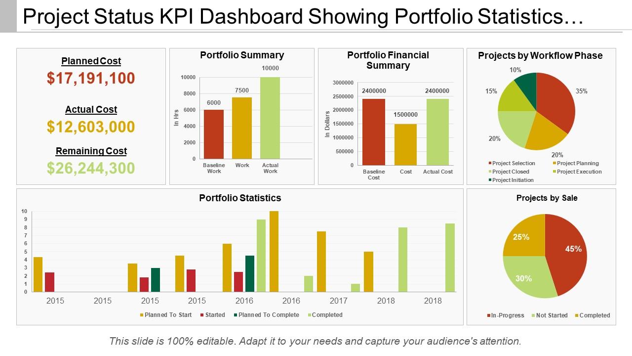
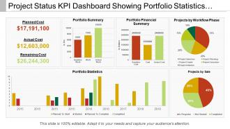
Project status kpi dashboard showing portfolio statistics and workflow phase

Rating:
90%
Project status kpi dashboard showing portfolio statistics and workflow phase
Slide 1 of 6
Favourites Favourites

Try Before you Buy Download Free Sample Product

Audience Impress Your
Audience
Editable 100%
Editable
Time Save Hours
of Time
The Biggest Sale is ending soon in
0
0
:
0
0
:
0
0
Rating:
90%
Presenting Project Status Kpi Dashboard Showing Portfolio Statistics And Workflow Phase PPT template. All around planned layout slide. This template slide is completely perfect with Google. Tend to upgrade the general effect of your introduction. Introduced to be spared in JPEG, JPG or PDF arrange whenever required. Space accessible to include your organization data as and when required. The format slide is famous and popular because of its simple utilize and openness. Basic and accommodating downloading by following clear advances. This slide keeps up the demonstrable skill of the introduction.

FAQs for Project status kpi dashboard showing portfolio statistics

So the big ones are schedule performance (are you hitting deadlines?), budget variance, resource utilization, and quality stuff like defect rates. Milestone completion and risk indicators are clutch too - seriously, tracking those early has saved me so many headaches. Oh, and customer satisfaction if that applies to your project. Don't overcomplicate it though. Your stakeholders need to spot problems fast without getting buried in spreadsheets. Start with these basics, then tack on whatever makes sense for your specific situation. Trust me, simple dashboards work way better than fancy ones nobody reads.

Honestly, good visual design is what separates dashboards people actually use from ones that just collect dust. Color-code your metrics strategically - red for trouble spots, green for wins. White space is your friend here; cramped layouts just make people's brains hurt. Pick chart types that tell the story instantly (bar charts for comparisons, line graphs for trends over time - you know the drill). Put your most critical KPIs front and center where they can't be missed. Oh, and don't go crazy with fancy animations - they're more distracting than helpful most of the time.

Tableau and Power BI are probably your best bet - Power BI's great if you're already deep in Microsoft stuff. Google Data Studio won't cost you anything and honestly works fine for basic dashboards. Excel can work too but gets annoying real quick when you're pulling from multiple places. Oh, and definitely check if Monday or Asana (or whatever PM tool you're using) already has decent reporting built in before you go down a rabbit hole. I'd just start with whatever connects easiest to your existing data. No point making it harder than it needs to be.

Honestly, I'd go with weekly at minimum, but daily is way better if you can pull it off. Fresh data keeps everyone on the same page and stops small issues from turning into disasters. I've watched projects crash because they only checked monthly - by then it's too late to fix anything meaningful. Find whatever works for your team though. Daily might sound intense at first, but once you get the hang of it, it's actually not that bad. Weekly's a solid starting point if daily feels crazy. Just pick something and stick with it so people know what to expect.

Honestly, KPI dashboards are game-changers for team transparency. Everyone sees the same numbers and progress updates in real time - no more awkward "wait, where are we on this?" conversations. Your designers, devs, and stakeholders can spot bottlenecks instantly. Plus people stay more accountable when their work is visible to the whole team. Just don't get caught up tracking vanity metrics that look impressive but don't actually move the needle. Start with maybe 3-5 KPIs that everyone genuinely agrees matter for your goals. Trust me, less is more here.

Honestly, the worst thing you can do is cram like 15 different metrics on one screen. Nobody knows what to look at first. Stick to maybe 5-7 things that actually matter for your project. And don't just throw raw numbers at people without any context - I swear, some dashboards look like fancy Excel sheets. Show trends and targets so stakeholders can tell if you're winning or failing at a glance. Oh, and test it with real users before you present! What seems obvious to you might make zero sense to everyone else.

So your methodology basically determines everything. Agile teams track sprint velocity and burndown charts - that's their bread and butter. Waterfall is all about hitting those milestone deadlines and staying on schedule. With Kanban you're obsessing over cycle time (honestly, some teams get way too into this stuff). Scrum folks? They live and die by sprint goals and capacity metrics. Don't just copy-paste random KPIs though. Pick maybe 3-5 that actually match how your team operates. Way more useful than generic dashboard garbage that nobody looks at anyway.

Yeah totally! Most dashboard tools make it super easy to set up different views for different people. Like your CEO probably just wants the big picture stuff - revenue trends, overall performance, that kind of thing. But project managers need the nitty-gritty details about deadlines and who's working on what. I'd honestly start by figuring out what decisions each person actually makes with the data. Then you can filter views so people only see what matters to them. Nobody wants to scroll through 50 metrics when they only care about 5, you know? The permission settings usually aren't too complicated to set up either.

Okay so with qualitative stuff, you want visuals that actually make sense right away. I always go for the simple red/yellow/green indicators - works every time. Word clouds are great for feedback themes, and heat maps? Honestly way better than people think for showing patterns. You can also do scorecards that turn those messy qualitative assessments into clean 1-5 ratings. Your stakeholders shouldn't have to read novels to get it. Pick your top 2-3 qualitative metrics first. Build everything around those and you're golden.

Set up automated validation rules and check your sources weekly - I've saved myself so much embarrassment catching weird discrepancies that way. Pull from the actual source of truth, not some random export Bob made last month. Alerts for outliers are clutch so you catch issues before your boss does. Document your calculation logic somewhere you'll actually find it later (trust me on this one). Monthly spot-checks help too. Oh and honestly? The more complex your formulas get, the more you'll thank yourself for good documentation six months down the road.

Honestly, live data is a game changer because you'll spot problems while you can actually fix them. Instead of finding out about budget overruns or timeline issues in some awkward status meeting three weeks later (ugh, the worst), your dashboard shows what's happening right now. Caught a resource bottleneck this morning? You can shuffle people around before lunch. Timeline looking sketchy? Call stakeholders today, not next month when everything's already on fire. The whole point is having info that's fresh enough to change your next move - not just create a fancy post-mortem about what went sideways.

Honestly, don't just stare at current numbers - watch for patterns instead. Budget variance trending down for weeks? Schedule slipping gradually? That's your warning right there. Most people wait until everything's screaming red, but then you're screwed. I learned this the hard way on a project last year. Set up alerts when things hit certain thresholds and check trend lines weekly. Those subtle shifts matter way more than people think. Catch them early before they tank your timeline or budget completely.

Watch your on-time delivery rates - anything above 90% is solid. Budget variance should stay under 5%, and don't let scope creep hit 10%. Failed projects? You'll see the opposite: late deliveries, budget overruns past 15%, quality tanking. Resource utilization is weird because both 40% and 120% are red flags (learned that one the hard way). The scary part is when several metrics tank at once. Quality should improve over time while team velocity stays steady or gets better. Set up alerts when multiple things go south simultaneously - that's when you need to jump in fast.

Honestly, historical data is a game-changer for making your KPIs actually mean something. Pull at least 12 months back so you can say "hey, we hit 85% completion rate" and actually know if that's good or terrible compared to your usual numbers. Seasonal stuff becomes super obvious too - like Q4 always being a disaster because half your team disappears for holidays. I'd throw in some trend lines and year-over-year comparisons so people aren't just staring at random snapshots. Rolling averages help smooth out the noise. Trust me, stakeholders love seeing the full picture instead of just guessing whether you're winning or losing.

Honestly, you need those specific targets or you're just staring at numbers all day wondering "is this good?" It's like having a speedometer but no clue what the speed limit is. Your team will actually know what they're working toward instead of just hoping for the best. Plus when tough decisions come up, you can ask "does this help us hit our target?" Makes everything way clearer. I'd start with maybe 3-5 of your most important KPIs and set SMART goals for each. Trust me, your team meetings will get so much more focused once everyone knows what you're actually trying to achieve.

Ratings and Reviews

90% of 100
Review Form
Write a review
Most Relevant Reviews
  1. 100%

    by Coy Wallace

    Unique and attractive product design.
  2. 80%

    by Dwain Johnston

    Thanks for all your great templates they have saved me lots of time and accelerate my presentations. Great product, keep them up!

2 Item(s)

per page: