Best practices improve product development dashboard snapshot depicting usage
Try Before you Buy Download Free Sample Product
Audience
Editable
of Time
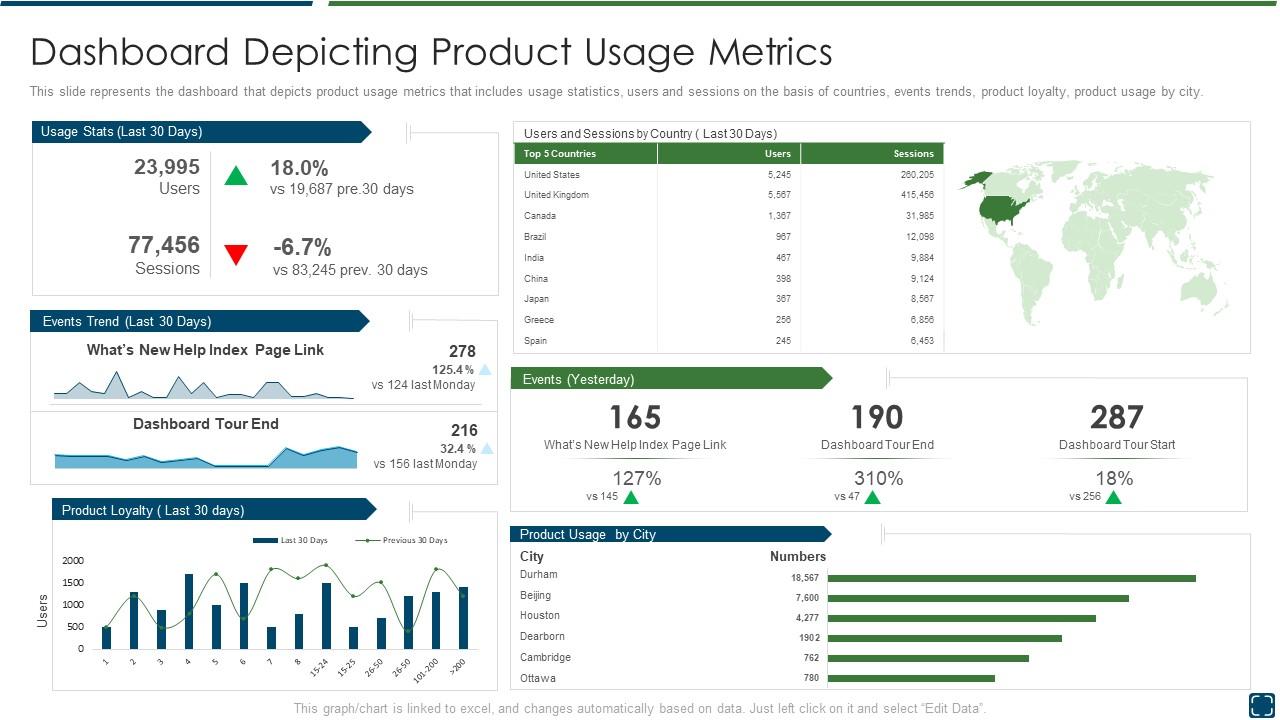
This slide represents the dashboard that depicts product usage metrics that includes usage statistics, users and sessions on the basis of countries, events trends, product loyalty, product usage by city.
People who downloaded this PowerPoint presentation also viewed the following :
Best practices improve product development dashboard snapshot depicting usage with all 7 slides:
Use our Best Practices Improve Product Development Dashboard Snapshot Depicting Usage to effectively help you save your valuable time. They are readymade to fit into any presentation structure.
FAQs for Best practices improve product development dashboard
Product development dashboards should include development velocity metrics, milestone completion rates, budget variance tracking, resource allocation efficiency, and customer feedback scores. These KPIs enable product teams to monitor timeline adherence, cost management, and market alignment simultaneously, with many technology companies finding that combining quantitative progress metrics with qualitative user insights delivers faster iteration cycles and ultimately more successful product launches.
A product development dashboard facilitates better communication by providing real-time visibility into project status, milestones, and resource allocation across all team functions. Through centralized data sharing, teams can track dependencies, identify bottlenecks, and coordinate efforts seamlessly, with many organizations finding that this transparency reduces miscommunication while accelerating product delivery timelines.
Effective visualization techniques for product development data include Gantt charts for timeline tracking, burndown charts for sprint progress, milestone markers for key deliverables, heat maps for resource allocation, and interactive dashboards combining multiple metrics. These visualizations enhance stakeholder understanding by presenting complex development cycles clearly, enabling faster decision-making and strategic alignment, with many organizations finding that visual data storytelling significantly improves project transparency and executive buy-in.
Product development dashboards should be updated in real-time for critical metrics like bug counts and sprint progress, with weekly updates for milestone tracking and monthly refreshes for strategic KPIs. This tiered approach ensures development teams access current information for daily decisions while maintaining broader project visibility, with many software companies finding that automated data feeds streamline updates and enhance team responsiveness.
Best practices for integrating user feedback into product development dashboards include real-time feedback collection, sentiment analysis tools, priority scoring matrices, visual feedback categorization, and automated workflow triggers. These systems streamline decision-making by consolidating customer insights, feature requests, and usability data into actionable metrics, enabling development teams to respond faster to market demands while maintaining strategic product roadmap alignment.
Ensuring user-friendly product development dashboards involves implementing intuitive navigation, customizable views, role-based access controls, clear visual hierarchies, and comprehensive onboarding tutorials. These design principles streamline collaboration by reducing learning curves, enabling faster decision-making, and accommodating diverse technical skill levels, with many organizations finding that well-designed dashboards ultimately enhance team productivity and project transparency.
Data visualization transforms complex product development data into clear, actionable insights that enable faster, more informed decision-making across teams. Through interactive charts, progress tracking dashboards, and performance metrics displays, development teams can quickly identify bottlenecks, assess feature performance, and prioritize resources effectively, while stakeholders gain real-time visibility into project status, ultimately accelerating time-to-market and improving product outcomes.
A product development dashboard supports agile methodologies by providing real-time sprint tracking, backlog visualization, velocity metrics, and team collaboration tools. These features enable product managers and development teams to monitor progress transparently, identify bottlenecks quickly, and adapt iterations seamlessly, with many software companies finding that integrated dashboards ultimately accelerate delivery cycles and enhance stakeholder alignment.
Real-time data in product development dashboards enables faster decision-making, improved collaboration, enhanced risk management, and accelerated time-to-market. Through instant visibility into development metrics, teams can quickly identify bottlenecks, adjust resource allocation, and respond to market changes, with many organizations finding that real-time insights ultimately deliver competitive advantage and more successful product launches.
Role-based dashboard customization involves creating tailored views with relevant metrics, personalized widgets, configurable data filters, and access controls aligned to each team member's specific responsibilities. Product managers might focus on roadmap progress and market feedback, while developers prioritize sprint velocity and bug tracking, ultimately delivering targeted insights that enhance decision-making and operational efficiency across development cycles.
**INPUT**: What tools and software are recommended for creating an effective product development dashboard? **OUTPUT**: Recommended tools include Tableau, Power BI, Jira with integrated analytics, Monday.com, Microsoft Project with dashboard capabilities, and custom solutions using D3.js or React frameworks. These platforms streamline project tracking, resource allocation, and stakeholder communication by centralizing metrics, automating status updates, and enabling real-time collaboration, with many product teams finding that integrated solutions deliver faster decision-making and enhanced development visibility.
Common pitfalls include overcrowding with excessive metrics, using misleading visualizations, ignoring user needs, lacking real-time data integration, and poor mobile optimization. These design flaws can overwhelm decision-makers and hinder strategic insights, with many organizations finding that streamlined, user-focused dashboards ultimately deliver clearer visibility, faster decision-making, and enhanced product development efficiency.
Success measurement for product development dashboards includes tracking adoption rates, decision-making speed improvements, milestone adherence, stakeholder satisfaction scores, and time-to-market reductions. Through comprehensive analytics and user feedback, organizations streamline product cycles, enhance cross-functional collaboration, and ultimately deliver faster innovation cycles, with many development teams finding that well-implemented dashboards reduce project delays by 25-40%.
**INPUT**: What strategies can help ensure that the dashboard remains aligned with overall business goals? **OUTPUT**: Effective alignment strategies include regular stakeholder reviews, KPI mapping to business objectives, cross-functional input sessions, quarterly goal assessments, and outcome-based metric selection. These approaches streamline decision-making by connecting product metrics to revenue targets, operational efficiency, and strategic priorities, with many organizations finding that structured alignment processes ultimately deliver enhanced visibility and accelerated goal achievement. **Word count: 56 words**
**INPUT**: How do we balance the amount of data presented to keep the dashboard informative without overwhelming users? **OUTPUT**: Balancing dashboard data involves prioritizing key metrics, using progressive disclosure techniques, and implementing customizable views that allow users to drill down into details as needed. These approaches streamline decision-making by presenting critical insights upfront while maintaining access to comprehensive data, with many organizations finding that layered information architecture ultimately delivers both clarity and depth for strategic product development decisions. **Word count: 60 words**
-
Excellent work done on template design and graphics.
-
Much better than the original! Thanks for the quick turnaround.