Beware if you are still creating slides full of bullet points!
Very soon, you will find audiences leave the hall in disgust or hold a placard in protest “No Bullet Points, Please.” Already you will find them moan in pain as soon as they see a bullet-ridden slide. That’s not surprising. The audiences are intelligent enough to know what will follow that boring slide on screen: a far boring talk with presenter reading the slides and audience figuring out whether to listen to the presenter or read the slides.
Such is the bullet-point terror in the presentation world that cognitive psychologist Chris Atherton writes, “Bullets don't kill, bullet points do.” [Tweet This Quote]
What are you supposed to do as a presenter then? All presentation experts will advise you to keep 1 message per slide. So if you have 6 bullet points on a slide, you can simply make 6 slides and save the audience a headache. But what if you do not want to follow this advice. What if you wish to keep those 6 bullet points on your slide.
Perhaps you are not presenting your slides on a stage. You want to send the presentation as an attachment to one of your prospective clients. You would therefore need descriptive slides in such instances. Or maybe you have a slide full of steps and you do not wish the break the process into multiple slides that’ll make it complicated for you as well as the reader. What to do then?
Can we keep text-heavy slides and still make them look visually amazing? Yes, of course we can. Let’s get started.
Suppose you have a text-heavy “About Us” or “Our Services” slide, a mandatory slide in any business presentation, like the one below:
Bad, right? If you are presenting this slide on stage, there is no logic why you should be having complete sentences in each bullet point. The audience will read the lines faster than you speak them out, making you look dumb. So, ideally you should have 6 or 7 words in each bullet point summarizing the main idea; you can elaborate upon them via your talk. The edited bullet points would then read as:
- Design and execute a digital marketing plan
- Give decision makers access to Mobile Insights
- Understand Past Performance and Prescribe Actions
- Setup up and manage Social Media Profiles
- Deploy Cloud Based Services
- Leverage Big Data Analytics
But assuming you are sending this presentation as a stand-alone file to be read at leisure by clients, we won’t play with your content. Instead, we’ll show you 15 hacks or ways to display 6 lengthy bullet points in style. Here we go:
Hack 1: Icon-ize the Bullet Points + Split Text into Columns
The easiest way to up the style quotient of your slide is to accompany your text with a corresponding icon. They hardly take any space at all, add visual interest to your slide and reinforce the message you wish to convey. What better do you want! It’s up to you to have vector icons that are fully editable or non-editable image icons. For this hack, split the content into aligned columns to give the modern look of a website to your slide. Just like this one:
We also have a Free PowerPoint Templates section on our site where you can download PPT templates, icons, maps and diagrams for absolutely free.
Alternate: Customize the Shapes of Icons for a Stunning Effect
Now that you have seen the difference icons can make to your slide, it’s time you go a step further and make the icons stand out more prominently. You can do that by using customized shapes as shown below and evenly space out your bullet points above and below those icons. You can download this awesome PowerPoint template and simply copy paste your text in the placeholders.
Hack 2: Convert to SmartArt
This is the least time-consuming hack of all. With a single click, you can convert plain text into eye-catchy graphics that visually communicate information. PowerPoint has built-in SmartArt feature with different types of professional graphics. These illustrations combine shape, line and text placeholders allowing presenters to show interdependencies of processes visually rather than through bullet points.
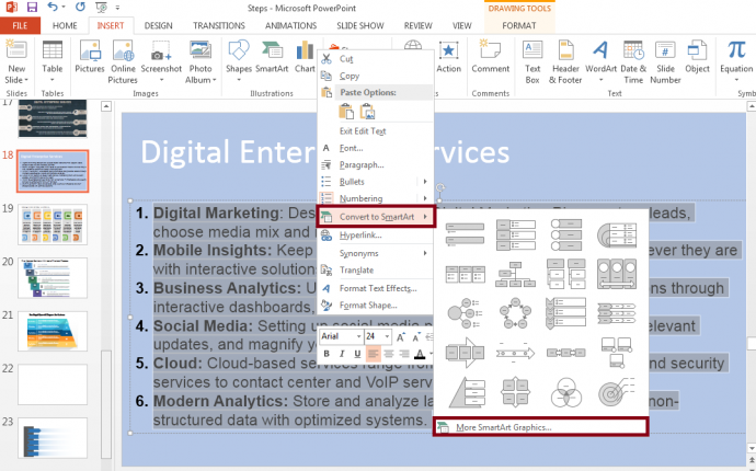
There are 2 ways to apply this hack. The first is to go to the Insert tab on the PowerPoint Ribbon, choose a SmartArt you like and paste your content in the placeholders. The second and easier way is to copy all the text, right click, select the Convert to SmartArt option (see screenshot below) and choose the graphic you like.
See how much better your slide now looks with a SmartArt graphic:
Hack 3: Split into Grid
Give a neat, polished look to your text-heavy slide by simply creating a grid using lines. Choose the Line shape from the Shapes menu and format its style and width to create neat blocks. Place each bullet point in a grid along with its corresponding icon. Do ensure that you have some breathing space in each grid.
Notice how in the slide below a dartboard has been placed in the centre of the slide to bring further visual relief to the text-heavy slide. Use strong contrasting colors for maximum impact.
Hack 4: Alternate the Colors in the Grid
Unlike the previous hack, here you have to alternate the colors of the grids. You can choose the Rectangle shape from the Shapes menu and duplicate it until you have 6 equal compartments. Use two alternating colors to avoid having a color riot on the slide. So, like shown in the slide below, if you have chosen white and maroon as the alternating colors: you’ll be using maroon as the text fill in the white block and vice versa (white text fill in the maroon block).
Hack 5: Convert Bullets to Shapes
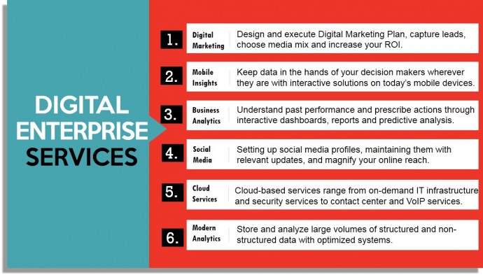
In this hack, you require no visual element at all. We will be using simple shapes with strong contrast to the background that will serve as visual element in themselves. See what we have done in the slide below: Divided the background into heading and text, in the content half added rectangular shapes, created a separate square shape for the bullet numbering and that’s it. The strong contrast rendered in the slide makes it awesome, and not a word was sacrificed in the process.
Here’s another design that can be created using these hack. All we have done here is add rectangular boxes for each bullet number and add another thin rectangular line to separate each bullet point.
Hack 6: Divide each Bullet by a Dotted Line
Simply separating each bullet point by a divider like a dotted line changes the look of your slide. A line separator creates 6 different chunks of text making them far easier on the eye than one long passage as was before. Rather than following the top-down approach of title-above-text-below, you can rotate the title to create a dynamic look. You can further separate the headings of the bullet points from the description with another line separator. Adding icons to each bullet point is your choice completely. In 2 minutes, you have created a far impressive slide than you started with.
Hack 7: Insert One Visual Element (a large icon)
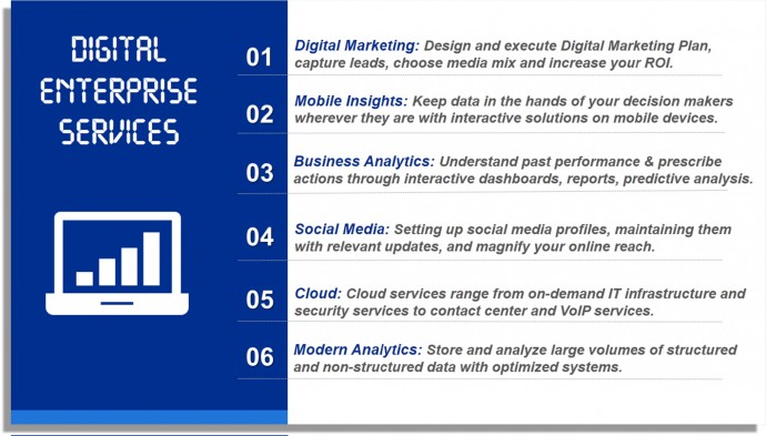
This is similar to the above hack, the only difference being that we add one visual element that summarizes the main idea of the slide. You can divide the slide into title and text sections with a strong contrast. You may choose any image; however we recommend using an icon due to the simplicity of the illustration and its neat, transparent look.
Alternatively, you can choose a white background and give a strong contrasting background to the text boxes and the icon. As you can see in the slide below, the calendar bullet points enhance the look of the slide greatly. It’s very simple to create such customized shapes- all we have done is first drawn a blue square, superimpose a white square over it and add two small white boxes with colored outline to depict the wire binding. With a little effort, you can create this amazing slide.
If you love the drop shadow effect given to the icon in the slide below, you can download such icons from the SlideTeam website. Creating them on own is a little tricky and we’ll be sharing this trick in our upcoming posts.
Hack 8: Go for a Circular Template
Circular processes look elegant and are very easy to understand. Microsoft PowerPoint has built-in circular SmartArt graphics that can be tried out for your presentation. If you want more professional and eye-catching circular diagrams, you can choose a professionally-designed template. The advantage of such templates are that they are fully editable. You simply have to paste your content in the placeholders and change the colors to match your company’s brand.
For instance, we used one of our professional templates to display services in the style of spokes of a wheel.
Here’s another professional template that gives an impression of unlocking your company services. The icons and perfect distribution of content around the slide canvas makes for a pretty impressive look. Using simple “Appear” animation, you can show each service one by one and keep the audience hooked to your presentation.
Hack 9: Semicircle Layout
Semicircles or half circles look as powerful, if not more, as complete circles. They are perfect to present the different segments of your audience, departments, services, etc. Creating a semicircle in PowerPoint is not tough, dividing it into segments and giving a different color to each segment is however a little tricky task. Here’s one workaround: Insert a Pie Chart from the Chart menu, divide it into 12 segments (say you give 10 value to each), save that piechart as an image and crop the bottom half. That way, you will be left with 6 equal segments with 6 different colors and a semicircle!
Or save yourself this trouble by downloading a semicircle template and pasting your content in the given placeholders. Here’s one semicircle slide design with world map as background- the perfect fit for any business services slide:
Hack 10: Half Page Image Layout
This layout uses the perfect balance of visual and textual content on your slide. We had shared this hack in the last Hackathon post Turn Boring PowerPoint Slides into Visual Masterpieces using 11 Image Hacks. The only thing that has changed here is that we are dealing with a lot of text.
A great way to present each bullet point is to show it via the ‘Folded Corner’ shape. You do not need to invest any time in creating these. It’s available in PowerPoint itself! Simply go to the Insert tab, open the Shapes menu and choose the Folded Corner shape from Basic Shapes. We picked the dark green and light green colors from the image on right to create harmony and balance in the overall slide.
Hack 11: Full Page Image Layout
This is similar to the hack that we shared in Hackathon 2: choose an impressive visual, let it cover the slide canvas, and add transparency to the text box. But we are faced with the same challenge: Lots of text! Even if you add transparency behind the text, it will look a mess. What to do? Check out what we have done in the slide below.
First, we added an Artistic Effect to the visual. Here’s how you can try it: select the visual on your slide, click the Format tab on the PowerPoint ribbon, click the Color menu and choose the gray option. That gives an earthy and classic look to the image.
Second, Mask the Image using Gradient Fill. The steps remain the same as shared in the last Hackathon post. Let us repeat it for you.
- Insert a rectangle from the Shapes menu under the Insert tab
- Right click on the shape and click Format Shape
- Under Fill, select the Gradient Fill radio button
- Add two to three gradient stops and choose their color as white
- Keep decreasing the transparency level of each gradient stop (the first stop with transparency between 95-100%, the second stop with transparency between 40-50% and the last having transparency between 0-5%).
Third, Insert Arrows as Tags over the Slide. Here’s how you can achieve that: choose the Pentagon shape from the Block Arrows section in the Shapes menu. Place each bullet point in the block arrow. Insert the Right Triangle shape from the Shapes menu, rotate it by 180 degree, give it the same color as the arrow and place it on corner left, bottom of the arrow. That’s it. All your bullet points get converted into awesome picture tags!
Hack 12: Use a Professionally Designed Diagram
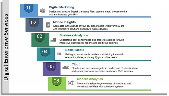
If you want to settle for nothing less than the best, go for a professionally designed diagram. In a few dollars, you can choose a ready-to-use template, put your bullet points in the placeholders and present it. Professional designs are also the best solution when you face a time crunch. The fonts, colors, layout etc. are all well taken care of. Check out the professional template below which is the perfect fit for the digital enterprise slide:
Here’s another professional design that uses elegant shapes to give the impression of moving forwards and driven towards achieving the goal.
P.S. If you are an academician and are presenting education services, a tree diagram will be the perfect design for your slide.
Hack 13: Split the Bullets into Left & Right
Much like a timeline or signboard, you can draw a straight line in the centre of the slide and split the bullet points on the left and right side of the line. This sobre yet elegant design is easy on the audiences’ eye and very professional at the same time. It’s pretty easy to create a timeline on your own using basic lines and rectangular boxes.
Or you can use a readymade signboard design like the one we have used below:
Hack 14: Use a Textured Background + Left-Right Partition
You can give an academic touch to your slide by using a blackboard texture in the background. PowerPoint has several default textured backgrounds which you can try. Simply right click on the blank slide, click Format Background and further select the Picture or Texture Fill radio button. Bullet points on the same textured background do not look ugly, because of the vibrant slide canvas. You can make the points more visually appealing by alternating them left and right.
As you can see in the slide below, only basic shapes have been used to highlight the headings of the services. A basic rectangular box merged with a circle are all that has been used. This may not be the best design of all hacks but it is definitely far, far superior to what we started with.
Hack 15: Present Text in Linear Fashion
Again a very simple hack. In the slide below, basic rectangular shapes have been taken and put together linearly. Within each block, a rounded rectangle taken from basic PowerPoint shapes menu, has been added. You need not create six different blocks; create it once and keep duplicating till you have six for each of the bullet points. Use the lighter and darker versions of each color to give a color-rich yet soothing look and feel to the slide.
Phew! We have to end here, not because we are out of ideas but because the possibilities are endless. The list of hacks we have provided you are decent enough to create not just good but awesome slides.
Now that you know there are so many ways to show your bullet points, we hope you won’t go for that boring-to-death, bullet-ridden slide. Your audience won’t forgive you if you still do! 😀
P.S. If you don't have time to revamp your boring slides, send your rough PPT to our PowerPoint Presentation Design Services team and get a polished, visually stunning presentation in 48 hours.
Which hack or hacks did you like the most? Tell us in the comments below.


![15 Ways to Turn a Very Text-Heavy, Bullet-Ridden Slide into Amazing! [Presentation Hackathon Part 3]](https://www.slideteam.net/wp/wp-content/uploads/2015/11/PowerPoint-Presentation-Slide-Layouts-to-Create-Visually-Attractive-Presentations-690x300.png)

 Customer Reviews


