


 Customer Reviews
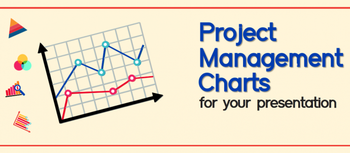
Project management is a challenging but important task with certain complex responsibilities. To fulfill the complex and unique assignment within the constrained time and cost, various tools and techniques are employed. In other words, to accomplish and manage them aptly, a myriad applications or charts are used. These not only reduce the interruptions of regular business activities, but also organize resources and technologies so that the project is executed successfully.
There are many organizations that are still not aware of the data visualization tools that they can use in their presentations. Numbers are dumped onto the slides without any analysis. The presenters either do not make use of charts and graphs or, if they do, end up using the wrong ones.
Let this article guide you on the importance of project management PPT and charts and where they should be implemented.
1. Gantt Chart
It is a type of bar chart that demonstrates the project schedule. Gantt chart diagram demonstrates the task duration in days, weeks and months. It is best in tracking progress. Moreover, project managers can plan, work out the practical aspects and potential problems, segregate the work to team members, and minimize the delivery time using this graphic. Additionally, one can illustrate the beginning and ending times of your assignment, and identify the task relationships. Portray task dependencies and give visual references to your colleagues are some benefits of implementing this chart. You can also the show the schedule changes and implications.

Download this Gantt Chart Diagram PPT
Try out this design
When you need to complete a project within the deadline in an organized manner, there is nothing better than a Gantt chart. So it makes sense to use a comprehensive design to keep all your team members on the same page with such project management charts. Use the following design to indicate important entities alongside the Gantt chart periods. You can specify the crucial cogwheels of your project and hit the targets with effective communication. Click the link below and grab this fully-customizable design.
2. Pert Chart
One of the most commonly-used project management charts after Gantt diagram is the Program Evaluation Review Technique (PERT) chart, also known as the network diagram. It was designed by the US Navy in the 1950s. This chart portrays more complex project tasks and analyzes the tasks encompassed in the completion of the project. Pert chart also analyzes the time needed to accomplish the task and recognizes the minimum time required. They generally showcase parallel activities and let your team easily conceptualize the whole project. Both Pert chart and Critical Path Method (CPM) diagram are used interchangeably. However, CPM doesn’t consider time variations while Pert chart permits the randomness in task completion time.

Grab this Pert Chart PowerPoint Template
Try out this design
Since Pert allows more flexibility with the tasks involved in a project, it makes sense to use it in work environments having open communication channels and less hierarchy. This way, the focus is on the completion of the task with any number of relevant personnel. So utilize the following innovative design crafted by our experts. This Pert chart will let you focus on each task while helping your team give their 100%. Feel free to edit the entire design as the graphics can be manipulated according to your needs.

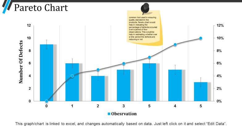
3. Pareto Chart
Pareto chart is a chart containing both bar graph and line chart. Mostly used in six sigma analysis, it can also fit into any project management scenario. One can also analyze the frequency of problems in a process effectively. These charts help in visualizing the quality aspects of your processes. Also, Pareto diagram assists in focusing on vital causes. An individual can easily communicate the data with other team members using a Pareto chart.

Download this Pareto Chart presentation slide
Try out this design
Among project management charts, Pareto charts serve a dual purpose. You can indicate data points effectively while chalking out a trend in figures. So by doing that, you can give your team the direction it needs to take that trend up a notch. Since there are plenty of processes involved in establishing a Pareto chart, we have worked out this out-of-the-box design for you. Download this template and specify who will be working on which module of the project. Efficiency guaranteed!
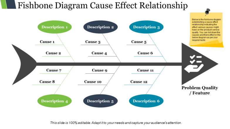
4. Cause-Effect Chart
In any project, the root cause and effect analysis plays a significant role. Also called an Ishikawa diagram or Fishbone Diagram, it helps professionals arrange causes and effects graphically. One can also categorize ideas that the team gathers for a fruitful brainstorming session. It gives an in-depth look into the issues behind the problems that further helps generate potential solutions for those who are determined to obtain the best outcomes.

Download this Cause-Effect Chart PowerPoint slide
Try out this design
Fishbone diagrams are synonymous to efficiency. The reason for that is their ease of use along with the ability to highlight problems and risks out front. So by using this chart, you will be able to give your team a more cautious outlook. Use this design to communicate how to minimize errors in the project. You can also use the simple yet effective layout for handouts so that the team stays on the same page. Churn out the best project with accuracy with this template. Click the link below to download and deploy.
Learn to create Fishbone Diagram for your business presentation
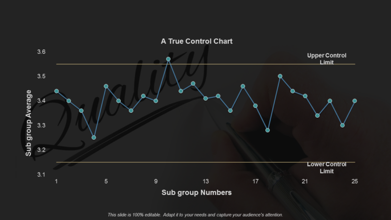
5. Control Chart
The Control Chart or a Statistical Process Control Chart is a graph used in efficient project management. This demonstrates the changes in the process with time. One can control the ongoing process by searching and correcting problems. A team member can analyze the quality enhancement in the project, be it for hampering the problem or making changes in the process. Process control chart can assist in determining the stability of the process.

Download this Control Chart PPT slide
Try out this design
A more creative set of project management charts, control charts help set benchmarks for project quality. From conception to prototyping, this chart helps project managers define the parameters on which your project will come out a winner. So use the following creative control chart design to earmark these parameters precisely. You can also manipulate the line points to as per your data and devise an informative presentation for your colleagues. Showcase how control will ensure quality by downloading this design.
6. Matrix Diagram
It represents the sequential steps taken in a process, workflow, or task. A matrix shows the relationships among four groups of information. One can also discover who is keen and influential in the task or project you are working on. With stakeholder analysis matrix, you get information about the involvement of stakeholders. On the other hand, with RACI matrix (Responsibility Assignment Matrix), you are informed about the deliverables during the lifecycle of a project, and the person tasked with achieving them.

Download this awesome Activity Matrix Diagram template
Try out this design
Smart design can keep you from falling into the matrix of problems. Use this template to mention the market share vs market growth relationship with key data points while managing a product. The specifications can be tabulated in a separate slide as you want them to be portrayed. You can also remix the color scheme as per your brand and keep everyone updated. Additionally, you can make the chart more descriptive by adding more textual content in placeholders. Flexibility to the fullest!

Download this creative matrix chart diagram PowerPoint Template
Learn to Create Matrix Diagram for your PPT presentation
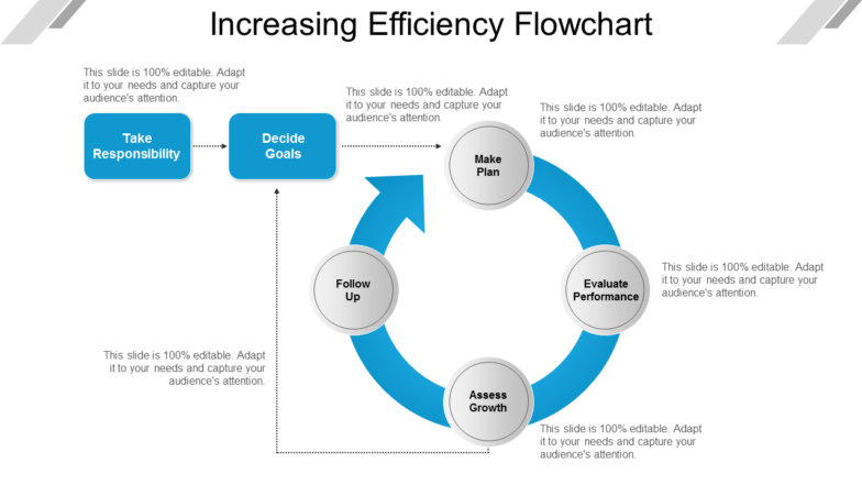
7. Flowchart
The sequence or flow of a process is shown using the flowchart. To raise the efficiency of the business, you can illustrate the financial, quality management, and production processes graphically. Further, the data flow of any form can be demonstrated using these diagrams.

Download this innovative Sequential Flowchart PPT slide template
Try out this design
For any particular project, you have to define the process workflow. There can be linear as well as circular arrangement of processes. So utilize this creative flowchart slide to showcase what processes will lead to faster prototyping till the final product is released. Given that you have figured out the nitty-gritty of project data, a flowchart makes it easier to define each process and the personnel relevant to it. So download this template to put your point across with precision.
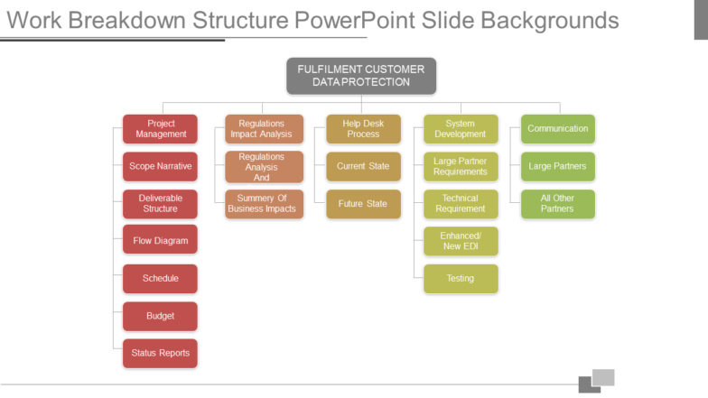
8. Work-Breakdown Structure
Work-Breakdown Structure (WBS) is another chart used in the project management. This provides you the hierarchy of tasks that are to be undertaken in a project. WBS chart assists you in planning your project. You can easily envision the components and their relation to execute the best planning. You can also see our hierarchy chart category for inspiration.

Download this Work-Breakdown Structure presentation template slide
Try out this design
Your instant answer to a hierarchical setup for a project should be a work-breakdown structure chart. It allows a more team-oriented depiction of project tasks and helps manage risks on an individual level. Therefore, you can use this 5-stage work-breakdown structure to establish hierarchy of processes. Additionally, you can add images to the slide to personalize it according to the company needs. You can also add different icons to add value to your presentation. Download now!
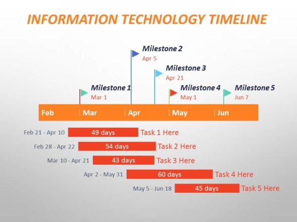
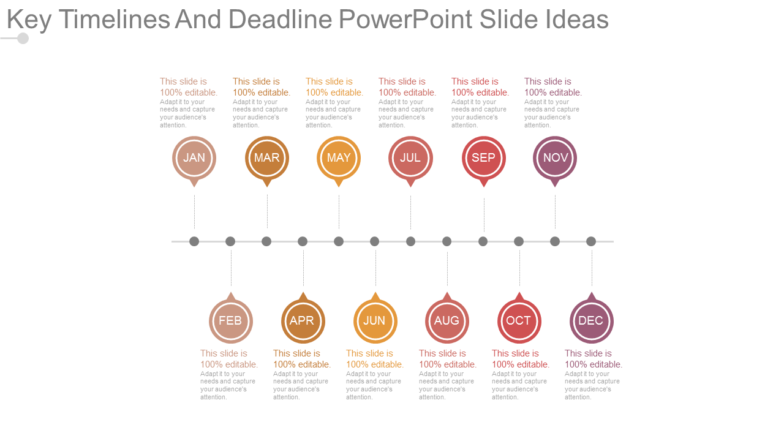
9. Timeline
A timeline is a graphical representation that enables your team to visualize the complex information. This helps you in monitoring the time taken for project completion. You can also identify the potential delays and track the progress with the creative timeline diagrams. Any individual can track the status and deliverables from anywhere. Last but not the least, one can update the progress metrics as and when required.

Download this stupendous timeline presentation diagram template
Try out this design
A popular one among the project management charts is the timeline design. This layout takes a balanced approach of team and deadline, giving a more refined outlook to your project management process. Depict your project needs clearly with the following creative timeline template. Impart a standard to your communication with catchy icons used in this slide. The month–wise distribution of tasks can also be changed to week-wise as the graphics and icons are fully editable. Grab the template now!
Learn to create Timeline PowerPoint Template for your presentation
Streamline your project, track progress with creative visuals as shown above, and lead your competitors. Feel free to combine various project management charts and create a visual metaphor in the form of a dashboard.
Hope this helps you. Share your feedback with us in the comments below.


![30-60-90 Day Plan Designs That’ll Help You Stay on Track [PowerPoint Tutorial #25]](https://www.slideteam.net/wp/wp-content/uploads/2016/10/blog-1-335x146.jpg)


