

Sequential flow chart for business operation flat powerpoint design




Try Before you Buy Download Free Sample Product
 Impress Your
 Audience
 100%
100% Editable
 Save Hours
 of Time


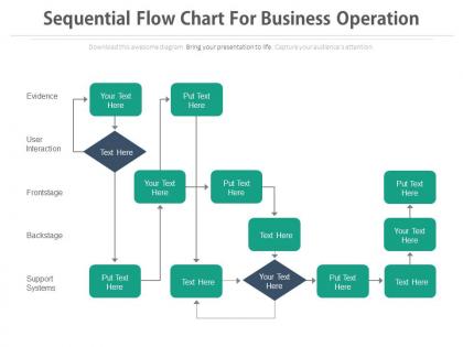
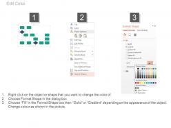
A business is ranked on the basis of strategies and the operations it follows. This sequential flow chart for business operation flat PowerPoint design works in the right direction to provide its users an ease of doing business. The flow chart graphical structure in the business operation PPT slide design, showcase a very clear picture of the template. The sequential order of the business processes and procedures can be entered in the structure easily and it becomes easier for the viewers as well as the user to catch the information without taking much time. Whether you need to portray the financial processes, official records, resource use or any related business functioning, this sequential flow chart can be decorated with the step by step information of the commercial processing. It is one of the greatest assets that can be used to make a trade industry elevate and achieve its goals with a clear business strategy. A user is free to use this Business operation flow chart PPT icon in a more impressive way. Abandon all thoughts of losing. Our Sequential Flow Chart For Business Operation Flat Powerpoint Design are wired for victory.
People who downloaded this PowerPoint presentation also viewed the following :
Sequential flow chart for business operation flat powerpoint design with all 4 slides:
Deal out the aces with our Sequential Flow Chart For Business Operation Flat Powerpoint Design. Give your team a good hand to play with.
FAQs for Sequential flow chart for business operation
So you'll need the basic shapes first - ovals for start/stop, rectangles for actions, diamonds for decisions. Pretty standard stuff. Arrows connect everything together like a roadmap. Start by sketching your main steps, then figure out where decisions happen. That's where things branch off into different paths. Keep the text short in each box or nobody's gonna read it. Oh, and if your flowchart gets crazy long, use connectors to split it across pages. Honestly, simpler is always better - I've seen people go overboard and create these monster charts that are more confusing than helpful.
Okay so flowcharts basically take messy processes and turn them into bite-sized visual steps that don't fry your brain. You're not juggling a million details anymore - everything's laid out in order. It's like having GPS but for work stuff, which sounds nerdy but actually works. The visual part is key because you'll catch problems that hide in regular written procedures. Bottlenecks jump out at you. Missing steps become obvious. I'd start with whatever process confuses you most right now and just map it out. You'll be surprised how much clearer things get once you can actually see the flow.
Sequential flow charts work amazing for manufacturing, healthcare, and software dev. Finance and logistics use them tons too. Basically any industry with complex multi-step processes where screwing up costs money or puts people at risk. The visual thing really helps - your team can actually see where things get stuck or go wrong way faster than reading through some boring manual. Honestly, if you're dealing with processes that need to be consistent every time, just start mapping them out. Makes training new people so much easier too.
So basically, your starting point is whatever kicks the whole thing off - could be a customer complaint, some system going nuts, or someone clicking submit. The end? That's when you'd actually get up from your desk and grab coffee because there's literally nothing left to do. I always think about it like this: what makes me go "oh shit, I need to handle this" and then later "okay, we're actually done here." Those are your boundaries. Just make sure the start point is obvious enough that anyone could spot it, and the finish line is crystal clear. Nobody wants to be stuck wondering if they're supposed to keep going or not.
Okay so you'll mainly need four shapes. Ovals are for starting and ending your flowchart. Rectangles show process steps - like actual work being done. Diamonds are for decisions, and honestly these trip people up because you HAVE to label the arrows with yes/no or true/false. Otherwise it makes zero sense. Parallelograms handle input/output stuff like entering data or printing reports. Arrows connect everything and show which direction the flow goes. There are other symbols like circles for connectors, but I'd stick with these basics first. Just stay consistent with whatever you pick.
Honestly, the biggest thing is keeping it super simple - just use basic shapes and don't cram too much text into each box. Multiple decision branches will make you want to pull your hair out, so try sticking to one path when you can. Make sure everything's lined up nicely because messy flowcharts are the worst. Oh, and definitely have someone else look at it before you call it done. If they're scratching their head or asking "wait, what happens here?" then you'll need to break those chunky steps down more. Standard symbols are your friend - don't get creative with weird shapes that'll confuse people.
Don't skip steps - that's the
-
Really like the color and design of the presentation.
-
Excellent work done on template design and graphics.